General
- Maths S2 SB File Uploaded 24/01/22, 15:45
- S2 Maths TG File Uploaded 3/08/22, 14:43
UNIT10: STATISTICS
Key unit competence
By the end of this unit, I will be able to collect, present and interpret grouped data.
Unit outline
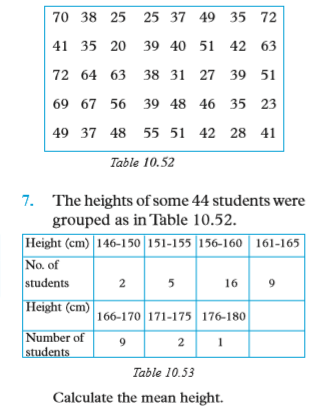
• Definition and examples of grouped data.
• Grouping data into classes.
• Frequency distribution tables for grouped data.
• Commulative frequency distribution tables.
• Measure of central tendency for grouped data.
• Graphical presentation of grouped data (polygon, histogram).
10.1 Grouped data
In unit 8 of S1, you were introduced to basic statistics that involved collection, organization and analysis of ungrouped data. In this unit, we are going to continue with the same using grouped data
10.1.1 Definition of grouped data
Activity 10.1
Given masses (in kg) of 30 pupils as follows:

1. Draw the following frequency distribution table in your exercise books. Count and fill the number of pupils whose mass fall in the given groups of masses:

2. Find the total number of pupils (∑ f) and fill it in the bottom cell of the frequency column.
3. Answer the following questions from the table:
(a) Which group has the highest number of pupils? (b) Which group has the lowest number of pupils?
4. Suppose you had pupils with masses of 50.4 kg and 50.9 kg. Discuss with your classmates in groups where you would place them, giving reasons for you choice of group.

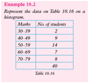
The data in this table represents marks scored by a group of 40 students in a mathematics test. We can analyse this performance by putting these students in groups according to their performance. For example, in this test, 2 students scored between 30 and 39, 9 scored between 40 and 49, 14 scored between 50 and 59, 7 scored between 60 and 69 and 8 scored between 70 and 79.
This information can be presented as in Table 10.3 below

When data is presented as in table 10.3 above, it is said to be a grouped data.
Grouped data is data that has been sorted into classes or categories.
Table 10.3 is an example of a frequency table. From table 10.3 it means that all scores from 30 to 39 inclusive, are in one group; all scores from 40 to 49 inclusive, are in the next group and so on.
Each of these groups is called a class or class interval. The values 30 and 39, 40 and 49, 50 and 59, etc. are called class limits for the respective class.
Note that, when the number of items in a data distribution is small, it is easy to deal with them; but when the number of items is large, it becomes necessary to group the data.
10.1.2 Frequency distribution table for grouped data
Activity 10.2
Table 10.4 below shows fifty scores for 25 basketball games.

Using the data in table 10.4;
1. Identify
(i) the lowest score
(ii) the highest score
2. Find the range of the scores.
3. Set these scores into 10 groups or class intervals beginning with 1 – 10, 11 – 20…. 91 – 100 in a frequency table.
4. For each group, state the class limits.
5. For each class frequency, denote the frequencies f1 = …, f2 = … and so on upto the 10th group.
6. How do you think the range can be useful in determining a suitable number of classes or the size of the class interval?
1. Consider the following data on the diameters of 40 ball bearings that were recorded in mm.

(i) the lowest diameter is 27 and
(ii) the highest diameter is 67.
• The range of the scores is the difference between the highest score and the lowest score.
Range = highest value – lowest
value = 67 – 27 = 40
2. Using classes 26 – 30, then 31 – 35, 36 – 40, 41 – 45 and so on, we get the following frequency table.

• Thus, for the class 26-30, 26 is called the Lower Class Limit and 30 is called the Upper Class Limit.
• Table 10.5 is called a frequency distribution table for Grouped Data. Similarly we can state the class limits for the rest of the groups.
• The number of observations in each class is the class frequency, denoted by f for example, the frequency for the class 41- 45 is f = 9.
• For this data the group size was already determined for us. Generally, the range and the number of classes can be used to estimate the class width or size.

Usually class sizes are better in multiples of 5 or 10. For example, to work with about 10 classes

we can then use a convenient class of 5.
Similarly we can estimate the number of classes as follows:

From this type of data presentation, we can draw better conclusions about the data than before.
Some of these conclusions are:
(a) The number of balls whose diameters fall between 31 and 35 is 3.
(b) No ball measures less than 26 mm.
(c) Nine balls have a diameter between 41 and 45 and so on.
Example 10.1
Table 10.6 shows the masses (in grams) of 50 carrots taken from a plot of land on which the effect of a new fertiliser was being investigated.

Make a frequency distribution table for this data
Solution
The smallest mass is 63 g and the largest is 118 g. The difference between the largest value and smallest value is called the range.
Thus, range = 118 g – 63 g = 55 g.
We need to group the data into a convenient number of classes. Usually, the reasonable number of classes varies from 4 to 12. By dividing the range by class size, we get the number of classes. Thus a class size of 5 will give us
55/5 i.e. 11 classes. A class size of 8 will give us 55/8 i.e. 7 classesA class size of 10 will give us 55/10 i.e. 6
classes.Let us use a class size of 10. Table 10.7 is the required frequency table.

Note: If the range is small, it is more convenient to use class sizes which are even. If it is large, multiples of 5 or 10 are more convenient. This is helpful especially if there is need to represent the data graphically.
Exercise 10.1
1. A handspan is the distance (length) from the end of the thumb to the end of the small finger when the hand is fully open. Table 10.8 shows the handspans of some 21 children measured in centimetres.

Make a frequency distribution table, grouping the data into four classes starting with 14.0 – 15.9.
2. The lengths of 36 pea pods were measured to the nearest millimetre and recorded in Table 10.9.

Put the data into a grouped frequency table by choosing a convenient number of classes.
3. The percentage burns for 70 fire accident victims treated in a hospital in two years were recorded in the hospital records as shown in Table 10.10.

Make a grouped frequency table using classes 10 – 19, 20 – 29, 30 – 39, etc.
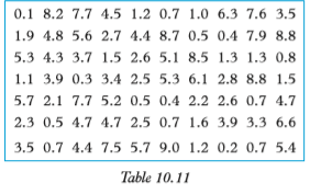
4. A pupil measured the amount of ink in biro pens used in his class by measuring the length (in cm) of the ink column that could be seen. He obtained the results shown in table 10.11 below. Make a grouped frequency table with 6 classes
10.2 Data presentation
10.2.1 Class boundaries
Consider the grouped distribution in Table 10.12. Suppose the data represents the masses to the nearest kg of a group of 40 boys.
Generally, for any data obtained from measurements, the practice is to record them to the nearest value of the accuracy chosen. For example, a recorded value of say 30 kg represents a number in the interval 29.5 to 30.5. Thus 29.5 ≤ 30 < 30.5
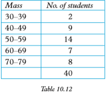
The class 30 – 39 includes all values equal to or greater than 29.5 but less than 39.5. Thus the class interval stretches from 29.5 to 39.5. The point half way between the upper limit of the first class and the lower limit of the next class is called the class boundary. i.e. class boundary between first and second class

Similarly, the class 40 – 49 includes all values equal to or greater than 39.5 but less than 49.5
The values 29.5, 39.5, 49.5, etc. are called class boundaries for Table 10.11. Thus, the class 30–39 can be represented as 29.5 – 39.5. The value 29.5 is the lower class boundary and 39.5 is the upper class boundary for this class
Similarly, the class 40 – 49 can be extended to 39.5 – 49.5, etc.
The difference between the upper class boundary and the lower class boundary is called the class interval, class width, or class size, i.e. class interval = upper class boundary – lower class boundary. This knowledge is essential for the construction of a histogram.
10.2.2 Histogram
Activity 10.3
Table 10.13 below shows the frequency distribution table for the heights of a group of men, to the nearest centimetres.

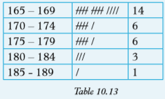
Use the given information to do the following:
1. Identify the boundaries of the classes.
2. Rewrite the table using boundaries rather than class limits.
3. In your own words, distinguish between class limits and class boundaries.
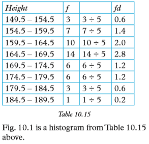
From Activity 10.4, the class boundary between the first and the second class is given by the mean of upper limit of the first class and lower limit of the second class

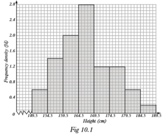
Between one class and the next, the class limits have a gap between them. There is a disconnect between any two consecutive classes. In table 10.13, class boundaries are such that the end of one class to the beginning of the next. In other words, there is a sense of continuity when the frequency table is written using class boundaries table 10.14. This is the format used when constructing a histogram of grouped data.
A histogram is a bar diagram that represents the frequency distribution of a continuous data. When class intervals are of equal width, a histogram resembles a bar graph the difference is that there are no spaces between bars. In a histogram, each rectangle is drawn above each respective class interval such that the area of each rectangle is proportional to the frequency of the observations falling in the corresponding interval.
If the class intervals are equal, then the heights of the rectangles are proportional to the corresponding frequencies. If the classes intervals are not equal the heights of rectangles are represented by a unit called relative frequency or frequency density.
Activity 10.4
1. Using a dictionary or the internet, find the meaning of the terms:
(i) frequency density
(ii) relative frequency
2. Copy table 10.14 and create another column for the frequency density (fd).
3. Using an appropriate scale, draw a pair of axes. On the vertical axis, mark the frequency density.
4. On the horizontal axis, draw appropriate rectangles whose width equals the class width, and whose height equals the corresponding frequency density.
From Activity 10.4, you notice that:
• Frequency density, also known as relative frequency is a statistical data that compares class frequency to the class width, for the purposes of constructing a histogram of a given set of data.

The required table that includes the frequency density column is as shown below i.e. Table 10.15
Note: class interval = 5 for all classes.
A histogram (or a frequency histogram) is a graph that consists of a series of rectangles:
(a) drawn on a continuous scale (i.e. no gaps between the rectangles) and
(b) with areas being proportional to class frequencies. The height of the rectangles are obtained as, , f being the frequency and w the class width. The value is called frequency density.
Solution
Table 10.17 represents the same data as in Table 10.16, but with the class limits having been changed to class boundaries and the column for the frequency density included

Choose a suitable scale and use it to represent marks on the horizontal axis, indicating all the class boundaries along this axis.
Since the class interval is constant, the rectangles must have the same width. Fig. 10.2 below shows the required histogram.

Note that:
(i) The class boundaries mark the boundaries of the rectangular bars in the histogram.
(ii) In Fig. 10.2, the horizontal axis is compressed. We put to show that there is no information being displayed on the lower part of the axis.
(iii) Where the widths of the rectangles of a histogram are equal (as in Fig. 10.2), the histogram is similar to a bar chart. Therefore the height of the bars is also proportional to the respective frequencies.
Example 10.3
In a certain function, the ages of the people present were recorded as shown in Table 10.18.

Draw a histogram for this data
Solution
Remember that in a histogram, the area of each rectangle represents the frequency and the width of a rectangle the class interval. Thus, we get the height of the bar by dividing the frequency by the class interval. This result is known as the frequency density (Table 10.19).

The height of each column (Table 10.19) represents the average number of people in each age group. It is assumed that there is a uniform distribution within the class intervals. Fig. 10.3 shows the required histogram.

Exercise 10.2
1. Table 10.20 represents the number of patients who attended a mobile clinic grouped by age.
Exercise 10.2
1. Table 10.20 represents the number of patients who attended a mobile clinic grouped by age.

Using a scale of 2 cm to represent 1 unit on y-axis, draw a histogram to represent the distribution.
2. In a high altitude weather station, wind speeds were observed for a period of 100 days

Using a scale of 4 cm to represent 1 unit on the y-axis, draw a histogram to represent the distribution.
3. Table 10.22 shows the heights to the nearest centimetre of a sample of seedlings in a tree nursery.

Construct a histogram to represent the distribution. Who do you think would be interested in a tree nursery project? To whose benefit would it be?
4. Use the data in Table 10.23 and a suitable number of class to make a frequency distribution table.

10.2.3 Frequency polygon
Fig. 10.4 shows a frequency polygon obtained using information in Table 10.24 shows the same information that was in Table 10.3 on page 178 but this time, the mid-points or class mid marks of the classes are included. Each class mark is obtained as half the sum of the class limits (or boundaries). These classmarks are useful in the construction of the frequency polygons, calculation of the mean and the standard deviation of grouped data.
In order to construct a frequency polygon of a given set of data, we plot the class mid-points against the corresponding frequency densities. Therefore, the class mid-points represent the corresponding class intervals. These mid-points are calculated using class limits as follows


When the frequency densities are plotted against the corresponding midpoints and the points joined with straight line segments, we obtain a frequency polygon (Fig. 10.4).

Thus, a frequency polygon is a graph in which frequency densities are plotted against class mid-points and the points are joined with straight line segments.
Note that in Table 10.24, the first point given is the mid-point of the first class whose frequency is 2. Normally, it is taken that the previous class
(i.e 20 – 29) has frequency 0 (zero). So the graph is extended to the mid-point of this class. Similarly, it is taken that the next class, after the last, has frequency 0 (zero). The graph is also extended to this class. Sometimes, more than one frequency polygon may be drawn on the same axes for purposes of comparing frequency distributions.
Activity 10.5
Table 10.25 shows the performance of two quizes. The maximum possible mark that could be scored was 50.

1. Copy table 10.25 and on it introduce a 4th column with the heading “class mid-values".
2. On the same axes and using an appropriate scale on each axis, draw a frequency polygon for each class.
3. Explain how you would use these frequency polygons.
From this activity, you should have observed the following:
(i) A frequency polygon is obtained by plotting class-mid values against the corresponding frequency densities.
(ii) You needed to add another two columns for the frequency density for each set.
Fig 10.5 is the required frequency polygons.
 Horizontal scale 1 m represents 5 marksVertical Scale 1 cm represents 0.2 (frequency density) Key___ represents S2A___ represents S2The trend of the graph shows that S2A is a better performer.Note: The frequency of the class below the first class is 0 and the frequency of the class after the last one is also 0.10.2.4 Pie-chartActivity 10.6
 We plot the two points in order to give the starting and the end points of the graph. Otherwise, the polygon would not be closed.using an appropriate number of classes.1. Make a frequency distribution table and ensure that all the entries are considered.2. If each class was to be represented by a sector of an angle, calculate the degree of the sectors representing each class.3. Construct an accurate pie chart and label it appropriately.4. In order to construct a pie chart, what other fact did you require?Since this is a small distribution, five classes are appropriate.
 1. Introduce the cumulative frequency of column just to confirm that you have the correct distribution total.2. On the frequency table, I have introduced the class boundaries column as a reminder that there should be no gaps in the pie chart.According to the frequencies the angles of the sectors should be as follows:
 To draw the pie chart, the circle should be not too small and not too big. Fig. 10.6 is the required chart.
 To draw an accurate pie chart, you need to be aware that we consider the class boundaries rather than the class limits even though you need not mark them.A pie-chart is a graph or a diagram in which different proportions of a given data distribution is represented by sectors of a circle.Since the diagram is a circle, it is looked at as a circular ‘pie’, hence the name pie chartExample 10.4Table 10.30 shows grades scored by 15 candidates who sat for a certain test
 Draw a pie chart for this data
 Note:1. Usually, there are no numbers on a pie chart.2. The sizes of the sectors give a comparison between the quantities represented.3. The order in which the sectors are presented does not matter.4. Sectors may be shaded with different patterns (or colours) to give a better visual impressionExample 10.5
In a school, 320 students are in Senior 1, 200 students in Senior 2, 160 students are in Senior 3 and 120 students in Senior 4. Draw a pie chart to display the information.SolutionStep IFind the angles that represent each item (class). Angles = Fraction of that item × 360° The total number of students in the school is; 320 + 200 + 160 + 120 = 800 students Angle = Fraction of class in the school × 360° Exercise 10.31. Table 10.32 shows masses of 100 students at St. Augustin’s College.
 (a) Represent this distribution in a pie chart.(b) Draw a histogram for this data.2. Table 10.33 shows marks in a mathematics test for some 80 pupils at St. Peter’s Primary School.
 (a) Represent this distribution in a pie chart.(b) Draw a histogram for this data.3. In a village, 25% of the people are male adults, 30% are female adults while the rest are children.(a) Draw a pie chart to represent the above information.(b) If the same village consists of a population of 950 000, find how many children are there?(c) If three quarters of the male adults are married, each having only one wife from the same village, find how many female adults are not married?4. Table 10.34 shows masses, to the nearest kg of 100 students, who were picked at random, in St. Emmanuel Secondary School
 Draw a pie chart to represent this information.5. The pie chart in Fig. 10.9 shows students taking different courses at the university.
 (a) If 240 students take law, find the total number of students in the university.(b) If 65% of education students take education in arts, find how many take education in science.6. Draw a frequency polygon using the data in(a) Question 1 Table 17.18(b) Question 2 Table 17.19(c) Question 3 Table 17.2010.2.5. Cumulative frequency table and graphA cumulative frequency table of a continuous variate gives the frequency of observations that fall below the upper end point of each class interval. The cumulative frequency table is formed from the individual frequencies by adding them up, getting a sum of frequencies at the end of each class. Consider the following:Table 10.35 represents times measured to the nearest second, taken by some 30 students to complete a timed quiz.
 Numbers in the last column of this table are called cumulative frequencies, denoted as cf.The clarification in the third column is normally not included in the cumulative frequency tableActivity 10.71. Copy and complete Table 10.36 below.
 2. Cumulative frequency diagram (graph). To draw a cumulative frequency diagram, we use the information in the last two columns i.e. we plot the cumulative frequencies against the corresponding upper class boundaries.3. By choosing an appropriate scale(a) Mark the cumulative frequency (cf) on the vertical axis.b) Mark the class boundaries on the horizontal axis.(c) Plot cf against the boundaries.(d) Join the points with a smooth curve.(e) The cumulative frequency at the beginning of the first class to be zero, the first point on your graph must be on the horizontal axis.4. From your graph, find the height when cf = 24.From the activity, your completed table should look like Table 10.37 below.
 Fig 10.10 shows the cumulative frequency diagram for the data in Table 10.37
 Note that 25 on the cf scale represents the median position, while 166 cm is the corresponding value on the height axis or scale. Therefore, 166 cm must represent the median height of the distribution. Thus, we can use cumulative frequency graph to estimate the median of a grouped distribution.
 (a) Construct a cumulative frequency (cf) table(b) Draw a cumulative frequency (cf) graph and use it to estimate the median age.
 (b) To draw the cumulative frequency curve, we need class boundaries so we introduce a 4th column in the cf table for the boundaries
 Since the sample size is 630, the median position is between 315 and 316 i.e. 315.5 Thus,when cf = 315.5Age = 50.8 yrsthe median age = 50.8 years
 Use this information to draw a cumulative frequency graph and use it to determine the mean age.2. The lengths of some pea pods were measured to the nearest mm and recorded as in Table 10.42. Choose a suitable number of class to put the data into a grouped frequency table. Hence, represent the data in a cumulative frequency graph.
 3. A survey was conducted to assess how much money a particular group spent per week. The data in Table 10.43 was obtained. Make a grouped frequency table using classes 110–119, 120 – 129 and so on. Use your table to construct a cumulative graph and use it to estimate the median amount to the nearest unit.
 10.3 Measures of central tendencyIn unit 8 of S1, we defined measures of central tendency, and found them using ungrouped data.Measures of central tendency include the mean, median, mode and range. We will look at each one of them separately. The measures of central tendencies are used to show the trends and patterns ofany given data. For example, in a class of 40 students, given the individual mass (kg) of each student, we can calculate the average mass (mean mass), the median mass, the most common mass and the difference between the highest and the lowest mass. This will help us to analyse the mass of the students and possibly make some important decisions based on the analysis.10.3.1 Arithmetic meanThis is one of the measures of the centre of a set of observations. You have already learnt that for ungrouped data, the sum of the observations divided by the number of observations gives the mean. Inclusion of any extreme value in a set of observations alters the mean significantly since the mean uses the actual values of the observationsTo find the mean of grouped data we must look for suitable values to represent the class intervals since mean involves multiplication of numbersThe best representative of a class interval is the class mid-value or class centre. We act as if all the observations in a class are equal in value to the class centre. We act as if all the observations in a class are equal in value to the class centre.Activity 10.81. Obtain the masses to the nearest kg of all the members of your group.2. Calculate the mean mass of your group.3. Through the secretary of the group, obtain the masses of all the other groups of the class.4. Now, calculate the mean mass of the whole class.5. Determine a suitable number of classes, and use it to determine the class size.6. Make a frequency distribution table for the masses.7. On your frequency distribution table, add another two columns i.e. one for the class mid values (x) and another one for the on product of the frequencies (f) and the corresponding class mid values (x) i.e. fx.8. Find the sum of the products above.9. Divide the sum in (8) above by the number of students in the class whose masses you have worked with.10. How does your answer in (9) above compare with the answer obtained in (2) above.In Activity 10.8, you should have observed the following:1. Unless any group made an error, in their calculations, the mean mass of the class should be the same.2. Your frequency distribution tables will depend on the number of groups chosen. Similarly the results of number 6 to 8 will depend on the number of groups.3. The result of Σfx ÷ Σf should be approximately equal to the mean mass found earlier. Can you explain why the two answers should differ?4. The answers to part (8) and part (9) in the activity represent the same measure i.e. the mean mass of the students in your class. Any discrepancy would be as a result of the approach used
 Use the table to calculate the mean height of the buildings.SolutionWe need to introduce a new row for class centres (x) and another row for the products of the frequencies and class – centres (fx) as shown in Table 10.45
 Example 10.8Table 10.46 shows the distribution of the average mathematics marks scored by 40 students in the end of year examination
 Exercise 10.51. The masses (kg) of a group of children between the ages of 6 months to 11 months are tabulated below. (Table 10.48).
 Calculate the mean mass.2. The frequency distribution table (Table 10.49) relates to the lengths of sentences in a book
 Calculate the mean number of words.3. Using the results of mathematics examination for the end of year 2013 in your class:(a) Calculate the mean mark for the class.(b) Using class intervals of 1 – 10, 10 – 20, form a frequency distribution table and use it to calculate the mean mark.(c) Compare the two answers that you have obtained in (a) and (b) above. Comment on them.4. A company’s monthly wage bill in FRW is distributed as in the Table 10.50 below
 5. In each of the following distributions, find the arithmetic mean.
 6. Table 10.52 shows marks out of 100 for 40 students in a mathematics test. Make a frequency distribution table with class intervals 20 – 24, 25 – 29…. Calculate the mean mark in the test
 Finding the mean using the assumed meanWhen finding the mean of a set of large numbers, it is possible to reduce the amount of computation involved. This is done by reducing each entry of the set by subtracting a constant number so that we work with smaller figures. Below is an explanation of the method including an example.Consider the following distributions (Table 10.54)
 Confirm that the means of these distributions are as follows:Mean of distribution A is 48·2Mean of distribution B is 78·2Mean of distribution C is 8·2Notice that distribution B is obtained by adding 30 to each of the values in distribution A. Similarly, distribution C is obtained by subtracting 40 from each of the values in distribution A.Now look at their means.Adding 30 to the mean of distribution A gives the mean of distribution B. Subtracting 40 from the mean of distribution A gives the mean of distribution C.In general:If a constant A is added to or subtracted from each value in a distribution, the mean of the new distribution equals the mean of the old distribution plus or minus the same constant A. This constant is referred to as a working mean or an assumed mean.The assumed mean may be used to make work easier and quicker when finding the mean of a distribution, especially if the values are large.Example 10.9Find the mean of 105, 107, 108, 109, 113.SolutionStep 1: Choose a reasonable assumed mean. You do this by looking at the values and seeing that they range from 105 to 113. The true mean will lie roughly halfway between these values. Thus, a reasonable working mean may be 109.Step 2: Subtract the assumed mean, 109, from each of the values to obtain the new distribution
–4, –2, –1, 0, 4 . This is a distribution of differences from the assumed mean known as deviations.Step 3: Calculate the mean of the new distribution (i.e. mean of deviations from the assumed mean). Step 4: To obtain the true mean, add the assumed mean to the mean of deviations. Thus:True mean = 109 + –0.6 = 108.4
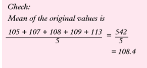 Example 10.10A farmer weighed the pigs in his sty and found their masses to be as in Table 10.55.
 Using an appropriate assumed mean, find the mean mass of the pigs.SolutionWe use a working mean A = 56. The working is tabulated as in table 10.56
 Recall:If the given data is in a grouped frequency distribution, we use mid-interval values, i.e. class mid-points as the values of xExercise 10.61. Using an appropriate assumed mean, find the mean of each of the following groups of values.(a) 178, 179, 183, 185, 186, 199(b) 66.4, 67.8, 69.2, 70.0, 71.3(c) 15.40, 16.20, 17.00, 17.80, 19.60, 20.40, 21.20, 22.00(d) 221 cm, 229 cm, 227 cm, 226 cm, 220 cm, 221 cm, 228 cm, 225 cm, 220 cm, 223 cm.2. Table 10.57 shows the marks (out of 50) obtained by 28 students of a certain school in an aptitude test.
 Use the method of working mean to find the mean mark.3. Table 10.58 shows the masses, to the nearest kilogram, of 40 form 4 students picked at random
 Calculate the mean mass, using an appropriate assumed mean4. Table 10.59 shows the grouping by age of students in a certain polytechnic.
 Calculate the mean age of the students, to the nearest year.5. An agricultural researcher measured the heights of a sample of plants and recorded them as in Table 10.60. Using an appropriate working mean, find the mean height of the plants.
 10.3.2 ModeThe mode is another measure of the centre of a set of observations. The mode of a discrete variate is that value of the variate, which occurs most frequently. For example, in a distribution such as 3, 4, 4, ,4, 4, 5, 5, 5, 33, 38, 40, which represents ages of group of people at a birthday party, the mode is 4 years. This is the mode of this ungrouped dataIn a grouped data it is not possible to find by observation a single most frequent value. So, we define a modal class. Thus, a modal class of a grouped data with equal intervals is the class that contains the highest frequency. For example look at the distribution in table 10.61.
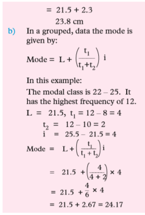
 The group with the highest number of people is 21 – 22 with a frequency of 16. Therefore, 21 – 22 is the modal class. Below is an alternative way of stating the formula.As observed earlier, the mode of a grouped data can only be estimated. There are two formulae that can be used, although the procedure has slight discrepancy in the answer. We use the following variables in the formulae:

 where:L – is the lower limit of the modal class.t1 – is the difference between the modal frequency and the frequency of the lower class.t2 – is the difference between the modal frequency and the frequency of the upper class.i – is the class size or the class interval.Example 10.11The following frequency distribution table (Table 10.62) shows the mass in kilograms of 100 athletes who participated in a Marathon competition in Rwanda.
 10.3.3 The rangeAs we have already learnt in earlier sections of this unit, the range of a set of observations is the difference between the largest and the smallest observations in a set.The range is a measure of variability, which uses only two of the observations in a set. It ignores the pattern of distribution in between the largest and the smallest value.Exercise 10.71. Find the mode and the range of the following data:(a) 15, 25, 18, 16, 25, 19, 18, 25, 16, 19, 25.(b) 1, 9, 22, 16, 15, 28, 9, 14, 16, 9, 28(c) 28, 7, 28, 17, 7, 19, 15, 7, 28, 7, 15, 18, 7.2.(a) Find the value of x so that the mode of the following data is 37: 12, 33, 37, 18, 19, 37, x, 33, 12, 33, 18, 37. What is the range?(b) What will be the new mode if one of the 37 after x is replaced by 33?3. Find the mode and the range of the following data: 28, 22, 21, 29, 12, 13, 18, 22, 14, 16, 28, 29, 13, 28, 22, 14, 22, 16, 19, 16, 15, 18, 22, 29.4. Find the mode of the scores in a Mathematics exam which were recorded as shown in table 10.63:
 5. Table 10.64 shows the findings on the amount of pocket money spent by 50 students in a school per month. The amounts are in Rwandan Francs
 Make a frequency table with the classes of 10 – 20, 20 – 30, 30 – 40 ... and use it to determine the mode.10.3.4 The medianRemember, when numbers are arranged in ascending or descending order, the middle number or the average of the two middle numbers is called the median. Consider the following example.the following example. The height in cm of a sample of 11 seedlings in a demonstration farm are 168 163, 165, 171, 169, 161, 159, 166, 163, 170, 159.If we rank the heights from the shortest to the highest, we obtain 159, 159, 161, 164, 163, 165, 166, 168, 169, 170, 171.We can use one height in this set to represent the set. The representative figure or the observation we choose should say something about the values in the set. In our example, we will choose an observation that has as many observations below it as above it. The value taken by this observation is called the medianThe median, M, of a set of observations is the middle one of the ranked quantities. In the rank order of the heights, the value 165 has 5 observations below it and five above it.Therefore, the median of the heights 159, 159, 161, 163, 164, 165, 166, 168, 169, 170, 171 is 165.When the number of observations, N, is odd, there is a unique middle observation, in the position.1/2 (N + 1) of the rank order. Suppose we had a 12th height i.e. 174 cm. The rank order would be 159, 159, 161, 163, 165, 166, 168, 169, 170, 171, 174. In the new order, if we take median = 165, there will be 5 entries below it and six above it.If we take median = 166, there will be 6 entries below it and 5 above it. So neither 165 nor 166 can be the median. The accepted rule when N is even is to place the median midway between the two middle observations, in this case between the sixth and the seventh.
 Note that median is a measure that ignores the actual sizes of the observations except those in the middle of the rank.Median of grouped dataActivity 10.91. Research from reference books and the internet the formula for calculating the median of grouped data.2. Collect the heights of your group members to the nearest cm.3. Through your group leader obtain the heights of the other groups so that every group has the heights of the whole class.4. Find range of the heights of the class.5. Use the data to make a frequency distribution table, using an appropriate group size.6. On your table, add a column for the cumulative frequency, cf7. Use the cumulative frequency table to find and state the median class.8. Does your answer agree with other groups? If your answer is no, explain why.To estimate the median of grouped data, we use the same principle as we used for ungrouped data. The assumption is that the data values in the median class are equally spread out in the classThe following is a formula that is used to estimate the median value. In the formula, the variables used in the formula are defined as was the case in the estimation of the mode
 Example 10.12The time taken by 38 students to work out a puzzle were recorded as in Table 10.65 below.


 Note:With reference to the cumulative frequency table 10.68 in example 10.13, the 24th position is the class 22 – 25. The class 22 – 25 stretches from the lower boundary 21.5 to the upper boundary 25.5, an interval of 4 cm. There are 12 seedlings in this interval, and 17 seedlings have lengths less than 21.5 cm. This means we require 7 more seedlings to make up to the 24th position i.e. the median position. If we assume that the lengths for the 12 seedlings in the median class are evenly or equally distributed in the class we can estimate the median as follows:
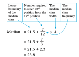 We can generalize a simple rule to estimate the median of grouped data distribution as follows. Let l be the lower median class boundary a be number of observations required to reach median position. fm be the median of the class frequency i be the median class size
 Exercise 10.81. Calculate the median of each of the following sets of observations. (a) 22, 16, 34, 25, 13(b) 20, 7, 63, 48, 10(c) 18, 9, 13, 15, 10, 4, 32, 26, 13, 17(d) 35, -13, 17, 1, 12, -1, 21, 2, 18,132. Find the median of the following sets of data:(a) The masses (kg) of 10 male students aged 18 years: 80, 75, 77, 83, 82, 73, 71, 77, 75, 89.(b) The width of a hand span of a group of people measured in mm. 52, 37, 103, 40, 20, 31, 86, 38, 70, 104, 50, 125.3. Calculate the median of the set of data given in Table 10.69.
 4. Table 10.70 shows the ages of a group of people in a gathering.
 (a) Find the number of people in the group.(b) Calculate the median age.5. The data below shows the marks scored by a group of students in a maths test.
 (a) Find:(i) the highest scores(ii) the lowest score(b) How many students did the test?(c) Calculate the median mark.6. Calculate the median of the data distribution and mode in table 10.7
 7. The following data show the number of children born to 25 families3, 5, 4, 2, 2, 4, 6, 8, 10, 4, 3, 5, 4, 8, 4, 7, 6, 6, 4, 6, 2, 3, 6, 5, 8.Make a frequency distribution table and find the mode and the median number of children.8. The mass of 30 new-born babies were recorded in kg as follows: 1.8, 1.7, 1.6, 2.1, 1.8, 1.9, 2.5, 1.7, 1.8, 1.6, 1.5, 1.4, 2.0, 2.1, 1.8, 1.6, 1.7, 2.1, 1.9, 1.8, 1.2, 1.9, 1.8, 1.8, 1.9, 1.7, 1.8, 2.0, 1.8, 1.6.(a) State the mode.(b) (i) What is the median?(ii) The mean mass?(c) Make a frequency distribution table and work out the mean, the mode and the median using the table.(d) How do your answer in (a) and (b) compare with the corresponding ones in (c)?9. Make a frequency distribution table for the data in table 10.73 below and use it to answer the following questions:(i) What is the median?(ii) Calculate the mode and the mean of the data.
 10. Make a frequency distribution table for the following data.15, 18, 11, 15, 11, 18, 17, 11, 20, 10, 11, 25, 24, 18, 10, 24, 14, 15, 20, 15, 15, 18, 20, 19, 13, 11, 17, 17, 12, 19, 17, 13, 11, 20.Use the table to find the mean and the median of the data.10.4 Reading statistical graphs/diagramsSo far, we have used diagrams/graphs to represent data distributions. It is also possible to extract vital information from such diagrams.Activity 10.10Table 10.74 represents some information about a set of observations.
 Use the table to find the value of x.1. Make a frequency distribution table for the data.2. What else might you do with the information such as the one given in this tableFrom the given table, we can see that the distribution has 55 entries. We also know that, we obtain successive cumulative frequencies by adding class frequencies.
 Note: Column 3 is what we needed to draw the frequency distribution table. Now, we can use this table to do a couple of processes i.e. estimating the mean of the data.We could use the given information to draw a cumulative frequency graph, histogram, etc. Remember this cumulative frequency graph can be used to estimate the median of the data.Example 10.14Fig. 10.12 shows some data distribution and a frequency polygon.
 Working in pairs, use the histogram for this activity.(a) Identify the class intervals of the data.(b) What is the class size?(c) Make a frequency distribution table i.e. use the class size and the frequency densities to find frequencies(d) Use the table to construct a cumulative frequency graph.(e) Use the frequency polygon to calculate the mean of the data
 (d) Table 10.76 shows the required frequency distribution table
 (e) Table 10.77 shows the frequency distribution table
 The graph of cf against upper class boundaries is as shown in. Fig. 10.13 Vertical Scale : 2 cm : 10 Horizontal Scale: 2 cm: 10
 Using the frequency polygon we see what class mid values can be read from the graph and the corresponding frequencies in the frequency table
 Use the graph to:(a) Make a frequency distribution table(b) Calculate the mean of the data(c) Calculate the median quantity(d) Estimate the median from the graph and compare it with the one you found in (c) above.(e) Calculate the mode of the distribution2. In a certain year, a school presented a total of 200 candidates in a national examination. Their performance is tabulated in Table 10.79
 (a) Use the table to make a frequency distribution table. (b) Construct a histogram for the data.(c) Calculate(i) the mean mark of the group(i) the median mark(ii) the mode of the distribution3. Patients who attended a medical clinic in one week were grouped by age as in table 10. 80.
 (a) Estimate the mean age.(b) Using a scale of 1cm to 1 unit on the vertical axis, draw a histogram to represent the distribution.4. A total of 120 AIDS patients were sampled out and their mass (kg) recorded in classes of 10 beginning with 30 – 39, 40 – 49…. 80 – 89. The data was represented in a pie chart as in figure 10.15
 The sectors in this pie chart represent the suggested classes.(a) By measuring each of the angles at the centre, find the frequencies of the distribution.(b) Make a frequency distribution table for the data.(c) Calculate:(i) the mean(ii) the median(iii) the mode of distributionCautionAIDS is REAL and has No Cure. Choose to live, reject death.5. The times taken, measured to the nearest minute, by 30 students to complete a class project are given in table 10.81.
 (a) Use the value in the table to make a frequency distribution table having eight equal classes starting with 35-39 minutes.(b) Draw a histogram of the grouped distribution and state the modal class.6. The ages of a group of people were recorded using class intervals of 5. The data was then represented in a bar chart as in Fig.. 10.16. Use the given information to
 (a) construct a frequency distribution table.(b) draw a cummulative frequency curve and use it to state the number of people whose mass lies between 12 kg and 23 kg.(c) construct a histogram for the data.7. A mysterious disease has affected children, in a certain region, who are between the ages of 0 and 12 years. Table 10.82 shows the number of deaths of children at various ages.
 (a) Draw a histogram to represent the data.(b) Represent the information in a pie chart.(c) Calculate the mean of the distribution.(d) Calculate the median.(e) Identify the modal class then:i) Estimate the mode of the dataii) Join the lower modal class boundary to the upper class boundary of the next classiii) Join the upper modal class boundary to the lower boundary of the preceding classiv) Let the diagonals in (ii) and (ii) meet at a point, A.v) Read the value in kg, at point A. How does this value compare with your answer in part (d)Unit Summary1. In a pie chart, the total data is represented by the area of a circle. The circle is divided into sectors, each of which represents a category. Angles of the sectors are proportional to the quantities they represent.2. A bar chart represents data using a series of bars of equal width, the length of each being proportional to the frequency (or quantity) for the category it represents.3. A histogram consists of a series of rectangles drawn on a horizontal base (i.e. the independent variabl axis), with the areas of rectangles representing the corresponding class frequencies.(a) The rectangles do not always have the same width, but the widths of their bases must be proportional to the width of the class intervals they represent.(b) Consecutive rectangles must share a common boundary. So, for each rectangle, the extremes of the base must be the lower class boundary (l.c.b) and the upper class boundary (u.c.b) of the class it represents.(c) The height of each rectangle is calculated as:
 4. If the consecutive midpoints of the tops of the rectangles in a histrogram are joined using line segments, the resulting graph is called a frequency polygon.5. A cummulative frequency curve is obtained as follows:(a) From a frequency distribution, form a cumulative frequency distribution. The cumulative frequency of any class is the sum of all frequencies of that class and all lower classes.(b) Plot each cumulative frequency value against the upper limit of the corresponding class.(c) Join the points thus plotted using a smooth curve to obtain a cumulative frequency curve also known as an ogive.6. The arithmetic mean of ungrouped data is obtained by dividing the sum of all values of a variable by the number of the values. Thus, for the
 7. The arithimetic mean of grouped data is obtained using the class centres and frequencies of the group. Consider the table below. The centres are denoted as xi, where
i = 1,2,…, k.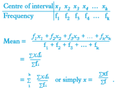 8. The median of N observations which have been arranged in order of size is equal to the value taken by the middle observation. When N is odd, the middle observation is in position 1 – 2(N + 1). When N is even, the median is the mean of the two middle observations, 1 – 2Nth and 1 – 2 (N + 1)th9. To estimate the median of a grouped distribution,(a) find the cumulative frequency of the data, then:(b) identify the median class.(c) The median M of a set of N observations, which have been ranked in order of size is equal to the value taken by the middle 1 – 2 (N + 1)th position when N is odd. When N is even, M is half the sum of the values of the values of the two middle observations i.e. the 1/2 Nth and
 (d) For continuous data, as above, it is sufficient to estimate the median by using the formula only once as, median
 10. The mode in a set of discrete elements is the value of the element that occurs most frequently. The modal class in grouped data with equal class intervals is the class that contains the highest frequency.We use the following variables in the formulae for mode of grouped data:L: the lower limit of the modal class fm: the modal frequencyf1: the frequency of the immediate class below the modal class f2: the frequency of the immediate class above the modal class w: modal class width
 Unit 10 test1. The data below shows the number of words correctly spelt by a group of 30 students in an English lesson
 Use a frequency distribution table starting with class 15 – 19 tocalculate:(a) the mean number of words.(b) the median number of words.(c) state the modal class.2. A die was thrown 25 times and the face that appeared at the top was recorded. The scores were as shown in Table 10.83
 Draw a bar chart to represent the information above3. Four milk dealers Jean, Charlotte, Paul and Lucie shared 1200 litres of milk from a supplier as shown in the piechart (Fig. 10.7). Find the amount of milk in litres, that each dealer got.
 4. The number of patients who attended a clinic by age was grouped as shown in Table 10.84.
 (a) Calculate the mean and median age of attendance.(b) State the modal class.(c) Calculate the mode of the distribution.(d) On the same axes draw a histogram to represent the information.5. Table 10.85 below shows the number of people by age who attended a counselling seminar.
 (a) Calculate the mean and median of the distribution.(b) Draw a histogram and frequency polygon on the same axes to represent the above information.6. Use the histogram in Fig. 10.17 below to calculate the mean and median of the data it represents.
 7. The masses of letters in a post office were recorded in Table 10.86 below:
 Calculate:(a) the mean mass in grams(b) the median mass8. The mean of the numbers 3, 4, a, 5, 7, 9, 5, 8, 5 and 9 is equal to the mode. Find the value of a and hence the median of the data.