Key unit competence: By the end of this unit, the learner should be able to
collect, represent and interpret bivariate data.
Unit outline
• Definition and examples bivariate data.
• Frequency distribution table of bivariate data.
• Review of data representation using graphs.
• Definition of scatter diagrams.
• Correlation
• Unit summary
• Unit Test
Introduction
Unit Focus Activity
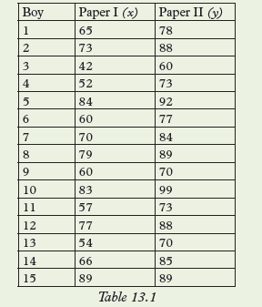
In a certain school, 15 boys took two examination papers in the same subject.
The percentage marks obtained by each boy is given in table 13.1 where each
boy’s marks are in the same column.
(a) Is the performance in the twopapers consistent? Which is the
better of the two performances?
(b) Plot the corresponding points (x, y) on a Cartesian plane and
describe the resulting graph.
(c) Can you obtain a rule relating x and y? Explain your answer.
(d) Calculate the mean mark in each paper and represent the same
on your graph paper. Can you describe the performance in each
paper with reference to the mean mark.
(e) Can you draw a line that roughly represents the points in your graph?
(f) Calculate the median mark on each paper, denote the medians as
mx and my respectively.
(g) Using the graph Table 13.1, divide the set into 3 regions each
containing 5 entries.
(iii) Plot the three points on the same graphs and join them
with the best line you can draw.
Most of the statistical skills that we have developed in our earlier work were based
on one variate i.e one set of data only. Such variates included heights, mass,
age, marks etc. In everyday life situations, activities, circumstances etc may arise
so
that there is need to compare two sets of data. In this unit we shall learn how
represent and analyse data that considers use of two variables for the same person
or activity.
13.1 Definition and examples of bivariate data
Activity 13.1
1. Use reference books or internet to define bivariate data.
2. Give examples of bivariate data that can be obtained.
(i) From members of your class
(ii) From any other source.
Consider statistical data whose observations have exactly two measurement
or variables for the same group of persons, items or activities.
Such data is know as Bivariate data. Some examples of Bivariate data are
• Age (x) years and mass

kg
• Height (x) cm and age
years.
• Height (x) cm and mass
kg.
• Expenditure in a business (x) and profit
for a particular period of
time etc.
13.2 Frequency distribution table for bivariate data
Activity 13.2
This data can be displayed in a frequency table using the information
for the whole class for later use. In a bivariate data, the x and y are
considered as an ordered part written as (x1, y1), (x2, y2),…..(xn, yn). Meaning
that both variables
have equal number of elements, referring to the same entry.
Suppose a Mathematics examination consists of two distinct papers i.e. an
algebra paper and a geometry paper. The mark scored by a candidate in the
algebra paper is one variate,
and that on the Geometry is another variate. In
order to assess the overall performance in mathematics the examiner must
consider the two corresponding marks together for each student.
Let x denote the algebra mark And y denote the geometry
mark.
And the number of students in the class be 15.
The set of marks (x, y) in table 13.3 above
is an example of bivariate data. Every set denotes the corresponding
marks for each student. For example student member 1 scored 45% in algebra
and 57% in geometry.
13.3 Review of data presentation using graphs
Activity 13.3
4. What kind of graph do you obtain? Would it make sense to join these
points?
To be able to represent any two variables graphically, one should first write the
given information in co-ordinate form.
• For an accurate graph, an appropriate scale should be chosen and used.
• In order to analyse a graph accurately, it must be accurately drawn and
points joined either using:
i) A straight line or
ii) A curve or
iii) A series of zigzag line segments.
Graph. 13.1
This graph represents a curve with an increasing upward trend.
(a) Graph 13.1 shows the required graph of y against x.
(b) (i) when x = 2.5, y = 30
(ii) when y = 150, x = 4.6
(c) When y = 500, x = 7.
Note:
The graph in our example results in a curve.
13.4 Representing bivariate using scatter diagrams
13.4.1 Definition of scatter diagrams
Activity 13.4
In a certain county, data relating 18 to 25 year old drivers and fatal traffic
accidents was gathered and recorded over a period of 3 months. The data
was presented as in table 13.9.
2. Plot the points (18, 8) (18,10) (18,6),………….(25, 2)
3. What patterns do the points reveal that can help you draw
any conclusion?
4. Do you think any group or groups of people would be
interested in the conclusion of this activity? Explain.
Often graphs are in form of straight lines, or curves or continuous jagged line
segments.
However, some graphs do not fit into any of these categories. Some graphs result in
a scatter of points rather than a collection of points falling on a well-defined line
or curve. Sometimes there may be an underlying linear relation between the
variables,
but the points in the graph are scattered along it rather than fall on it.
Such a graph is called a scatter graph orscatter diagram.
13.4.2 The line of best fit in a scatter diagram
Activity 13.5
Using the graph you obtained in activity 13.4, draw a line as follows.
1. Use a transparent ruler.
2. Place the ruler on the scatter diagram in the direction of the
trend of the points so that you can see all the points.
3. Adjust the ruler until it appears as though it passes through the
centre of the data (points). Then draw the line.
Although the points in Fig 13.1 do not fall on a line, they seem to scatter in a specific
direction. Therefore, a line that closely approximates the data can be drawn and
used to analyse the data further. In a scatter diagram, it is not easy
to
define a relation between the two variables involved. However, the points
may appear to point some direction which may be approximated by a line
known as the line of best fit.
Using points on such a line, we can
analyse the given data as follows;
i) Describe the relation between the two variables.
ii) Find the equation of the line,
iii) Interpret the data i.e. read values from the graph,.
iv) Describe the trend of the graph. written R2(A).
(a) Write the data in co-ordinate form.
(b) Plot the points to obtain a scatter diagram.
(c) Draw the line of best fit.
(d) Identify three points on the line and use them to find the equation of the
line.
(e) Describe the trend of the graph.
(f) Use the graph to estimate: (i) x
when y = 42.0 ; (ii) y when x =85.
Use the data to draw a scattered diagram. Use the scatter diagram
obtained to draw the line of best fit. Use your graph to estimate the shoe
size you expect someone 171 cm tall to wear.
4. From an experiment, different masses are attached at the end of a spring
wire and the length of the wire noted and recorded as in Table 13.14 below.
(a) Obtain the scatter diagram for the data in table 13.15 to estimate
the line of best fit.
(b) What velocity corresponds to 8.0 volts?
(c) What can you say about the gradient of the line?
(d) Find the equation of the line
Alternative method of obtaining the line of best fit (The median fit line)
Activity 13.6
Table 13.16 shows the result of a survey done on nine supermarket
stores. It shows the amount of money spent on advertising
each day and the corresponding amount of money earned as
profit.
use Table 13.17 to draw a scatter diagram.
Step 1
1. Divide the scatter diagram into three region. Each region should
have the same number of points.
Step 2
1. For each region, using the table of values above,
(i) find the median of the x co-ordinates (x - median)
(ii) find the median of the y co-ordinates (y - median).
(iii) Write the x- and y-medians for each region in the coordinate
form.
(iv) On the scatter diagram, plot the three median points.
(v) Place the edge of a ruler between the first and third median points. If
the middle point is not on the line formed, then slide
the ruler about a third of the way towards the second
points without changing the direction of the shape of the
line. Draw the median fit line.
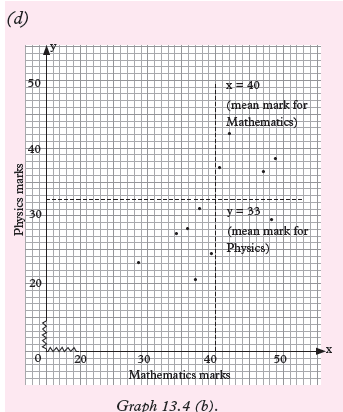
(b) The median points are (20, 14), (55, 31), and (90, 49.5). They are marked with
(x) crosses on the graph.
• The broken lines in Graph 13.4 (b) represent the mean marks for
the two subjects.
• From this graph we can see that any Physics mark above 33 is
above average score. Similarly any Mathematics mark above 40 is
above average score.
• We can see that the above-average scorers are same in the two
subjects.
Also the below-average scorers are the same.
From these observations, we can conclude that, for this sample, ability in
Mathematics is closely associated with ability in Physics.
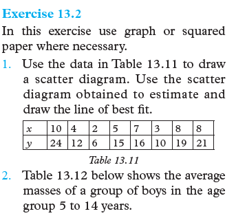
Exercise 13.3
1. The mass (kg) and the average daily food consumption for a group of 13
teenage boys was recorded as in Table 13.19.
Use the table to:
(a) Draw a scatter diagram.
(b) Estimate the line of best fit.
(c) Describe the slope of the line.
2. Table 13.20 below shows marks scored by 25 students in two subjects,
Chemistry and Social studies.
a) Use the data to draw a scatter diagram.
(b) Use the method of mean marks to establish the type of relationship if
any between the Chemistry marks and the Social studies marks.
13.5 Correlation
Activity 13.7
1. Use the dictionary or internet to find the meaning of the world
correlation.
Table 13.21 shows entrance test marks (x) and the corresponding
course grade
for a particular year.
2. Draw a scatter diagram for the data in table 13.21 and draw a
line of best fit. Comment on the suitability of the entrance test to
the placement of the students in the respective courses the
co-ordinates of the image.
By definition, correlation is a mutual relationship between two or more things.
Examples of correlation in real life include:
• As students study time increases, the tests average increases too.
• As the number of trees cut down increases, soil erosion increases too.
• The more you exercise your muscles, the stronger they get.
• As a child grows, so does the clothing size.
• The more one smokes, the fewer years he will have to live.
• A student who has many absences has a decrease in grades scored.
Types of correlation
Activity 13.8
Identify positive and negative
correlation situation in the following cases:
a) The more times people have unprotected sex with different
partners, the more the rates of HIV in a society.
b) The more people save their incomes, the more financially
stable they become.
c) As weather gets colder, air conditioning costs decrease.
d) The more alcohol are consumes, the less the judgment one has.
e) The more one cleans the house, the less likely are to be pests
problems.
Correlation can be negative or positive depending on the situation:
In a situation where one variable positively affects another variable, we
say positive correlation has occurred. Also, when one variable affects another
variable negatively,
we say negative correlation has occurred.
Correlation is a scatter diagram which can be determined whether it is positive
or negative by following the trend of the points and the gradient of the line of the
best fit.
• If the gradient is positive, the positive correlation occurs.
• If the gradient is negative, then negative correlation occurs
• If gradient is zero, the there is no correlation between two variables.
Example 13.5
The amount of government bursaries allocated to certain administration
regions in the country in a certain year is listed together with their population sizes.
Use the data in table 13.22 to draw a scatter diagram and assess whether
there appears to be correlation between the two measurements labeled x and y.
Vs: 1 cm: 50 000
Hs: 1 cm: 10 m
Solution
Graph 13.5 shows the scatter diagram and the line of bet fit of the sets of data.
The two measurements (x) and
have a correlation.
The best line of fit in this scatter diagram follows the general trend of the
points. This line has a positive gradient. Thus, the relation in this data is called
a positive correlation. image cordinator A′′B′′C′′and D′′
Example 13.6
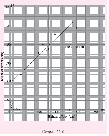
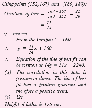
The following measurements were made and the data recorded to the nearest cm.
b) Draw the line of best fit for the data
(c) Find the equation of the line in (b) above.
(d) Describe the correlation.
(e) Would it be reasonable to use your graph to estimate the height of a
father whose son is 158 cm tall?
Solution
Let the height of the boy be x cm and that of the father y cm. Using a scale of
1cm – 5cm on both axes, mark x on the horizontal axis and y on the vertical axis.
Exercise 13.4
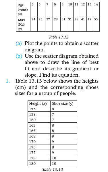
1. The set of data in Table 13.24 shows number of vehicles and road deaths
in some 10 countries.
Use table 13.24 to draw a scatter
diagram and use it to determine whether there is a correlation
between x and y. If yes, describe the correlation.
2. Data were collected on the mass of a rabbit in kilograms at various ages in
weeks. Table 13.25
Use the data in the table above to:
(a) Draw a scatter diagram for the data
(b) Draw a line of best fit
(c) Use your graph to predict the mass of the rabbit when it is 8 weeks.
(d) How would you describe the correlation in this data?
3. From a laboratory research, data were collected on mass of hen and mass of
the heart of hen and recorded table 13.26
Use the table to:
(a) Construct a scatter diagram for the data.
(b) Estimate a line of best fit.
(c) Find the equation of the line.
(d) How can you use the equation in c to make predictions?
(e) Describe the correlation in this data.
4. In a junior cross country race the masses (kg) of sample participants
were checked and recorded as they entered the race in Table 13.27. Their
finishing positions in the race were also noted. Use a scatter
diagram
to determine whether there was any correlation between the sets of data.
Give reason(s) for your answer.
5. A basketball coach recorded the amount of time each player played
and the number of points the player scored. Table 13.28 shows the data.
(a) Make a scatter diagram and estimate the line of best fit.
(b) Describe the type of correlation if any.
(c) Use your graph to estimate how much time a player who scored
67 points played.
6. The production manager had 10 newly recruited workers under him.
For one week, he kept a record of the number of times that each employee
needed help with a task, table 13.29.
(a) Make a scatter diagram for the data and estimate the line of best fit.
(b) What type of correlation is there?
(c) What conclusion do you make from your graph? Justify your answer.
Unit Summary
The data in the Table 13.30 belows belong to the same sample.
• Such data is called Bivariate data. This data has two variants x and y.
– The data has ten entries
– Each entry has two variants x and y
– This data can be presented
graphically using co-ordinates.
(x, y) ie. (46, 33) (17, 17)………… (56, 39)
• The graph below represents the given data. Such a graph is called a scatter
diagram. The point do not lie on a line or a curve, hence the name.
The line drawn through the points is an approximation. It is called the line
of best fit. It shows the general trend of the data or graph.
• The equation of such a line can be found and used to analyse data
equation: 20y = 11x + 80.
• The line of best fit shows that there is a relationship between the two data sets
though the line is an approximation. If it shows a positive trend i.e. the
line has a positive gradient thus we say the data has a correlation. Since
the line has a positive gradient, the correlation is positive.
If the line had a negative gradient, we would say the correlation is negative.
• We can use the graph to estimate missing variants. For example, we
can find:
(i) y when x = 29; Ans y = 20
(ii) x when y = 3; Ans x = 60
(iii) y when x = 44; Ans y = 28
Unit 13 Test
1. The table below shows the data collected and recorded on ten football
players in a season.
Use the given information to answer the following questions.
(a) Make a scatter diagram for the data.
(b) Estimate the line of best fit representing the data in (Table 13.31).
(c) Use your graph to estimate:
(i) The number of points earned by a player who scored 25 goals.
(ii) The number of goals scored by a player who earned 45 points.
(d) Explain how for any line, you know whether a slope (gradient)
is positive or negative.
(e) Find the equation of the line you drew in question (b) above
(f) Describe the correlation in the data in this question.
(g) What conclusion can you draw from this graph?
2. Data below was collected from a certain supermarket in Kigali City.
The price is in Francs:.
(a) Calculate the average price for all commodities.
(i) May 2016
(ii)June 2016
(b) Plot a scatter diagram for the two prices for all the commodities.
(c) Draw the line of best fit for thedata.
(d) What conclusion can you draw from the scatter diagram plotted?
3. (a) Calculate the x and y from the data given below:
(b) Plot a scatter diagram for the data above.
4. The table below shows the number of students (x) and the number of days
they remained at school at the end of term one in 2017.
(a) Make a scatter diagram for the data.
(b) Explain how any line of best fit can be draw.
(c) Describe the correlation of the data.
 (a) Is the performance in the twopapers consistent? Which is the
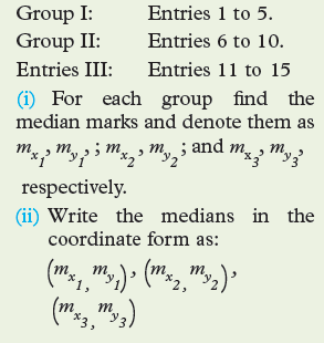 (iii) Plot the three points on the same graphs and join them
 This data can be displayed in a frequency table using the information
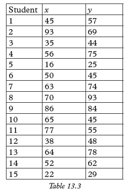 The set of marks (x, y) in table 13.3 above
 4. What kind of graph do you obtain? Would it make sense to join these
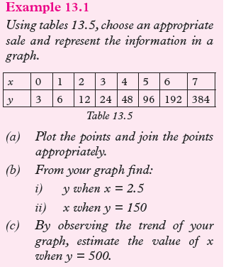

 Graph. 13.1This graph represents a curve with an increasing upward trend.(a) Graph 13.1 shows the required graph of y against x.(b) (i) when x = 2.5, y = 30(ii) when y = 150, x = 4.6(c) When y = 500, x = 7.Note:
 13.4 Representing bivariate using scatter diagrams13.4.1 Definition of scatter diagramsActivity 13.4In a certain county, data relating 18 to 25 year old drivers and fatal traffic
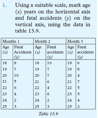 2. Plot the points (18, 8) (18,10) (18,6),………….(25, 2)3. What patterns do the points reveal that can help you draw
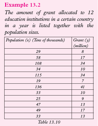 (a) Write the data in co-ordinate form.(b) Plot the points to obtain a scatter diagram.(c) Draw the line of best fit.(d) Identify three points on the line and use them to find the equation of the
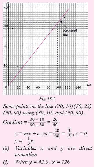
 Use the data to draw a scattered diagram. Use the scatter diagram
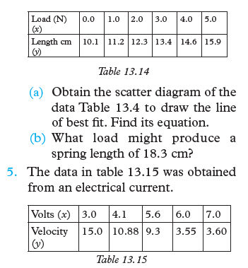 (a) Obtain the scatter diagram for the data in table 13.15 to estimate
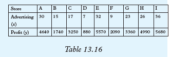 use Table 13.17 to draw a scatter diagram.Step 11. Divide the scatter diagram into three region. Each region should
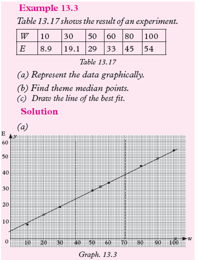 (b) The median points are (20, 14), (55, 31), and (90, 49.5). They are marked with


 • The broken lines in Graph 13.4 (b) represent the mean marks for
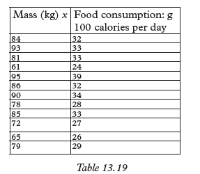 Use the table to:(a) Draw a scatter diagram.(b) Estimate the line of best fit.(c) Describe the slope of the line.2. Table 13.20 below shows marks scored by 25 students in two subjects,
 a) Use the data to draw a scatter diagram.(b) Use the method of mean marks to establish the type of relationship if
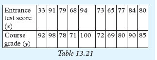 2. Draw a scatter diagram for the data in table 13.21 and draw a
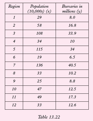 Use the data in table 13.22 to draw a scatter diagram and assess whether
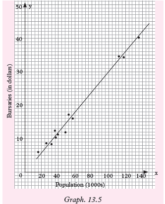 The best line of fit in this scatter diagram follows the general trend of the
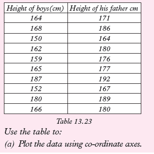 b) Draw the line of best fit for the data(c) Find the equation of the line in (b) above.(d) Describe the correlation.(e) Would it be reasonable to use your graph to estimate the height of a
 Exercise 13.41. The set of data in Table 13.24 shows number of vehicles and road deaths
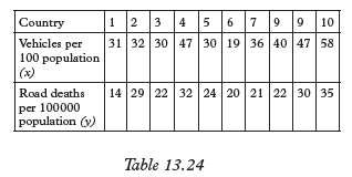 Use table 13.24 to draw a scatter
 Use the data in the table above to:
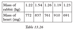 Use the table to:
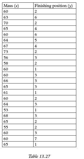 5. A basketball coach recorded the amount of time each player played
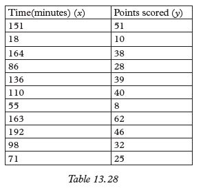 (a) Make a scatter diagram and estimate the line of best fit.(b) Describe the type of correlation if any.(c) Use your graph to estimate how much time a player who scored
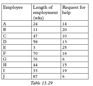 (a) Make a scatter diagram for the data and estimate the line of best fit.(b) What type of correlation is there?(c) What conclusion do you make from your graph? Justify your answer.Unit SummaryThe data in the Table 13.30 belows belong to the same sample.
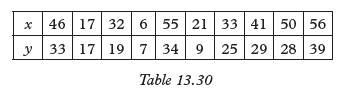 • Such data is called Bivariate data. This data has two variants x and y.
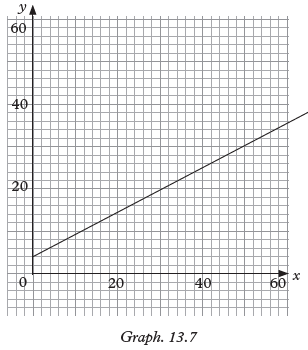 The line drawn through the points is an approximation. It is called the line
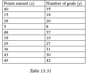 Use the given information to answer the following questions.(a) Make a scatter diagram for the data.(b) Estimate the line of best fit representing the data in (Table 13.31).(c) Use your graph to estimate:(i) The number of points earned by a player who scored 25 goals.(ii) The number of goals scored by a player who earned 45 points.(d) Explain how for any line, you know whether a slope (gradient)
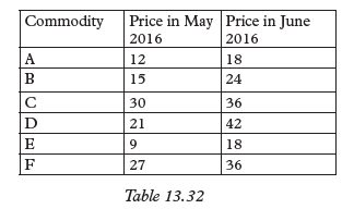 (a) Calculate the average price for all commodities.(i) May 2016(ii)June 2016(b) Plot a scatter diagram for the two prices for all the commodities.(c) Draw the line of best fit for thedata.(d) What conclusion can you draw from the scatter diagram plotted?3. (a) Calculate the x and y from the data given below:
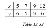 (b) Plot a scatter diagram for the data above.4. The table below shows the number of students (x) and the number of days
 (a) Make a scatter diagram for the data.(b) Explain how any line of best fit can be draw.(c) Describe the correlation of the data.