Topic outline
UNIT 1: THE DEVELOPMENT OF ART THROUGH DIFFERENT ERAS
Key unit competence:
To be able to describe the key points in the evolution of Art through ages
and carryout an appreciation of techniques and works of renowned Artistsin Rwanda and East Africa in general.
1.1. Introduction of art in Rwanda
1.1.1. Art in Rwanda
Rwanda is one of the African countries that shave stuck to their cultures.
Seeing no reason to become complacent with her culture, Rwanda has
maintained an explicit and traditionally refined culture that has been neatly
marketed across the globe where basket craft products decorated with
“Imigongo” pattern have been appreciated by a large number of people in thisworld.
Rwanda’s Art dates way back to the early 1880’s, when Rwandans distinctively
used dung ‘paintings’ known on IMIGONGO Styles. Often in the colours black,
white and red, popular themes include spiral and geometric designs that are
painted on walls, pottery, and canvas. They were used in local house decorationsespecially inside the houses.
The different objects are produced using cow dung and clay which is put onto
wooden boards in spiral and geometric designs. The dung is left to harden and
is then decorated using colours made from organic materials. The traditional
colours are black, white, red, grey and yellow but increasingly other colours are
being used.
However, much of Rwanda’s traditional cultural heritage revolved around dances,
praise songs, dynastic poems, drums (for example the royal drum ‘Karinga’),
riddles, and traditional crafts such as basketry, weaving, pottery, and ironworks.These provided another element of continuity with the past.
It is very paramount to note that the craftworks in figure 4above were made from
weaving, pottery and blacksmithing.
1.2. Famous/Renowned artists in Rwanda
Rwanda has famous Artists like SEBUKANGA Jean Baptiste (sculptor), Medard
Bizimana (sculptor), Pascal BUSHAYIJA (painter), NTAMABYARIRO Leopold
(painter and art educator), KAYITANA Faustin (sculptor)who was a teacher at
Ecole d’Arts de Nyundo, Laurent HATEGEKIMANA (sculptor), BIRASA Bernard
(painter), KIRIMOBENECYO Alphonse (he designed Rwanda flag and National
emblem), Epa BINAMUNGU (painter), KABAKERA Jean Marie Vianney
(sculptor) and others.
• SEBUKANGAGA Jean Baptiste
Sebukangaga was born in 1937 in Gitarama, at Ntenyo, in 1947 he started
his school at Byimana Primary school, in 1952-1955 he was in Ecole d’Art de
Kabgayi and joined Academie des Beaux Arts de Kinshasa (1955-1959) in
ceramic.
In 1959, he returned to Rwanda to work with Brother Marc Wallenda on the
project of creating a School of Arts in Nyundo, Gisenyi prefecture/province, the
current Rubavu district. This school was founded by Brother Marc Wallenda
in 1953. It was officially opened by the high ranking government officials in
1963 and during the opening ceremony, the first exhibition displaying the
paintings and sculptures produced at the school by the students was made,
Sebukangaga became the co-founder of that school and professor in charge
of technical courses (1963-1966). From 1969 up to 1988, Sebukangaga wasprofessor at the National Institute of Education (IPN).

• KABAKERA Jean Marie Vianney
KABAKERA Jean Marie Vianney is a Rwandan artist, born in 1968. He is a
sculptor by profession. He studied at Ecole d’Arts de Nyundo which was formally
called “Normale artistique” He made statues set up in front of the minor Basilica
of Kabgayi, statues at Rusororo, 2 statues in the fathers Marians de Kibeho andmany others.
• BIZIMANA Medard is a Rwandan renowned artist, a sculptor by profession,
born in 1967 in Nyundo, he started primary school from 1974 to 1983. He
studied his secondary School at Ecole d’Arts de Nyundo from 1983 to 1990.
From 1991 to 1993, he was a Teacher of Art at Saint Joseph High School in
Gitarama/ Rwanda. In 2003, he won the second national award for Olympic
games competition. The theme was ART AND SPORTS.
In 2004, he participated in the 7th China Changchun International Sculpture
Symposium. In 2006, he won the first category National Award under the Theme
“TOLERANCE -MUSEUMS RWANDA”. Still in 2006, he won again the First
category National Award for the best sculpture in MUSEUMS OF RWAMDA.
In 2008, he got the Second category National Award under the theme “THEEDUCATION OF AN EXCELLENT CULTURE-MUSEUMS OF RWANDA”.

• BIRASA Bernard
BIRASA Bernard is a Rwandan sculptor and a painter, born in 1967. He studied
at Ecole d’Arts de Nyundo from 1985 to 1991, he also studied what was called
“Normale artistique”. Some of his artworks are exhibited in different places,
museums and embassy. When he was in Senior six (1991), he made a sculpture
called “La fille au calebasse” that expressed the beauty of a young girl and it isnow in Gabon (Libreville) in a library.

• BUSHAYIJA Pascal
BUSHAYIJA Pascalis a Rwandan renowned artist, born in 1957. He studied
at Ecole d’Arts de Nyundo from 1973 to 1978 and taught at Ecole d’Arts de
Nyundo from 1983 to 1994. He lives in Kigali (Nyarugenge), he attended many
exhibitions outside the country and apart from being a visual artist, he is also asinger, and commonly known by his song “ELINA”.


UNIT 2: DIGITAL DRAWING AND PAINTING STILL LIFE AND NATURE.
Key unit competence:
To be able to make digital painting of still life and nature studies by applyingdifferent techniques, media and tools.

2.1. Digital tools and software for drawing and painting
Drawing tools refer to applications with built-in tools that allow users to create
artwork from scratch. With the help simple tools such as a mouse and key board,
users can draw virtually anything depending on the available features. Users can
create, edit, and delete their drawings. They can also save their work and load
existing projects in different formats such as JPEG, GIF and PDF among others.
A variety of digital devices like computers, laptops, tablet, and Smart phones...
can be used for Drawing and painting with window program or downloadable
software programs or online drawing tools. The best drawing tools on the
market today can run on various platforms including windows Mac Os, Linux
and Android. Your choice will depend on the device you are using the features
you are looking for, and what you want to achieve.
Software like paint, Microsoft office publisher, adobe Photoshop, and adobe
illustrator and in design is most popular to be used for drawing and painting.
Basic and Advanced Toolsets:
All drawing tools have a basic toolset with the necessary drawing tools such
as a drawing area, pencil, markers, paintbrushes, text tools, ink tools, rubbers
etc. Most drawing tools also come with a color palette that is easy to customize
depending on the user’s needs. The most advanced features found on some
modern drawing tools includes 3D effects ,3D brushes, animation and clone
tools.
Built-in Effects:
Usually, drawing tools come with all kinds of effects to enhance your drawing
with a single click.
For example, you can choose the appropriate texture/gradient, blur your drawing,
use filters, and add shadows to your drawing. You can also change parameters
such as brightness and contrast levels.
Integration tools
Drawing tools my integrate with the tools you use every day such as design
tools, Photo editing application, MS word, and M S Power PowerPoint.
Some application allow users to integrate external devices such as electronic
sketchpads that translate images onto the screen to make their work
DRAWING AND PAINTING SOFTWARE
1) Adobe Photoshop
When it comes to creative software, Adobe has dominated the scene for
decades, and Photoshop CC (CC stands for Creative Cloud) is loved by artists
and designers across the world. It provides creative types with a plethora of
cloud-based tools to create and enhance photos, illustrations and 3D visuals.
This software isn’t just about editing photos. If you’re a professional designer,
you can use it to create packaging, banners, websites, logos and icons. Not
only can you come up with your own creations, but you’re also able to make use
of intuitive templates if you’re more of a beginner, or you’re working to a tight
deadline.
You can design your own illustrations and turn images into paintings as well,
with the option of switching between animate and print-style options. When
you’ve created a piece, you can enhance it with a range of built-in effects
2) Adobe Illustrator can sometimes be thought of as being the little brother
to the more powerful Photoshop, but don›t overlook its possibilities. While
Photoshop was originally built for photo editing, Adobe Illustrator has always
been designed around illustration and drawing. You don›t need to choose
between one or the other, however, as if you subscribe to even the basic
level Adobe creative apps plan, you can have both Photoshop and Illustrator
together.
3) Microsoft Paint is a basic art package that comes with every Windows
install, and has done so since at least Windows 3.x. The release of Windows
10 has seen 3D editing tools added to it, but let›s be fair-it›s still a simple
program that isn›t going to rival anything else on this list. However, because
of the easy availability of MS Paint it›s worth mentioning - if nothing else
because it does have a basic toolkit that is expanded on by other software.
As an artist, designer or illustrator, it is important to use drawing tools with
features that will help you achieve the desired results. whether you want to draw
sketches, illustrations, flowcharts.
Network diagram, or shapes, the ability to achieve good results will not only
depend on your artistic skills, but also the kind of drawing tool you choose.
4) Adobe In-Design is one of adobe systems which is used to design works
such as posters, flyers, brochures, magazines, newspapers, presentations,
books and e books. In-Design can also publish content suitable for tablet
devices in conjunction with Adobe Digital Publishing Suite. Graphic
designers and production artists are the principal users, creating and layingout periodical publications, posters, and print media.

2.2. Drawing and painting using digital tools
• Process of drawing and painting with Microsoft painting
Open Start and Click the Windows logo in the bottom-left corner of the screen
2. Type in paint. This will search your computer for the Paint program.
Look for the Paint app icon. In the Start menu, look for the Paint app icon,which resembles a paint palette with paint on it.
3. Click Paint. It›s next to the Paint app icon. Doing so will open a new Paint
window.
4. Review the toolbar. The toolbar, which is at the top of the Paint window,
is where you›ll find all of the options used to interact with the Paint canvas.
5. Select a brush type. Click the Brushes option at the top of the Paint
window, then click the type of brush tip you want to use. This is what affects
the line size, shape, and width options.
If you just want to draw a regular free-form line, click the pencil-shaped “Pencil”
icon in the “Tools” section.
6. Select a line thickness Click the Size option to the left of the color palette,
then click the line thickness you want to use while drawing.Still life drawing of potatoes


Fill a section with color. Click the «Fill with color» tool, which resembles a
paint bucket, in the «Tools» section, then click the canvas to change an entire
section of it to your primary color (you can right-click to use your secondary
color instead).
If you have the canvas sectioned off (e.g., a line dividing the canvas in two), only
the section in which you click will be filled with color.
If your canvas is blank or contains no full sections, your whole canvas will befilled in when you use the “Fill with color” tool.
• Process of drawing and painting with Adobe illustrator or photoshop
Welcome to the Get Started with Illustrator series of tutorials that teaches you
the basic tools and techniques of Adobe Illustrator. This first tutorial introduces
you to the Illustrator workspace and shows you how to open and save your
images.
Illustrator or photoshop workspace
Menu bar (at the very top) shows the File, Edit, and other menus that give you
access to a variety of commands, adjustments, settings, and panels.
Tools panel (on the left) contains tools for creating and editing artwork. Similar
tools are grouped together. You can access them by clicking and holding a tool
in the Tools panel.
Panels (on the right) include Properties, Layers, and other panels that contain
a variety of controls for working with artwork. You can find a full list of panels
under the Window menu.
Document window (in the middle) displays the file you’re currently working on.
Multiple open documents appear as tabs in the Document window.
Zoom and Pan
The Zoom tool, located in the Tools panel, can be used to show you more detail
of a document. To change from Zoom In to Zoom Out, press Alt (Windows) or
Option (macOS).
The Hand tool, found by clicking and holding the Zoom tool in the Tools panel,
allows you to pan across a document.
Create a new document
The Start screen appears when there are no documents currently open in
Illustrator. It lists your recent files, Learn content, and presets. You can also
access various resources and search Adobe Stock from here.
Choose File > New. In the New Document dialog box, start by choosing a
preset. For example, the Print preset shows various sizes and document options
you can set for a new document. The New Document dialog box is where you
can access free and paid Adobe Stock templates, which are a great starting
point for your designs.
The basics of creating new artwork with the Pen tool
The Pen tool, found in the Toolbar, is one of the most powerful drawing tools in
Illustrator. With it, you can create and edit anchor points and paths.
Set stroke and fill before drawing
To start with the Pen tool, select the Pen tool in the Toolbar and, in the Properties
panel, set the stroke weight to 1 pt, the color to black, and the fill to none.
Create straight lines
To create straight lines with the Pen tool, click and release to create an anchor
point. Move the pointer, and you’ll see a preview of the path you are creating.
Click and release to create another anchor point. You can continue clicking and
releasing in different areas to create more anchor points for the path.
To close a path, move the pointer over the original anchor point and, when a
circle shows next to the pointer, press the Shift key and click the end point. To
stop drawing a path without closing it, press the Escape key.
Create curves
To draw a curve when creating an anchor point, drag to create direction handles,
and then release. The more you drag when creating or editing anchor point
handles, the more curve the path has.
Create corner points (change path direction)
To change the direction of a path while drawing, drag to create a smooth point (a
curve). Release the mouse button. Move the pointer over the end of a direction
handle, press the Option key (macOS) or Alt key (Windows), and drag the end
of the handle to split them.
Remove direction handles
To remove a direction handle as you draw with the Pen tool, so that you can
go from a curve to a straight line, click back on the last anchor point created to
remove the handle. Then continue drawing.
Process of drawing using adobe illustratorNature drawing done with illustrator software


UNIT 3: MOTIFS, PATTERN AND DESIGN PROCESS
Key Unit competence:
To be able to create new design from motifs and patterns and apply them onthe surface using different techniques.
3.1. Applying new designs from motifs and patterns on
surfaces using different techniques.
Motif is a single design and a pattern is a repetition of the motif in a design.
The following is the example of motif and pattern.

• Using impression technique
There are times you can transfer a pattern from one source to another by
impression. Patterns from hard surface as biscuits, rocks, stones, tree bark,
coin, shoe sole, prepared clay with different patterns etch are needed to usethis method.

Stamping technique
Stamping is a craft in which some type of ink is applied to an image or pattern
that has been carved. The ink coated rubber stamp is pressed onto any type
of medium such that the colored image is transferred to the surface or other
medium.
One can make a stamp using a sharpen razor and waste of gumboots made in
rubber. You draw the design in reverse, remove the background, put the piece
of gumboot on the support and put the design in the ink pad, then stamp on thesurface.

• Stenciling technique
Stenciling technique produces an image or pattern by applying paint to
a surface over an intermediate object with designed gaps in it which create
the pattern or image by only allowing the pigment to reach some parts of the
surface. The key advantage of a stencil is that it can be reused to repeatedly and
rapidly produce the same letters or design. With some designs, this is done by
connecting stencil islands (sections of material that are inside cut-out “holes”
in the stencil) to other parts of the stencil with bridges (narrow sections ofmaterial that are not cut out).


Parts of a stencil
The result when you forgot bridge
Some letters and numbers like I, J, K, L, M, N, S, T, U, V, 1, 2, 3, 5,… don’t need
bridges when cutting them, but letters like A,B, D, O, P, R,4, 6, 8, 9, 0,… need
bridge to support or protect the island. This is not only on numbers and letters
but also on shapes or other designs, bridges are sometimes needed.
The following is another form of stenciling technique which use digital tool:
Screen printing is a printing technique that uses a woven mesh to support an
ink-blocking stencil to receive a desired image. There are many ways of making
screen printing depending on the used materials.
The following steps can be used in general for screen printing
techniques
Method 1: using film of two layers
Step 1: Prepare your screen
Step 2: Make a design, using freehand or computer
Step 3: transfer the design on film,
Step 4: cut the film, remove the design
Step 5: burn the cut out of the design on the screen using thinner and
brush or sponge, you can dilute the thinner with water because thinner is
too strong, it can damage the design
Step 6: coat the rest of the screen with masking tape, let only where ink
will pass.
Step 7: start printing. And after wash and dry your screen. You can also
iron your t-shirt or fabric to fix well the design on the fabric.
Method 2: using photo emulsionStep 1: Prepare your screen
Step2: make a design using computer, or free hands (better to use a marker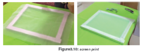
or ink pen)
Step 3: print with a printer your design on film (a translucent paper)
Step 4: coat your screen with emulsion and let it dry in dark place
Because light destroys the emulsion, for 24hours but to save time you can
use hair dryer to be quick.
Step 5: stick the film on top of the screen and burn it using light bubble or
add few petrol on the screen and stick the film and expose it to thesun when you don’t have the appropriate light bubble.
Step 6: start printing. And after wash and dry your screen. You can also iron
your t-shirt or fabric to fix well the design on the fabric.
Materials to be used:
Fabric, Canvas stretcher, woven mesh, Staples or nails to mount the woven
mesh on the screen, Staple gun or a small hummer, Thick printer paper, printer
(optional), pencil, utility knife, masking tape, screen printing fabric ink, squeegee(D-cut or square-edged), Water, Sponge.
A. Ink
B. Squeegee
C. Image or design
D. Photo-emulsion or film
E. ScreenF. Printed image.


UNIT 4: GRAPHIC DESIGN
Key Unit competence:
To be able to create various designs with illustrations and different lettersstyles using digital devices
4.1. The Elements of Graphic Design
4.1. Aspects and elements of design.
1. Lines
Lines are used as roadmaps to direct the viewer’s eye movements. They can
exist on their own or be employed to create texture and movement to connect
information, to demarcate space or even to create a desired mood. Lines can bevertical, horizontal, diagonal, circular, patterned, free form or solid/bold.
2. Shape
Shapes can be geometric, abstract, stylized or as they occur in nature. They
give volume to the forms in a design. You can make use of texture, lines, colorsand alterations in value to discern shapes.
3. Texture
Texture is a powerful graphic design tool used to enhance design with details
necessary for creating visual impact. It delivers a sense of feel, especially with
two-dimensional images. In graphic design, texture can take the form of layers
or gradation of text, lines or shapes.
4. Space
In design expression; white space is called negative space. It can be used to
connect, separate or maximize the relationship between the elements making
up the design. Negative space creates groupings, enhances expressions and
emphasizes hierarchies. Space can also be used to give the illusion of depth ormulti-dimension.
5. Size
The functionality of a graphic design layout hinges heavily on size. Use size to
draw attention to the most important element in the design; typically, a larger
size invites the most attention. Different sizes within the same graphic design
or layout creates a hierarchy of dominance. Use variations in size to guide theviewer’s eye through the path you want it to take.
6. Value
This refers to how dark or light (in terms of color) something is. In a monochromatic
image, value is used to define the shape and texture of a design element. Value
comes in handy when you want to convey the illusion of movement or bring oneelement into sharp focus while another recedes into the background.
7. Color
People process color subconsciously. To establish mood, create appeal,
generate interest and get a message across, color is the most potent tool inyour graphic design arsenal.
• Aspects/qualities of design
Layout in graphic design deals with the arrangement of visual elements so as
to achieve specific communication objectives.
When designing, the graphic designers should rely on the required information
to present the layout properly, such as rotating and resizing the images, which
requires time and efforts. In order to be able to design quickly, it is necessary
to plan the layout in advance to save time and create a consistent look for your
design.
Legibility: the artist should choose the kind of lettering that will be easy to read
at a glance. It should not be too congested or condensed. The words should
have proper spacing, a good background color and illustrations should be seen
clearly.
Placement: don’t overlap your images over your font, but make sure they are
next to any wording that helps explain them. You shouldn’t be using these just
to fill a giant empty space. All of your images should have purpose.
Illustration: are those images or pictures that accompany the text to explain
it, illustrations help the viewer to understand well and quickly the message. On
a poster it is better when the illustration takes a big place at least 60% of thewhole place.

1.2. Different letter styles with digital tools and software.
Generally letter styles are classified into two main font styles which are serif and
san serif letter styles. Around 19th century the author categorized letters into the
following types of letter styles.
Sans serif, Serif, Cursive / Script, Vintage, Gothic – Black letter
calligraphy, Graffiti, Creative lettering and
Other sub-lettering styles
• Sans serif letters
Sans serif letters are letters that doesn’t have tailor hock at the bottom and
at the top. When creating sans serif lettering you need to pay close attention
to the letter forms where nature of line that are made letters are valued while
tracing letters
• Serifs
The serifs – small decorative strokes added at the end of the letterformsThe different thickness in the strokes – not every stroke has the same thickness.
• Cursive
Cursive lettering also known as script, cursive is about hand lettering
Vintage
It is letter style which is recognizable on a few different aspects Decorations(flourishes/embellishments)Serifs, Textures and Colors
Gothic / black letter calligraphy
 Black letter calligraphy is one of many scripts created using a flat
style with digitalGraffiti
CREATIVE LETTERING
Creative lettering it the type of lettering that incorporates some different elements
besides just the letters.This could be illustrations, textures, play on words, perspective etc.
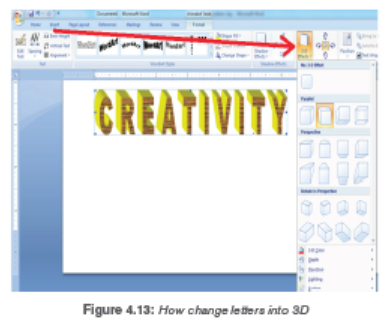
In our days all the letter styles can be manipulated with digital tools to produce
digital artworks it only requires the font style installed in digital tool. Let’s takethis example on how to design the word creativity in Micro soft world processer


• Poster making using digital tools
A poster is a large notice or picture that you stick on a wall or board, often
in order to advertise something. Synonyms: notice, bill, announcement and
advertisement
Steps for designing a professional poster
Determine you poster format
Brainstorm the content
Pick a suitable template
Use colours to grab attention
Choose graphics and typography
Clean up any clutterExample of a poster with machine software design
After select drawing tools you can start sketching your ideas by taking care of
element and principles of design


UNIT 5: MODELLING SIMPLE CLAY FORMS AND FIGURES
Key Unit competence:To be able to make clay object by using different techniques of modeling.

5.1 Techniques of decorating clay surfaces
Decorating clay figures is one of the most rewarding aspects of working in clay.
It is the time when you can add color and life to a bare clay surface that can
show your creative talents. Decorations can be made before or after firing the
clay figure. Firing can be done by putting the clay object in a kiln and fired so
as to harden it.
There are different techniques you can use to decorate clay object like; incision,
impression, marking, grazing and varnishing, painting…
• Painting
Painting of surface is done using water color paints. Oil paint maybe used on object made in clay.
• Incising is to engrave a design by cutting or scraping into the clay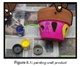
surface at any stage of drying, from soft to bone dry. ... Note: Incising
becomes sprigging when it goes through the clay, leaving a hole ratherthan continue with additional carving.
• Impression
Impressing is a type of decoration produced by pressing something on thesurface of the clay when it is still soft or stamped decoration.
• Marking design using cord
It is known as cord marking is the decorative technique in which cord or string
wrapped around a paddle and pressed against an unfired clay vessel, leavingthe twisted mark of the chord.
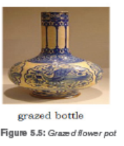
• Grazing
This is applying chemical on fired clay to create shining or various colours afterthe firing.
5.2. The techniques and process of decorating ceramic
object.

Sand the pot to smooth any rough spots. Do this outside in the grass, if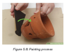
you can, to reduce cleanup. If you do it inside, or even in a garage, you may want
to lay newspaper down so the dust doesn’t get everywhere.
Soak the pot for 1 hour. This is good for new pots because it will loosen any
stickers for easier removal. It is also good for pots you have planted in before
because it will loosen any dirt.
Scrub the pot with a brush. While soaking the pot may loosen the dirt, used
pots are likely to need a scrubbing to get them completely clean. The paint will
not go on even or stick properly if there is any dirt or debris.
Let the pot dry completely. Painting the pot while it is still wet will cause the
paint not to stick, so set it out to dry. If it’s a sunny day, put it outside to dry the
pot faster. The time it takes to dry may depend on the size of the pot.
Use foam brushes to paint the pot. Bristled brushes tend to leave streaks,
so using a foam brush will give you a more even coat. You may want a couple
brushes of different sizes, especially if you want to paint any kind of patterns on
the pot.
Tape off stripes or sections You can paint the pot one solid color, but for
more variety or for fun designs, painters tape is a great option. With this variation,
you’ll tape and paint over the tape for the first coat. Once the paint dries, you’ll
take the tape off and paint the areas that were under the tape before.
Paint the outside and 1-2 inches down the inside. You can use any paint
you want for the main coats. It’s cheapest to use leftover paint you already have
around. Exterior or interior paints are both fine, as well as acrylic craft paint.
Spray paint works well, too.
a).Vanishing process
Varnish can provide a beautiful finish to clay projects and paintings. Before
applying varnish to clay, sand your piece and clean your workspace. Apply the
varnish in several thin layers, letting each one dry thoroughly before proceedingto the next.
b) Incising process
1. Make an object using clay.
2. Before drying object, make design you need on it.
3. Incise the design into the object.4. Let the object dry
C) Impression Process
There are times you can transfer a pattern from one source to another by
impression. Patterns from hard surface as biscuits, rocks, stones, tree bark,
coin, shoe sole, prepared clay with different patterns etch are needed to use
this method.
1. Make an object using clay
2. Choice any source that you will use for impression
3. Impress source on wet object before drying4. Let object dry.


REFERENCES
Books references:
Kenya Literature Bureau (2007). Distinction Creative Arts, For Primary Teacher
Education.
Kenya Literature Bureau (2010). Distinction Creative Arts, For Primary Teacher
Education.
Studio technology revision question and answers 2016.
Arts, crafts &design a piratical guide for teachers’ key strategies 1&2 1997.
Graphic art Baker Apollo 2010.
Online references:
https://en.wikipedia.org/wiki/Cave_of_Altamira
https://www.instructables.com/id/Digital-Painting-Lesson-1-The-basics-ofusing-
a-gr/https://www.designhill.com/design-blog/top-9-tips-for-creatingsurface-
pattern-designs-on-your-own/https://sewguide.com/fabric-stampingtechniques
https://www.techradar.com/news/best-drawing-and-painting-software
http://www.prochemical.com/directions/Folding.htm
https://www.ritstudio.com/techniques/creative-techniques/how-to-tie-dyeusing-
the-bucket-method/
http://www.dharmatrading.com/gifts/the-spiral-tie-dye-basics.html
http://www.prochemical.com/directions/Folding.htm
http://www.skiptomylou.org/how-to-spiral-tie-dye/
http://www.dharmatrading.com/gifts/the-spiral-tie-dye-basics.htmlhttp://www.prochemical.com/directions/Folding.htm

UNIT 1: MATHEMATICS UNIT 10 COMPLEX TIME SIGNATURE

The time signatures that do not fit the usual duple, triple or quadruple categories
are called complex, asymmetric, irregular, unusual, or odd. They are subdivided
into beat patterns that make them easier to count and they contain both simple
and compound beats. Hence, they are called “complex time signatures.”1.1. Five eight time signature
In 5/8, there are two possible beat patterns. In the examples below, the top line
of numbers indicates the beat in the measure, and the bottom line in italics
represents the subdivision of the measure into smaller groupings of beats.2 beats + 3 beats in each measure
Counting the beats in this third manner may be confusing at first because you
will count the beat “one” multiple times in a measure. For example, if you are
in 5/8 and the subdivision equals 2 + 3 beats, you will count “one two one two
three.” You will say the word “one” on the first beat and the third beat of the
measure. The key to performing these rhythms successfully is to repeat the patterns many times at an effortless tempo. Doing so will help you to feel the
subdivision of each measure, allowing you to become more comfortable with
the beat patterns that occur within each measure.
Since a quavers is equal to one beat, the semiquavers is equal to half a beat,
and the beat will be subdivided accordingly.Practice five eight time


1.2. Ten eight time signature


1.3. Seven eight time signature
You will say the word “one” on the first beat and the third beat of the measure.
The key to performing these rhythms successfully is to repeat the patterns many
times at an effortless tempo. Doing so will help you to feel the subdivision of
each measure, allowing you to become more comfortable with the beat patterns
that occur within each measure.
Since the eighth note is equal to the beat, the sixteenth note is equal to half abeat, and the beat will be subdivided accordingly.

Practice seven eight


1.4. Eight eight time signature
Eight eight time contains two compound beats and one simple beat. This
means 3+3+2 beats. Some tend to confuse eight eight time with four four time
but there differ because it is grouped into three odd beats while four four isgrouped into 4 beats of two eighth notes.


UNIT 2: CHORDS

A chord, in music, is any harmonic set of superposed notes sounding simultaneously.
The most frequently encountered chords are triads, so called because they
consist of three distinct notes: the root note, and intervals of a third and
a fifth above the root note. There are also the seventh chords that are rarely
found in music, those are made by adding another third above the fifth of the
triad.2.1. Triads
A triad is any three-tone chord. Blow is tried on musical staff and on the piano.
The triads built on the tonic, subdominant, and dominant are often referred to as
the primary triads because of their strong relationship to each other. The tonic
stands in the center of the tonal system, with the dominant a perfect fifth above
and the subdominant a perfect fifth below.
The roots of these triads begin on the first, fourth, and fifth degrees (respectively)
of the diatonic scale, otherwise symbolized: I, IV, and V (again, respectively).
Primary triads, «express function clearly and unambiguously. The other triads
of the diatonic key include the supertonic, mediant, sub-mediant, and leadingtone,
whose roots begin on the second, third, sixth, and seventh degrees
(respectively) of the diatonic scale, otherwise symbolized: ii, iii, vi, and viio (again,respectively). They function as auxiliary or supportive triads to the primary triads.
Apart from the primary triads, name the secondary triads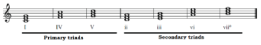
2.1.1. Types of triads
There are four types of triads in common use. They are identified by their quality
names: major, minor, diminished and augmented. They are named so basing on
the qualities of intervals that are between the three notes that make a triad. So,
it is based on the number of semi tones where a major third has four semi tones,
a minor has 3 semi tones, a perfect 5th has 7 semi tones and when a semi tone
is increased on them, it becomes augmented and when reduced by a semi tone
it becomes diminished.
a) Major triad
A major triad consists of a major third and a perfect fifth. M3 + P5 = Major TriadM3
b) Minor triad
A minor triad consists of a minor third and a perfect fifth. m3 + P5 = Minor Triad
c) Diminished triad
A diminished triad consists of a minor third and a diminished fifth. m3 + d5 =Diminished Triad.
d) Augmented triad
An augmented triad consists of a major third and an augmented fifth. M3 + A5= Augmented Triad.

The following are different triads with their names:
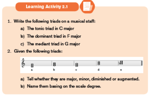
2.1.2. Triad name
You can construct a triad on any of the scale degrees. The triad has the same
function name as the individual pitch. Both the pitch C and the C major triad are
the Tonic, Supertonic, Mediant, Subdominant, Dominant Submediant, LeadingTone and Tonic.

Practice1:


Practice2:


2.2. Triad position

A triad is found in root position or inverted. Triad position identifies the note of
the chord that appears as the lowest-sounding pitch of the harmony. Any of the
three notes of the triad can appear as the lowest-sounding pitch.
a) Root position
The term root refers to the note on which a triad is built. “C major triad” refers
to a major triad whose root is C. The root is the pitch from which a triad isgenerated.
No matter what the arrangement of the third and fifth factors, the triad is in root
position if the root of the triad is the lowest-sounding pitch.
b) Inversion of triadsAn inversion of a triad occurs when the root is not the lowest-sounding pitch.
i) First inversion:
No matter what the arrangement of the root and fifth factors, the triad is in first
inversion if the third factor is the lowest-sounding pitch. This means that in
the first inversion, the third note of the root is maintained as the lowest in the
inverted triad.Given the following triad:
This shows how the root “C note” and the fifth degree “G note” moved up but
the third degree “E note” remained.
ii) Second inversion:
No matter what the arrangement of the root and third factors, the triad is in
second inversion if the fifth factor is the lowest-sounding pitch.On this triad:
This shows how the root “C note” and the third degree “E note” moved up but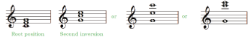
the fifth degree “G note” remained.


UNIT 3: MUSICAL PERFORMANCE TECHNIQUES
Key unit competence:Be able to sing respecting the performance techniques
Musical performance techniques are steps in the musical process during
which musical ideas are realized and transmitted to a listener. Performers
to some degree determine aspects of any music they play. Issues of tempo,
phrasing, dynamics, and, in some types of music, pitches and instrumentation
are subject to a performer’s discretion. In this unit, different techniques are
discussed, such as: Tempo, Dynamics, Articulation marks and repeat marks.3.1. Tempo
Tempo refers to the speed at which a piece of music is to be played. Tempo
is measured in beats per minute or BPM. So if we talk about a piece of music
being “at 120 BPM,” we mean that there are 120 beats (pulses) every minute.
Some types of musical patterns have a very clear underlying beat, while othershave a more subtle or implied one. To hear a steady beat, add notes on the Kick
Tempo can also be indicated by using the Italian words to approximate the
speed. Some of them are shown in the following table:


They can be shown as follows:
Additional terms
A piecere= (also known as ad libitum in Latin) the performer may take
liberties with regard to tempo and rhythm; literary at pleasure.
Gradual change in tempo
Often a tempo will change gradually. Gradual accelerations or decelerations intempo are indicated by:


Terms used to indicate simultaneous reduction of speed (tempo) and volume.


3.2. Dynamics
Both dynamics and tempo direct the performer or conductor during music
performance to which speed or loudness a piece of music is to be performed.
The following combinations are possible, going from softest toloudest:
Those dynamics can be shown in the following table with their relative velocity
and voice


Words used to indicate changes in dynamics. These are qualified terms used to
indicate the mood, degree intensity or style.


3.3. Articulations
In music, articulation refers to the musical direction performance technique
which affects the transition or continuity on a single note, or, sometimes—they
(articulations) mark the strength of individual notes. They can be placed above
or below the notes.
Below are some of the articulations we use in music:
Slur is a symbol indicating that two or more notes it embraces are to be playedor sung without separation. These notes are played in legato style.

Tie is a curved line that joins two notes of the same pitch
Staccato is the opposite of legato. Staccato means short, detached, method of
playing or singing a note, usually half the value performed note.
Staccatissimo means the note is to be performed very short comparing to
staccato. It is an exaggerated staccato. Usually applied to crotchets (quarternotes) or shorter.
Accent means play or sing the note louder, it must be most pronounced but
held for its full value.
Marcato indicate that the note should be played louder or more forcefully than
surrounding notes.

Tenuto hold the note for its full value or give a slight emphasis to the note.
Legato indicate that musical notes are played or sung smoothly and connected.
Usually a slur join these notes.
Fermata means hold the note for approximately twice as long as its normal
value. It is usually used at the end of a piece of music or at the end of a section.


3.4. Repeat signs
Repeat signs are used to direct the performer to which section of the music
should be repeated.
Two dots before a double bar form a repeat sign. If a repeat sign occurs at the
end of the piece, it indicates that you should repeat the entire piece of music
once from the beginning up to the end.
When you encounter a repeat sign in the middle of a piece, you have to play/
sing up to the repeat sign and then go back to the beginning and repeat thesection before going on.
3.4.1. Inverted repeat
To play the inverted repeat, you play to the original repeat, then you go back to
the inverted repeat and play/sing to the end. In the example below the inverted
repeat sign means that you should skip the first measure when you repeat the
piece.
3.4.2. Alternate Endings (1st and 2nd ending)
A bracket and number are used to show the performer that there are multiple
endings for a piece of music. You should play/sing though the first ending, and
then return to the beginning. Then play/sing through the piece again skipping
the first ending; play/sing the second ending until the end. Third and higherending are also possible.
3.4.3. Da Capo (D.C.)
Da Capo (abbreviated D.C.) means go back to the beginning of the piece and
repeat.
To perform a D.C, you play/sing until you reach to D.C. then go back to thebeginning then you play/sing from there until the end of music.
3.4.4. Da Capo al Coda (D.C. al Coda)
To perform ‘Da Capo al Coda (D.C. al Coda)’ play/sing until you reach D.C. al
Coda , go back to the beginning and play to the Coda sign; then skip, and
play the CODA (a short ending section).
3.4.5. Da Capo al Fine (D.C. al Fine)
To perform Da Capo al Fine (D.C. al Fine), you play/sing until you reach D.C. al
Fine and then go back to the beginning and play through to the mark Fine itselfsignifying END or ENDING.
3.4.6. Dal segno
To perform Dal Segno, play/sing until you reach D.S. then go back to the sign,then from there, continue playing to the end.


UNIT 4: PIANO PRACTICE

The piano keyboard is one of keyboard instruments that produce sounds by
pressing different keys. By observing the piano keyboard, there are black and
white keys that are separated by a half step from a key to the nearest.4.1. Description of the piano keyboard

The letters C, D, E, F, G, A, B and C show the white keys of the keyboard which
are differentiated by different tones and semi tones as follows:
C-D: 1tone, D-E: 1tone, E-F: 1/2 tone, F-G: 1tone, G-A: 1tone, A-B: 1tone,B-C: 1/2 tone. This is what is known as a diatonic scale.
The letters C#(Db), D#(Eb), F#(Gb), G#(Ab) and A#(Bb) show the black keys of the
keyboard and they are altered. So when playing the keyboard both the keys are
used to make different melodies. Therefore, there is an interval of a semi tone
between two close keys. ie: C-C#, C#-D, D-D#, D#-E, E-F, F#-G, G-G#, G#-A,A-A#, A#-B and B-C.


Remember that for the piano playing, our fingers are given numbers.

4.2. Playing triad chords on the piano
Before playing any chord on the piano, it is crucial to first know how to position
the hands on the piano. Different chords are all played using the right hand so
as to be familiar with playing them.
4.2.1. Playing the chord of C major
This triad is played by pressing the tonic, the mediant and the dominant
simultaneously. It is a major triad because the interval between the tonic and themediant form a major interval (Major third).

On the piano keyboard the highlighted notes are pressed as follows:
4.2.2. Playing the chord of D minor
This triad is played by pressing the supertonic, the sub-dominant and the sub
mediant simultaneously. It is a minor triad because the interval between the
tonic and the mediant form a minor interval (minor third).On a staff, we get:

On the piano keyboard the highlighted notes are pressed as follows:
4.2.3. Playing the chord of E minor
This triad is played by pressing the mediant, the dominant and the leading tone
simultaneously. It is a minor triad because the interval between the mediant andthe dominant form a minor interval (minor third).
On a staff, we get:

On the piano keyboard the highlighted notes are pressed as follows:
4.2.4. Playing the chord of F major
This triad is played by pressing the sub-dominant, the sub-mediant and the
tonic simultaneously. It is a major triad because the interval between the subdominantand the sub-mediant form a major interval (major third).
On a staff, we get:

On the piano keyboard the highlighted notes are pressed as follows:
4.2.5. Playing the chord of G major
This triad is played by pressing the dominant, the leading tone and the supertonic
simultaneously. It is a major triad because the interval between the dominantand the leading tone form a major interval (major third).
On a staff, we get:

On the piano keyboard the highlighted notes are pressed as follows:
4.2.6. Playing the chord of A minor
This triad is played by pressing the sub-mediant, the tonic and the mediant
simultaneously. It is a minor triad because the interval between the sub-mediant
and the tonic form a minor interval (minor third).On a staff, we get:

On the piano keyboard the highlighted notes are pressed as follows:
4.2.7. Playing the chord of B diminished
This triad is played by pressing the leading tone, the super-tonic and the subdominant
simultaneously. It is a diminished triad because the interval between
the leading tone and the super-tonic form a minor interval and another minor
between the super-tonic and the sub-dominant.On a staff, we get:

On the piano keyboard the highlighted notes are pressed as follows:
Without making any inversion. The identified triads can be summarized in the
following staff. It is to be played as many times as possible to be familiar withtriads.
It is better to start with many triads and exercise to play them on the piano.
Below are some of those that can be used but others may be found or createdso as to practice more.
From the triads, it is easy to play ascending and descending C scale with
accompaniment. The staff below gives more details. It is observed that sometriads are inverted to get harmonic chords.
The roman numbers I, IV, V indicate Tonic, Subdominant, Dominant respectively.
Those degrees’ act as accompaniment in all melodies.Practices of C scale with accompaniment


4.3. Scales with accidentals

4.3.1. The scale of F major
As it was done in C scale, the scale of F major is made of different chords. So
it is just to play them on the piano keyboard following their accompaniment asshown in the following staff:

4.3.2. The scale of G major
The scale of G major is made of different chords and they are shown on thefollowing staff with their accompaniment.

Practice1:

Practice 2:
4.3.3. The scale of D major
D major scale is played respecting different chords that are accompanied asshown in the following staff.
Practice1:

Practice 2:
4.3.4. The scale of A major
The scale of A major is obtained by playing the following chords:

Practice1:

Practice2:

Practice1:

Practice 2:
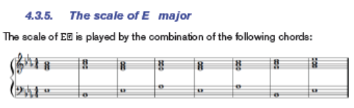
4.3.6. The scale of B major
The scale of B is played by the combination of the following chords:

Practice1:

Practice 2:

Note:
On each of the above scales, many exercises must be done to be familiar with the
piano practice. It is to be made by composing different accompanied melodies
and other existing songs that are commonly used in daily life. It is better to startby simple exercises of practice on every scale.


REFERENCE BOOKS
Burton, Anthony (2002). A Performer’s Guide to the Music of the Classical Period.
London: Associated Board of the Royal Schools of Music. p. 3. ISBN 978-1-
86096-1939.
Downs, Philip G. (1992). Classical Music: The Era of Haydn, Mozart, and
Beethoven, 4th vol of Norton Introduction to Music History. W.W. Norton &
Company. ISBN 0-393-95191-X (hardcover)
Tim Emmons, Odd Meter Bass: Playing Odd Time Signatures Made Easy(Van
Nuys: Alfred Publishing, 2008): 4. ISBN 978-0-7390-4081-2.
Stephen E. Hefling. “Dotted rhythms”. In Deane L. Root (ed.). Grove Music
Online. Oxford Music Online. Oxford University Press
Taylor, Eric (2011). The AB Guide to Music Theory Part I. ABRSM.p. 18. ISBN 978-1-85472-446-5