General
- Geograpy SSE Y2 SB File Uploaded 2/11/21, 16:08
- Geograpy SSE Y2 TG File Uploaded 2/11/21, 16:07
UNIT 1:STATISTICAL GRAPHS AND DIAGRAMS
Key unit competence: The student-teacher should be able to interpret
the statistical data, construct statistical graphsand diagrams.
Introductory activity
Read the extract below and use it to answer the questions that follow:
Rwanda exported over Rwf 250b Agricultural products in 2017. The National
Agriculture Exports Development Board (NAEB) says that the country’s
agricultural exports generated revenues amounting to Rwf 304.6 million from
January to September 2017 compared to 232.65 million earned in the same
period in 2016. In the first quarter of 2017/18, agricultural exports generated
Rwf 116 million against Rwf 82,809,581 in first quarter 2016/17. Agricultural
crops locally produced and exported like coffee, tea, and pyrethrum generated
frw 108 million from January to September of 2017, compared to 89 million
in the same period in 2016. The volume of exported vegetables was frw 18.98
million kilograms from January to September 2017, compared to over 15.61
million kilograms in the same period of 2016, meaning that the quantity of
exports increased by only 21.56%. The value of exported vegetables was frw
8 billion from January to September 2017, against frw4.2 billion in the same
period of 2016, implying an increase of 98.65 percent, and a rise in price per
unit of the vegetables.
Answer the following questions:
1) Name the data which are represented in the passage
2) Using the past studies in both ordinary level, senior four and personal
research,
i) Identify other methods to represent the data displayed in the passage.
ii) Discuss the importance of the geographical data identified in (i) above
and make a class presentation, if possible using ICT tools, or flip charts
or any other resource available.
iii) Comment on the Rwanda’s exports between January 2017 to Oct 2017and account for the variations in the trend of exports.
1.1. Introduction to the statistics in Geography
Activity 1.1
Read the story below and use it to answer the questions that follow:
Micomyiza Jeanne and Habinshuti Gilbert made their field study on ‘The
effects of human activities on the physical environment in Rulindo village.
They used various methods of data collection. Jeanne was interested in
writing down every observed aspect in a descriptive manner while Gilbert
filled his note book with tables and charts that he would interpret after
the field trip. Some other students who had also attended the field work,
used various methods of noting down data, such as line graphs, bar graphs
with description foot notes. They could look at the graphs and drawn
charts and easily understand the content contained therein. The collected
numerical data revealed that 12 farmers were using poor methods of
farming, 20 farmers had applied agro-forestry and tree planting, 2
farmers were engaged in charcoal burning, 7 people had large herds of
cattle whose impact on the environment was so evident. All data collected
were presented and recorded on a chart.
a) Explain why most of students were interested in using statistical
way of data recording.
b) Does the passage above represent statistics? Explain your answer.
c) Using the example of Habinshuti, examine the importance of statistical
graphs and diagrams in Geography.
1.1.1. Definition of statistical geography
Statistical geography is defined as the study and practice of collecting, analyzing
and presenting data that has a geographic dimension. The statistics in geography
is about social, economic, climatic, spatial or demographic characteristics. Data
used in statistical analyses comes from various variables such as, population
housing censuses, surveys, and administrative records.
In a broader sense, the term statistics refers to the science of collecting,
analyzing, interpreting and presenting various data. It is a science of how data
are collected, analyzed and interpreted.
Someone who collects, classifies, analyses, presents and interprets statisticaldata is called statistician.
1.1.2. Importance of statistical graphs and diagrams in geography
Statistical graphs and diagrams play a key role in geography for the following
reasons:
1) Statistical graphs and diagrams help students to process and summarize
huge data with accuracy.
2) The geographers can identify and interpret the relationship existing
between various variables (e.g. the relationship between the increase of
prices for commodities and increase in cost of fuel).
3) They clearly predict the trend and variations among others of production, trade.
4) Statistical diagrams and graphs enable make easy the presentation and
interpretation of geographical data.
5) Statistical graphs and diagrams provide a good and attractive visual
representation.
6) Statistical diagrams and graphs facilitate easier memory of the reader orstudents/geographers than data presented in a descriptive manner.
Application Activity 1.1
Using firsthand experiences and skills acquired in statistics explain how
statistics is important in your daily life and show how it would help tounderstand geography.
1.2. Line and curve graphs
Line graph and curve graph are types of charts which display information as a
series of data points called ‘markers’ connected by straight line segments.
The types of line and curve graphs the most used in statistical geography
described in this section include:
i) Simple line and curve graph
ii) Group or comparative line graph
iii) Compound line graphsiv) Divergence graphs
1.2.1. Simple line and curve graphs
Activity 1.2.1Land use in country X from 2015 to 2017
Using the knowledge and skills acquired from Mathematics and the data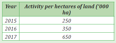
provided in the table above, answer the following questions:
a) Draw a simple line graph to represent the above information.
b) Use the same data indicated in the table above, to construct a simple
curve graph.
c) Using both the data and the graphs drawn, comment on the trend of
land use in country X from 2015 to 2017.
d) Discuss the advantages and disadvantages of simple line graph.
i. Simple line graph
A simple line graph is one which shows points plotted connected by a series of
short straight lines. This distinguishes it from the simple curve graph in which
points plotted are joined by a single smooth line.
Construction of a simple line graph
The following are steps to be followed while constructing a simple line graph
and curve graph.
1. The independent variables are indicated on horizontal axis.
(Independent variables are items that are not affected by the changes
in other values)
2. The dependent variables are represented on the vertical axis.
(Dependent variables are items that are reliant on the independent
variables. That is to say; are measurable responses from the reaction
caused by a change in the independent variables).
3. The vertical axis should start from zero. While the top part be slightly
greater than the maximum value to be indicated or recorded on it.
4. The length of the horizontal line is determined by the number of the
independent values in relation to the scale.
5. Draw two vertical lines on both sides and exact numbers of values of
constant relationship be recorded on the two axes. However, this is not a
must be done condition.
6. When plotting points in correspondence to both independent variables
and dependent variables, it is appropriate to put the dot in the middle of
the two vertical lines.
7. Join the points with smooth curve using free hand.
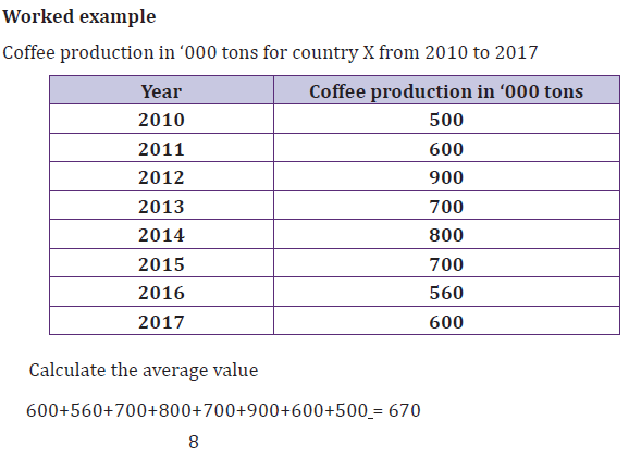
Worked example:
The following table presents mean temperature values recorded at weather
stationTemperature recorded at weather station B
Simple line graph of monthly mean temperature recorded at weather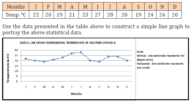
station B
When making a simple line graph, the following must be considered:
─ Choose a suitable scale to be used on vertical as well as horizontal
axes.
─ Write the scale as statement in the upper right corner of the graph.
─ Write suitable title in capital letters, balancing it above the graph as
appropriate.─ Do not attach the line to the vertical axes of the graph
ii. Simple curve line graph
The procedures for drawing a curve graph is similar to that of drawing a line
graph except that while in constructing curve graphs the dots are joined using
a straight line, in the case of simple line graphs; the dots are joined using a
smooth line with free hands.
The data recorded at weather station B are used to construct the followingsimple curve graph
Advantages and disadvantages of simple line and simple curve line graphs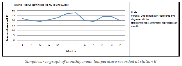
In the following paragraphs are described advantages and disadvantages of
both simple line graphs and simple curve graphs:
Advantages
1. They are simple to draw or construct.
2. When neatly drawn, they provide a good visual impression.
3. They are easy to interpret.
4. Less time is needed to construct them.
5. Simple errors or error free because of the simplicity nature of the
methods.
6. Simple calculations are involved.
7. They can be used together with other statistical methods and diagrams
such as dot maps, in a super-imposition manner.
8. They have a multi-purpose service. For example, they are used in
representing several geographical aspects such as the trend of cropproduction, variation in temperature, minerals, etc.
Disadvantages
1. There is no accurate interpretation because of some points are plotted
basing on estimation of values.
2. There are difficulties in determining the appropriate scale especially
when large figures or values are used.
3. The curve graphs are less accurate in comparison to simple line graphs.
4. It is not easy to use the simple line and curve graphs to compare various
categories of data.
5. Changing scale of either axes, can greatly change the visual impression
of the graph.6. They are only used while dealing with continuous data.
1.2.2. Group or comparative line graphsActivity 1.2.2
Group or comparative line graphs are also known as multiple line/curve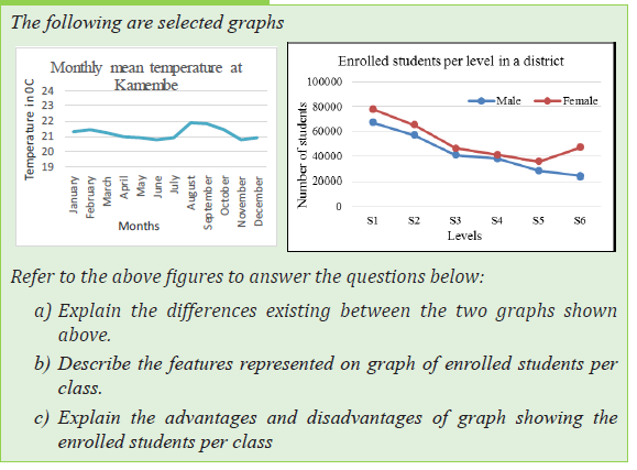
graphs. This form of displaying statistical data is used to portray more than
one dependent variable, whereby each line represents a given specific variableof individual item.
Construction of group or comparative line/curve graph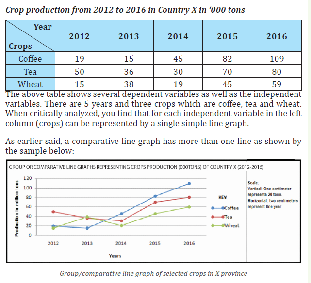
Below are steps or guidelines to be followed while drawing a group or
comparative/multiple line/curve graphs:
1. Several lines are constructed on the same graph.
2. The lines drawn representing individual variables or items should be
easily distinguishable from one another. It is advised to use varying colors.
3. Avoid congesting the graph with many lines. The recommendable
maximum number of lines is five.
4. The lines/curve should not cross each other unless the data given
requires it. If it happens therefore, strictly varying colors or shading
must be used.
5. Lines should not touch the vertical axis.
6. Names of variables being represented should be written directly on each line.
Advantages of group/comparative line graph
1. It is a simple method as it does not involve a lot of calculations.
2. It gives a clear impression of the different variables presented on one graph.3. It can be used to show comparison of different items.
Disadvantages of group/comparative line graph
1. The presence of many variables on the same graph makes their
interpretation more difficult.2. The values for each period are not easy to determine.
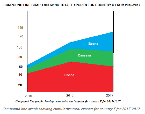
1.2.3. Compound line graphActivity 1.2.3
The table below shows the crop production from 2005 to 2010 in ‘000tons in country Y:
Using the previous knowledge and skills acquired in Mathematics and the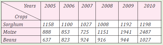
data presented in the table above, answer the following questions:
a) Calculate the cumulative totals.
b) Construct a compound line and shade every component.
c) Research on the advantages and disadvantages of compound line graphs.
A compound line graph is also known as a cumulative line graph. It is the
type of graph where a variety of variables are presented as subsequent lines.
Therefore, a compound line graph displays cumulative totals. It is drawn in a
way that lines are super-imposed above each other; creating several segments
or components.
Construction of a compound line graph
The following steps must be followed while constructing a compound line
graph:
1) Make a cumulative table representing progressive or cumulative totals
of the provided variables.
2) Select the appropriate scale for both dependent and independent
variables.
3) Follow the steps used when a simple line graph is being drawn. It should
be the variables with large or biggest values to begin.
4) The lines constructed for each variable should connect onto the two
vertical lines on both sides.
5) Super-impose other lines on top of the first line beginning from each
segment or component. Indicate the name of the variable in each section
shaded.
6) The lines drawn must begin from or attached to the vertical axis as
earlier emphasized.
7) Since plotting of points is dependent on the calculated values in a
cumulative manner, lines therefore, must not cross each other.
8) If the statistical data is in large numbers, it is very advisable to convert
the value of each variable into percentage. Thereafter, calculate the
cumulative totals. Such calculations should be indicated.
Worked example:
Table of total exports in million tons for country X’s for 2015-2017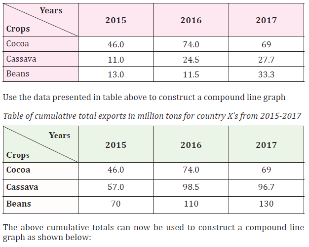
Advantages of compound line graph
1. They are easy to interpret.
2. They provide a good visual impression.
3. They are simple to draw.
4. Less space is used.
5. They can be used to present a variety of variables.
6. They are suitable for comparison purposes.
Disadvantages of compound line graph
1. When large numbers are used, selecting a suitable scale becomes more
challenging.
2. It or they involve calculations such as; converting the values into
percentages and then determining the cumulative totals.
3. The use of cumulative totals while constructing the compound line graphsmakes it difficult to find precisely the actual values of the variables.
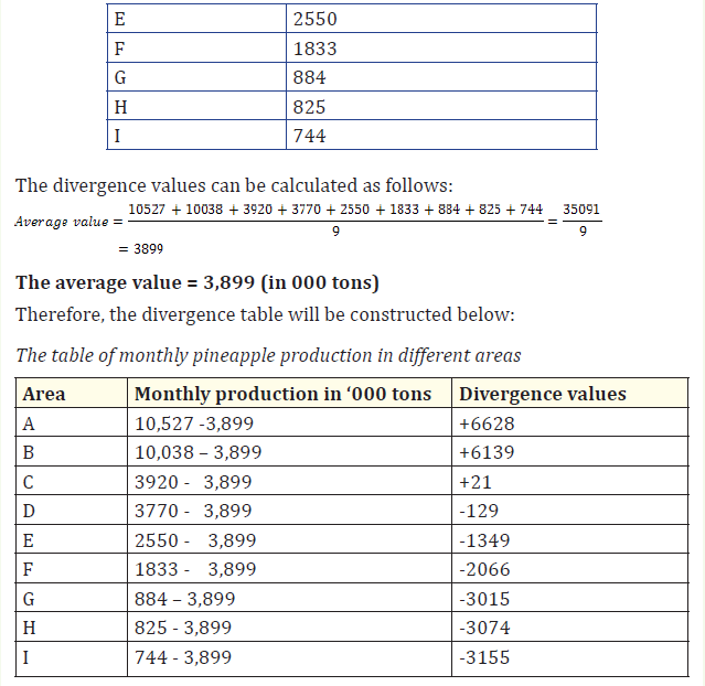
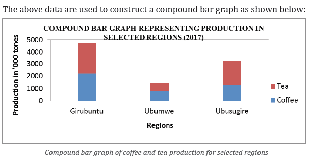
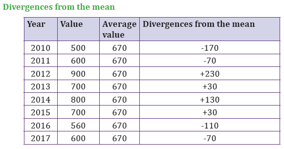
1.2.4. Divergence line graphs
Activity 1.2.4Below are two statistical graphs representing different statistical data:
Use the diagrams above to answer the following questions: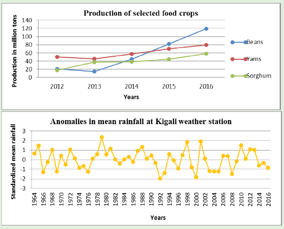
a) Identify the differences existing between the two graphs presented
above.
b) Research on advantages and disadvantages of the graph showingthe anomalies in mean rainfall at Kigali weather station.
Divergence line graphs are statistical graphs that directly portray variations in
values. When there is an increase in values; a plus sign (+) is used in the figure
while a fall or decrease in values is portrayed using a negative sign (-). This type
of graph is used while dealing with variables whose values are highly changing
spatially and temporally.
Construction of a divergence line graph
The following steps must be considered when drawing a divergence line graph:
1. Draw two vertical lines (axis) and leave a reasonable space for the
baseline; on which the independent variables are to be indicated.
2. Draw the average line commonly known as the zero line. This should join
the center of the two-vertical axis.
3. Draw a basement line for independent variables; joining the bases of the
two vertical lines. The length of the horizontal line is determined by the
number of independent variables and the horizontal scale used.
4. Determine the average values of all the values indicated in the table. Thisis obtained using the following formula:
1. Deduct the average value from each value. The positive and negative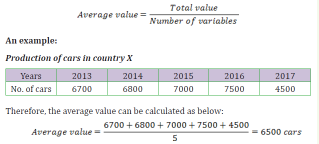
signs should be indicated or shown.
2. The figures or values with positive sign (+) are plotted above the Zero
line or average line. While the negative values are plotted below or
beneath the zero or average line.
3. While determining the scale, the vertical scale should be determined
basing on the calculated divergences. The horizontal scale is chosen
normally depending on the independent variables provided.4. Thicken or darken the zero line/average line.
Advantages of divergence line graph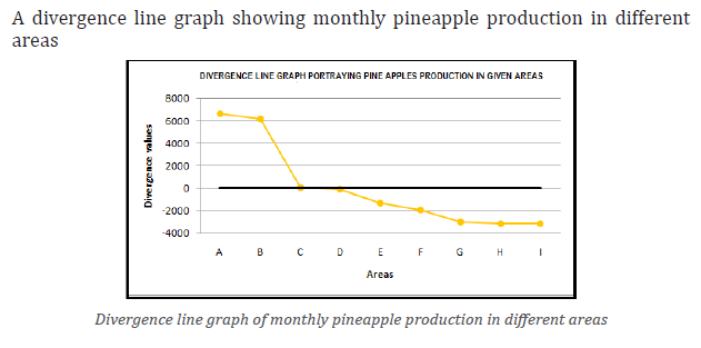
Below is an outline of the main advantages of divergence line graph:
1. It is easy to construct.
2. It provides a good visual impression.
3. It is easy to interpret.
4. It is an appropriate method of representing items that need comparative
analysis.
5. It requires limited space.
Disadvantages of divergence line graph
1. It involves several calculations for example the total value, getting
average and finding divergences.
2. The actual figures are not shown. Only divergences are indicated instead.
3. There are some difficulties while determining the scale mostly when the
divergences are composed of bigger values and very low ones.
4. Its construction is time consuming.
5. The method allows some inaccuracy while being drawn. This is because
if large values are used, decimal points are neglected.
6. To be used, it requires the reader to have the original raw data or a tableof values.
Application Activity 1.2
1. Collect data on the students’ performance in any subject of your
choice and use the scores to construct the following line graphs:
simple and curve line graph, comparative, compound and divergence
line graphs.
2. Comment on the distribution of statistical data displayed on the
constructed graphs.
1.3. Bar graphs
Bar graphs are statistical methods whereby rectangular bars are used to portray data.
Bar graphs differ from line graphs because the lines used under bar graphs join
to form single and individual rectangular bars.
Bar graphs described below include:
i) Simple bar graphs
ii) Compound bar graphs
iii) Divergence bar graphs
iv) Age-sex graphsv) Dispersion graphs
1.3.1. Simple bar graphs
Activity 1.3.1
Table showing population of selected countries of the world (‘000,000people) in 2016
Use the data presented in table above to answer the following questions: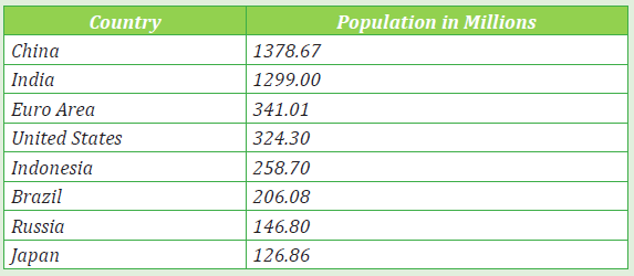
a) Draw a simple bar graph portraying the above data.
b) Describe the population distribution as portrayed on the graph and
the table above.
c) Explain the impact of population on the physical environment in
countries such as China and India.d) Research on advantages and disadvantages of bar graphs.
A simple bar graph is created following the same procedures as a simple line
graph. However, instead of using a line to represent the variables, parallel bars
are used. The independent variables are indicated on the horizontal axis anddependent variables shown on the y-axis or vertical line.
Construction of a simple bar graph
The following are the main steps followed to construct a simple bar graph:
1) Create a frame of both vertical and horizontal axes. That is, drawing the
X and Y axes. The length of these two lines will be determined by the
scales used and the figures to be plotted.
2) Indicate the independent variables on the X axis and dependent variables
on Y axis.
3) Select appropriate scale: Both vertical and horizontal scales. This is
determined as studied while dealing with line graphs.
4) The horizontal scale will automatically determine the size of the bars.
It is recommended that the size of each bar should not exceed 1 cm or
go below 1cm in width. Too small and huge bars make the graph lose its
primary appearance.
5) While plotting points, use tiny dots to mark the required points. This is
because with bar graphs dots are not supposed to be seen.
6) The volume, percentage or value of the dependent variable is represented
by the height of each independent bar.
7) A reasonable small space should be left to separate the bars from the
vertical axis.
8) There should be uniformity in terms of the size of bars, separating space
existing between bars.
9) The bars should be attached only when a single or similar dependent
variable is being dealt with. But this is not a golden ruling. For example,Rainfall, production of coffee or any other variable.
Worked example:Table of annual mean rainfall of X weather station in 2019
The data displayed in table above were used to construct the following simple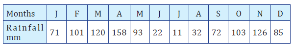
bar graph:
The data used to construct the above simple bar graph, deals with single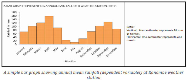
dependent variables like rainfall and that is why the bars are attached to each
other. However, the separated bars are used to represent independent variables
as shown on the figure below.
Table showing the profits made in a period of 5 years by company Umubanomwiza
Advantages of simple bar graphs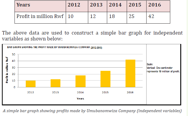
The following are advantages of simple bar graphs:
1) They are easy to interpret.
2) Summarizes a large amount of data in a visual form.
3) They display trends easier to highlight or notice than simple line graphs.
4) They can be super-imposed on other statistical diagrams. That is, they
can be used together with other methods.
5) They are easy to construct.
6) They do not involve complicated calculations.
7) They represent each data category in a frequency distribution.
8) The several bars constructed provide a chance of comparative analysis
and expression of differences existing between variables. For example,
rainfall received within 12 months.
9) They provide a compact way of presenting statistical data.
10) They are suitable for showing data with different units such as years,
months among many others.
Disadvantages of simple bar graphs
1) They can easily be manipulated to provide false impressions.
2) When large figures are used, determining a suitable scale is more
challenging.
3) Time consuming especially when several variables are dealt with.
4) They do not provide adequate explanation. Therefore, for them to be
rewardingly understandable, additional explanation is required.
5) Simple bar graphs do not show key assumptions, causes, impacts andpatterns.
Group bar graphs also known as multiple bar graphs. Group or multiple bar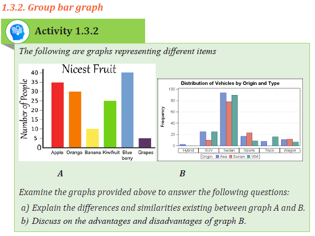
graph is a statistical technique used to represent data that is made up of several
dependent variables, that can hardly be shown using simple bar graph. A group
of bars is constructed following the steps involved in drawing of a simple bar
graph. The only difference is that group bar graph is constructed by attaching a
set of bars representing individual variables.
Construction of a group bar graph
The following are main steps involved in construction of a group bar graph:
1) The way of constructing a group bar graph is the same as that of simple bar graph.
2) The bars are drawn in form of a set and touching each other for each
independent variable. This implies that bars are grouped but separated
from another group by a space.
3) Draw the bars in a vertical manner.
4) The independent variable that has the largest values should be started
with and drawn on the left and continuing in a descending order towards the right.5) The arrangement of the first group should be maintained throughout.
Advantages of group bar graph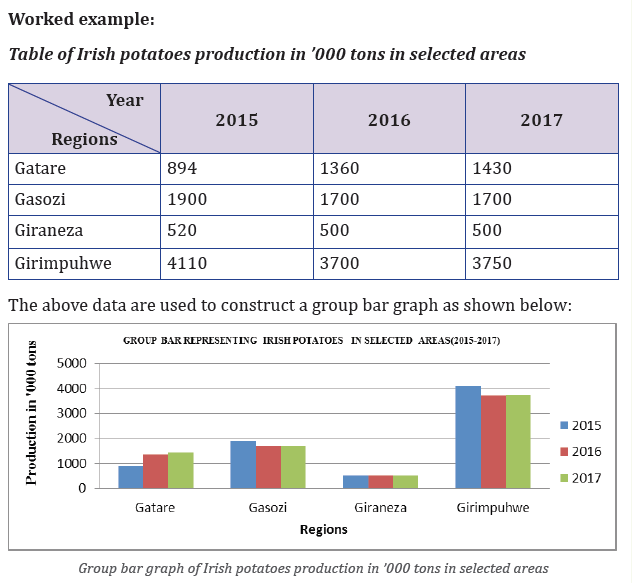
1) Group bar graph is easy to interpret;
2) It favors comparative analysis of the statistical data being dealt with;
3) It is simple to draw;
4) The calculations involved are simple and easy;
5) It provides a wonderful visual impression when it is coloured;
6) It can be used together with other diagrams in a super-imposed way;
7) It is suitable for a wide range of variables.
Disadvantages of group bar graph
1) It requires a large space;
2) It is challenging while determining the scale;3) It may be difficult to interpret it when it is congested.
1.3.3. Compound bar graph
Examine the graphs provided above to answer the following questions: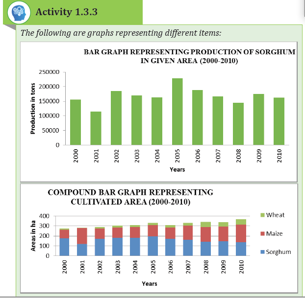
1. Explain the differences and similarities existing between graph showing
production of Sorghum and that of cultivated areas of selected food
crops in given area.
2. Research on the advantages and disadvantages of the graph showing
cultivated areas of selected food crops in given area.
Compound bar graphs are also called cumulative or divided bar graphs. This
form of statistical graph is used to show how the total in any one bar is divided
up between several subtotals basing on the calculated cumulative totals.
A compound bar graph used when there is more than one variable and a variety
of the items are to be portrayed using one bar. Basing on cumulative totals as
calculated depending on the raw data on the table provided, a given bar can
be divided into segments. The size of each segment depends on the value of
variable being represented.
Construction of a compound bar graph
The following are the main steps followed to construct compound bar graph:
1) It is constructed by using cumulative progressive totals.
2) It requires selecting a suitable scale that enables the plotting of both big
and small values.
3) The plotted data are displayed in percentages starting with the greatest
value and ending with the smallest figure.
4) The width of each bar is determined basing on the scale used.
5) The number of bars will be determined by the number of variables to be
represented in each set of bars.
6) The varying sheds or colors are used for each individual segment or
component of every bar.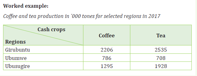
The primary purpose of the divergence bar graph is to represent the way values
of various variables deviate from the average/mean value. Therefore, thisstatistical method shows the fluctuation of the variables.
Construction of divergence bar graphs
The steps to be followed while constructing divergence bar graph are:
1) Construct the two vertical axis lines.
2) Join the two vertical lines with the horizontal line at the base line.
3) Draw the average line which is known as a zero line at the center of the
two vertical lines. Write the average against this line at the end points
where “0” is indicated.
4) Find the total of all the value of the variables and divide it by the number
of the items to get the average. Subtract the average obtained from each
value, to get the divergences or deviations.
5) Select the suitable scale basing on the divergences calculated.
6) Plot the negative values below the average line and the positive onesabove the same line.
Advantages of divergence bar graphs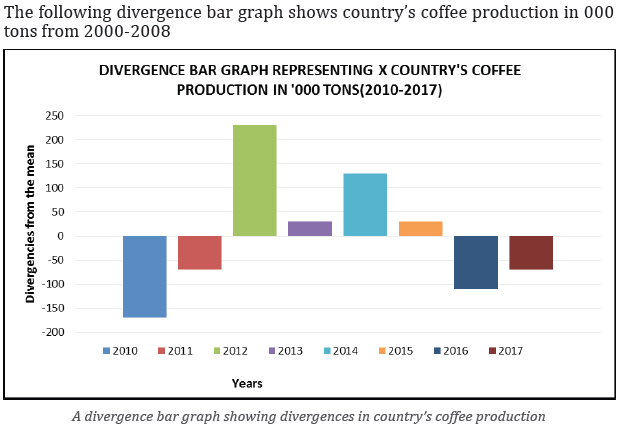
The following are advantages associated with divergence bar graphs:
1) They provide a good visual impression.
2) They are appropriate for comparison purposes.
3) They are easy to construct.
4) They are less complex therefore, easy to interpret.5) They use limited space.
Disadvantages of divergence bar graphs
1) There are several calculations involved.
2) The method is only limited to a single item or commodity.
3) Determining the scale especially when the values have a wider amplitude
is challenging.
4) The plotting of values is only based on divergences. Therefore, the actualvalues are not seen.
1.3.5. Age and sex graphs
Activity 1.3.5
Statistical diagrams showing population structure in two different countries: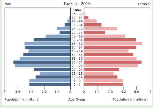
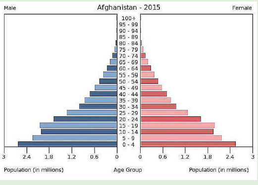
Refer to the figures presented above to answer the following questions:
a) Name the diagrams indicated above.
b) Differentiate the two diagrams represented above based on their
structure.c) Research on the advantages and disadvantages of such diagrams.
An age-sex graph is also known as a population pyramid. It is a type of bar graph
that represents the structure of the population of a country or area basing on
age and sex. An age-sex graph forms a structure of pyramid as the population grows.
It is a graphical drawing that displays the distribution of several age groups in
each population of a country or part of the world, which makes the shape of a
pyramid as the population grows. It is usually in age groups of five years for
example 0 - 4 years; 5 - 9 years; 10 - 14 years and so on. The age groups are
indicated or plotted in the middle.
The primary purpose of the population pyramid is to portray population
structure and age groups. The number may be in a raw form or converted intopercentages.
Construction of age-sex graph
When drawing an Age-sex pyramid, the following steps should be observed:
1) It is constructed on two X-axis; one to portray male and another for females.
2) Males are represented on the left and females on the right.
3) The bars representing each sex are separated by a space. It is in this
space that age groups are indicated in a progressive manner.
4) The data provided should be grouped using the interval of 5 years as
follows; 0 - 4; 5 – 9; 10 – 14; 15 – 19; 20 – 24; 25 – 29; 30 - 34 and so on.
5) After forming the age groups; the lowest group which forms the youngestis indicated on the base of the graph.
The following age-sex bar graph of country X is drawn using the data presented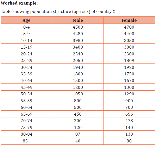
in table above.
Advantages of an age-sex graph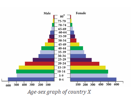
The following are the main advantages of an age-sex graph:
1) It provides instant display of the composition of female and male
population being portrayed and their corresponding age ranges;
2) It shows the general shape of population structure. The features
associated with the age-sex pyramid can indicate factors affecting a
represented area or region;
3) It gives a good visual impression that captures the attention of the reader
or interpreter;
4) It is easy to interpret;
5) It has limited or sometimes no calculations involved, therefore, it is easy to draw;
6) Age-sex pyramid is suitable for comparison purposes.
Disadvantages of an age-sex graph
1) It is only used to represent population structure;
2) There is loss of important information due to the use of figures that are
in age-cohorts;
3) It cannot show the population distribution (Do not describe or show the
trend of population growth);
4) The actual figures may not be seen since in most cases percentages are used;5) It is challenging to determine a suitable scale.
Referring to the figures above answer the questions that follow:
a) Name and describe the above presented diagrams.
b) Research on the advantages and disadvantages of dispersion graphsusing the internet and text books available.
The dispersion graphs are statistical representation method that displays the
tendency of data scattered over a range. It is also called scatter graph. It is
used to show the relationship existing between dependent and independent
variables.
Construction of dispersion graph
Below are the main steps followed while constructing a dispersion graph:
1) Draw the vertical axis and horizontal axis.
2) Select the suitable scale for both axes.
3) Determine the variable that qualifies to be independent variable and the
dependent variable.
4) Indicate the dependent variables along the vertical axis and the
independent variables on the horizontal axis.
5) Plot the points using visible dots that are thickened.
Dispersion graphs can display positive correlation (e.g. previous figure) and
negative correlation
Worked example:
The table below shows the examination scores in G.S Dihiro in Bugesera Districtin relation to the hours assigned.
The graph above shows a positive correlation between studying hours and
students’ examination scores because the students’ examination scores increase
with increase in hours of study. The following graph shows negative correlationbetween altitude and temperature.
The figure above depicts that there is a negative correlation between altitude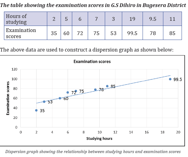
and temperature as far as the temperatures decrease with altitude.
Advantages of a dispersion graph
1) Dispersion graph displays the relationship between two variables;
2) It tests how reliable the data collected is;
3) It is easy to draw;
4) It provides a good visual impression;
5) It easily portrays the anomalies associated with data.
Disadvantages of a dispersion graph
1. Some information that may be important is not displayed.
2. It is more reliable when a wide data is used but when the data used is
small, the conclusion may not logically be reliable.
3. Much time is required when huge information is used.
4. It is easily constructed by using ICT (Excel) and hard to construct itmanually.
Skills lab
In your school, collect data of the number of students for the last five years and
construct the appropriate statistical graph to portray the population of your school.
End unit Assessment
Landslides and floods hit several parts of Rwanda between 7 and 8 May
2016 after a period of heavy rainfall. Government officials say that at least
49 deaths have been recorded so far. Some of the victims drowned in flood
water, others died after houses collapsed under the heavy rain and landslide.
The worst hit areas are the districts of Gakenke and Muhanga. As many
as 34 people have died in Gakenke, 8 in Muhanga, 4 in Rubavu and 3 in
Ngororero. Around 26 injuries have also been reported. Reports from the
Ministry for Disaster Management and Refugee Affairs reported that over
500 houses have been destroyed. Therefore, use the statistical information
presented above to do the following:
a) Extract statistical raw data mentioned in the story.
b) Use appropriate statistical diagrams and graphs to display the portrayed
data in (a) above.
c) Identify and describe the geographical phenomena that are highlighted
in the news print.
d) Explain how you would use the data collected and statistical diagrams,
graphs and charts constructed to advise the people and the
government on the environmental challenges to be addressed.
e) Assess the environmental challenges to be addressed in the area andshow measures of controlling them.