UNIT 4:LETTERING
Key unit competence: To be able to make a graphic work with
handwriting using cursive and print
letters in both lower and upper-caseletters.
Introductory Activity
A B C D E F G H I J K L M N Q R S T U V W X Y Z
a b c d e f g h i j k l m n o p q r s t u v w x y
1. Discuss the elements used in pictures above.2. Make greeting cards by using lettering styles
4.1.Elements of lettering
Activity 4.1
Discuss about different writing of lettering styles
Identify the basic elements of graphic art
Calligraphy is writing with a single pass to create written art, hand lettering is
a composition created with drawn letters, and typography uses prefabricated
and designed letters. Essentially, hand lettering is the illustration of letters
that come together to create a single, unified piece.
Graphic design It is visual communication and the aesthetic expression of
concepts and ideas using various graphic elements and tools. It involves
the use of images, symbols or even words.
The basic elements of graphic design.
There are six main elements of graphic design; the line, the shape, the
color, the texture, the value and the space.
1. The line
The line is usually present in every design, even if it is a solid border of 1px
or a dotted one of 5px. Every website has lines, but the minimalistic style
that became more popular in the past couple of years tries to erase the linesfrom the layouts, or at least to decrease the use of them.
The lines can be long, red, straight, thin, blue, dashed, short, black or
curved; they are all into the same category. They are most of the time used
for delimitation between different sections of a design, or are used to direct
a viewer’s vision in a specific direction.
2. The shape
The shape, or the form, is the second most used element of a web design.
They are actually lines combined in different shapes. The forms are still
popular and this is because if there is something that needs to stand out,
forms are one of the ways to do it.
There can be circles, squares, rectangles, triangles or any other abstract
shape; most of the designs include at least one of these. Minimalistic designs
use it a lot, because they often based on illustrations and drawings.
3. Textures
The textures can look similar to solid background colors, but if they analyzed
closer, small but effective differences can noticed.
Texture styles include paper, stone, concrete, brick, fabric and natural
elements, among flat or smooth colours. Textures can also be subtle or
pronounced and can used sparingly or liberally. They work with pretty much
everything.
Even if they do not seem important, the textures can totally change a website
and offer a very different visual impact.
4. Colour
The colour may even be the most important element of a design, because it
offers the most powerful visual impact at a single glance. Colour is obvious
and does not need basic graphic skills to be noticed.
While lines and shapes mean the same thing as in the reality, only at a
little more profound level, the color means exactly the same thing as in the
nature. Colour creates emotions – red is passionate, blue is calm, green is
natural.
Even if you do not realize this, colours have a clear effect on your mind.
Studies were done; a person who lives in a red environment has a higher
heartbeat and pulse than a person living in a blue environment. The humanbrain sees this and influences the rest of the body.
Therefore, colour theory is very important to know, because not many
designers can call themselves experts in this field. Being a master of colours
might make the difference between a good design and a stunning one.
Please, this is not saying that you have to know all of them, but knowing
how hue, saturation, shade, tint, tone or chroma work together is crucial for
a graphic designer.
5. Value
value is more general and represents how dark or light a design is. Value
has a lot to do with mood too, only at a more profound level.
6. Space
The space and how it, used is crucially important in design. Lately the “white
space” (also called negative space) became widely because it allows the
human eye to read easier.
For whoever is not familiar with the term “white space”, it does not mean
precisely space filled with white, but every area of the design that only filled
with the background color. You can see several examples below for better
understanding of the concept.
Application activity 4.1
• What do you understand by calligraphy?
• Discuss any three elements of graphic design
4.2.Process of making calligraphy text / cursive letter
Activity 4.2
By following the procedure of making calligraphy (cursive letter), construct
the letters of alphabet.
Calligraphy means “beautiful writing” in Greek and spans thousands of
years and countless cultures. There are several styles, including Western,
Eastern Asian, Southern Asian, and Islamic. All calligraphy uses the same
basic principles to create beautiful lettering. If you want to practice the art of
decorative handwriting, all you need to do is follow a few simple steps.
Cursive letters are a handwriting in which letters are formed and joined ina rapid stroke
Lowercase Cursive Letters
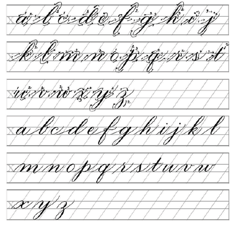
Uppercase Cursive Letters
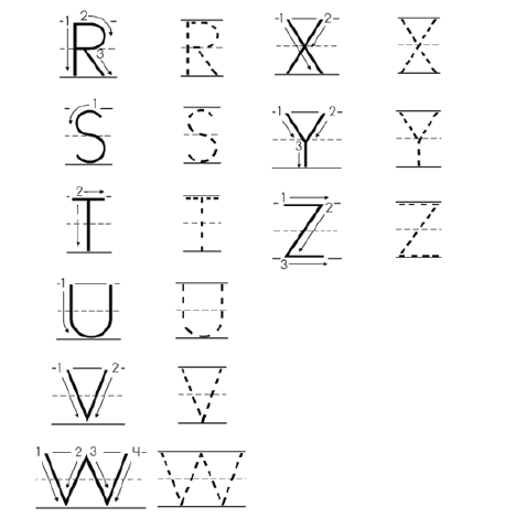
4.3.print letters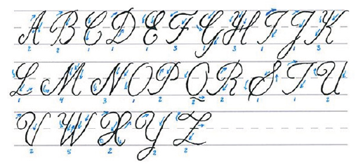
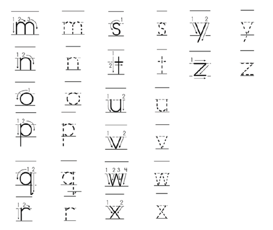
Print letters are not joined together and they are look like the letters in a book
or newspaper.
Lowercase Print Letters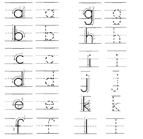
Uppercase Print Letters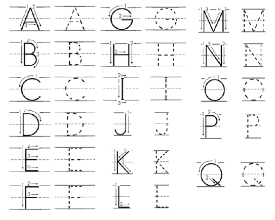
4.4.SPACING
Spacing: is a study of a space between letter when designing a typographic
work which refers to the nature of line that are made letter.
Spacing between letters, words and lines is very important. It has a big effect
on the readability (legibility) of a text.• The space between 2 words takes the space of the width of one letter.In typography there two main types of spacing which are mechanical and
• The letters W and M take more space than others.
• The letters I and J take less space than others.
• The space between the letters will be always the same in mechanical
spacing.
• When 2 capital letters A and V or W are following each other, the space
between them becomes short.
optical spacing
Mechanical Spacing: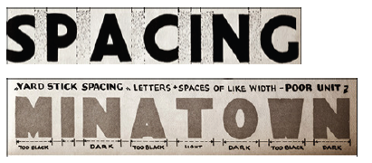
The yard- stick spacing of ‘’ minatown’’ shows what happens letters are all
fitted into like areas with the same distance between them. Note how spotty
the different letters look, especially the M, A and W and how unrelated
the irregular letters appear. By making the M, N, A and W wide and fitting
the irregular letters optically to compensate for their shape an even tone isobtained over all.
Optical Spacing
The example shown here illustrate how the different combinations work out
in use. In the word ‘’ spacing’’ letter of the same size and shape are spaced
in both ways. Note how legibility and unity are destroyed by mechanical
arrangement. Using a ‘’ yard-stick’’ to measure the width or distance between
letter seldom produces results and is generally detrimental to legibility.
Application activity 4.2
• Use lowercase and uppercase lettres to design your names in both
cursive and print letters in the area of 20 cm for height and 20 cm
for width by taking into consideration optical spacing.
End unit assessment 4
1. With your knowledge and skills, you have about calligraphy writing,
design these words “Rwanda Education Board” in both cursive
and print letters.