General
- Y1: Mathematics SSE SB File Uploaded 17/08/22, 10:06
- Y1: Mathematics SSE TG File Uploaded 17/08/22, 10:10
UNIT 6:DESCRIPTIVE STATISTICS
Key Unit competence: Analyse and interpret statistical
data from daily life situations
6.0. Introductory Activity
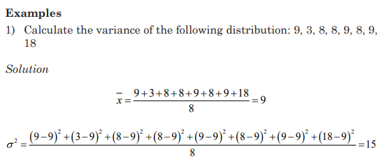
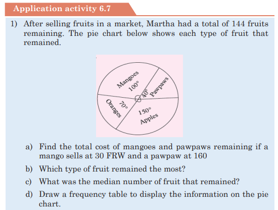
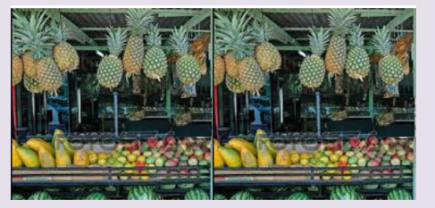
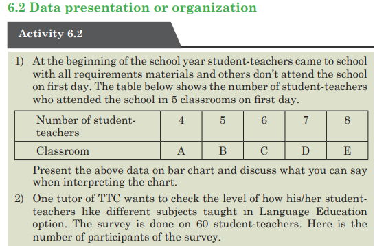
1) 1. At the market a fruit-seller has the following daily sales
Rwandan francs for five consecutive days: 1000Frw, 1200Frw,
125Frw, 1000Frw, and 1300Frw. Help her to determine the money
she could get if the sales are equally distributed per day to get the
same total amount of money
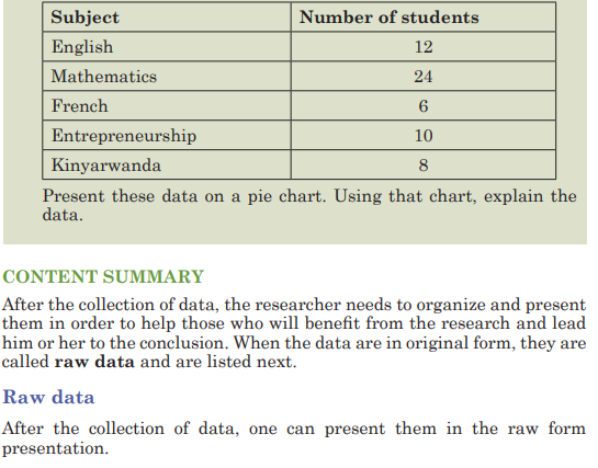
2) During the welcome test of Mathematics for the first term 10
student-teachers of year one language education scored the
following marks out of 10 : 3, 5,6,3,8,7,8,4,8 and 6.
a) What is the mean mark of the class?
b) Chose the mark that was obtained by many students.
c) Compare the differences between the mean of the group and
the mark for every student teacher.
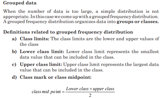
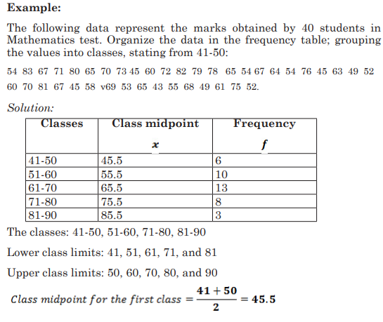
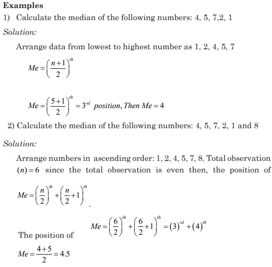
6.1 Definition and type of data
Activity 6.1
Carry out research on statistics to determine the meanings of
statistics and types of data. Use your findings to select qualitative and
quantitative data from this list: Male, female, tall, age, 20 sticks, 45
student-teachers, and 20 meters, 4 pieces of chalk.
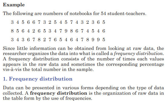
CONTENT SUMMARY
Statistics is the branch of mathematics that deals with data collection,
data organization, summarization, analysis and draws conclusions from
data.
The use of graphs, charts, and tables and the calculation of various
statistical measures to organize and summarize information is
called descriptive statistics. Descriptive statistics helps to reduce our
information to a manageable size and put it into focus.
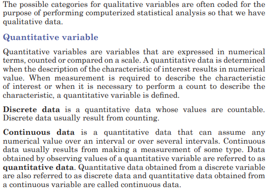
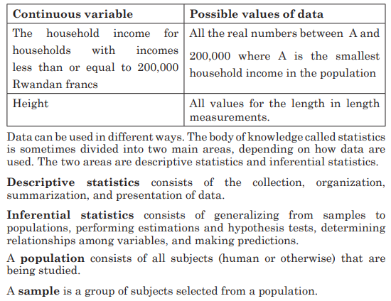
Every day, we come across a wide variety of information in form of
facts, numerical figures or table groups. A variable is a characteristic
or attribute that can assume different values. Data are the values
(measurements or observations) that the variables can assume.
Variables whose values are determined by chance are called random
variables. A collection of data values forms a data set. Each value in
the data set is called a data value or a datum.
For example information related to profit/ loss of the school, attendance
of students and tutors, used materials, school expenditure in term or
year, etc. These facts or figure which is numerical or otherwise, collected
with a definite purpose is called data. This is the word derived from Latin
word Datum which means pieces of information.
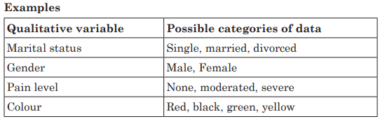
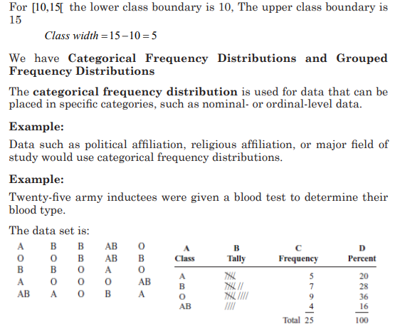
Qualitative variable
The qualitative variables are variables that cannot be expressed using
a number. A qualitative data is determined when the description of the
characteristic of interest results is a non-numerical value. A qualitative
variable may be classified into two or more categories. Data obtained by
observing values of a qualitative variable are referred to as qualitative
data.


The three most commonly used graphs in research are
1) The histogram.
2) The frequency polygon.
3) The cumulative frequency graph or ogive (pronounced o-jive).
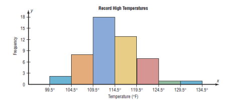
a)The Histogram
The histogram is a graph that displays the data by using contiguous
vertical bars (unless the frequency of a class is 0) of various heights to
represent the frequencies of the classes.
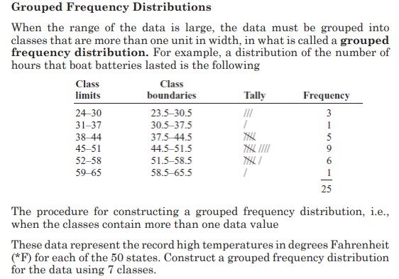
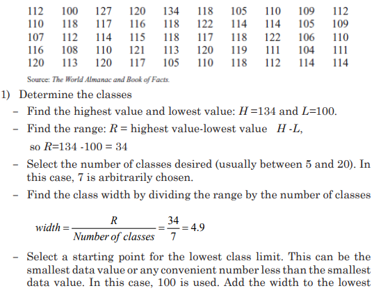
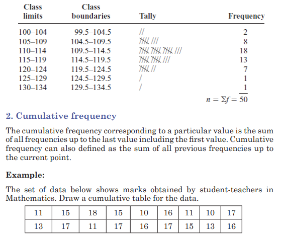
Example:
Construct a histogram to represent the data shown for the record high
temperatures for each of the 50 states
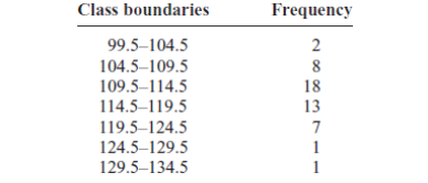
Step 1: Draw and label the x and y axes. The x axis is always the
horizontal axis, and the y axis is always the vertical axis.
Step 2: Represent the frequency on the y axis and the class boundaries
on the x axis.
Step 3: Using the frequencies as the heights, draw vertical bars for each
class. See Figure below
b)The Frequency Polygon
The frequency polygon is a graph that displays the data by using lines
that connect points plotted for the frequencies at the midpoints of the
classes. The frequencies are represented by the heights of the points.
Example:
Using the frequency distribution given in Example 2–4, construct a
frequency polygon
Step 1 Find the midpoints of each class. Recall that midpoints are found
by adding the upper and lower boundaries and dividing by 2:
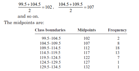
Step 2 Draw the x and y axes. Label the x axis with the midpoint of each
class, and then use a suitable scale on the y axis for the frequencies.
Step 3 Using the midpoints for the x values and the frequencies as the y
values, plot the points.
Step 4 Connect adjacent points with line segments. Draw a line back to
the x axis at the beginning and end of the graph, at the same distance
that the previous and next midpoints would be located, as shown in
Figure 2–3
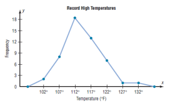
The frequency polygon and the histogram are two different ways to
represent the same data set. The choice of which one to use is left to the
discretion of the researcher.
c) The Ogive
The ogive is a graph that represents the cumulative frequencies for the
classes in a frequency distribution.
Step 1: Find the cumulative frequency for each class
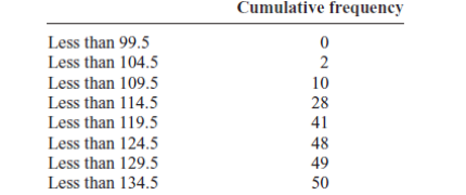
Step 2: Draw the x and y axes. Label the x axis with the class boundaries.
Use an appropriate scale for the y axis to represent the cumulative
frequencies.
(Depending on the numbers in the cumulative frequency columns, scales
such as 0, 1, 2, 3, . . . , or 5, 10, 15, 20, . . . , or 1000, 2000, 3000, . . . can
be used.
Do not label the y axis with the numbers in the cumulative frequency
column.) In this example, a scale of 0, 5, 10, 15, . . . will be used.
Step 3 Plot the cumulative frequency at each upper class boundary, as
shown in Figure below. Upper boundaries are used since the cumulative
frequencies represent the number of data values accumulated up to the
upper boundary of each class.
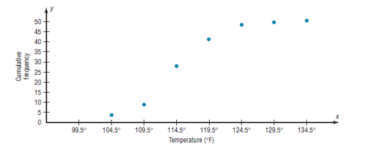
Step 4 Starting with the first upper class boundary, 104.5, connect
adjacent points with line segments, as shown in the figure. Then extend
the graph to the first lower class boundary, 99.5, on the x axis.
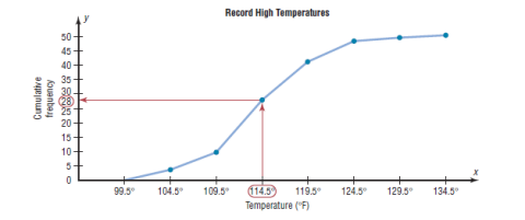
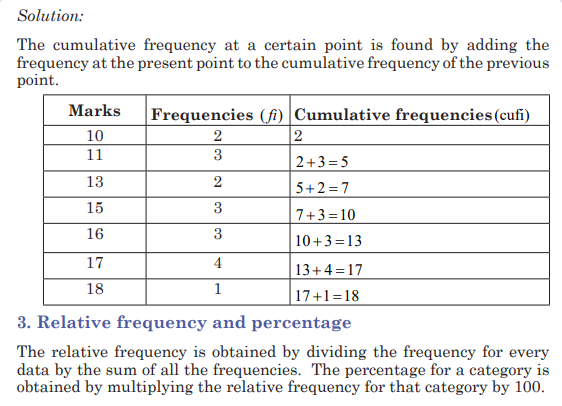
Cumulative frequency graphs are used to visually represent how many
values are below a certain upper class boundary. For example, to find
out how many record high temperatures are less than 114.5_F, locate
114.5_F on the x axis, draw a vertical line up until it intersects the graph,
and then draw a horizontal line at that point to the y axis. The y axis
value is 28, as shown in the figure.
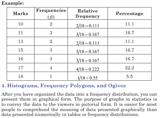
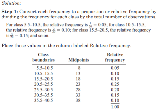
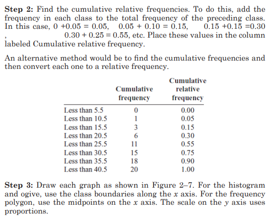
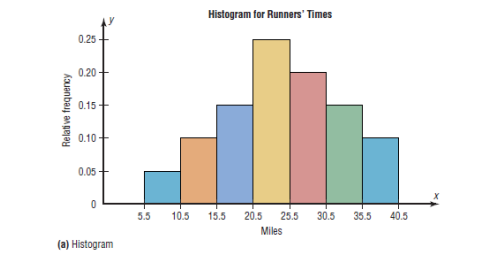
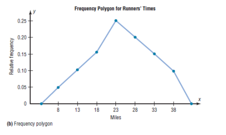
5. Relative Frequency Graphs
The histogram, the frequency polygon, and the ogive shown previously
were constructed by using frequencies in terms of the raw data. These
distributions can be converted to distributions using proportions instead
of raw data as frequencies. These types of graphs are called relative
frequency graphs.
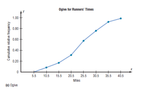
Example:
Construct a histogram, frequency polygon, and ogive using relative
frequencies for the distribution (shown here) of the kilometers that 20
randomly selected runners ran during a given week.

7. Stem and Leaf Plots
The stem and leaf plot is a method of organizing data and is a combination
of sorting and graphing. It uses part of the data value as the stem and
part of the data value as the leaf to form groups or classes. It has the
advantage over a grouped frequency distribution of retaining the actual
data while showing them in graphical form.
Examples:
1) At an outpatient testing center, the number of cardiograms performed
each day for 20 days is shown. Construct a stem and leaf plot for the
data.
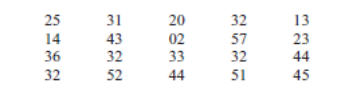
Step 1: Arrange the data in order: 02, 13, 14, 20, 23, 25, 31, 32, 32,
32, 32, 33, 36, 43, 44, 44, 45, 51, 52, 57
Note: Arranging the data in order is not essential and can be
cumbersome when the data set is large; however, it is helpful in
constructing a stem and leaf plot. The leaves in the final stem and
leaf plot should be arranged in order.
Step 2 Separate the data according to the first digit, as shown.
02 13, 14 20, 23, 25 31, 32, 32, 32, 32, 33, 36, 43, 44, 44, 45 51, 52, 57
Step 3: A display can be made by using the leading digit as the stem
and the trailing digit as the leaf.
For example, for the value 32, the leading digit, 3, is the stem and
the trailing digit, 2, is the leaf. For the value 14, the 1 is the stem and
the 4 is the leaf. Now a plot can be constructed as follows:
It shows that the distribution peaks in the center and that there are
no gaps in the data. For 7 of the 20 days, the number of patients
receiving cardiograms was between 31 and 36. The plot also shows
that the testing center treated from a minimum of 2 patients to a
maximum of 57 patients in any one day.
If there are no data values in a class, you should write the stem
number and leave the leaf row blank. Do not put a zero in the leaf
row.
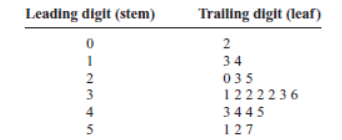
2) The mathematical competence scores of 10 student-teachers
participating in mathematics competition are as follows: 15, 16, 21,
23, 23, 26, 26, 30, 32, 41. Construct a stem and leaf display for these
data by using 2, 3, and 4 as your stems.
This means that data are concentrated in twenties.
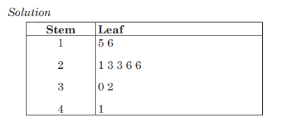
3) The following are results obtained by student-teachers in French out
of 50.
37, 33, 33, 32, 29, 28, 28, 23, 22, 22, 22, 21, 21, 21, 20,
20, 19, 19, 18, 18, 18, 18, 16, 15, 14, 14, 14, 12, 12, 9, 6
Use stem and leaf to display data
Solution:
Numbers 3, 2, 1, and 0, arranged as a stems to the left of the bars.
The other numbers come in the leaf part.
Application activity 6.2
1) Suppose that a tutor conducted a test for student-teachers and
the marks out of 10 were as follows: 3 3 3 5 6 4 6 7 8 3 8 8 8
10 9 10 9 10 8 10 6
a) Draw a frequency table;
b) Draw a relative frequency table and calculate percentage for
each;
c) Present data in cumulative frequency table, hence show the
number of student-teachers who did the test.
2) During the examination of English student-teacher got the
following results out of 80: 54, 42, 61, 47, 24, 43, 55, 62, 30, 27, 28,
43, 54, 46, 25, 32, 49, 73, 50, 45.
Present the results using stem and leaf.
3) A firm making artificial sand sold its products in four cities: 5%
was sold in Huye, 15% in Musanze, 15% in Kayonza and 65% was
sold in Rwamagana.
a) What would be the angles on pie chart?
b) Draw a pie chart to represent this information.
c) Use the pie chart to comment on these findings
6.3 Graph interpretation and Interpretation of statistical data
Activity 6.3
The graph below shows the sizes of sweaters worn by 30 year 1
students in a certain school. Observe it and interpret it by answering
the questions below it
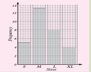
a) How many students are with small size?
b) How many students with medium size, large size and extra
large size are there?
CONTENT SUMMARY
Once data has been collected, they may be presented or displayed in
various ways including graphs. Such displays make it easier to interpret
and compare the data.
Examples
1) The bar graph shows the number of athletes who represented five
African countries in an international championship.
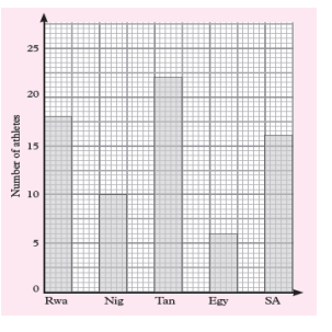
a) What was the total number of athletes representing the five
countries?
b) What was the smallest number of athletes representing one
country?
c) What was the most number of athletes representing a country?
d) Represent the information on the graph on a frequency table.
Solution:
We read the data on the graph:
a) Total number of athletes are: 18 + 10 + 22 + 6 + 16 = 72 athletes
b) 6 athletes
c) 22 athletes
d) Representation of the given information on the graph on a
frequency table.
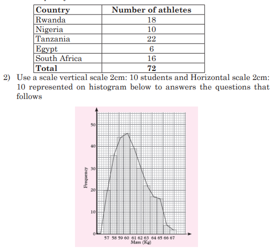
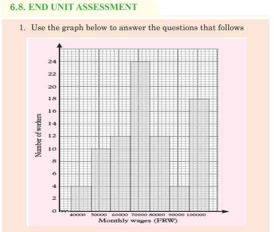
a) Estimate the mode
b) Calculate the range
Solution:
a) To estimate the mode graphically, we identify the bar that
represents the highest frequency. The mass with the highest
frequency is 60 kg. It represents the mode.
b) The highest mass = 67 kg and the lowest mass = 57 kg
Then, The range=highest mass-lowest mass=67 57 10 kg kg kg − =
Application activity 6.3
The line graph below shows bags of cement produced by CIMERWA
industry cement factory in a minute.
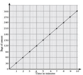
a) Find how many bags of cement will be produced in: 8 minutes,
3 minutes12 seconds, 5 minutes and 7 minutes.
b) Calculate how long it will take to produce: 78 bags of cement.
c) Draw a frequency table to show the number of bags produced
and the time taken.
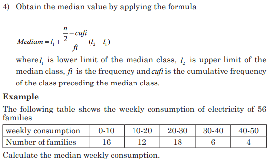
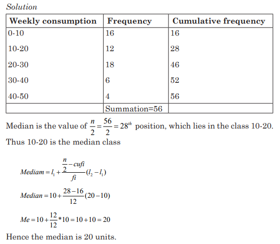
6.4 Measures of central tendencies for ungrouped data
Activity 6.4
Conduct research in the library or on the internet and explain
measures of central tendency, their types and provide examples.
Insist on explaining how to determine the Mean, Mode, Median and them
role when interpreting statistic data.
CONTENT SUMMARY
Measures of central tendency were studies in S1 and S2.
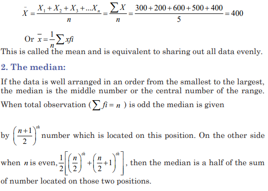
1. The mean
The mean, also known as the arithmetic average, is found by adding the
values of the data and dividing by the total number of values.
Suppose that a fruit seller earned the flowing money from Monday to
Friday respectively: 300, 200, 600, 500, and 400 Rwandan francs. The
mean of this money explains the same daily amount of money that she
should earn to totalize the same amount in 5 days.

Application activity 6.4
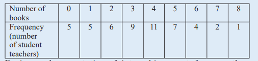
1) A group of student-teachers from language education were asked
how many books they had read in previous year, the results are
shown in the frequency table below. Calculate the mean, median
and mode of the number books read.
2) During oral presentation of internship report for year three
student-teachers the first 10 student-teachers scored the following
marks out of 10:
8, 7, 9, 10, 8, 9, 8, 6, 7 and 10
Calculate the mean and the median of the group.
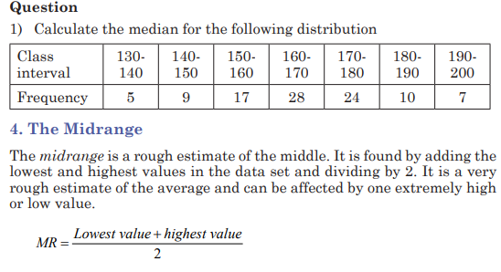
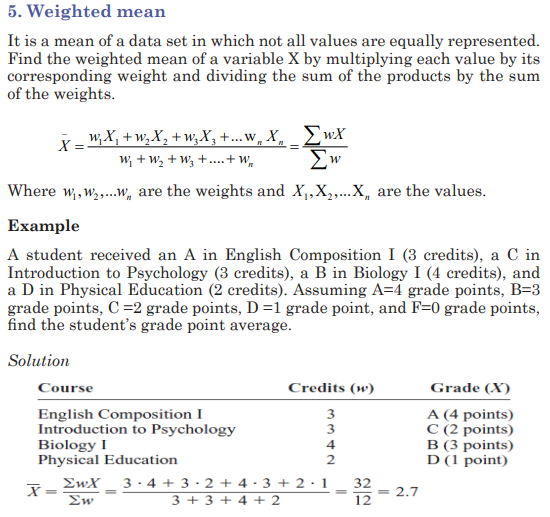
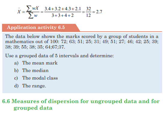
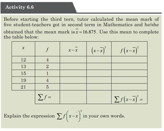
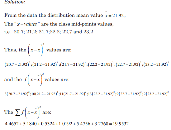
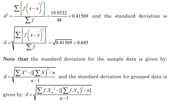
6.5 Measures of central tendencies for grouped data:
mode, mean, median and midrange
Activity 6.5
1) Conduct a research in the library or on the internet and explain
measures of central tendency for grouped data and provide
examples.
Insist on explaining how to determine the Mean, Mode, Median
and their role when interpreting statistic data.
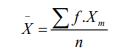
2) Using the frequency distribution given below, find the mean. The
data represent the number of kilometers run during one week for
a sample of 20 runners.
What does this mean represent considering the class in which it is
located in the data?
1. The mean
The process of finding the mean is the same as the one applied in the
ungrouped data with the exception that the midpoints mx of each class in
grouped data plays the role of x used in ungrouped data
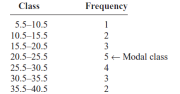
2. The mode
The mode for grouped data is the modal class. The modal class is the
class with the largest frequency. The mode can be determined using the
following formula:

Where:
L: the lower limit of the modal class
fm: the modal frequency
f1: the frequency of the immediate class below the modal class
f2: the frequency of the immediate class above the modal class
w: modal class width.
Example:
Find the modal class for the frequency distribution of kilometers that 20
runners ran in one week.