General
- ICT S3 SB File Uploaded 25/01/22, 13:15
Unit 3: Charts and Advanced Objects
Key unit competence
Present data graphically and use different objects in a document.
3.1 Charts
A chart is a diagram or object used to display numerical information in details. A chart can also be called a graph.
Data in a chart is represented by symbols, such as bars in a bar chart, lines in a line chart, or slices in a pie chart.
Learners can see results of numerical data in a chart and can use it to predict current and future.
3.1.1 Role of charts
- Charts are used to summarize and display information in an easy manner to understand.
- Charts act as useful tools for conveying financial information.
- they are used to make patterns and trends in numerical order much easier to see.
- Charts facilitate data analysis.
3.1.2 Types of charts
there are several types of charts used to display data. the most popular types include among others the following:
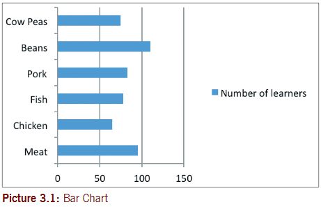
A. Bar Chart (Bar graph)
A bar chart is a graphic representation of data with horizontal bars or objects. Bar charts usually display horizontal bars or objects going across the chart vertically, with the values displayed at the bottom of the chart.
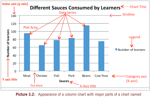
B. Column Chart
A column chart is a graphic representation of data with vertical bars or objects. Column charts display vertical bars (categories)going across the chart horizontally (along the horizontal axis), with the values organized along the vertical axis (on the left side of the chart).
Chart Overview
C. Line Chart (Line Graph)
A line chart is a graphic representation of data plotted using a series of lines. Line charts display lines going across the chart horizontally, with the values axis being displayed on the vertical axis (left side of the chart).

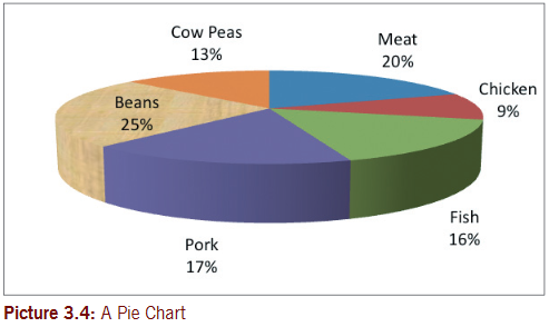
D. Pie Chart
Pie chart is a circular chart sliced into sections; each section represents a percentage of the whole. Pie charts do not display horizontal and vertical axes as other charts.
3.2 To create a chart or graph
Use the steps given below to create a graph. All the charts already shown above were created using similar data as in the ones below. Use this data to create these charts as they are in Microsoft Word. save the file as ‘Common charts’.
Step 1:Prepare the data that you need to make the chart (this data can be on paper or in a book).
Step 2: start Microsoft Word and then click where you want to place the chart.
Note: First create table data in Microsoft Word, but this is an option you may ignore.
Step 3: on the Insert tab, in the Illustrations group click Chart.
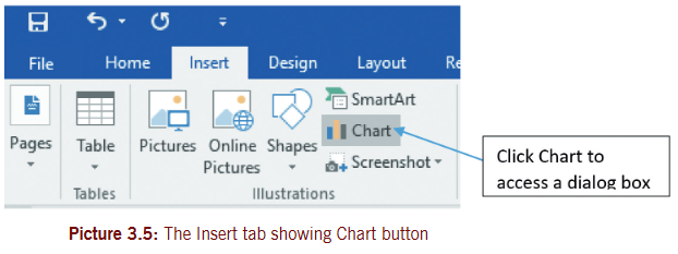
Step 4:In the Insert Chart dialog box (that displays as shown in picture 3.6), select the type of chart that you want on the left side, then select the chart sub type and finally click OK.
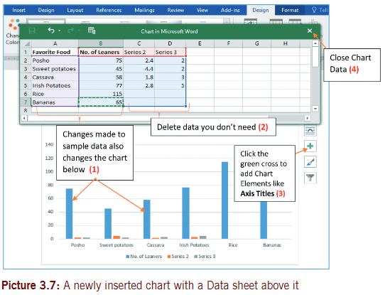
Step 5: the Chart remains selected and Chart tools display (on Design, Layout and Format tabs). Use Chart tools to modify your chart the way you want.

Step 6: Replace the sample data (edit data) by clicking on a cell and then typing the data that you want.
Note: to delete a column or row data, right click on column letter e.g. column D or row number e.g. row 5. then select delete.
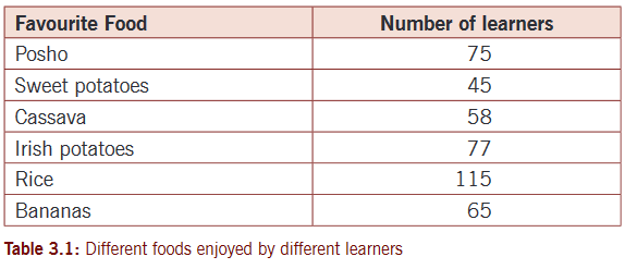
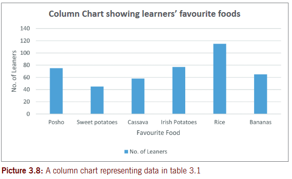
The resulting chart for our data in table 3.1 will appear as shown below
Activity 3.1
1. S.3 class has a total of 120 learners. the class teacher carried out a data survey to find out how many learners regularly eat meat, pork, chicken or fish at home. the data below in table 3.2 was collected.

Instructions
a) open Microsoft Word and create the table 3.2 above as it appears.
b) Use the data given in table and create:
(i) A clustered bar chart on page 1 just below table
(ii) Pie Chart on page 2 (with data call outs).
c) Apply Chart titles and Axis titles in b
(i) and b
(ii) above.
d) save changes to your file and save it as ‘Sauces’.
2. a) the picture below is displaying chart tools. Use it to answer the questions that follow.
(i) name the tab that is active. Identify two buttons displayed by this tab.

(ii) Identify how many tabs display Chart Tools. state the use of any one button on each tab.
b) study the Chart Tools on the Design tab in picture 3.9. Identify the name of the button used to:
(i) Change from one chart type to another
(ii) Add titles to axes and add/remove legend.
c) Which type of chart might have been selected according to picture 3.9?
d) Which button on design tab can be used to quickly apply axis labels or titles?
3. a) Picture 3.10 below shows another set of Chart tools. study the picture. Which tab is displaying chat tools?

3.3 Formatting an object and chart
Formatting an object and chart means to change the appearance of object and chart to look nice. A chart is an object in a document. A chart can be formatted to look attractive to the user. to format a chart, different features or buttons are used to make these changes. Most of the buttons are located on format tab under Chart Tools as shown in picture 3.9.
To format a chart
Step 1: select a chart you want to format.
Step 2:Click Format tab under Chart Tools and select a formatting button you want. the changes immediately take effect.
example:
To apply Word Art styles on your Chart
a) select a chart or chart element or a particular data series.
b) Click Format tab under Chart Tools.
c) In the Word Art Styles group, click Quick Styles and select a style you want (or use Text fill and or Text outline drop-down arrows and select desired colors you want). Refer to picture 3.8 or 3.9.
Alternatively perform (a) to (b) above and then use Shape styles group buttons/commands i.e. select from Shape Fill and Shape Outline drop-down lists.
Adjust chart size
a) select a chart or object you want to resize.
b) Click Format tab under Chart tools.
c) In the Size group type or scroll in to adjust the Shape Height and Shape Width of the chart (Refer to picture 3.9).
To format an object
Follow the same steps as those used to format a chart.
Activity 3.2
1. a) open Ms Word, create and display table 3.3 on a 3-D clustered column chart. save the file as ‘House competitions’.
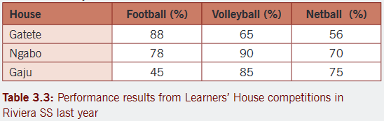
b) Include a chart title and axis titles.
c) Copy the chart and paste it on page 2 and page 3.
d) Change the chart type on page 2 to a 3-D pie chart and use a suitable chart style. Apply style 3 of pie charts.
e) Change the chart on page 3 into a line graph.
f) Page your work and save changes.
Activity 3.3
the following table was prepared by Director of studies of Gs nyarusange pertaining to extra lessons covered by 10 teachers for the 4th week of the term. Values are in minutes.

a) typeset the table above as it appears in the new document and save it as ‘Overtime’.
b) Bold all column headings.
c) Center all the figures in your table.
d) sort the data as A-Z to the names of teachers.
e) Insert the heading at the top of your table as “Teachers’ Daily Overtime in GS Nyarusange”.
f) Create a 3-D stacked column graph for all teachers for Mon, tue and Wed. Place the graph on page 2.
g) Create a line graph for the first five teachers (in ascending order) for Mon to sat. Place this chart on page 3.
h) Create a pie chart for Mon and sat for all teachers. Place the chart on page 3 below the line graph above in (g).
3.4 Add objects from file
An object is something that you can see. In Word, processing objects can be inserted from other files already created, for example; documents, workbooks, presentations, PDF and so on.
3.4.1 To add object from file
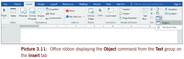
Step 1: on the Insert tab, click Object command from the text group.
3.5 Add objects
In word processing, you can add different types of objects created with other programs such as Ms excel, Presentation, and equation applications in a document.
3.5.1 To add Microsoft Excel Worksheet as an object in a document (or another type of document)
Step 1:Create a new document or open an existing document where you want to insert an object.
Step 2:Click where you want to insert the object.
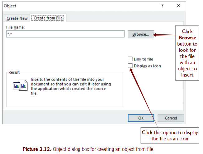
Step 3: on the Insert tab in the Text group, click Object button. the object dialog box appears. see picture 3.12.
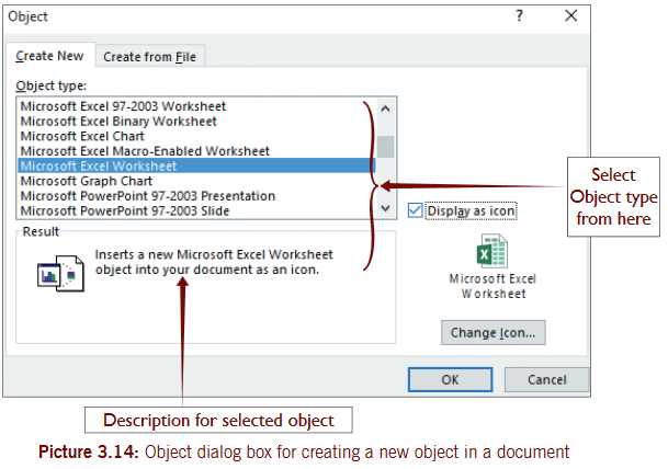
Step 4:In the Object Type list, scroll and select the type of object you want i.e. Microsoft excel Worksheet. (You can display the object as an icon if desired by ticking the “Display as Icon” check box. see the picture 3.14.
End of Unit 3 Assessment
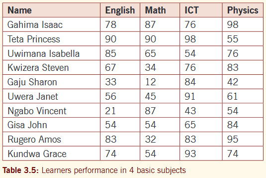
1. Data given in table 3.5 shows learners performance in 4 subjects. Use this data to generate on separate page(s):
a) A 3-D Clustered column chart showing all the learners’ performance in percentages. Change chart colors and the style you want.
b) A stacked line chart for all learners.
c) A pie chart representing the performance of learners in ICT. Use a desired chart style and color.
d) Apply page numbers in the Footer and your name and class in the Header.
e) save your file as your ‘Name-Class’.
2. type the following data in Microsoft Word and save as ‘Learning ICT’.
Learning ICT in Rwanda
ICT syllabus for Rwanda is very interesting. there are many topics that were added for purposes of improving and enhancing the skills of learners. thanks for our Government, a caring mother for all Rwandan children, taking charge of our future livelihood.
there are many topics and units that we learn on different levels gradually from lower secondary.
The following topics are learnt right from S1 to S3
- ICT Fundamentals
- safety and security
- Word processing
- GIS
- Computer network and Communication
- scratch Programming for Juniors
At s.2 level spreadsheet software is added to equip learners with basics of managing numerical data with a computer program.
At s3 level more topics are added to build learners with more skills in using graphics and multimedia presentation. they include:
- Presentation
- Graphics and Multimedia
Requireda) Justify your document and save it with a name, ‘ICT in Rwanda’.b) Insert Sauces file you created in unit 3 as object- icon (you can open from here) at the end of the text you typed above.c) Add a bitmap Image and Microsoft excel Worksheet as objects at the beginning of your text.d) Insert an equation as below the image.e) save changes to your file.