General
- Home Science S2 SB File Uploaded 24/01/22, 15:21
Unit 2: Colours in Decoration
Key Unit Competency
To be able to demonstrate the use of colours and basic decoration methods in simple decoration.
Learning objectives
After studying this unit, I should be able to:
• Identify decorative accessories.
• Use decoration accessories in simple decoration.
• Explain the basic decoration methods.
• Apply the decoration arrangement techniques.
Introduction
What are your favourite colours? Why? Do you like how your house at home is painted? What decorations would you have preferred? Now, look at the following pictures.

From the pictures above, which one would you prefer? Why is that the case?From your answers, predict what you are likely to learn in this topic.
2.1 Types of decorative accessories
In order to improve the appearance of anything, ranging from homes, offices and various venues; decoration is necessary. Decorative accessories are decorative items used to add beauty, as well as give personality and individuality to a room or a place. Other than being decorative, some accessories can be functional too. If well-chosen, they contribute to the overall unity and ambience of a given place. Also appropriate use of colour is an essential part of decoration.
Discussion corner
Look at the following pictures. What are they? What is their importance? Discuss with your friend how they are used in decorating a house, home or a venue.
The facts
The following are some commonly used decorative accessories:• Lamps and lamp stands • Pictures and wall hangings• Mirrors • Wall clocks• pins • Papers• Threads • Laces• Flowers • Textiles• Beads 1. (a) Give five functional decorative accessories you know.(b) Explain how they are used.(c) Give ideas on how one can ensure that they are decorative at the same time.2. Why is it not advisable to apply very dull colours in a room?3. Why are mirrors common in restaurants and hotels?In Senior 1, you already learnt about use of threads, pins, paper, marker pens, pencils, paints and paint brushes, ropes, textiles, ribbons, laces and flowers in decoration.
Activity 2.1
1. Look for the materials, tools and accessories above from your locality.2. Brainstorm how you can make use of the materials in decoration.3. Practice using the tools and materials with your group members to decorate a venue.4. Compare your work with that of other group members.The facts
The various decorative materials above can be combined and used in various ways in decoration.2.2 Basic decoration methods
Though reasons for decorating a home may vary with each individual, community or society, decorating and patterning makes rather plain surfaces at home more appealing to the eye and improves the overall view. A wide range of decorative accessories can be used in various shapes and colours to add aesthetic value to a home. This can be done in a variety of ways, as you will discover shortly.Activity 2.2
1. Look at the pictures below with your friends. 2. Discuss what is happening in each picture. What tools or materials are being used? How are they being used?3. Come up with a list of decoration methods based on your discussions.
The facts
Decoration methods to apply depends on a number of things. Some of them include:• The type of decorative accessories available.• Architectural out look of the house or home or venue.• Age, sex and taste of the users of the house or home.• Personal prefferences in terms of colours.• If venue, the nature of event.All in all there is need to carefully think about whatever decorative accessories we have and how to combine them in order to come up with attractive designs which bring about the right aesthetics and desired ambience in the room, house, venue or whatever it is that we are decorating.We will now look at some common decoration methods that we can use to improve the appearance of our houses, homes, venues for various functions or any other item that we use in our daily lives.a) Use of haberdasheries
Haberdasheries comprise of additional decorative trimmings useful in adding décor to the accessories used in the home. They include items such as paper, ribbons, laces, textiles, threads, beads, ropes and flowers.
Activity 2.3: Research activity
Find out with a friend from textbooks in the library or the internet how the above items can be used in decoration. Practice doing the decorations with your friend. Share your work with the rest of the class.The facts
Simple cards for various accassions for example wedding cards can be made using paper, ribbon and lace. Ribbons and lace are useful for putting a dainty touch to household accessories such as a tea cozy or personal accessory storage bags. They too can be used to make fancy cards for various occasions. This is a cost effective way of providing such items at the same time developing a person’s creativity that allows an individual to make unique items.
 Tea cozies can artistically be made from threads, beads and buttons using crocheting method. Floral flowers can be made from textile fabrics and lace as well.Beads also make useful contribution in home decoration. A variety of soft furnishing accessories such as lampshades and cushion covers and wall hangings can be made more appealing to the eye by giving them a touch of beads. See the pictures below.
 Further, cushions can be made more attractive by giving them corded edges as well. Frills of curtains can be improved by giving the edges a contrasting colour of ribbon among many other decorations.
Work to do
In your free time, find out other ways the haberdasheries above and others not included in this list can be used in decoration. Come up with attractive items based on your findings.Example
How to make simple wedding invitation cardFollow these steps:Step 1: Carefully choose the designOnline invitations, magazines and other wedding cards samples can be useful in shaping your ideas on the design to choose keeping in mind the invitation forms the first impression the guests will have about the wedding. You can go for wallets and fl at unfolded cards or the traditional card blanks. Wallets are great for including lots of extra information inserts, RSVP cards as well as the main invitations cards themselves. Step 2: Set your budgetThink along how much it may cost you to make the invitation cards. The estimate can be made basing on the number of people you intend to invite, whether singles or couples and the materials to use. Flat unfolded cards and traditional card blanks are great if you’re on a stringent budget or don’t have huge amounts of information to include.Step 3: Work on the decorationsStart with a neutral colour for the card and carefully add décor through printed inserts and use of ribbons or lace. Vary the texture (tapestry style or pearlescent effect) to create a difference in the overall feel of the card. Use of peel off stickers too provides an interesting finish. However, remember to keep the decoration simple but elegant. Adding a diamanté ribbon buckle makes the invitation card look much more expensive than it actually is, and saves you having to tie neat ribbon bows. Lace too can be used down the spine of the card; decorative papers can be used for panels, strips and wraps to bring in a splash of your accent colour, or add a bit of glitter. Layer decorative panels with the same card as your base invite printed with your names, initials, dates and so on can be included as well.with your names, initials, dates and so on can be included as well.with your names, initials, dates and so on can be included as well.
 Step 4: Print your insertsUse a font that is easy to read; some styles of inserts can be mounted on decorative papers, or contrasting card. Accent colours can be introduced by printing in coloured ink or alternating metallic foil printed inserts can be used.Step 5: Add the insertsThis can be done using adhesive tape pens. Attach inserts to the left hand side of the card near the spine, so the insert will fall open when the card is opened. Ribbons, if used, can be either left loose, or secured with a line of adhesive tape pen.Step 6: Add envelopsThese come in standard sizes. Make sure your invitation card will fi t in one before you get too far. Keep in mind the cost of postage as a letter thicker than 5 mm will cost more to send. Remember too the envelope is the fi rst thing people see when receiving your invitation, so consider making it a little bit special with a pearlescent or textured fi nish to match the invite.
Activity 2.4
You will make a birthday invitation card in this activity. Think about the design of the card then follow the steps above to make the card. Make the card as attractive as you can.My safety, my life!
Be careful when handling sharp and dangerous objects when doing decorations. They could hurt you.b) Use of soft furnishing accessories
These group of accessories may be purely decorative or both decorative and functional. They include wall hangings, wall pictures, wall clocks, lamps, lampshades, mirrors, among others.Activity 2.5: Research activity
Find out from textbooks in the library or the internet how soft furnishings can be used in decoration. Practice doing the decorations with your friend. Share your work with the rest of the class.i) Use of lamps and lampstandsCan you give an example of a case where lamps and lampstands are used in decoration? Why are they important? Lamps are functional decorative accessories. They give light to a room when it is dark. If meant for decoration, the design, colours and shape must be selected with an intention to enhance the appearance of the room. Pendant lighting fi xtures such as the chandeliers and the rise and fall fitments give a decorative finish to a room; especially if chosen in colours that blend well with the existing colour scheme. (ii) Use of pictures and wall hangingsLook at Fig. 2.12 below. Does it look familiar? What role do such things serve in a house? Fig. 2.12 shows a wall hanging. The colours and texture of wall hangings and pictures should be in harmony with those used in the room. Their sizes and shapes should blend well with the wall area onto which they are hang. Well-chosen and properly fixed pictures and wall hangings play a big role in adding to the personality of a room.
 (iii) Use of mirrorsMaybe you have used a mirror before. If so, where and how? Mirrors can also be functional depending on the area where they have been used. When used in the bathroom and bedroom, it becomes functional. Even in their functionality, the design used can render them decorative. Mirrors also help in increasing the apparent spaciousness of an otherwise small room.
 (iv) Use of wall clocksDo you use a wall clock at school? How about home? Do you have a wall clock? Now, look at Fig 2.14 below. Does the thing in the picture look familiar? Wall clocks are also functional decorative accessories. They are available in different colours, shapes, sizes, designs and materials. When appropriately selected, they can add to the personality of a room as well.
Note
Also, things like cushions, lampstands, shells, draperies and carpets can be used as decorative accessories. All the things above if well-chosen, give an impressive decorative finish to a house or a home. All or some of the soft furnishing accessories above can be metivulously combined to bring out an attractive and ambient environment as appears in the picture below.
Activity 2.6
Practice rearranging the above decorative accessories in your house at home to come up with a better and more attractive home. Do this with permission of your parents or guardian.Money matters!
When selecting decorative accessories, it is of more value to consider the quality and authenticity of an item rather than just outward appearance. It is even safer to have an arts expert to help in the selection so that you get value for your money.c) Use of paintings in decoration
Activity 2.7
You will make paintings in this activity for use to decorate your room at home. Think about the design of the painting, come up with the painting and hang it on the walls of your room. Think of other ways in which you can use paintings in decoration. With your parent’s or guardian’s permission, decorate the whole house at home.The facts
When doing paintings as a method of home decoration, a wide range of tools and materials can be used. Relying completely on ready-made materials can be quite expensive therefore it is wise to explore local materials and improvised tools. Carpentry workshops and sawmills are good points where one can find various sized cut off wood blocks that may cost little or nothing.Scrapes of fabrics from tailors can also come in handy in home decoration especially as a stuffing material. Look at the picture below. What is going on in the picture? Home decoration tools and materials widely used include paint and painting brushes, pins, pencils, markers, manila papers, scissors, razor blades, textile threads, newspapers and soft paper.• Paints and brushes -It is better to have one good brush than several cheap ones that have no resilience. A good brush can be flooded with paint to cover a larger surface and yet still twist it to a point for a fine line thus more useful than cheap poor quality brush. No 7 or 8 stable brush are highly recommended for most work that requires painting in the home.
 • Pens and pencils - Fountain pen or drawing ink give good results however this is a matter of personal choice therefore experiment until you find one that suits your work. A soft black pencil (3B or 4B) gives better lines than grey ones; HB pencils are quite useful for riling lines or tracing designs on clothes.• Paper - Sketchbook layout pad is most useful as it comes in varying sizes small enough to carry around easily. It takes up rubbings and can be used for pencil, pen or brush. It can also be used as tracing paper if necessary. Pieces of coloured paper of all kinds can be very handy in home decoration; wallpapers, wrapping paper, corrugated paper and coloured pages from newspapers too can be useful. Dressmaker’s paper and graph paper work well where paper with ruled lines is required; brown paper however can be useful where ruled paper is not essential.• Stanley Knife - It has 3 or 4 blades in the handle making it excellent for cutting cards. In addition, a compass and a set-square are useful for making patterns for patchwork.
 • Metal ruler - this would be more useful for cutting card for mounts than plastic or wooden ruler, which can easily be damaged by a sharp knife.
d) Use of colour harmony and colour schemes in decoration
In senior 1, you learnt about colour scheme.What is colour scheme? How about colour harmony?Activity 2.8
1.Observe the figure below with a friend. 2. Identify the various colours and discuss the various ways some can be combined.
The facts
Proper and successful use of colour may pass unnoticed when pleasing. However, colours can be quite annoying and even depressing when there is poor selection of colour. Balance and harmony can be achieved by the visual contrast that exists between colour combinations and good understanding of colour relationships. A colour wheel helps us to understand these easily. If used imaginatively, colour can create the right mood and ambience. It also enhances the personality of the room, house or venue. Look at the following picture. Comment about the use of colour in the picture.
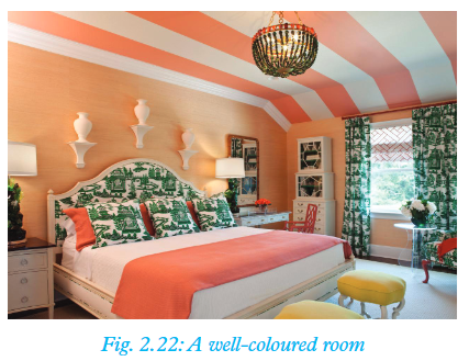
Note:
Colour can only be seen when there is light. Objects exhibit colour depending on the manner in which their surfaces reflect or absorb light. White surfaces reflect light whereas black surfaces absorb it. 1. Have you ever heard of the following types of colours?(a) Primary colours(b) Secondary colours(c) Tertiary colours2. What are they made of? Give examples from Fig. 2.21 above.Different colours can be combined to create a colour scheme for a given room or house as shown in Fig. 2.22 on page 43.
Types of colour schemes
Activity 2.9: Research Activity
1. Find out from the library or the internet the various types of colour schemes.2. Collect paints of different colours. Using manila paper and paint brush, try to replicate those colour schemes in a drawing of your choice.The facts
The following are the four basic types of colour schemes that can be used in decoration:• Monochromatic colour scheme• Analogous colour scheme• Triadic harmony• Complementary colour planWe will now look at these colour schemes in detail.(a) Monochromatic colour scheme
Look at the picture below. What is common in the picture? What colour scheme is it?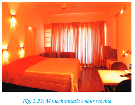 Monochromatic colour scheme is also known as one colour plan. Here, one colour is used as the key colour. An example is Fig. 2.23 above where orange has been used as the key colour. Monotony is broken using tints and shades of the same colour as shown.
(b) Analogous colour scheme
In this case, one uses a related colour plan. This means that the colours used are next to each other on the colour wheel. An example is yellow, yellow-green and green-blue. Different values and intensities of these colours can be used to create an interesting effect. Look at the following picture. What is common in the picture?
(c) Triadic harmony
This involves use of three colours that are equidistant and form a triangle on the colour wheel. The three primary colours give a good example of triadic harmony. Look at Fig. 2.25 below. What colours can you see? Compare the colours with those in a colour wheel. Can you observe any relationships? Triadic harmony is the most widely used form of colour plan.This is mostly because it provides the basis for many other practical combinations. In fi gure 2.25 green, orange and purple colours have been used.
(d) Complementary colour plan
Here, the used colours are directly opposite each other on the colour wheel. Look at the picture that follows. Which colours can you identify? What is the position of the colours on the colour wheel. Fig. 2.26 above is an example of a complimentary colour plan where colours i.e. red and green are used. A more pleasant effect has been produced by use of tints and shades of the two complementary colours.
Note:
There is also the split complementary colour plan; whereby instead of using colours that are opposite each other on the colour wheel, one can use a hue of one given colour and combine it with the colours on either side of its compliment. This basically means using colours that form a ‘Y’ on the colour wheel. Varying the strengths and intensities of the three colours provides interesting combinations to work with. An example of a split complementary colour plan combination is shown in Figure 2.27 below. The artist of the pot painting used yellow, green and violet colours to create a split complimentary colour scheme.
 What types of colour schemes do you see in the following areas around you?1. Your classroom2. At home3. In the Rwandan flag
Proportion of colours
This refers to the various quantities and concentrations of colours used. Even as we consider the various colour schemes, it is important that we understand the effects of proportion of colours on our decorations.Colour effects
Colour effects can also be used in decoration. Look at the picture below. Comment about the choice of the various items in the picture.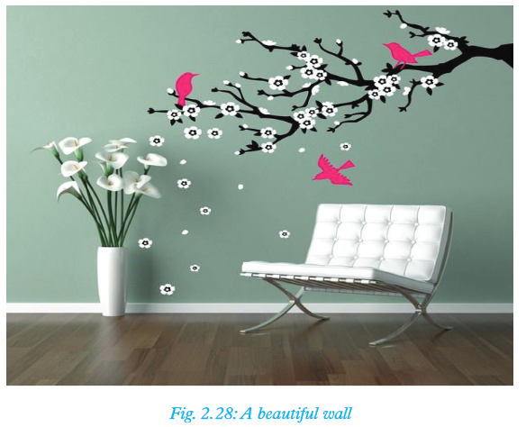
The facts
Walls as decoration and as backgroundWalls make for a crucial part of any house. Walls normally have two portions; the exterior and the interior. We shall however place focus on the interior part of walls; the part that is inside the house.Activity 2.10 : Research Activity
Find out from textbooks in the library or the internet about some of the factors to consider when choosing colours for the interior of walls of a home. List them down and compare your fi ndings with other groups.Look at the walls of the house in the picture below. What colour forms the background in the walls? Was that choice appropriate?
The facts
The following should be considered when choosing colours for the interior of walls in a house:• The intensity of natural light - This in many ways infl uences the choice of colours for house decoration. The colours chosen must blend well with the available natural light. Bright light will make colours like red, yellow and green appear more intense while dull natural lighting will make them appear less intense.• Light colours - These make a room appear larger and warmer while dull colours make it appear small and cold.• Accent in colour is created when a relatively small proportion of a certain colour is applied in a larger area. It is usually meant to offer contrast due to a variation in hue intensity or saturation. For instance, placing small proportions of a light colour on a dark background or small proportions of a dark colour on a light background will create an accent.• Colour intensity - If large areas of a light hue are used, the whole area will appear light. If large areas of dark hues are used, then the whole area appears dark as well. Alternating colour by intensity rather than proportion will also help in changing the perceived visual mix of colour.e) Use of furniture and fixtures in decoration
 1. Describe the furniture and fixtures you have at your home to your friend.2. How can you use the furniture and fixtures to make the house more attractive?Prepare a report and present it in front of your class.
The facts
Styles and colours can be very dynamic. It is therefore important to think ahead when re-modelling a room or designing colour schemes for a new home. Since fi xtures, such as the tub, the toilet, sinks and tiles can be diffi cult and expensive to keep replacing, choose those with a classic look and muted colour. This will ensure that they stand the test of time. White fi xtures are the best choice for bathrooms. However, the appearance of the bathroom can be made more colourful by playing around with more easily changeable items such as towels, pictures, curtains and wall hangings. These help to enhance personality and style in the lavatory. For example, what is your comment about the colour scheme in the picture below? When choosing colour for furniture and fi xtures, the following should be considered:• The desired effect• Purpose of the room• Existing décor• The user’s personal preference (personality and style)For furniture, it is also important to select colours that align with the present colour scheme. It is safe to select plain colours. However, flowery decorations can also be selected with care. They should also be selected with the future in mind.The material and design should also blend with the wall background to enhance unity. A good example of furniture in a room is shown in the figure below.
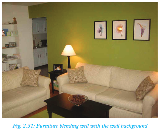
Project work
Form groups of five in your class. Work on a housing project. Collect the materials that you would require. Plan together on how you will construct a small house (Kernnel size) and how you will decorate it so as to look attractive. Implement your plan as a group then present the fi nished work to the teacher for evaluation. 1. Why is knowledge on colour schemes important when doing decoration?2. What colour combination options would you think of in a house with an orange wall?3. Why would it be inappropriate to have very bright colours in an office setting?
Remember the facts!
• In order to improve the appearance of anything ranging from homes, offices and various venues, decoration is necessary.• Appropriate use of colour is an essential part of decoration.• Decorative accessories are decorative items used to add beauty, as well as give personality and individuality to a room.• Examples of decorative accessories are:– Lamps and lampstands– Pictures and wall paintings– Mirrors and wall clocks– Flowers– Cushions– Lampshades– Draperies– Carpets• Balance and harmony can be achieved by the visual contrast that exists between colour combinations and good understanding of colour relationships.• If used imaginatively, colour can create the right mood and enhance the personality of a room.• Objects exhibit colour depending on the manner in which their surfaces reflect or absorb light.• There are three basic characteristics of colour:– Hue– Intensity– Value• Colours can be broadly classifi ed into three categories:– Primary colours (pure colours)– Secondary colours (a combination of two primary colours)– Tertiary or intermediate colours (a combination of a secondary colour and a primary colour).• The four basic types of colour schemes that can be used in decoration are:– Monochromatic colour scheme– Analogous colour scheme– Triadic harmony– Complementary colour plan• Other methods of decoration apart from use of colour schemes and colour harmony are:– Use of haberdasheries– Use of soft furnishings– Use of paintings– Use of furniture and fittingsTest your competence 2
1. Using a colour wheel, show the different colour schemes that can be constructed (use appropriate examples).2. Make a birthday card and use it to invite your friends during your birthday.3. Give examples of decorative accessories you know that are both functional and decorative.4. Which colour schemes have been employed in the pictures below? What advantages do they have? 5. Explain how light can affect choice of colours to be used on a surface.6. With use of appropriate examples, differentiate between tints and shades.7. Decorate your room at home using industrial beads.8. Write True or False.a) Using mirrors in a kitchen makes it look bigger. ____________b) Cushions are examples of decorative acecssories. ____________c) Light colours make a room appear smaller. ____________d) Light has no effect on colour in a room. ____________9. Assume you have just bought a new house. You are trying to furnish it. Why should you be extremely careful when selecting colours for the various fi xtures in the house?10. What colours would be appropriate for a hospital setting and why?11. Describe how you would use the different colours in any specifi c room in the house.12. Make a wall painting of your choice, hang it on the wall of your classroom.13. Why do you think interior design and décor is a thriving career today?14. Match the following characteristics of colour with the correct scheme.
 15. Fill the gaps in the following sentences.(a) Secondary colours are obtained by mixing ______ and ______ colours.(b) Tertiary colours are obtained by mixing ______ and ______ colours.(c) (i) Blue + Yellow = ______(ii) Red + Blue = ______(iii) Yellow + Red = ______(iv) Blue + Green = ______(v) Red + Violet = ______16. Assume your parents have allocated you the village house to decorate. Describe how you will go about doing this task in a responsible manner. Go ahead and carry out the task when you visit the village.
Glossary
Achromatic: A term that refers to lack of hue, for example black, white and grey.Analogous: This refers to colour scheme produced when related colours (appearing side by side on colour wheel) are used together; for example, green, yellow-green and blue-green.Chandeliers: These are branched decorative light fixtures suspended from the ceiling with the capacity to hold several bulbs or candles.Chromatic colours: A term that refers to presence of hue, for example red, green, blue and yellow.Colour Scheme: This refers to a combination of colours aimed at producing a certain effect - mostly applied in interior decoration.Colour wheel: This is a wheel of 12 colours - three primary, three secondary and six tertiary colours arranged in the same way as those of a rainbow.Complentary colours: These are colours which appear opposite each other on the colour wheel and are direct contrasts. Examples are; red and green, blue and orange; violet and yellow.Draperies: This is a term used to refer to long curtains covering a large section of a wall.Furnishings: The term furnishing refers to a piece of equipment necessary for comfort or convenience. Examples are furniture, carpets, curtains and related items.Harmonious colours: These are colours that appear adjacent on the colour wheel such as green, yellow-green and blue-green. Hue: A term used to refer to colour.Intensity: This is the degree of brightness, purity or dullness of a colour.Monochromatic: A term used to refer to something that is having or appearing to have one colour.Pendant: A pendant is a lighting fixture suspended from a point, for example, the ceiling.Secondary colours: These are colours obtained by mixing equal parts of two primary colours. For example, green is a secondary colour composed of blue and yellow.Shade: This is the colour produced when black is mixed with any other colour. For example, maroon is a shade if red.Tertiary colours: Also known as intermediate colours. They are formed when primary colours are mixed with secondary colours or where they overlap in the colour wheel. For example, blue and green gives blue-green colour.Tint: This is the colour produced when white is mixed with any other colour. For example, pink is a tint of red.Tone: Also known as value. It refers to the degree of lightness or darkness of a tint or shade.Triad harmony: This is a type of colour scheme where three primary or three secondary or three tertiary colours are used together.