General
- Fine Arts an crafts S2 SB File Uploaded 24/01/22, 15:12
- S2: Fine Arts & Crafts TG File Uploaded 11/08/22, 21:48
UNIT3:Letter Styles, Illustration and Design Technology
My goals
By the end of this Unit, I will be able to:
⦿ Explain the basic elements of design.
⦿ Write using calligraphy.
⦿ Design a magazine cover.
⦿ Communicate through designing.
⦿ Share ideas about own work and that of others.
Introduction
In Senior One you studied about letter construction and made
designs with letters. You also learnt that neatness is important
for producing attractive designs. In this unit, we are going
to look at other designs that can be made with letters. Look
at the designs in Figure 3.1 and answer the questions that
follow.
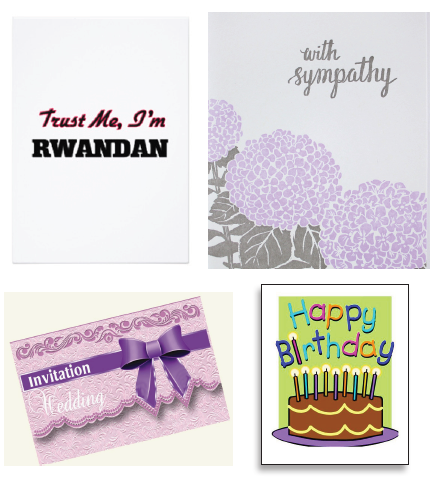
Figure 3.1: Different designs of cards
Activity 1
1. What messages do you read ifrom the four different
cards?
2. Describe the colours that were used in the four different
designs.
3. What type of letters were used in the designs?
The major aspects of a design
I hope you were able to note that letters play a very important
role in bringing out the message for each card. Letters must
be carefully designed to look neat and legible.
Therefore, the key aspects which must be considered while
designing cards, posters and book covers include the following:
·· The layout: this refers to a particular plan or outline acceptable
for a given design. Each design has a particular layout. This
has to be spread out for clarity.
· Message: the design has to communicate to the observer.
· Lettering: the choice and construction of letters in a design.
Letters have to be legible so as to bring out a clear message
to the observer.
· Balance: space has to be wisely distributed throughout the
design.
· Neatness: a design has to be clean and attractive to the
observer.
· Colour choice: the colours used must relate to the
message being communicated. Dull colours tend to kill the
attractiveness of the design. Contrast is often followed when
applying colours in a design.
Activity 2
Discuss how the aspects discussed above were achieved
in the works presented in Figure 3.1
Different letter styles in design
We have already seen that letters play an important role in
conveying a message in many designs. In Senior One you
practiced letter construction and you were introduced to
different letter styles. By now you know the difference between
upper case and lower case. The choice of letters depends on
the nature of the design you want. There are two major types
of letter fonts; i.e. formal letters and fancy letters.
Formal letters are not so decorated. They are easy to read and
are often used to pass on important messages to the viewer.
Look at the fonts in Figure 3.2.

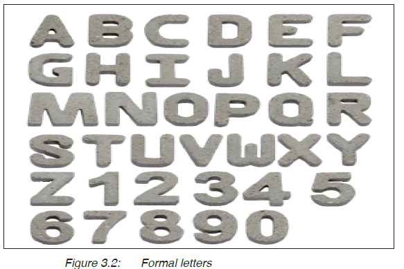
Formal letters are good for designing posters and book covers
which carry formal information. Look at the following examples
in Figure 3.3

On the other hand, there are fancy letters. These look
complicated and more difficult to construct and read. They are
often used to design works which are more decorative such
as cards and fancy magazines. For example look at the letter
fonts in Figure 3.4.
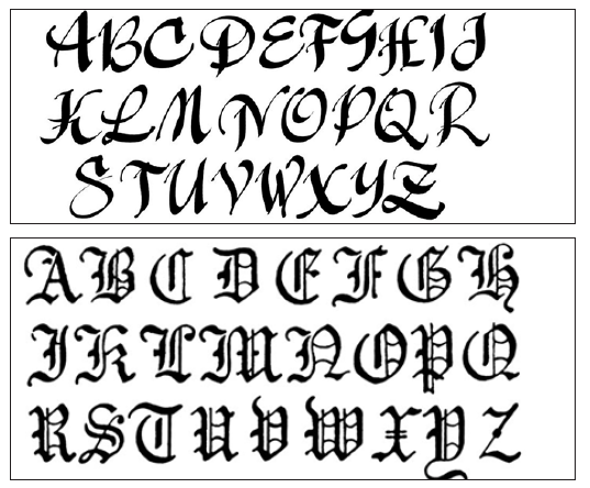
Figure 3.4: Fancy letters
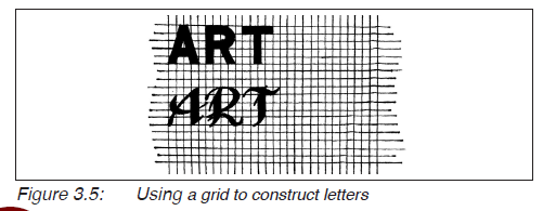
You can use a grid while constructing different letters, for
example look at Figure 3.5.
Activity 3
1. Practice with letter construction by following the guide
lines you learnt in Senior One. These include; the base
line, mid line and cape line for the upper case, and the
ascender, mid line, base line and descender for the lower
case in addition to a grid.
2. Try it out with the formal and fancy letters.
How to design a magazine cover
For any design work, it is important to plan for it by going
through the design process. You must know the proper lay out
and the main features of the work you are going to design.
Activity 4
1. Look at the magazines in Figures 3.6, 3.7, 3.8 and 3.9,
and discuss the features common to all the magazines.
2. Write the title for each magazine.
3. Mention the author for each magazine.
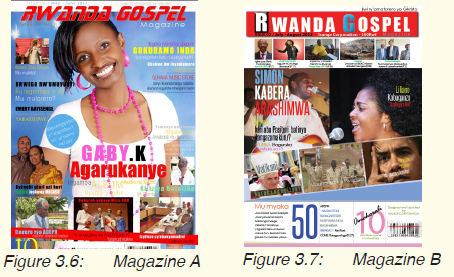

You may have observed that the examples presented have
many words and images. However, in designing you have to
make your work simple and attractive. A magazine has the
following important components;
· A front cover; with a name of the magazine, the different titles
of the articles found inside, and an illustration or illustrations.
Titles can be arranged in any way that is interesting to the
observer as long as balance is achieved.
· A back cover which usually has an image of the author and
publisher.
Look at the layout in Figure 3.10.
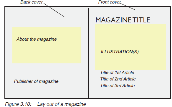
Take note:
· Any design you make must fit within the particular
measurements (dimensions).
· The front and back cover of a magazine share the same
dimensions (A × B) where “A” is the length and “B” the
height .
· The choice of colours should match with the message on the
magazine.
· The illustration should add to the meaning of the title of the
magazine. This has to be simplified to avoid confusing the
reader.
Activity 5
1. Design a magazine cover with a title “The Beauty of
wild ld Life” written by Peter Kayibanda. The magazine
should have dimensions 15cm by 20cm. Use only three
colours.
2. Display your work and discuss it with your classmate.
Assessment
Using letters of your preference, design an invitation card for
Senior Two students. The card should invite students for a
nature talk to be held at your school on a date of your choice.
Glossary
Author: an individual who writes a book.
Balance: a state of equal distribution of elements in a
given design.
Design process: the stages of making sketches for a given design
Fancy letters: the type of letters with decorations.
Feature: character of a given work of art.
Formal letters: the type of letters with no decorations. These are
often easy to read and construct.
Illustration: an image or a set of images which accompanies
a design to add to its meaning.
Layout: the spread out or general outline of a design
presented on a flat surface.
Lettering: the art of letter construction regarding type, size
and neatness.
Message: the ability of a design to communicate.
Neatness: the appearance of a design with minimum
mistakes.
Publisher: the organisation which organises, proofreads
and prints out a particular book or magazine.