Topic outline
General
- Fine Arts an crafts S2 SB File Uploaded 24/01/22, 15:12
- S2: Fine Arts & Crafts TG File Uploaded 11/08/22, 21:48
unit 1:Still Life and Nature
My goals
By the end of this Unit, I will be able to:
⦿ Explain the elements of art.
⦿ State the difference between dry and wet media.
⦿ Draw and paint objects in composition.
⦿ Paint a landscape.
⦿ Draw from a human figure.
⦿ Respect the opinions given by others about my own
work.
Introduction
In Senior One, you were introduced to different materials used in
drawing and painting. You also practiced with the elements of art such
as shape, line, tone, colour and texture. You also observed and drew
objects in composition as still life, as well as single objects picked from
nature.
Remember, still life is the study of objects in composition, in relation to
their immediate background. Yet nature is the analytic study of objects
from the natural environment.
Based on your past experience, do Activity 1.
Activity 1
1. Visit your surroundings and pick a twig with three
leaves.
2. Using a pencil and paper draw the twig.
3. Exchange your drawing with your neighbour.
4. Discuss each other’s drawing by pointing out the
strengths and weaknesses that you are able to observe.
(Assessment is done in terms of use of space, shapes,
tones and texture).
5. How can such weaknesses be improved for a better
drawing?.
Observation of the drawings
I hope you were able to observe that in some drawings from
Activity 1, the object was too small for the paper. In some
drawings still, the object could not fit on the paper. The two
cases usually happen if you have not taken time to compare
the size of the object with that of the paper. Space should be
used comparatively, to make sure that the object drawn fits
well on the paper.
Observe the two pictures in Figure 1.1 and answer the
questions in Activity 2.

Figure 1.1: Studies of plants
Activity 2
1. Identify the different types of lines used in the two
pictures.
2. Mention the colours that were used in the two pictures.
3. Describe the types of shapes in the pictures.
4. Describe the kind of texture in the work.
Elements for drawing and painting
Remember, in order to draw and paint well, you need the
building blocks to follow. These are the elements of art. They
include space, line, shape, tone, form, structure, colour and
texture.
(a) Space
When you look around you, you can see different objects, and
people including your neighbour. But at the same time there
are areas you can see which are occupied by nothing. All
these are part of space. Therefore space is simply emptiness.
However, in drawing and painting, we have both negative and
positive space. For example, look at how space was used in
Figure 1.2
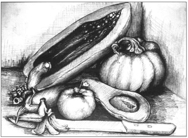
Figure 1.2 : A still life composition of fruits
The area occupied by objects in the composition is called the positive
space. The area around the objects is what we call negative space.
We always begin drawing and painting by identifying the space in
which to create our compositions. After identifying space, we use
other elements to form our drawings and paintings.
Observe the compositions in Figures 1.3 and 1.4 and work out
activity 3.
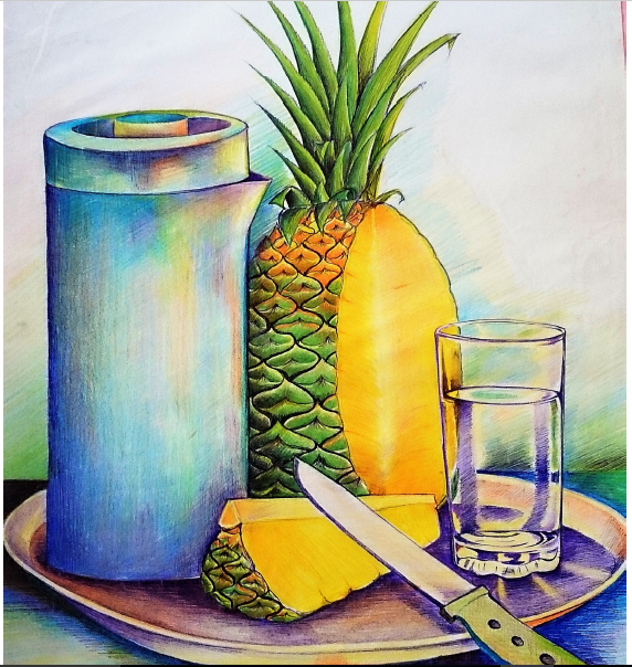
Figure 1.3: A still life composition in colour
Activity 3
Space in a still life composition
1. Identify the positive and negative spaces in the two
pictures above.(ie Figure 1.3 and Figure 1.4)
2. Comment on how space was created in the two
compositions.
3. Mention the objects and the colours used in the two
different pictures.
Take note:
The paper you are given for drawing or painting provides you
with the space in which to fit your drawing or painting.
In drawing and painting, a good composition balances space.
The picture you draw has to fit within the space provided.
Never cut off parts of the object drawn or painted in a given
space.
Leave same space on the left and right side of the paper. The
upper space should be bigger than the lower space left on
the paper, thats how negative space is balanced in drawing
and painting.
Space is controlled in order to create a feeling of depth in the
composition.
(b) Line and shape
In Senior One, you identified the different materials used in
drawing. After identifying what to draw in a given space and
the suitable materials to use, we use lines to draw or paint.
Lines play a vital role in drawing different shapes of objects.
Remember, shapes can be either geometric or natural
(organic).
Geometric shapes are more regular, they include circles,
squares, rectangles and triangles. Natural shapes are irregular
such as a shape of a stone, tree or leaf.
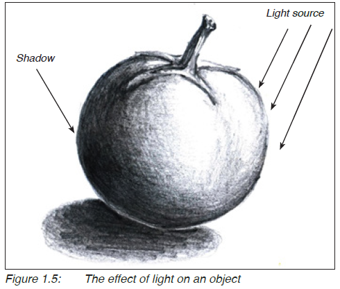
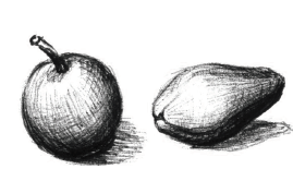
(c) Tone and form
After drawing the required shapes of objects in the composition,
then you can apply tones according to the light direction. It is
the tones that bring out the forms of objects in the composition.
As light fall on an object, it casts a shadow on the opposite
side.
Therefore tone refers to the variation from light to dark on the
surface of an object as light falls on it. On the other hand form
is the roundness of an object.
For example, look at the effect of light on the drawing of a
tomato in Figure 1.5.
Activity 4
Responding to light and shade
1. Arrange three objects from your surroundings to form a
composition.
2. Using a pencil and paper, draw the composition; first in
lines and then shade the composition to create forms
and shadows.
3. Display your work and discuss it with your friends
regarding the use of tones to create the forms in the
composition.
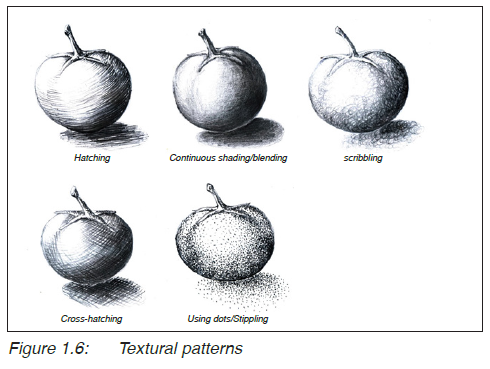
(d) Textural patterns
During the process of trying to draw the forms of objects
in a given composition, there is need to show their surface
quality (texture). Are the objects smooth, rough or coarse?
This question is answered by using textural patterns that fit
the objects being studied. Textural patterns depend on the
shading technique used. For example, look at the textural
patterns on the objects in Figure 1.6.
Hence, textural patterns refer to the appearance of the surface
of an object according to the shading technique used.
Activity 5
Dealing with textural patterns
1. Pick three objects with different texture, from your
surroundings and arrange them to form a composition.
2. Draw the objects on a piece of paper and use different
shading techniques to capture the different surface
qualities of the objects.
Take note:
· Texture varies with the form of a given object.
· Where the tone is light, the texture is light and vice versa
Types of colour application
In Senior One, you studied about colour and you looked at
primary and secondary colours. Primary colours are basic and
are only three ie. Red, Yellow and Blue. Besides, secondary
colours are got after combining two primary colours. Secondary
colours include orange, green and violet. When you combine
a secondary colour with a primary colour, you get a tertiary
colour. For example, study the colour combinations in Figure
1.7 and Figure 1.8.


Activity 6
Colour mixing
Mix the different colour combinations. Remember to always
use equal amounts of the different colours in order to come
up with the right mixture.
Colours can be used to capture objects in a still life composition.
Colour can be classified under different properties such as
hue or purity, value and intensity. A hue refers to a colour in
its purest state. The common hues include yellow, red, blue,
green and purple as they appear on a colour wheel. Look at
Figure 1.9.
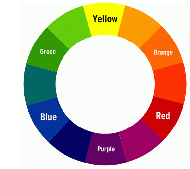
Figure 1.9: Colour Hues
Value refers to the darknes or lightness of a colour; if a colour
is dark, its value is low and if a colour is light, its value is light
for example, look at Figure 1.10.
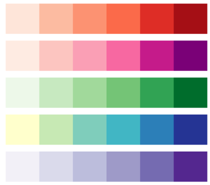
Figure 1.10: Colour Value
On the other hand intensity refers to the brightness or dullnerss
of a colour, for example look at Figure 1.11 Intensity also
refers to saturation.

Colour can also be classified as being (colour temperature)
hot, cool, complementary and supplementary/analogous. Hot
colours strike the eye; these include red, yellow and orange.
Cool colours do not strike the viewer’s eyes; they include;
brown, green and blue. Supplementary colours appear next to
each other on the 12 part colour wheel eg; yellow and orange
or blue and purple. Complementary colours appear opposite
each other on the colour wheel such as; green and red or
yellow and purple.
In painting, black is considered to be a shade, a colour
darkens when it is added with black. On the other hand white
is consider to be a tint. A colour becomes lighter when added
with white.
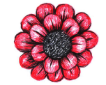
In order to paint a good picture, select colours according to the
natural appearance of the objects being studied. For example
look at Figure 1.12 and observe how colours were used to
reflect the natural appearance of the objects
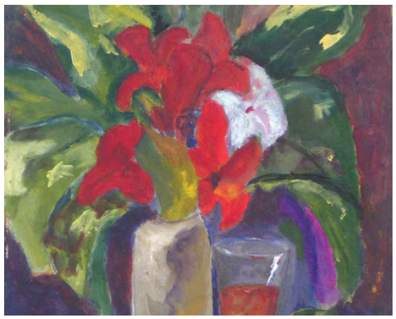
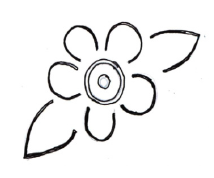
Figure 1.12: A painting of flowers
.Activity 7
Observation exercise
Observe the picture in Figure 1.12 and do the following:
1. Identify the objects in the composition by their colours.
2. Mention the primary colours, secondary colours and
tertiary colours that you can see in the composition.
The Principles of Art
As you follow elements of art while drawing and painting, you
need to follow guidelines. These guidelines or rules are referred
to as the principles of art. They include balance, rhythm,
pattern, perspective, unity/harmony and proportionality.
1. Balance: This refers to a state of equilibrium when all
elements in an artwork are well arranged. Balance can be
symmetrical, asymmetrical or radial.
 (i) Symmetrical balance is also called
formal balance. This is achieved when
the opposite parts in an artwork are
exactly or nearly the same in respect to
a vertical / horizontal axis. For example,
look at the symmetrical balance on the
human face in Figure 1.13.
Figure 1.13: The human face
(ii) Asymmetrical balance is also
called informal balance. It

refers to balance by visual
weight. It can be achieved
when a work of art is looked
at in totality when all parts of
the work seem to agree with
each other even if they are not
equal with each other. For example
look at Figure 1.14
Figure 1.14: A painting showing asymmetrical balance
 (iii) Radial balance is a type
where elements are
equally distributed from
the center. For example
Figure1.15
Figure 1.15: A painting showing radial balance.
Activity 8
Look at the works of art from your surroundings and
identify those where symmetrical, asymmetrical and radial
balance has been achieved.
2. Rhythm is a principle of art which focuses on visual
movement in a work of art. It is achieved when there is a
feeling of movement from one part of the work to the other.
For example, look at the design in Figure 1.16
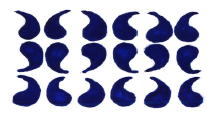 3. Pattern refers to repetition of elements such
as line, colour texture over and over to create
an impression work of art. For example,
the design in Figure 1.16 consists of curved
patterns.
Figure 1.16: A design showing rhythm and pattern
Activity 9
(i) Choose one geometric shape (eg circle, triangle and
square) draw and repeat it several times on a piece of
paper to form a pattern with rhythm. You are free to
use any colours of your choice.
(ii) Display your work and discuss it with your fellow
students to judge which pattern is more rhythmic.
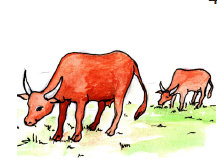 4. Perspective: In Senior One, you were
introduced to linear perspective, where
you focused on the use of lines to show
perspective in landscapes. As a principle
of art, perspective refers to the variation
in size, tone and colour of objects with
distance. Near objects look bigger/brighter
compared to those seen at a distance. For
example look at Figure 1.17.
Figure 1.17: Animals seen at different points.
 5. Unity/harmony: This
principle is achieved
when all, elements
in given work of
art (such as lines,
colour and texture)
agree with each
other. For example,
look at Figure 1.18.
Figure 1.18: A painting showing unity/harmony
6. Proportionality: This refers to the relationship of different
parts of an object in terms of size. Naturally, there are sizes
which are considered normal and when such sizes change
compared to others, they are considered abnormal. For
example the size of human hands is small compared to
that of legs. Or a passion fruit is considered smaller than
a pumpkin. Therefore when drawing or painting, always
consider the right sizes of the objects or parts of the objects
in order to achieve the right proportions.
Take note:
 In drawing and painting some
objects which are known to be
small may appear bigger than
those which are known to be
big, due to perspective. For
example look at the drawings
in Figure 1.19.
Figure 1.19: Passion fruit appearing bigger than a pawpaw
Working with dry and wet media in drawing and painting
What we use to draw and paint pictures (such as pencils,
crayons, pastels and water colours) is often referred to as a
medium. When there are many different materials, they are
referred to as media. Media can either be dry or wet.
Drawing with dry media
Pencils are commonly used in drawing. These are part of the
dry media. Dry media refer to materials which do not flow.
Other dry media include crayons and coloured pencils. For
example, look at the two drawings in Figure 1.20. One was
drawn using crayons and the other one by use of coloured
pencils.
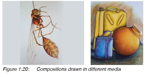
Activity 10
Drawing with dry media
1. Look at Figure 1.20 and identify the picture drawn with
crayons and the one drawn with coloured pencils. What
is the difference?
2. Using either coloured pencils or crayons draw a
composition of three objects picked from your
surroundings.
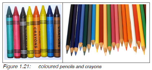
Take note:
Coloured pencils usually give a clear picture compared to
crayons.Crayons differ from pencils as shown in Figure 1.21
Drawing or painting with wet media
Wet media refer to materials which can flow. Using such
materials requires you to add a liquid in order to make it
flow well. You may need a brush in order to paint a given
composition.
These materials include inks, water colours and powder
colours. Observe Figures 1.22 and 1.23, and work out the
questions that follow.
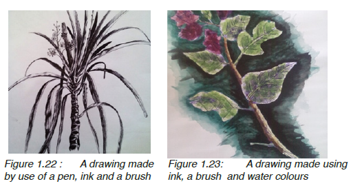
Activity 11
1. What is the difference between the two drawings in
Figure 1.22 and 1.23?
2. Using a pen and ink draw a twig of a plant from your
school compound.
3. Display your work and discuss it with your friends,
regarding how the materials have been used to create
tones and form.
Take note:
When you are going to draw or paint with wet media, always
begin with a sketch in pencil. This helps you to draw the right
shapes and the proper arrangement of the objects in a given
composition. Pencil work can easily be adjusted by rubbing
out. Ink and water colours cannot easily be changed.
Study of a landscape
Our environment is a rich resource for the study of landscape.
A landscape is the natural scenery. Such sceneries include
plants, houses, etc. You will enjoy your studies by moving out
of your classroom and observe the surroundings. Look at the
landscapes in Figure 1.24 and try out Activity 12.
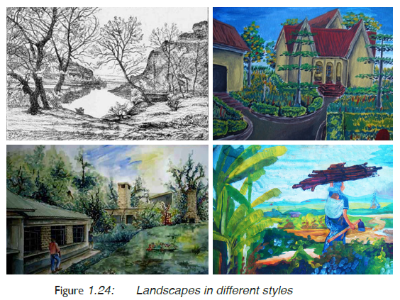
Activity 12
Study the landscapes in figure 1.24 and do the following:
1. List the different objects in the four landscapes.
2. Identify the materials that were used to draw or paint
these landscapes.
3. Discuss how space was used, how the shapes of different
objects were painted/drawn and the sizes of objects were
varied to achieve depth.
Much as your environment is rich for your studies of a
landscape, you do not have to include everything that you see.
You need to select the best view. This can be done by using
a view finder. A view finder is made by cutting a rectangular
shape on a cardboard, as shown in Figure 1.25.
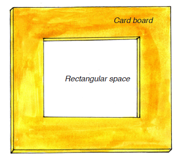
Figure 1.25: A view finder
How to use a view finder to study a landscape
You hold your view finder in one hand and through its space,
observe the landscape ahead of you. You then you sketch only
those objects which appear within the view finder’s space.
Look at the Figure 1.26.
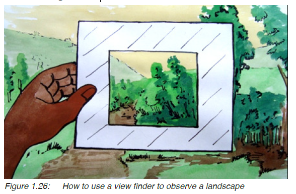
Take note:
The closer the view finder is to your eyes the bigger the area
of study and vice versa.
Keep the distance between the view finder and your eyes
uniform throughout your study of the landscape
Activity 13
Study of a landscape
1. Using a cardboard and cutter, prepare your view finder.
2. Go outside your classroom and use your view finder to
select a suitable view from your surroundings.
3. Draw or paint the landscape.
4. Display your work and discuss it with your friends.
Human figure drawing
In Senior One, you were introduced to human figure drawing
and you learnt that human figures can be drawn either from
observation or imagination. You also learnt that getting the
right posture (the way the human figure is sitting or standing)
of the human figure is important. This demands for continuous
practice with different studies of the human figure with
different materials. Now study the images in Figure 1.27 and
work out activity 14.
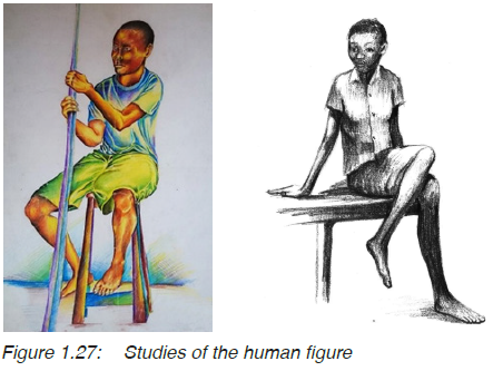
Activity 14
1. Study the seated figures in Figure 1.27 and discuss how
lines, shape, colour, tones texture and space were used to
bring out the posture.
2. Draw one of these pictures on a piece of paper.
3. Share your work with your neighbour and discuss it
regarding the posture and use of space. How do the
different parts of the body relate to each other in your
drawing? (Proportions).
How to get the right proportions
In the examples above, you note that the artists tried to get the
right proportions of the human figures. You can always check
the proportions of your human figure drawing by comparing
the size of the head to the rest of the body parts.
Activity 15
Stand up, look at each other and discuss the following:
1. Compare the size of the arms to the rest of the body.
2. Compare the size of the legs to the rest of the body.
3. Lastly compare the size of the head to the rest of the body
parts (i.e. the hands, legs and the torso).
A fully grown human being is believed to have about eight
head-lengths in height. Figures 1.28 and 1.29 show the
relationship between the head-length and the rest of the body
parts of the female and male human figures.

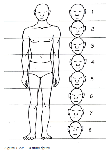
You can observe that the elbow is at the same line with the
navel for a standing posture. The lower leg matches with the
upper leg and the torso in height. There are two head-lengths
for the lower leg and the same applies to the upper leg and
torso each. The height of the head matches with the length
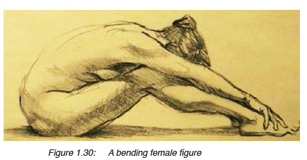
of the foot of the human figure. For example, observe the
relationship of the body parts in Figure 1.30.
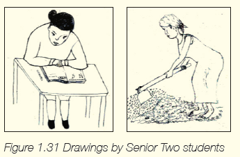
Activity 16
1. The following drawings were made by Senior Two
students. Observe the human figures in Figure 1.31 and
discuss the challenges with their proportions.
2. Following the right proportions draw a human figure in a
standing posture.
3. Display your work and discuss it with friends, regarding
proportions and posture.
Assessment
1. What is the difference between dry and wet media?
2. Using materials of your choice, draw an insect or animal from
your surroundings.
3. Draw or paint a standing boy, dressed in a short sleeved shirt
and a pair of shorts.
Glossary
Head-length: the size of the head from the chin to the end of the
forehead.
Imagination: using one’s mind to create ideas.
Negative space: area around the objects in a drawing or painting.
Observation: using eyes to look at something in details.
Posture: the way a human figure appears to the viewer, either
standing, sitting of sleeping.
Positive space: the area occupied by objects in a drawing or painting.
Proportions: relationship of different body parts of a given object.
Resource: a set of things from which an idea is developed.
Torso: the middle part of the human figure excluding the
hands, legs and head.
Landscape: a natural scenery which may include, plants houses,
animals etc.
Element of art: building blocks followed while making and talking
about a work of art.
View finder: a card with a square or rectangular space used to
select a particular area in a landscape for study.
Dry media: materials which do not flow such as pencils and
crayons.
Wet media: materials which flow as they are used in drawing
such as painting.
Still life: a study of objects in composition in reflection to their
immediate background.
Nature: a study of objects picked from the natural
environment.
Principles of Art: guide lines or rules followed while making or
talking about a work of art.
File: 1UNIT 2:Motifs, Patterns and Design Process
My goals
By the end of this Unit, I will be able to:
⦿ Identify patterns from the surroundings.
⦿ Develop a motif for printing.
⦿ Print patterns on surfaces using stamping and stenciling.
⦿ Share ideas with others about own work.
Introduction
In Unit one, we explored objects from the environment for
drawing and painting. But the same objects can be used
in a different way. Look at the different objects from your
surroundings (such as shirts, dresses, skirts, carpets and
curtains). What patterns can you see? Now look at the examples
in Figure 2.1 and do activity 1.
Figure 2.1: Objects with different patterns
Activity 1
Identifying patterns
1. Look at the designs on the works in Figure 2.1. Identify
the shapes that were used to develop the patterns.
2. Find some other patterns including some which look
really Rwandan, either traditional or modern.
3. Identify the shapes that were used to develop the
patterns.
4. Which shapes are natural and which ones are
geometric?
5. Mention some natural objects from which these patterns
might have been gotten from.
Indeed such interesting patterns can be got from objects from
our environment. These include both natural and artificial
objects. You may pick interest in their shapes, texture and
colour in order to create your own pattern. Now look at some
of the possible sources of patterns from the environment in
figure 2.2

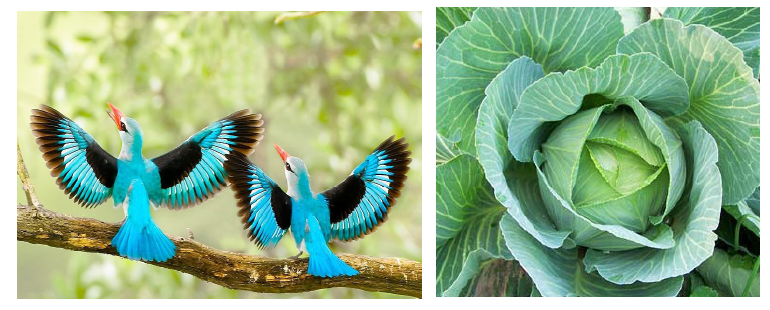
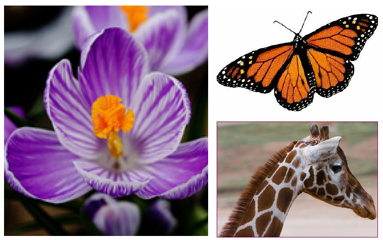
Figure 2.2: Objects with patterns
How to make a motif
The process of making a motif (pattern) is what we call a
design process. In order to make your pattern, you go through
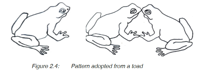
several steps and changes. For example, study the following
steps of creating a motif from a frog.
 Step 1
Identify an interesting
object from your
surroundings. This is
often called a source
of inspiration. Draw
it on a piece of paper
as shown in Figure
2.3.
Figure 2.3 A toad
Step 2
Simplify the shapes into outlines. You could join two of these
shapes facing and touching each other, to create a pattern
as shown in Figure 2. 4. This can be done with the help of a
tracing paper
 Step 3
Shade these shapes into
black patches to create
positives as shown
in Figure 2.5. The
remaining white space
is called negative.
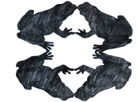 Step 4
This could be repeated
and joined as a reflection
on the same paper, as
shown in Figure 2.6.
Look at the pattern being
formed.
Figure 2.6: Repeating the patterns to enrich the design
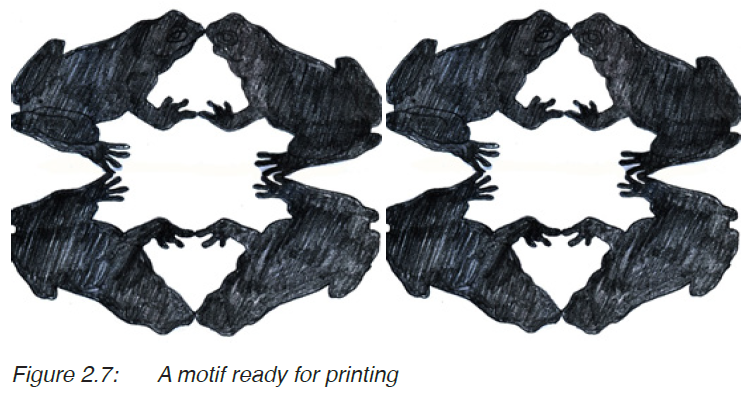
Step 5
The design can be repeated to create an interesting pattern
for your motif. Look at Figure 2.7. The black patches form the
positives and the white space forms the negatives.
Activity 2
1. Choose a different natural object, animal, flower or plant
(not a toad).
2. Follow the steps above and develop your own pattern for
printing.
3. Display your work and discuss it with your friends
regarding its attractiveness and movements.
Take note:
·· When you are creating a pattern for printing, try to balance
the positives with negatives.
·· There is no particular way of organising the shapes for your
pattern. The arrangement largely depends on your creativity.
·· While creating a motif, it is very important to follow rhythm
(Movement and balance).
After developing a pattern on a piece of paper, it is your duty
as a designer to transfer it on to another material where it
can be used for other purposes. This can be done by printing.
Printing is a process of reproducing a pattern or design on a
given surface. Printing is done in several ways, but at this
moment we are going to look at impression, stamping and
stenciling.
Printing by impression
Sometimes you can transfer a pattern from one source to
another by impression. In order to use this method, you need
a pattern from a hard surface, such as a stone, tree bark, a
coin, shoe sole, etc. Then you use this pattern to create an
interesting design in colours of your choice. For example, you
can develop a pattern by following the steps below.
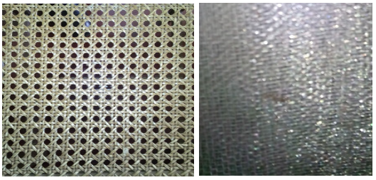 Step 1
Get a surface from
your surroundings,
with an interesting
pattern. For
example, look at
the surfaces in
Figures 2.8 and
2.9.
Figure 2.8: Texture of a
chair seat
Figure 2.9: Texture of a
wire mesh
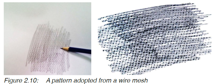
Step 2
Put the piece of paper on top of the object with the pattern
and rub the surface with a pencil so that the pattern is seen on
the paper. For example, the pattern in Figure 2.10 was taken
from a wire mesh.
 Step 3
Repeat this several
times until you cover
the whole space with
the pattern. You could
use different coloured
pencils to enrich your
pattern as shown in
Figure 2.11.
Activity 3
Creating a pattern by impression
1. Pick an object with a pattern from your environment and
create a pattern using the impression printing technique.
Use different colours of your choice.
2. Display and discuss your work with your classmates.
Focus on the choice of colours, neatness and
attractiveness of the pattern.
Take note:
·· Printing by impression is used to create designs on a small
scale and it is better used on paper.
·· Using different colours makes the pattern look more attractive.
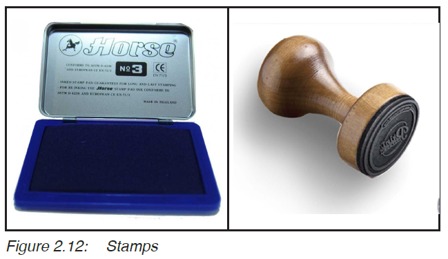
Printing by stamping
Probably you have seen stamps with letters and images, used
in different places such as schools, post offices and hospitals.
These are sometimes circular, square or rectangular. Such
stamps are used to pass on the same message to many
sources.
Observe the pictures in Figure 2.12,as well as Figure 2.13
and answer the questions in activity 4.
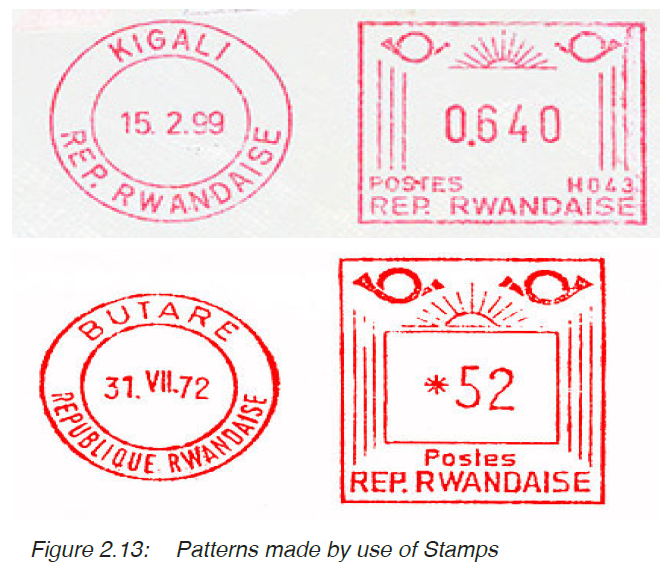
Activity 4
Creating a pattern by stamping
1. What is unique or special about the letters and images
on these stamps?
2. How do these stamps operate?
You may have observed that these stamps have images which
stick out but they are inverted, that is the reverse of the stamp
you want. When a stamp is pressed on to an ink pad, it picks
up ink and when it is pressed on a piece of paper, it releases the
ink following the protruding or sticking out images.
The same idea can be used to create patterns through a process
called stamping. This was briefly introduced to you in Senior
One. You can use soft materials such as irish potatoes, or
sweet potatoes and a cutter. You need the following materials;
materials for printing, photo cutter, printing ink as shown in
Figure 2.14.

Consider the following steps.
Step 1
Draw a simple pattern on paper as shown in Figure 2.15. This
can be developed from objects from your surroundings.

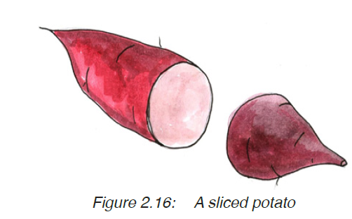 Step 2
Slice the sweet
potato into two parts
as shown in Figure
2.16. (Make sure
the sliced part is
flat)
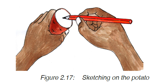 Step 3
Sketch the pattern on
the flat surface of the
potato with a pencil.
Look at figure 2.17.
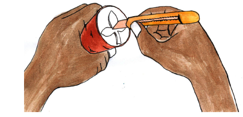 Step 4
Then use a cutter to
cut away the negative
space to retain the
pattern on the surface.
Your pattern should
be left protruding as
shown in Figure 2.18.
Figure 2.18: Cutting the pattern on a potato
 Step 5
Dip the pattern in
colour or ink as shown
in Figure 2.19. Make
sure that it is only the
pattern which touches
the colour and the rest
of the potato remains
clean.
 Step 5
Print your pattern on another
surface (such as cloth or
paper). The printing is repeated
to form a complete design on
the surface as shown in Figure
2.20.
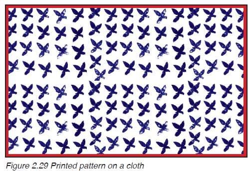
Figure 2.20: The printed pattern
The final work appears as shown in figure below

Figure 2.21: The printed pattern
Activity 5
1. Follow the steps above and create your own design.
2. Display your work and discuss it with your classmate.
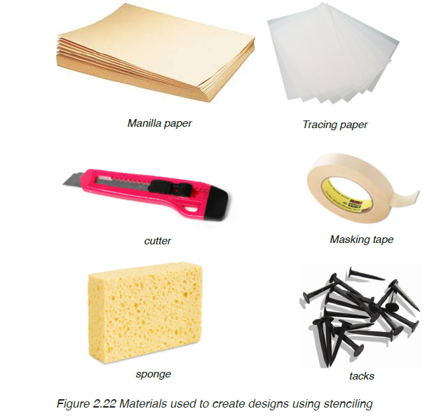
Printing by stenciling
Stenciling as a printing technique, comes from the use of
a stencil to transfer a given design on a given surface. A
stencil can be made from a hard material (Figure 2.18) such
as manilla paper or transparences. You need the following
materials in place, then follow the steps given to make your
print.
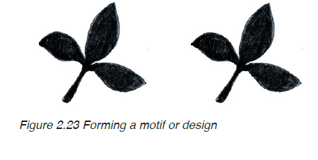
Step 1: The design process
Making a print usually begins with the design process. At this
stage you make sketches of an object which inspires you from
your surroundings as studied in Unit 1. The process continues
until you prepare your motif or design on a piece of paper
such as the one in Figure 2.23. Remember always to develop
a well-balanced motif.
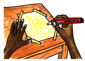
Step 2: Fixing the stencil on to the motif
If your stencil is transparent, use a masking tape to fix it on
top of your motif on paper, along a flat surface. This can be on
top of a table or desk as shown in Figure 2.24. This is done
so that you can observe the design from underneath. If you are
using an opaque stencil such as a manilla paper, use a tracing
paper to transfer your design on to the stencil.

Figure 2.24 Fixing a stencil on the motif
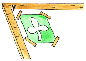
 Step 3: Cutting out the
positives
Use a cutter to cut out
the pattern on the stencil
as shown in Figure 2.25.
When cutting the stencil,
you should only cut out
the positives and leave out
the negatives. Take care to
avoid hurting yourself
Figure 2.25 Cutting the pattern on a stencil
Step 4: Stretching out the
cloth
 Stretch the cloth on top of the
table. You can use tacks to fix
it in the same position. Look
at Figure 2.26. Remember
before printing the cloth has to
be washed, dried and ironed
in order for your printing paste
to register well.
Figure 2.26 A cloth stretched on a table ready for printing
Step 5: Fixing the stencil on
the cloth
Place your stencil on the
surface of the material you
are going to print on as shown
in Figure 2.27. You could use
pins to fix the motif in position.
Figure 2.27: Fitting the motif on the cloth for printing
Step 6: Printing with a sponge
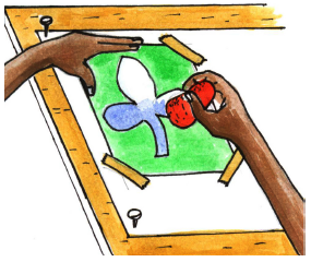
Use a sponge to print your design
as shown in Figure 2.28. Repeat
the process until the whole cloth
is covered with the design. Take
care as you print; when you apply
a lot of force, the printing ink can
easily spread beyond the intended
lines. On the other hand, if you
print with too gently, the design
becomes faint.
Figure 2.28: Printing the pattern on a cloth with a sponge
Activity 6
1. Design your pattern on cloth by following the steps
given.
2. Display your work and discuss it with friends regarding
balance, rhythm and neatness.
Assessment
1. Get a source of inspiration from your surrounding and
develop a motif.
2. Choose a method of your choice (either stamping or
stencilling) and print your motif on a cloth of half a square
meter.
3. What is the use of a stencil in the process of printing?
4. What is the difference between stamping and stenciling in
printing?
Take note: Your design should be balanced and flowing.
Glossary
Balance: a state of equilibrium where elements of art are seen
to agree with each other in a work of art.
Design process: steps taken to develop a design or motif. This usually
involves sketching of the ideas as they are developed.
Flow: movement of patterns in a design.
Motif: a set of patterns in a design.
Pattern: a repeated form or design mainly used to decorate
something.
Rhythm: repeated art elements to form an interesting movement.
Source of inspiration: something from which an idea is got.
Stencil: a thin material with a design cut into it for printing
purposes.
Design: the art of making arrangements or patterns to produce
a decorative work of art.
Stamping: a technique of creating patterns by pressing a motif
with ink on a given surface.
Stenciling: creating a design by use of a stencil.
UNIT3:Letter Styles, Illustration and Design Technology
My goals
By the end of this Unit, I will be able to:
⦿ Explain the basic elements of design.
⦿ Write using calligraphy.
⦿ Design a magazine cover.
⦿ Communicate through designing.
⦿ Share ideas about own work and that of others.
Introduction
In Senior One you studied about letter construction and made
designs with letters. You also learnt that neatness is important
for producing attractive designs. In this unit, we are going
to look at other designs that can be made with letters. Look
at the designs in Figure 3.1 and answer the questions that
follow.
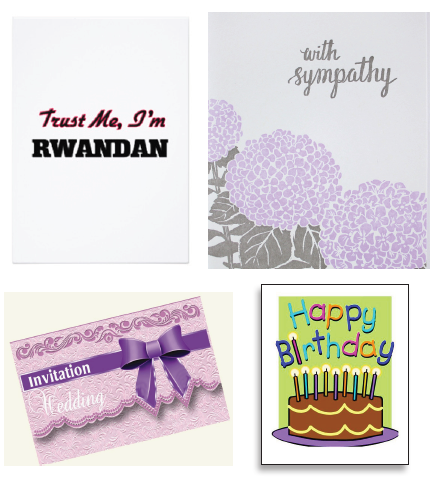
Figure 3.1: Different designs of cards
Activity 1
1. What messages do you read ifrom the four different
cards?
2. Describe the colours that were used in the four different
designs.
3. What type of letters were used in the designs?
The major aspects of a design
I hope you were able to note that letters play a very important
role in bringing out the message for each card. Letters must
be carefully designed to look neat and legible.
Therefore, the key aspects which must be considered while
designing cards, posters and book covers include the following:
·· The layout: this refers to a particular plan or outline acceptable
for a given design. Each design has a particular layout. This
has to be spread out for clarity.
· Message: the design has to communicate to the observer.
· Lettering: the choice and construction of letters in a design.
Letters have to be legible so as to bring out a clear message
to the observer.
· Balance: space has to be wisely distributed throughout the
design.
· Neatness: a design has to be clean and attractive to the
observer.
· Colour choice: the colours used must relate to the
message being communicated. Dull colours tend to kill the
attractiveness of the design. Contrast is often followed when
applying colours in a design.
Activity 2
Discuss how the aspects discussed above were achieved
in the works presented in Figure 3.1
Different letter styles in design
We have already seen that letters play an important role in
conveying a message in many designs. In Senior One you
practiced letter construction and you were introduced to
different letter styles. By now you know the difference between
upper case and lower case. The choice of letters depends on
the nature of the design you want. There are two major types
of letter fonts; i.e. formal letters and fancy letters.
Formal letters are not so decorated. They are easy to read and
are often used to pass on important messages to the viewer.
Look at the fonts in Figure 3.2.

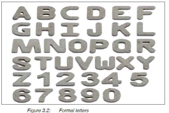
Formal letters are good for designing posters and book covers
which carry formal information. Look at the following examples
in Figure 3.3

On the other hand, there are fancy letters. These look
complicated and more difficult to construct and read. They are
often used to design works which are more decorative such
as cards and fancy magazines. For example look at the letter
fonts in Figure 3.4.
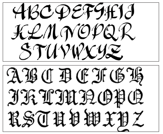
Figure 3.4: Fancy letters
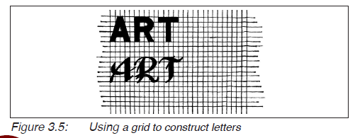
You can use a grid while constructing different letters, for
example look at Figure 3.5.
Activity 3
1. Practice with letter construction by following the guide
lines you learnt in Senior One. These include; the base
line, mid line and cape line for the upper case, and the
ascender, mid line, base line and descender for the lower
case in addition to a grid.
2. Try it out with the formal and fancy letters.
How to design a magazine cover
For any design work, it is important to plan for it by going
through the design process. You must know the proper lay out
and the main features of the work you are going to design.
Activity 4
1. Look at the magazines in Figures 3.6, 3.7, 3.8 and 3.9,
and discuss the features common to all the magazines.
2. Write the title for each magazine.
3. Mention the author for each magazine.
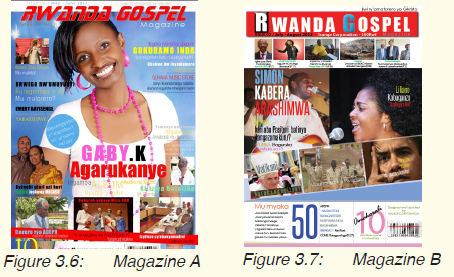

You may have observed that the examples presented have
many words and images. However, in designing you have to
make your work simple and attractive. A magazine has the
following important components;
· A front cover; with a name of the magazine, the different titles
of the articles found inside, and an illustration or illustrations.
Titles can be arranged in any way that is interesting to the
observer as long as balance is achieved.
· A back cover which usually has an image of the author and
publisher.
Look at the layout in Figure 3.10.
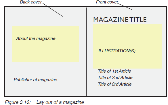
Take note:
· Any design you make must fit within the particular
measurements (dimensions).
· The front and back cover of a magazine share the same
dimensions (A × B) where “A” is the length and “B” the
height .
· The choice of colours should match with the message on the
magazine.
· The illustration should add to the meaning of the title of the
magazine. This has to be simplified to avoid confusing the
reader.
Activity 5
1. Design a magazine cover with a title “The Beauty of
wild ld Life” written by Peter Kayibanda. The magazine
should have dimensions 15cm by 20cm. Use only three
colours.
2. Display your work and discuss it with your classmate.
Assessment
Using letters of your preference, design an invitation card for
Senior Two students. The card should invite students for a
nature talk to be held at your school on a date of your choice.
Glossary
Author: an individual who writes a book.
Balance: a state of equal distribution of elements in a
given design.
Design process: the stages of making sketches for a given design
Fancy letters: the type of letters with decorations.
Feature: character of a given work of art.
Formal letters: the type of letters with no decorations. These are
often easy to read and construct.
Illustration: an image or a set of images which accompanies
a design to add to its meaning.
Layout: the spread out or general outline of a design
presented on a flat surface.
Lettering: the art of letter construction regarding type, size
and neatness.
Message: the ability of a design to communicate.
Neatness: the appearance of a design with minimum
mistakes.
Publisher: the organisation which organises, proofreads
and prints out a particular book or magazine.
UNIT 4:Methods of Modelling Clay Figures and Forms
My goals
By the end of this Unit, I will be able to:
⦿ Describe the process of preparing clay.
⦿ Make a sculpture in clay.
⦿ Decorate the surface of a clay piece.
⦿ Make a mask and decorate it.
⦿ Share ideas with others about modelling.
Introduction
Modelling is a very old activity which has been done by
different cultures. It includes both pottery and sculpture.
There are many figures which have been formed using clay.
For example look at the ceramic wares from Gatagara Pottery
in Figure 4.1.
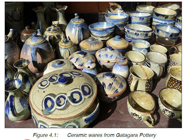
Activity 1
1. Look at Figure 4.1 and mention the different objects in
the picture.
2. Identify the patterns used to decorate these objects.
3. Which materials were used to make these products?
In Senior One you studied about modelling where you learnt
about clay and its uses. You also studied about the different
methods of making ceramics (such as pots, cups and bowls);
these include pinch, coil and slabs. You studied about the
different methods of decorating ceramic articles. You learnt
that clay was used as the basic material for ceramics. Clay
can further be used in other ways.
In this unit, we are going to learn more about modelling in clay
by exploring additive and subtractive methods. For example,
look at the two sculptures in Figure 4.2.

Figure 4.2: A male and female sculpture made out of clay
Activity 2
1. Observe the sculpture in Figure 4.2 and identify the
activites represented.
2. Discuss the sculptures in terms of form and use of clay.
3. Look at the surface of these sculptures and discuss how
their texture was made.
Clay preparation
In Senior One you learnt about clay preparation. You studied
about four different methods of clay preparation namely;
The plastic method: The method is often used in brick
making. The available moisture in clay
is used to prepare it.
The wet method: Where clay is dissolved in water to
form shap. Then it is wedged to loose
moisture and prepare it for use. It is
good for making pottery.
The dry method: Clay is dried, pounded and crushed
into powder form. It is often used in
factories for making tiles.
The semi dry method: Combines both dry and plastics
methods.
Each method has got advantages depending on where it
is being used. However, it is always important to get rid of
unwanted materials such as stones, plant roots from clay
during its preparation. Grog is always added in clay for
sculpture in order to make it stronger and to ease the firing
process.
Remember, clay has to be kneaded and pressed during its
preparation in order to get rid of air pockets. This is also done
in order for the clay to become more plastic.
Activity 3
1. Discuss the four different methods of clay preparation.
2. Which method is more suitable for preparing clay for
pottery?
3. Which method is more suitable for the preparation of
clay for sculpture?
4. Follow an appropriate method and prepare your clay.
Keep it in a safe place.
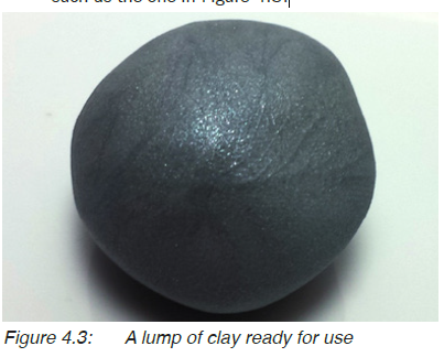
Take note:
· The quality of clay determines the quality of the object
formed. When clay is well prepared, it can be used to form
fine objects.
· Objects can easily break if they are made from poorly prepared
clay.
· Ready clay should not crack when pressed, it should be even
such as the one in Figure 4.3.
Moulding different clay figures
Your hand is the basic tool while moulding clay. This applies
to both additive and subtractive methods of forming art works.
Clay figures can be made by use of the following methods:
· Using coils
· Using slabs
· Additive method
· Subtractive method
Activity 4
Discuss the four methods above and write how each one of
them can be applied for making clay work.
make clay figures such as masks. As you may have observed,
these methods are commonly used to make pottery and
ceramic sculpture. You can make a sculpture using the additive
method, by putting together small pieces of clay until you get
the whole sculpture desired. For example, the sculptures in
Figure 4.2 were made using the additive method.
Substractive method is where you begin with a big piece of
material which you keep reducing until the required sculpture
is got. Subtractive method commonly applies to such materials
as wood and stone. However, it could be used in clay. For such
a method, you pile up a lump of clay, then you keep removing
pieces until you get the required form.
How to make a mask from a mold
Remember, a mask is an object which is normally put on the
face to disguise one’s identity. Since it is to be worn on the
face, a mask is usually made of light materials such as wood,
plastic and paper. For example, look at the masks in Figure
4.4.
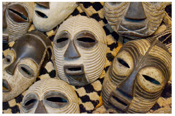
Figure 4.4: Local masks
You can make a mask of your own using a mold. A mold is a
form which is used to give shape to another softer material. In
this unit we shall use clay to make a mold.
In order to make a mask using a mold, you begin by thinking
about the purpose of your mask. From the purpose you can
develop a title for your mask. For example, your mask could
be used to entertain people on a festive occasion. You need
the following materials in place.
· Clay
· Waste papers
· Glue
· Polythene material
· Vaseline
· Colours
· Brushes
· Small stones or seeds
· Raffia and threads
Then you follow the steps below:
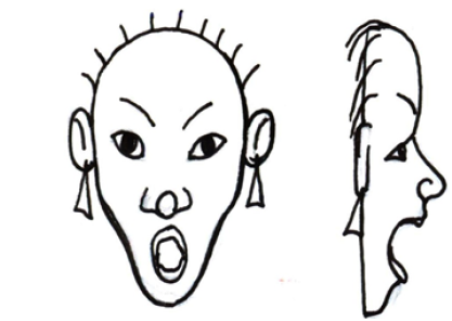 Step 1
Develop sketches for
your mask as shown
in Figure 4.5. Making
a sketch helps you
to develop and put
ideas together and it
acts as a guide while
forming your work.
Figure 4.5: Sketches for a mask showing the front and side view
Step 2
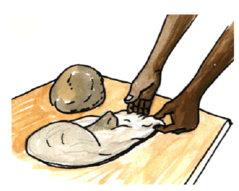 Use clay to make your mask
mold. Look at Figure 4.6.
Avoid creating pockets on
your mold. These are areas
with depressions within
the mold. Such pockets
make it difficult to remove
the mask off your mold.
Figure 4.6: Forming a mold for the mask out of clay
Step 4
 Use a tool to create a smooth
finishing on your mold as
shown in Figure 4.7. This
could be a table knife or a
smooth stick. This would
further help you to remove
your mask so easily. Never
allow your mold to get
dry. Always cover it with a
polythene material whenever
you break off.
Step 4
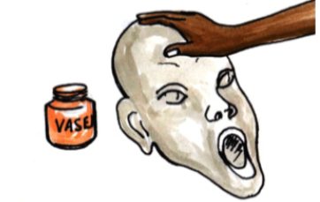 When you are done
with the mold, smear
its surface with
Vaseline. (Figure
4.8). This eases the
removal of the mask
after completion
Figure 4.8: Smearing the clay mold with vaseline
Step 5
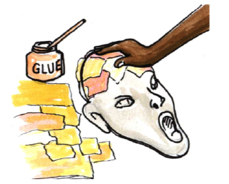 Tear small pieces of paper
and carefully use glue to
fit them on your mold
as shown in Figure 4.9.
When you are done with
the first layer, apply glue
and add another layer.
Whenever you add three
to four layers expose your
work to get dry.
Figure 4.9: Applying papers on the clay mold
Step 6
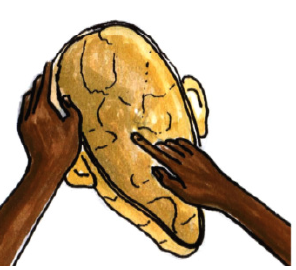 When you are done and
satisfied with the thickness
of the mask, carefully get
it off the mold. This can be
done by scooping clay out
and you remain with the
image in papers. Then turn it
around and work on its inner
parts. Look at Figure 4.10.
The inner part of your mask
should be as smooth as the
outer part
Figure 4.10: Finishing the inner part of the mask after
Step 7
 Then cut out the
provision for the eyes
as shown in Figure
4.11. Prepare colours
and paint your mask
according to your plan
or sketch. Add a string
for holding your mask in
place.
Figure 4.11: Cutting out the provision for the eyes
Step 8
 Your mask could be
decorated further by
adding more colours,
raffia and a rough texture
with small stones or
seeds. For example look
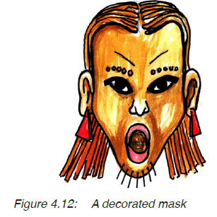
at Figure 4.12.
Activity 4
1. Follow the steps above and make your mask to be
used on an occasion. Decorate it using the available
materials.
2. Display your work and discuss it with classmates
Decorating clay surfaces
Clay naturally has its texture. But this can be changed by use
of different tools to improve the appearance of the art work.
Consider the following techniques of decorating clay
surfaces:
· Smoothening: the article is made smooth with a tool, then it
is fired.
· Glazing: glaze is applied to the surface of the article at bisque
level, the article is then fired for the second time. Glazing can
be done in one uniform colour or with patterns.
· Painting: a technique where colours are applied to an article
after firing. Such colours are applied following particular
patterns.
· Incision: this is done by using a tool to cut patterns into the
surface of an article.
· Building: the surface of an article is decorated by adding small
pieces on the surface while following a particular pattern.
Activity 5
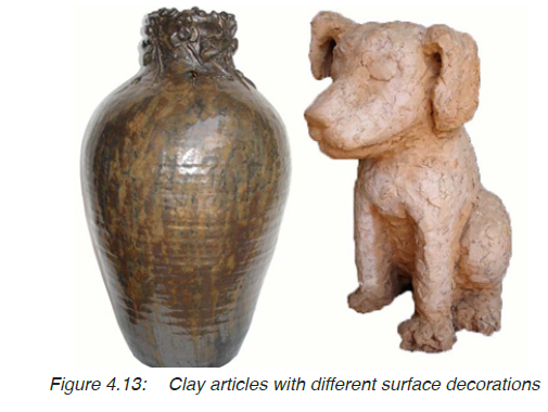
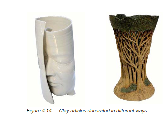
Observe the clay pieces in Figure 4.13 and 4.14, and
mention the technique which was used to decorate its
surface. (Choose from these; building, incision, painting,
glazing and smoothening).
Assessment
1. Use clay to prepare a mold of your choice. Don’t let your
mold dry up.
2. Using waste papers and glue, prepare a mask and decorate
it.
3. Display and discuss your skills regarding creativity and use
of materials.
4. Describe four techniques of decorating a pottery article.
Glossary
Grog: crashed fired clay which is usually added in
clay to make it stronger and to ease its firing
process.
Additive method: a method of making clay works by putting
together smack pieces of clay.
Subtractive method: a method of making artworks by removing
small bits off the original shape until the
required form is got.
Glaze: a coating of coloured, opaque, or transparent
material applied to ceramics before firing.
Mold: a hollow form or matrix for giving a particular
shape to something in a molten or plastic
state.
Kneading: a processing of folding, pressing and stretching
a soft substance such as clay, and making it a
smooth uniform mass.
Pressing: exerting force on a substance such as clay to
flatten it.
Pocket: depressions within a given surface.
UNIT 5:Weaving using Basic Local Materials
My goals
By the end of this Unit, I will be able to:
⦿ Identify materials and tools used for weaving.
⦿ Describe the techniques of weaving with raffia.
⦿ Identify the decoration techniques for weaving.
⦿ Share ideas with others about own work.
Introduction
Weaving is practiced by many different cultures in the world. It
refers to the process of interlacing strands of a given material.
The practice usually involves the use of natural materials such
as palm leaves, sisal, raffia, different plant stems and plant
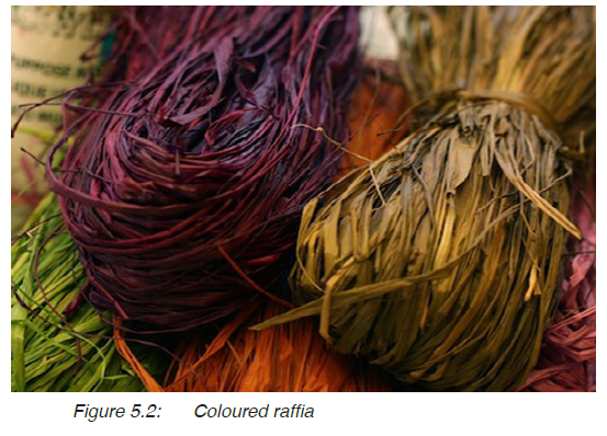
fibers. For example look at raffia in Figure 5.1. Raffia is a type
of a natural yarn. Have you ever seen and touched it before?
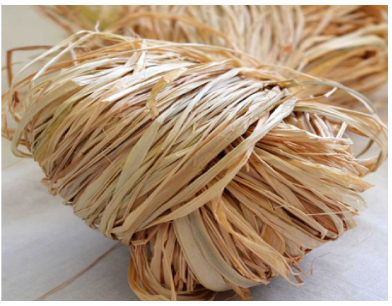
Figure 5.1: Raffia
In Rwanda, there are many local products woven from Raffia.
Raffia can be dipped in dyes to change its colour according to
the products to be made, for example look at Figure 5.2.
Activity 1
1. List objects from your local area which are made from
raffia.
2. Which other materials are used together with raffia to
make these objects?
3. Visit your local area and get raffia (coloured and
uncoloured).
There are many products made by weaving raffia. For example
look at the different products in Figure 5.3.

Figure 5.3: Products made from raffia
Activity 2
1. Observe the objects in Figure 5.3 and discuss their
purpose.
2. Discuss how these products were made. What style was
used?
Weaving techniques
The appearance and texture of a woven work depends on the
weaving techniques used. There are many types of weaving
techniques that can be used to make raffia products. These
include; plain weave, twill weave, satin weave and Ghiord’s
knot.
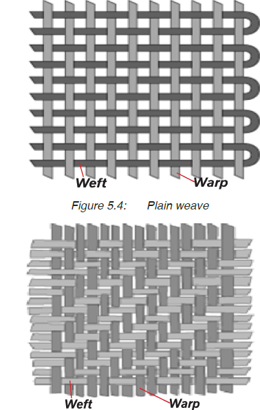 (a) The plain weave:
This is the simplest
weaving technique. The
weft weave goes under
one warp at a time.
The process is repeated
as one weaves. For
example, look at Figure
5.4. This type of weave
is also known as a 1/1
weaving style.
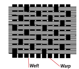
(b) Twill weave:
For this style, a weft
goes over several warps
before going down and
then under two warps. The
most common twill weave
is shown in Figure 5.5.
This is a 2/2 twill weave.
Figure 5.5: Twill weave (2/2 pattern)
Twill weaves often look
heavier and stronger and
therefore are used to make
long lasting works.
 (c) Satin weave:
This is a more delicate and
fancy weaving technique. For
this style the weft goes over
four or more warp before going
down. Then it goes under only
one warp as shown in Figure
5.6.
Figure 5.6: A 4/1 satin weave
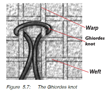 (d) Ghiordes Knot:
This is a type of knot
where a yarn is passed
over two warp yarns and
is then pulled through
between these two
warps. Then the knot
is cut to form a pile as
shown in Figure 5.7.
This type of knot is often
used to finish edges of
certain woven work such
as carpets.
Twinning weave
This is the type of weave where two left strands are twisted
or interlaced as they are made to pass over the left as shown
in Figure 5.8. Twinning is often used in making baskets and
mats

Activity 3
1. Study the weaving techniques above and try them on
your own using raffia.
2. Display weaves to your friends and discuss it with them.
Design Patterns for weaving
The weaving techniques discussed can be used to make such
products as carpets, table and door mats. The patterns of
the woven work largely depends on your creativity. In some
patterns you may include words yet in others you simply deal
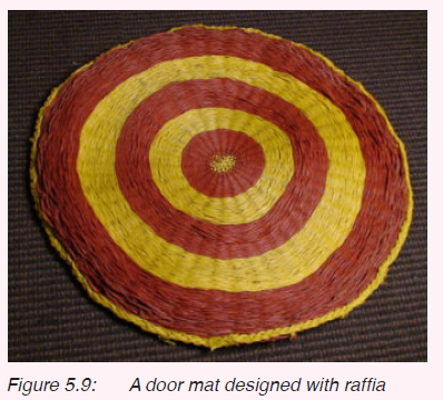
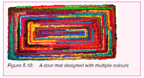
with different colours of raffia. Observe Figures 5.8 and 5.9,
and work out activity 3.
Activity 4
Observe Figures 5.8 and 5.9 and do the following;
1. What weaving technique was used in the two works?
2. Identify similar work from your surroundings.
Coming up with such quality work may be difficult for you this time.
However, simpler activities would make you improve on your skill with
continuous practice. In the next activity, you need raffia in different
colours (where possible) and a pair of scissors or a cutter.
You can weave a square or rectangular table mat by following the
steps below. You could join two or three pieces of raffia for one strand
depending on the strength required.
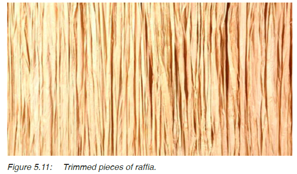
Step 1
Get pieces of raffia and trim them to about 30cm. Look at
Figure 5.11.
 Step 2
Using either a plain weave
or a twill weave, make your
table mat. Begin with two
strands at right angles and
then keep adding on the two
adjacent sides. Leave raffia
of about 5cm on either side
of your table mat as shown
in Figure 5.12. Follow an
even number for both the
warp and weft in order to
ease the finishing.
Figure 5.12: Trimmed pieces of raffia
Step 3
 After weaving the required
size of the table mat, seal
off the edges by tying the
first strand with the third
in the row. Look at Figure
5.13. Remember, your
table mat must be kept
tight.
Figure 5.13: Sealing the edges
Step 4
 Using either a cutter or a pair
of scissors, cut off the excess
raffia on all sides. This is what
we call “finishing” the article.
Look at the finished table mat
in Figure 5.14.
Figure 5.14: A finished table mat.
Activity 5
1. Use raffia to weave a table mat by following the steps
above.
2. Finish the table mat by cutting off excess raffia.
3. Display your work and discuss it in terms of the weaving
pattern used and the neatness of the woven work.
Assessment
1. Collect raffia and dye it in two different colours.
2. Weave a small piece (15cm by 15cm) using a satin weave.
the warp should be in a different colour from the weft?
3. Finish your art piece by cutting off all unnecessary pieces of
raffia.
4. What is the difference between twill weave and plain
weave.
Glossary
Finishing: trimming off unnecessary yarn from a woven
piece.
Ghiorde’s knot: a Turkish knot where a piece of yarn is tied and
twisted along two warps to form a pile. It is
usually used in making carpets.
Pile: upright loops of strands in a weave.
Plain weave: a type of weave where the weft goes over and
under one warp during the weaving process.
Satin weave: a weaving technique where a weft goes over four
wefts and one weft under.
Strand: fibers or yarn combined to form one piece for
weaving.
Twill weave: a weaving technique where the weft goes
over and under two warps during the weaving
process.
Warp: vertical strands in the weaving process.
Weave: interlacing threads/yarn to form an article.
Weaver: a person who weaves.
Weft: horizontal strands which go over and under
warp in the weaving process.
Strand: a single thin length of something such as fibre
especially twisted together with others.
UNIT 6:Motifs, pattern in embroidery, batik, tie and dye and design technology
My goals
By the end of this Unit, I will be able to:
⦿ Describe the materials and tools used for designing
textiles.
⦿ Create motifs using different tools for textile decoration.
⦿ Make patterns using batik technique.
⦿ Create a pattern using tie and dye.
Introduction
In Unit two you made patterns using different printing
techniques. The techniques you used are referred to as surface
resist. There are other methods of resisting a liquid (colour or
dyes) from entering a cloth or another surface. In this unit we
are going to study about batik and tie and dye methods of
textile decoration. These are called bound resist techniques.
For example look at the patterns in Figures 6.1, 6.2, 6.3 and
6.4.

Activity 1
Identifying patterns
1. Look at Figures 6.1 to 6.4 and differentiate batik
designs from tie and dye designs.
2. What makes the two patterns different?
3. Identify the colours used.
4. Look for similar patterns from your local area and
discuss them with your classmates.
You may observe that patterns made using batik technique
are bolder than those made using tie and dye. However, one
has to plan the patterns in advance before using either batik
or tie and dye
Making motifs and patterns for batik
In batik, we use wax to resist dyes from occupying certain
areas in your pattern. Whenever you are applying dyes, begin
with light colours, then add dark colours as you complete the
work. These colours mix with each other to create interesting
tones.
In order to make a batik article, you need the following
materials:
· Pencil and paper
· Cloth (A cotton cloth works better). Remember, you should
wash and iron the cloth before using it in any design work.
· Wax (this can be either bee wax or paraffin wax)
· Brushes of different sizes
· Dyes of different colours
· Containers for mixing dyes
· A heating source
· A source pan
· Rough papers, such as news papers
· Iron box or flat iron
Then follow these steps to make your batik article.
Step 1
 Using a pencil, sketch your pattern
on paper. Your pattern should be
simple as the one shown shown in
Figure 6.5. A complicated pattern
will give you a hard time to work
on. Mix the dyes in water, following
the instructions for mixing which
appear on these dyes.
Figure 6.5: Sketches for a batik work
 Step 2
Spread your cloth on a table. Then
transfer the sketch on to the cloth
as you follow the proportions of your
sketch. Look at Figure 6.6.
This can be done by re-drawing it with
a pencil or you may use a stencil if the
sketch does not need enlargement.
Figure 6.6: Transferring the sketch on to the cloth
 Step 3
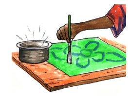
Put wax in a source pan and heat it
until it melts into liquid as shown in
Figure 6.7. Use little heat when the
wax melts, to keep it in liquid form.
Figure 6.7: melting wax
 Step 4
Dip the brush bristles in the molten
wax and block the sketched lines on the
cloth as in figure 6.8. Never leave the
brush in hot wax for long, it could easily
get burnt.
You should put a paper or papers below
the cloth in order to stop it from getting
stuck on the table.
Figure 6.8: Applying wax on the clot
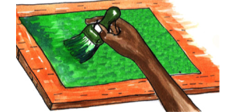
 Step 5
Using a relatively big brush, paint
your cloth with a light colour. Then
let the cloth dry. Never dry the cloth
under hot sun because it melts the
wax put on earlier. See figure 6.9.
Figure 6.9: Painting the cloth with dyes
 Step 6
Apply wax to places where you want
to maintain the first colour. Then
paint the cloth with another colour
(darker than the first).
Look at figure 6.10
Figure 6.10: Painting the cloth with wax
Step 7
When you are done with the colours you wanted, apply wax
on the entire cloth. Let it dry up and then crackle it (create
cracks through the wax).
 Step 8
Paint the cloth with
the darkest colour as
shown in Figure 6.11.
Let it dry up.
Figure 6.11: Painting the cloth with the darkest colour
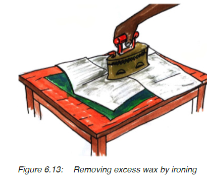
 Step 9
Crease the cloth to remove
the wax as shown in Figure
6.12.
When you are done, remove
the excess wax by putting
the cloth between papers
and ironing it as shown in
Figure 6.13.
Figure 6.12: Creasing the cloth to remove wax
Activity 2
1. Follow the steps given to make your own batik article.
2. Display and discuss your work with your classmate.
Take note
Melting wax and making batik work requires a well ventilated
place.
Be careful as you work with hot molten wax. It can easily burn
you.
Making patterns for Tie and dye
The process of making patterns for tie and dye begin with
tightly tying the cloth, and dipping it in boiling dyes before
bringing it out to dry. Therefore the name comes from the
process of making the patterns, “first tie the cloth and then
dye it in dyes”.
To make tie and dye patterns, you need the following
materials:
· Cloth
· Raffia or nylon threads
· Dyes
· Water
· Heat source
· Cutters
· Wax
·· Salt (this is usually added in the dyes as they are boiled)
Patterns for tie and dye largely depend on how the cloth is
treated before dyeing it. The cloth is tied in order to resist
dyes from going to unwanted areas. After tying the cloth, it is
dipped in dyes and boiled for about 30 minutes (or according
to the instructions on the tin for a given dye).
It is then removed from the dye and made to dry under shade.
The tying should be tight in order to limit dye from going to
places they are not supposed to.
You can use different colours to dye your cloth. But before
dyeing the cloth in another colour, the first colour should be
dry. Then more tying is done to preserve the first colour. The
threads are not removed until the cloth is totally dry.
Activity 3
1. Look for tie and dye patterns from your local area.
2. What shapes can you see in these patterns?
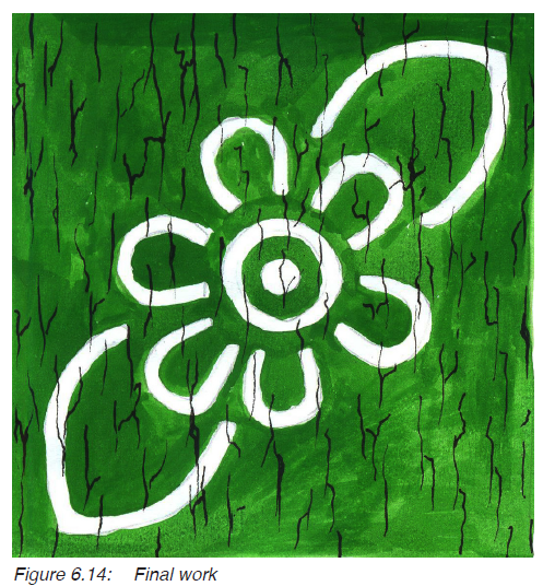
There are several ways of treating the cloth, these include:
1. Folding and gathering
2. Stitchery
1. Folding and gathering
There are several ways of folding and gathering the cloth
these include pleats, strips, circles and spirals. These are
demonstrated in Figure 6.14. In all the styles shown, the cloth
is twisted first, then it is tied to form a given pattern.
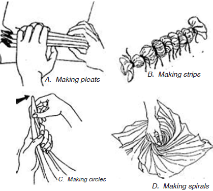
Figure 6.15: Ways of making patterns for tie and dye
After folding and gathering the cloth, its is then tied and
emersed in dyes as shown in figure 6.16. The cloth is boiled
for some time as indicated on the dyes, look at Figure 6.17.
After dyeing the cloth it is left to dry under a shade if you are
to use several colours, the process is repeated. You add more
ties after drying the cloth and dip it into the second colour.
Then when you are done with all colours, the cloth is unfolded
and ironed and the patterns of final work appear as shown in
figure 6.18

Activity 4
1. Observe the patterns in Figure 6.14 and try them out on
a piece of cloth.
2. Dye the cloth to see the outcome.
Now take a look at how the patterns look like on the final work
in Figure 6.18, after dyeing the cloth.

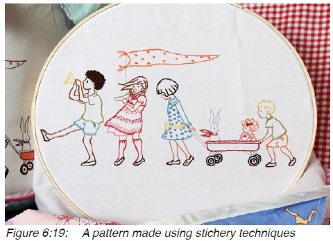
2. Stitchery
For this technique, you need a needle and threads (preferably
nylon threads or raffia). For example the pattern in Figure 6.15
was a result of stitchery. You begin by sketching the patterns
on the cloth, then you sew them with a running stitch. But
you leave threads of a reasonable length hanging. These are
the threads used to tie the cloth when it comes to dyeing it.
Figure 6.19 A pattern made using stichery techniques. You
can now look at the pattern made by use of threads on a cloth
in figure 6.20.
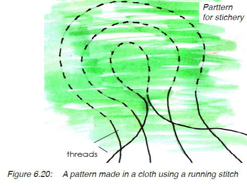
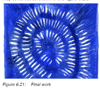
While using the stitchery technique, threads are pulled and
tied at intervals depending on the planned design and colours.
Then the cloth is dipped in dyes following the same process as
the one you used in folding together on page 83. Your pattern
may come out as shown in the figure 6.21.
Take note:
· Just like the case of batik works, the process of dyeing the
cloth should always begin with light colours.
· You need to know the colour combinations before doing tie
and dye. These were studied in Unit one.
Activity 5
1. Draw a pattern for stitchery on a piece of paper.
2. Sew the stitch on a piece of cloth.
3. Dye the pattern and observe the outcome
Assessment
Create a pattern on a cloth (1/2 square meter) using one of the
techniques discussed in this unit.
1. Get a piece of cloth (1/2 square meter) and create patterns
by folding it into either circles or pleats
2. Tie the cloth into different values and dip it into a light dye
3. Repeat the processes in ‘2’ atwith different parts in the
second dye.
4. Unfold the cloth and let it dry. Then iron your cloth and
display it.
Glossary
Bound resist: a technique of decorating cloth in which dyes
are stopped from going to certain areas on a
cloth by either tying, or using wax.
Surface resist: a technique of decorating a cloth in which
printing ink is limited to particular areas by using
a stencil, or graphic film or photo emulsion.
Crackling: a technique used to create rugged lines on a
batik work when it is completed.
Stitchery: a tie and dye method in which threads are used
to create patterns on a cloth.
Dye: a material which is used to change the colour
of another materials either directly or by use of
heat.
Crease: a process of squeezing a cloth in order to remove
excess wax.
Pleats: folds created in a pieces of cloth as a process of
creating patterns on it before dipping it in dyes.
UNIT 7:The Development of Art Through different eras in the World
My goals
By the end of this Unit, I will be able to:
Identify the characteristics of art in some African and
European regions.
⦿ Describe the characteristics of works by renowned artists.
⦿ Appreciate the value of culture in the society.
⦿ Discuss the major art sites in the world.
⦿ Appreciate modern and abstract art.
Introduction
Art reflects people’s way of life. This is majorly because people
create art according to their social, economic and political
background. Therefore, by studying the history of art from
different regions and periods, we can understand the nature
of different societies in the world. This helps us learn about
the works they produced, their methods and techniques, and
the materials they used, in order to boost our creative abilities
as we produce our own art.
For example, look at the change in style of the art works in
Figures 7.1, 7.2, 7.3, 7.4 and 7.5.
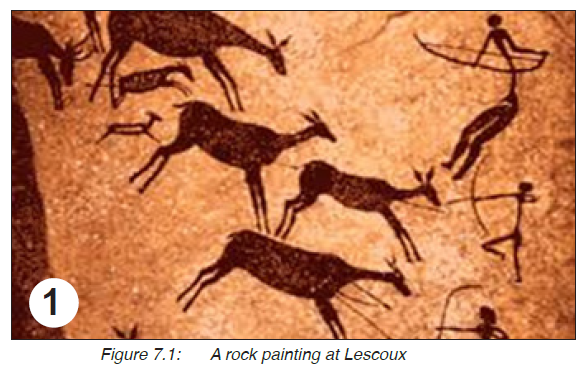
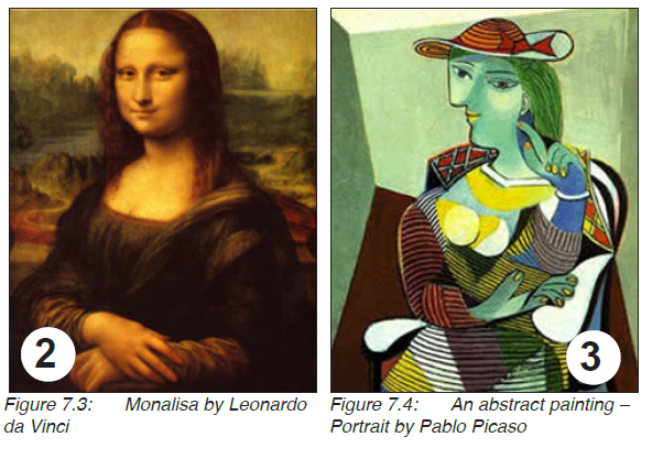
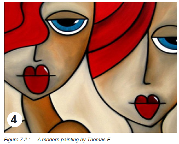
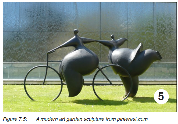
Activity 1
Observe the art works in Figures 7.1, 7.2, 7.3, 7.4 and
7.5, and do the following:
1. Discuss their differences regarding the following aspects;
(a) use of space
(b) subject matter
(c) the light effect in the composition
2. Identify the colours used in these compositions.
3. Mention any paintings from your local area with some of
these characteristics.
The paintings in Figures 7.1 to 7.4 and the sculpture in
Figure 7.5 show the trend of art from the pre-historic, the
renaissance, to the modern and abstract art. Indeed art has
greatly changed and a number of materials discovered to date
in painting, sculpture, pottery, the graphic arts, textile designs
and architecture. But in this unit, we are going to look at
Modern and Abstract Art.
What is Modern Art?
The word modern has been used to refer to the most recent
things as opposed to the past. Sometimes the past is related
to what is traditional. For example in your community, what
do you consider to be the past and what is modern?
Modern art can be traced from the period of industrial
revolution (18th and 19th century). This was a period with
many changes in manufacturing, technology and transport.
These changes greatly affected the cultural, social and
economic conditions of the western world.
Before the 18th century, the church was the major consumer
of art and therefore artists painted compositions from biblical
stories. But as the industrial revolution progressed, people of
the high class begun demanding for art works. Besides, as
people’s way of life changed, artists became more interested
in painting about the people and places which interested
them. Therefore the subject matter changed. For example look
at the painting in Figure 7.6.

Activity 2
Observe the painting in Figure 7.6 and discuss the following
questions:
1. How many people are in the composition?
2. From which direction is light coming from in the
painting?
3. What is the story presented in the composition?
4. From which setting is the action taking place?
5. Draw this composition on a paper and paint it while
trying to copy the colours as they appear in this
painting.
6. Display and discuss your paintings with other groups
Well, some scholars believe that modern art is likely to have
begun with the work of the French painter, Jacques Louis David,
the founder of the style called Neoclassism. He was born in
1748 and died in 1825. He painted various compositions
from stories around French politics and Figure 7.6 is one of
them.
The painting presents a dramatic composition in which three
brothers are saluting toward three swords held up by their
father. At the extreme corner, there are women in grief behind
the father, an indication that they were not in support of their
sons’ joining the army.
A number of art schools had been started and they trained
artists following ideas that were developed in the Renaissance.
Modern art was started by artists who kept working against the
norms learnt from these art schools. Therefore, other scholars
consider modern art as the style of art which existed between
1870 and 1970.
What are the characteristics of modern art?
1. New types of art were formed during this period, for
example; collage art, animation, performance art and kinetic
art.
2. New materials were discovered and used in painting, such
as fixing objects on canvas paintings. Also, found objects
were used in sculpture in form of assemblages.
3. Colour was extensively used for expressive purposes. In
many compositions, colour was used to express the artist’s
ideas.
4. New movements of art were formed, especially in painting.
Activity 3
Discuss the following questions.
1. What is meant by the term Modern Art?
2. What are the common characteristics of Modern Art?
3. Mention four artists’ paintings and four artists in Modern
Art.
A number of art movements were formed as part of “Modern
Art”. These include: impressionism, Fauvism, cubism, pop art,
Dadaism, surrealism and abstract art. We shall discuss some of
these styles as follows.
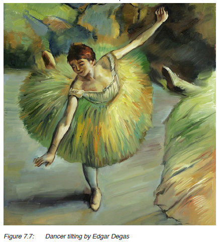
1. Impressionism
This is a style of painting which was developed in the 19th
century by French artists, such as Edgar Degas, Claude Monet,
Edouard Manet and Auguste Renoir. It is characterized by the
use of short brush strokes, using bright colours with the effect
of light. For example look at Figure 7.7.
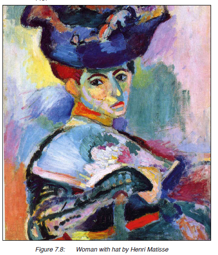
2. Fauvism
This is a style of painting which was developed in the 20th
century by a group of French artists who referred to themselves
as “the wild beasts”. The style was based on colour effects and
light with big parches of colour. For example look at Figure
7.8.
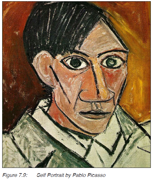
3. Cubism
This is another modern art style which was developed in
the 20th century. The style is focused on presenting figures
whose natural forms are simplified into geometric shapes. A
prominent artist who followed this style is Pablo Picasso, one
of his paintings is presented in Figure 7.9.
Activity 4
1. Sketch a composition of an activity of your choice on a
piece of paper.
2. Paint this composition by following any of the styles
discussed so far.
3. Display your paintings and discuss them with the rest of
your classmates.
4. Surrealism
This is a modern art style in which the artist portrays what
seems to be a dream into reality. It was developed during the
20th Century. There is a lot of rearrangement of ideas which
from the natural point of view looks unreal. For example look
at the painting in Figure 7.10.
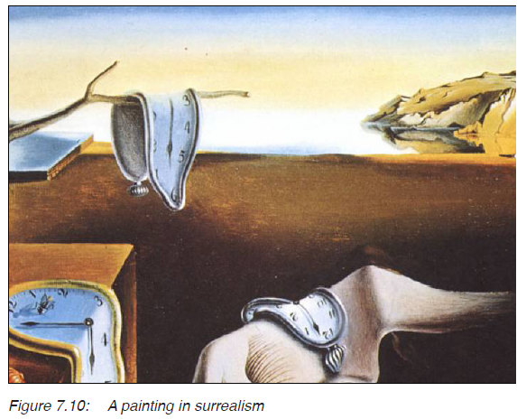
5. Pop art
This is the type of modern art which is nonrepresentational. It
was developed in the 1950s in Britain and the United States.
It depicts objects and scenes from everyday life. For example,
look at the painting in Figure 7.11.

Figure 7.11: Pop Art
Activity 5
1. Sketch a composition in either surrealism or pop art.
2. Using colours of your choice, paint this composition.
3. Display the paintings and discuss them with friends.
What is Abstract art?
This is a type of modern art which focuses on using forms,
shapes, colours and texture. It does not represent objects as
they appear in nature but according to the artist’s expressive
abilities. For example look at Figures 7.12 and 7.13.
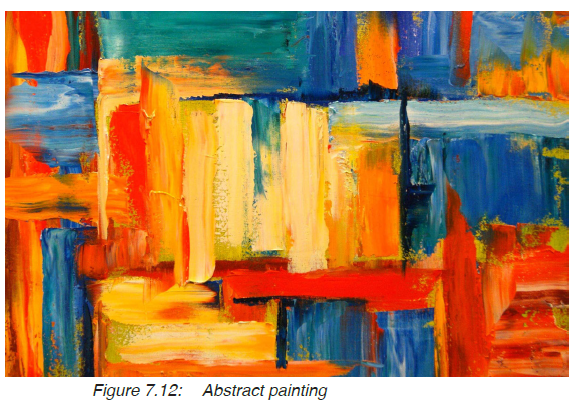
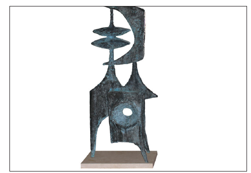
Figure 7.13: Abstract sculpture by B.J. Las v
In Figure 7.12, the artist focused on the use of colour to
create rhythm in the painting. Then in Figure 7.13, the artist
uses geometric shapes to create harmony and unity in the
composition.
Therefore, in abstract art, objects are deformed, simplified
and rearranged to come up with a work of art.
Activity 6
Look at Figures 7.12 and 7.13 and discuss the following:
1. Identify the colours that were used in the abstract
painting.
2. What shapes were used in the sculpture? Relate these
shapes to any natural object from your surroundings.
3. How does abstract art differ from cubism? (refer to
Figures 7.9 and 7.12).
World renowned artists
There are a number of artists who have made significant impact
in the field of art. These include; Michelangelo, Leonardo da
vinci, Pablo Picasso and O’Keeffe. Some of these and their
work, you studied about in Senior One. Let us summarise their
contribution in the following section.
Michelangelo (1475-1564)
An Italian Renaissance artist
who was a painter, sculptor and
architect. He is known for his
mastery if the body structure. He
painted great works in the Sistine
charpel such as creation of Adam
in Figure 7.16.
Leonardo da vinci (1452-1519)
An Italian Renaissance artist who
was a painter and ceramicist. He
is known for his style of making
paintings with no strict outlines
(chiaroscuro). One of his painting is
the monalisa shown in figure 7.17.
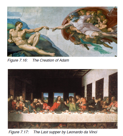
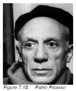
Pablo Picasso
A Spanish painter, ceramicist,
sculptor and poet. He is one
of the renowned artists in
the 20th century who is the
founder of cubism. He made
many compositions and
portraits such as Figure 7.20.
Georgia o’Keeffe
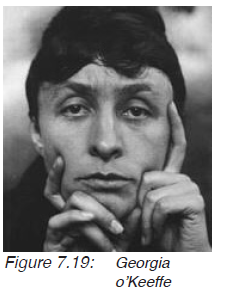
An American modern artist who is
known for her paintings depicting
nature. She mainly painted
plants with emphasis on flowers
in brilliant colours for example,
look at Figure 7.19.
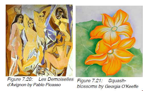
Activity 7
1. Discuss the characteristics of art works of the renowned
artists presented in the previous section.
2. Identify some art works from your local area with
characteristics similar to those of the famous artist
discussed.
Major art works in the world
Many art works have been produced by different artists from different
regions of the world. Such works have characteristics which have
influenced the production of art in the world. Some of these art
works include; the fertility goddess (Figure 7.22), The Monalisa
(Figure 7.3), the Sistine charpel (Figure 7.24) and the kangaroo
hunt (Figure 7.23).

Figure 7.22: Fertility goddess
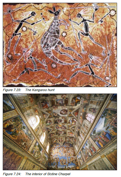
Activity 8
7.24 and discuss the questions that follow:
1. Identify the objects and compositions presented in these
works.
2. List the different colours used.
3. What materials were used in these works?
Major art sites
You studied about the major art sites in the world in Senior
One and discussed some of the art works found in these
places. These places include Altamira in Spain, Lascaux in
France and Olduvai Gorge in Tanzania.
Activity 9
Observe the paintings in Figure 7.25, 7.26 and discuss
the general characteristics of the two paintings.
1. What do you think are the materials used to make these
paintings?
2. Mention the colours that were used in the paintings.
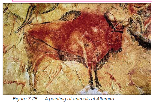
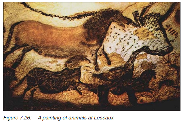
In your discussion, you may have come up with theses
similarities in the paintings at Altamira and Lescaux:
1. Both paintings were made during the Pre-historic period.
2. The painting were done on rocks.
3. The paintings were done in cave ceilings.
4. Animals are the main subject matter of both paintings.
5. Lines were used to draw the shapes of the animals and
filled with colour.
6. The colours used are similar, basically browns and yellow
ocre.
At Olduvai Gorge, it is believed that the oldest man on earth
lived here and his major tools were made of stone. These
tools were discussed in Senior One. Therefore, the similarity
between Olduvai Gorge, Altamira and Lescaux is that the
people who lived in these places used stone as the major tool.
Assessment
1. Discuss five styles that existed in the modern art period.
2. Mention three world renowned artists and state one art
work made by each of them.
3. In which period does Leonardo da vinci belong.
Glossary
Rhythm: a strong, regular repeated pattern of movement
observed from an artwork.
Portrait: a likeness of a person, especially of the face, as
a painting or drawing.
Ceramicist: a person who makes ceramic pieces.
Poet: a person who writes or makes poems.
Architect: a person who designs and supervises the
construction of buildings or other large structures.
Chiaroscuro: an Italian artistic term used to describe the
dramatic effect of contrasting areas of light and
dark in an art work, particularly paintings.
Neoclassism: this refers to a period where there was a revival
of a classical style or treatment in art, literature,
architecture and music.
Renaisance: this a period which started in Italy and spread
to the rest of Europe. It’s a period when artists
revised the style of the classical period in ancient
Rome and ancient Greece.
References
Arnason H.H. (1986). A History of Modern Art. (Third Edition).
Thames and Hudson
Brommer, G.F. & Kinne, N.K. (1995). Exploring Painting. Davis
Publication inc. Worcewster.
Canaday, J. (1987). Mainstreams of Modern Art. (2nd Edition).
Harcourt Brace Jovanovich College Publishers.
Getlein, M. (2008). Living with Art. (Eighth Edition). McGraw-Hill
Companies inc.
Gombrich, G. W. (1995). The Story of Art. Phaidon Press.
Proctor, R.M. & Lew, J.F. (1995). Surface Design for Fabrics.
(Revised Edition). University of Washington Press.
Tansev, R., Kleiner, F. S., De La Croix, H., (2004). Gardner’s Art
through the Ages. (14th Edition). Thames and
Hudson
Tebenkana, T. (2013). Insights into the History of Art. (Volume 3).
Astro Book Binding Center, Kampala
Tebenkana, T. (2013). Crafts and Studio Technology. (A revised
Edition). Astro Book Binding Store. Kampala.