Unit 17:CASCADING STYLE SHEET
Key Competency
By the end of this unit, you should be able to build standards compliance web pages using CSS.Unit Outline
• Definition of CSS
• HTML styling and disadvantages
• Comparison between HTML and CSS Styling
• CSS syntax
• Adding CSS to web pages
• CSS Styles
• Creating CSS pages from scratchIntroduction
Cascading Style Sheets (CSS) uses rules to describe to the browser how HTML elements are to be displayed on the screen. We use CSS properties to come up with rules that format one or many HTML pages all at once. These properties generally fall into one of two categories:Presentation
How to control things like the colour of text, the fonts you want to use and the size of those fonts, how to add background colours to pages (or parts of a page), and how to add background images.Layout
How to control where the different elements are positioned on the screen. You will also learn how to develop a CSS page from scratch.17.1 Definition of CSS
Activity 17.1: Research on CSS and HTML
Access the website suggested to you by the teacher and do some research on cascading style sheets. Find out the following:
1. Its difference when compared to HTML which you covered earlier.
2. The advantages it offers to website developers.CSS is a style language that defines the layouts of HTML documents in a more efficient manner. Unlike in HTML where we used tables to define strict layouts, with CSS there are no tables. Instead we define page layout styles using rules that are easy to apply across entire websites and that can easily be reused. CSS uses fonts, colors, lines, margins, height, width, background images, advanced positions etc. to define neat page layout styles.
Unlike some time back when few web browsers could understand CSS rules, most modern browsers support CSS. However, when developing CSS pages, test them in different browsers to ensure that they are displaying correctly across board.17.2 HTML Styling and disadvantages
HTML or Hypertext Markup Language is the standard and most basic language used to create web pages. It has a very simple code structure that makes it extremely user friendly, to learn and use. It has a few keywords (known as tags) that are dedicated to formatting text i.e. telling the browser how to display text. However, HTML suffers from the following shortcomings:
(a) In formatting, HTML is weak and cumbersome. Repeated blocks of the same code when formatting large documents increases memory usage and slows down web page loading time.
(b) The inclusion of formatting text together with page content in the same HTML file makes web pages to be inefficient and lack consistency throughout the website.
(c) HTML does not enforce strict coding standards. For example, you can type <br> without a terminating tag (i.e. without a terminating tag <br/> ). This may lead to language misunderstanding and problems when different browsers display the same web page differently.
(d) HTML is static in nature. It does not have control structures like other programming languages.
(e) HTML becomes complex when used to code large pages.17.2.1 Advantages of CSS
CSS addresses the need for functionally effective and efficient web designs. CSS has the following advantages:
(a) Improves Site Speed: The web pages and CSS stylesheet are small in size hence it makes the website to load faster and have efficient utilization of bandwidth.
(b) Centralised Format Styling: Changing a global stylesheet affects the entire site. Developers don’t have to individually change each page in the website separately.
(c) Flexibility: CSS can be combined with a Content Management System (CMS) to create content submission forms that can allow the user to easily select the layout of an article on-the-fly without the need for rigorous coding.
(d) Consistency: CSS has inheritance properties that can allow “cascading” of a global stylesheet that can be used to style an entire site. If a situation arises in which you need to change styles across the site, simply edit a few rules in the global stylesheet.17.3 Comparison between HTML and CSS styling
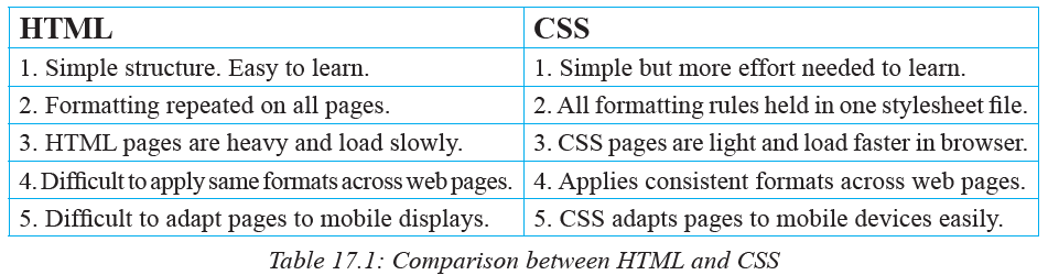
We can therefore conclude that while HTML is a markup language for building hypertext web pages, CSS is a rule based language that describes how various HTML page formats and layouts will be displayed on the screen.
17.4 CSS Syntax
We create CSS rule following a particular specific syntax. The format of a CSS rule set can be summarised as follows:
1. Start with a selector. The selector points to the HTML element you want to format.
2. Declaration block. It has a property and a value surrounded by curly brackets. It performs the actual formating of the selected element.
Figure 17. 1 below summarises this:
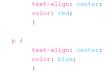
In this case, the rule specifies that all the level 1 headings will be pink in color and have a font size of 10.
17.4.1 CSS selectors
CSS selectors are used to point to or find HTML elements based on their defined names, IDs, attribute, class etc. Without a selector, the browser will not know which element to display in a particular format. There are several types of selectors:17.4.1.1 Element selector
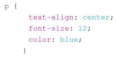
It selects an element based on its known HTML name e.g. <p>, <h2> etc. For example, if we wish the rtext in a paragraph to have font size 12 and be blue in color, our CSSsyntax would be written as follows below:
17.4.1.2 The ID selector
The id selector uses the id attribute in HTML to select a particular element. When creating id elements in HTML, make each one of them unique within a page to avoid reference conflicts!
An element with a specific id is selected by writing a hash (#) character, followed by the id of the element.
For example, if we have the HTML element with id=”globe”: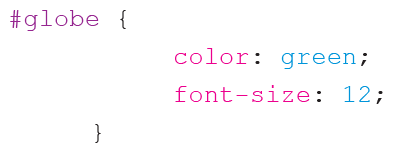
17.4.1.3 The Class selector
The class selector selects elements which are part of a particular class attribute. Write a period (.) followed by the name of the class. For example, if we have a class called wise in HTML e.g. class=”center” and we want all its elements to be orange and center-aligned we proceed as follows:
NB: A class name in HTML cannot start with a number.
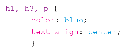
17.4.2 CSS grouping selectors
The grouping feature enables the CSS code to be compact and reduces unnecessary repetition. For example, you could have CSS code which looks like the one below: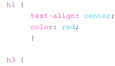
The above code can be grouped together as follows with all the selectors typed on the same line:
17.4.3 CSS comments
A comment is a string of non-executable text included in code as a means of explaining the code. It is helpful when you or someone else edits the source code at a later date.
In CSS, a comment starts with /* and ends with */. A comment can span more than one line. The example below demonstrates how comments are used:
17.4.4 CSS units
Measurement in CSS can be expressed using several different units. There are two types of units used to express length:
1. Relative length units: they specify a length as compared to another length e.g. if the font is 10 points then a length can be expressed as two times the current font size.
2. Absolute length units: these lengths are fixed. A length expressed in any of these will appear as exactly that size e.g. 10cm.17.4.4.1 Absolute length units
Unit Description
em Relative to size of current element e.g. 2em means 2 times the size
of the current font
vw Relative to 1% size of current viewport. The viewport is the
browser window size. e.g. if the browser has width 50cm e.g.
1vw = 0.5cm.17.4.4.2 Relative length units
Unit Description
px Pixel. 1px = 1/96th of 1 inch.
pt Points. 1pt = 1/72 of 1 inch.
mm Millimeter e.g. 1mm.NB: The margin, width, padding, border width, font-size, etc. all require unit specifications when designing your web page.
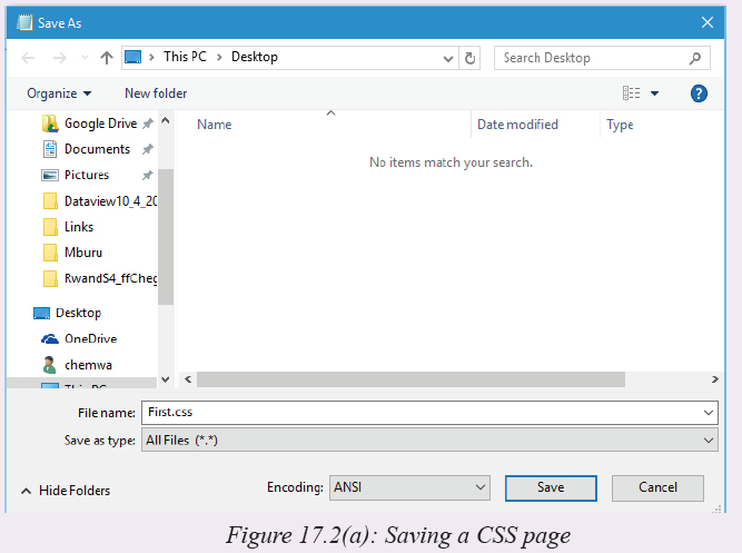
Activity 17.2: Creating simple HTML page
Open a text editor and create the following HTML page. Save your page as First. css as shown in Figure 17.2(a). If you are using Notepad in windows, select All files (*.*) in the Save as type box (Figure 17.2[a]) when saving to avoid saving it as First.css.txt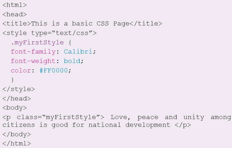

You can now open the page in a browser. What happens?
NB: In this example, .myFirstStyle is a Class. A class is a blue print on which we can define styles which can be accessed and applied to many different CSS sheets. You define a style by starting with a period (.) as shown above. It defines a class style which can be referenced as <p class=”myFirstStyle”>.
17.5 Colors
One of the most important formatting features in web design and development has to do with the right application of color. Color can be applied to text (font) or the background of a section or entire page.
In CSS, color can be specified in either of three ways:
1. Using a valid color name as a value in a declaration e.g. “red”, “blue”
2. Using a valid hexadecimal (HEX) value e.g. #ff1100, #BB00CC
3. Using the Red, Green, Blue (RGB) scheme e.g. “rgb(200,1,1)”
Table 17.2 below shows the values representing some of the most common colors.17.5.1 Using color names
The following pallete in Figure 17.3 shows the various colors and their names:
17.5.2 Using HEX values
Hexadecimal values are made of numbers that range from 0 - 9, A-F (where A = 10 and F=15). Some common HEX values are shown below in Figure 17.4: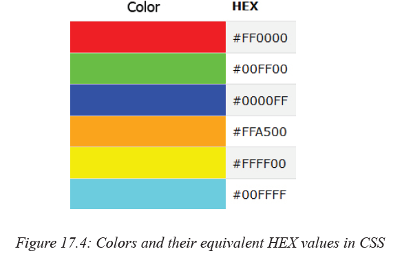
17.5.3 Using RGB values
RGB stands for the three primary colors of Red, Green and Blue. By combining these colors in varying percentages or ratios, it is possible to generate the other colors. Each color has an array that ranges from 0-255. The following are examples of RGB colors that can be generated using the stated ratios: Figure 17.5 below shows various RGB colors.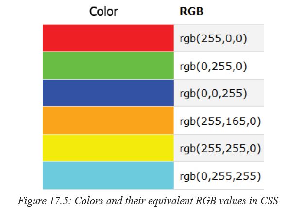
After briefly looking at the syntax, let us now delve into the specifics of how to include CSS in HTML pages.
17.6 Adding CSS to web pages
Activity 17.3: CSS coding strategiesOpen a web browser. Search for the following information:
1. External CSS
2. Internal CSS
3. Inline CSS
Write notes about each of these topics. Present to the class your findings.17.6.1 External CSS
An external style sheet is ideal when the style is applied to many pages. With an external style sheet, you can change the look of an entire web site by making changes to the CSS stylesheet file. Each page must link to the style sheet using the <link> tag. The <link> tag goes inside the head section as shown below: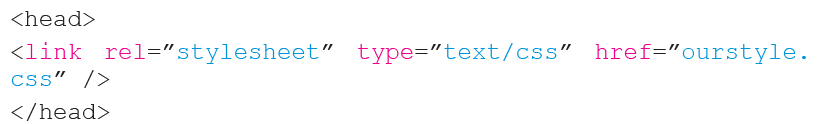
An external style sheet can be written in any text editor. The file should not contain any html tags. Your stylesheet should be saved with a .css extension. An example of a style sheet file text is shown below:

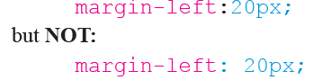
Do not leave spaces between the property value and the units e.g. should be:
Activity 17.4: External CSS example
Create a folder on the Desktop and name it MyCSS. Type the stylesheet file text above in a blank Notepad document. Save the notepad file as external.css in the MyCSS folder. Now open a new Notepad document and type the following HTML code.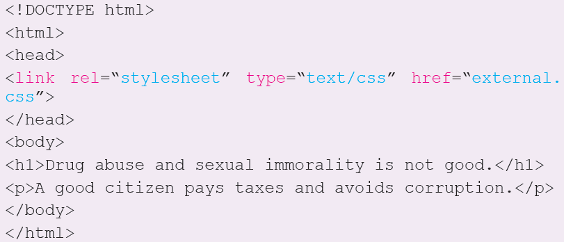
1. Save the above code as htmlcss.html in the MyCSS folder.
2. Download a *.jpg image and save it in the same folder as the CSS and
HTML files. Rename it as homepage.jpg.3. Load your htmlcss.html file in your localhost web server as guided by
the teacher. What happens?17.6.2 Internal CSS
An internal css applies styles to a single page or style sheet. An internal style sheet should be used when a single document has a unique style i.e a single page has styles that are not needed on other pages. You define internal styles in the head section of a HTML page, by using the <style> tag, as shown in Fig. 17.6: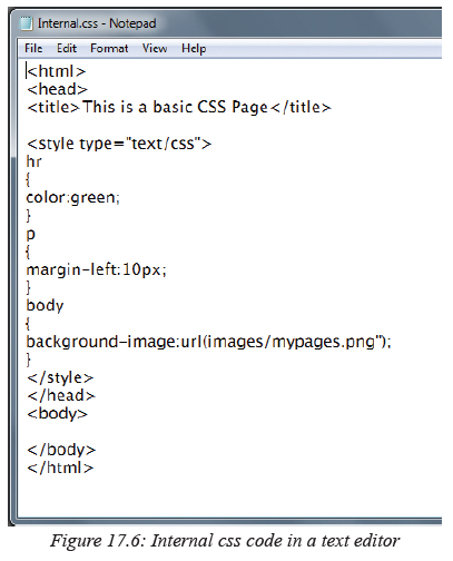
17.6.3 Inline CSS
An inline style loses many of the advantages of style sheets by mixing content with presentation. Do not use this method repeatedly.
To use inline styles, make sure to use the style attribute in the relevant tag. The style attribute contains CSS properties. The example below shows thow he paragraphs color and the left margin can be changed.
Each CSS property (the font-size property in this case) is followed by a colon and a
value. Attribute style specifies the style for an element.17.7 CSS styles
Activity 17.5: Fonts
Pair Work:
From you previous knowledge working with text in other applications, answer the following questions:
1. State four types of fonts that you know.
2. Is it possible to know the font used by looking at the text? If so how?17.7.1 Fonts
CSS has two types of font families:
1. Generic font families: a group of fonts that have a similar look and feel
e.g. Serif, Monospace, Arial etc.
2. A specific font family: e.g. Times New Roman, Courier New etc.
The font family in CSS is set by specifying the font-family property. Sometimes,
the browser may not be able to support the font specified. It is therefore wise to overload the font-family property with many font values separated by commas in order to create a fall back system i.e. its like telling the browser to display using the next font specified if the first cannot be found. If the name of the font-family has more than one words, it must appear between quote (“ ”) marks. The example below illustrates this strategy:
17.7.1.1 Font size
Use the font-size property to set the size of the font: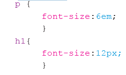
17.7.1.2 Font style
In CSS font-style property is used to display the font either in italics or not. The following example shows how this property can be used: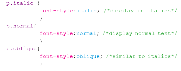
Activity 17.6: Fonts example
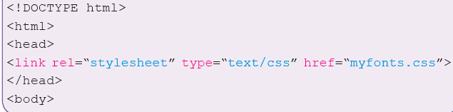
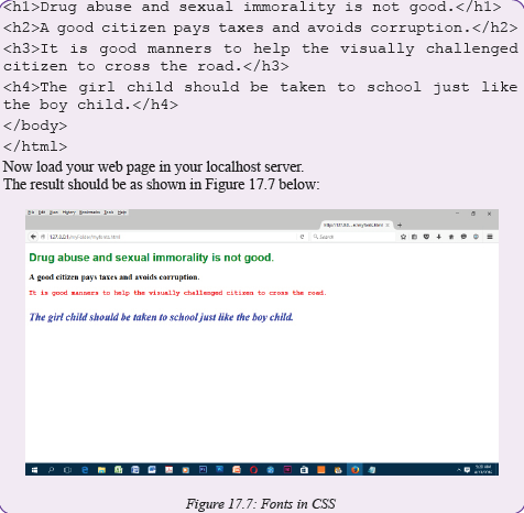
Open Notepad. Create the following and save it as myfonts.css in your folder.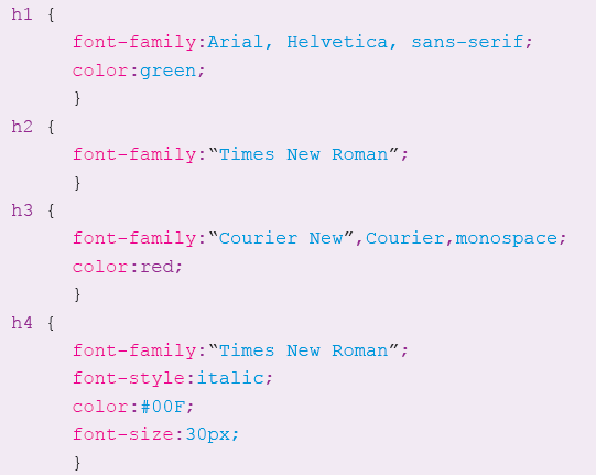
Now create a HTML file with the following code and save it as myfonts.html.
17.7.2 Margins
Activity 17.7: Margins
What is a margin? Why are margins important?
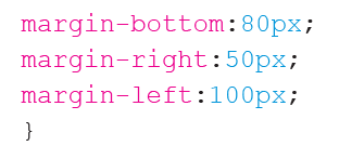
In CSS, margins are spaces that are generated around elements. The margin property is used to achieve this by specifying the size of the white space outside the border. We have the margin-top, margin left, margin right and marginbottom properties. The following example shows how you can apply this property to set the margind for a <p> element.
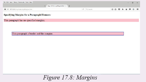
Activity 17.8: Margins example
Create the following HTML page and save it as myMargins.html. What type of CSS have we used? Load the HTML page in your server. What do you see?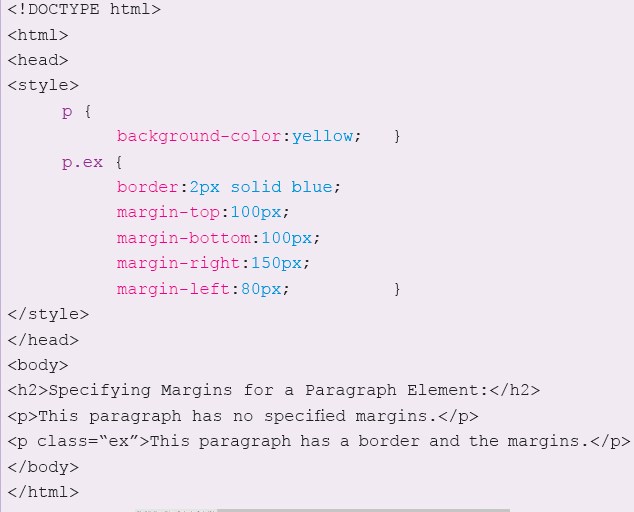
17.7.3 Display
Elements in HTML can be displayed either in block or inline value mode by default.
1. Block level element: an element that displays in block mode fills the entire
width of the screen by default and always starts on a new line e.g. the
<div>,<form>,<header>,<p>, <h1> etc.
2. Inline level element: An inline element does not start on a new line. It takes only the width that is required. Examples include <span>,<a> and <img>17.7.3.1 Hiding elements
Use the display:none; declaration to hide elements that you wish not to appear on the screen e.g.Activity 17.9: Hiding elements
Create the following HTML file and run it to see what happens: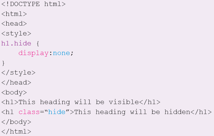
17.7.3.2 Overiding default display values
The <li> element creates a block list by default. However, it is possible to override it so that it can can be displayed as an inline element. One good example is when you create menus at the top of your page. Try out the following and load it in your browser:<!DOCTYPE html>
<html>
<head>
<style>
li {display: inline;
}
</style>
</head>
<body>
<p>Display a list of links as a horizontal menu:</p>
<ul>
<li><a href=“/myFolder/home.html”>Home</a></li>
<li><a href=“/myFolder/about.html”>About</a></li>
<li><a href=“/myFolder/Services.html”>Services</a></li>
</ul>
</body>
</html>If you do this correctly, you should get a web page like the one shown in Figure 17.9 below:

17.7.4 Background
The background of a web page, division or text is very important. It determines the general ambience of the web page to the visitor. There are many background properties. A few of them include:
1. background-color: used to set the background color of an element.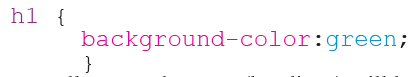
This means all <h1> elements (headings) will have a green background.
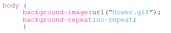
2. background-image: used to set an image as the background of an element. If the image is small, it repeats by default until it fills the space.
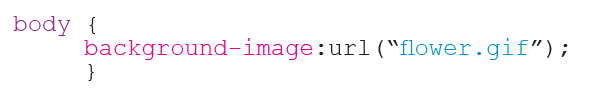
This will apply the image flower.gif to the body section of the web page. In case you do not want the image to repeat, then you can modify the CSS rule as follows:
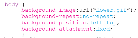
3. background-attachment:this is used to fix an image in a particular position so that it does not scroll with the rest of the page.
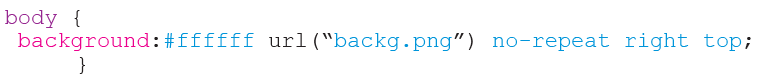
NB: It is also possible to use shorthand to specify background properties. This can be achieved as shown below:
Activity 17.10: Background example
Create the following HTML page and save it as background.html. Download an image of the flag of Rwanda and rename it as flag.jpg. Save both in myFolder.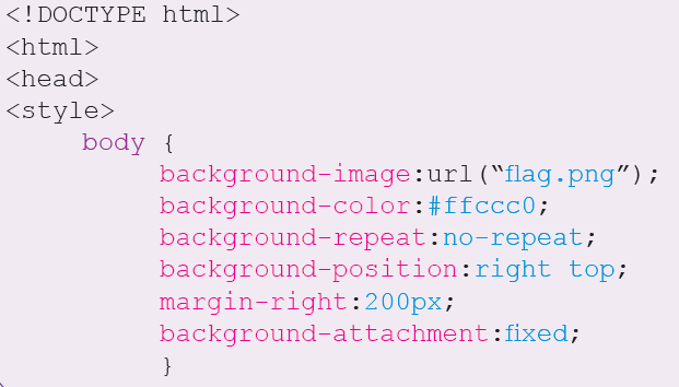
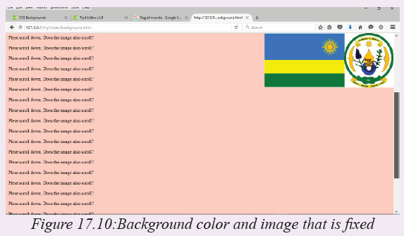
NB: In the Notepad document background.html that you create, make sure the paragraphs starting with <p> are many i.e. 20 and above so as to fill and overflow the web page at runtime. If the web page is not full, scroll bars will not appear hence you will not be able to scroll. The result of this HTML code is as shown in Figure 17.10 below:
17.7.5 Positioning
The positioning properties allow you to position an element on the screen. It can help you to define which element will be behind another, or what should happen if the content of an element becomes too big.
You can position elements using the top, bottom, left, and right properties. You must set the position property before this values can work. They also work differently depending on the positioning method. There are four different positioning methods. This includes:17.7.5.1 Static Positioning
HTML elements have static positioning. A static positioned element follows the normal flow of a page. Static positioned elements are not affected by the top, bottom, left, and right properties of CSS.17.7.5.2 Fixed Positioning
An element with fixed position is positioned stationary relative to the browser window.It does not move even when the window is scrolled. A CSS code extract that fixes an element can take the following form:

NB: Some browsers like Internet Explorer support the fixed value only if a !DOCTYPE is specified.
17.7.5.3 Relative Positioning
A relative positioned element is positioned relative to its normal position.
Example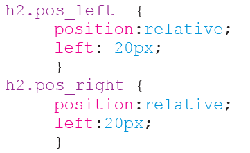
The content of relatively positioned elements can be moved and overlap other elements, but the reserved space for the element is still preserved in the normal flow.
Example
Relatively positioned elements are often used as container blocks for absolutely positioned elements.
Absolute Positioning
An absolute position element is positioned relative to the first parent element that has a position other than static. If no such element is found, the containing block is <html>:
Example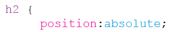
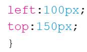
Absolutely positioned elements are removed from the normal flow. The document and other elements behave like the absolutely positioned element does not exist. Absolutely positioned elements can overlap other elements.
17.7.6 Floating
Activity 17.11: CSS float property
Fetch some water on a pail or basin. Float some bottletops on the water. try the
following:
1. Arrange them to float on a straight line relative to each other.
2. Push them to float to the left or right.
3. Is it easy to have the bottletops maintaining their order?
With CSS float, an element can be pushed to the left or right, allowing other elements
to wrap around it. Float is very often used for images, but it is also useful when
working with layouts.17.7.6.1 How Elements Float
Elements are floated horizontally; Either left or right on the page, not up or down. A floated element will move as far to the left or right as it can. Usually this means all the way to the left or right of the containing element. The elements after the floating element will flow around it. The elements before the floating element will not be affected. If an image is floated to the right, a following text flows around it, to the left:
Example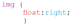
17.7.6.2 Floating Elements Next to Each Other
If you place several floating elements after each other, they will float next to each
other if there is room. Here we have made an image gallery using the float property:
Example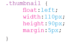
17.7.6.3 Turning off Float - Using Clear
Elements after the floating element will flow around it. To avoid this, use the clear property. The clear property specifies which sides of an element other floating elements are not allowed.
Add a text line into the image gallery, using the clear property:
Example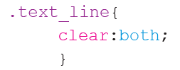
After learning all the above concepts, it is time for you to do the following Activity which will apply the concepts learned.
17.7.7 Padding
In CSS padding properties are used to create or generate space around content. This is seen as white space between the element content and the element border. When you set a padding value, it clears the area around the content within the inside of the margin. Figure 17.11 below represents this concept in a block diagram.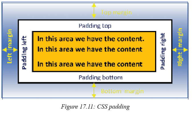
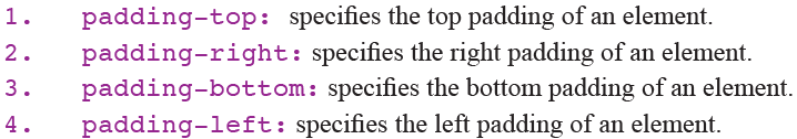
When specifying the padding, we use the following CSS properties:
When specifying the padding value associated to a particular property, you can use the following units:
a) length: you can specify this by using pixels (px), points (pt), Centimetres (cm) etc.
b) percentage(%): it specifies the padding space in terms of the width of the containing element.
c) inherit: specifies that the padding should be inherited from a parent element. For purposes of simplicity, we shall demonstrate how to use the pixels to specify the padding value.
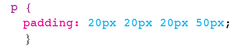
Example: If you wish to specify the padding around the element p then do the following: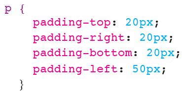
The above CSS code can be summarised as:
Activity 17.12: Setting the padding of an element
Open Notepad and type the following text exactly the way it is below: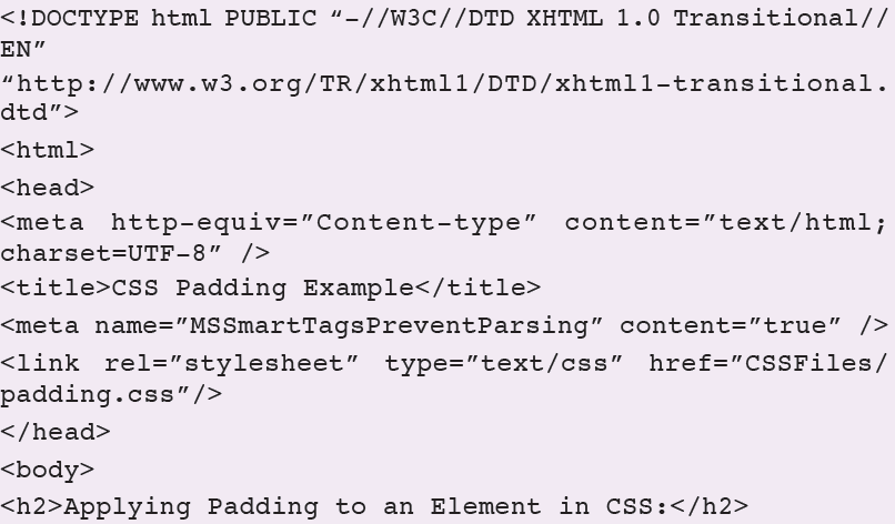
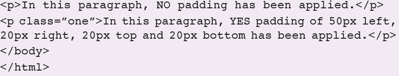
Save the text file as padding.html in a folder of your choice. In this case we have saved it in the htdocs folder of the WAMP server.
Now create the following CSS file too and save save it as padding.css in a folder of your choice. In this case, we saved ours in a folder called CSSFiles which is within htdocs folder.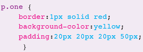
Now load your padding.html file in your web server. What do you see? You should get the following result as illustrated by Figure 17.12.

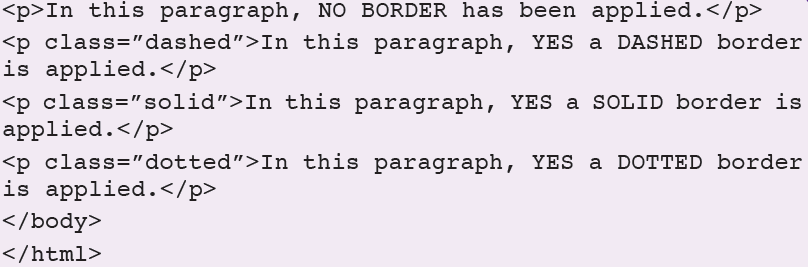
17.7.8 Borders
Using CSS, a border can be specified around an element like a paragraph. You specify
a border using the border-style property. The style of the border line can also be specified using various values as follows: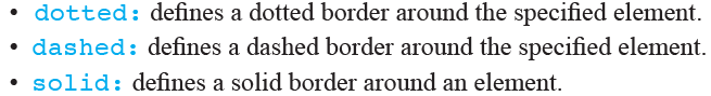
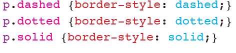
We can define different elements with different border styles as follows:
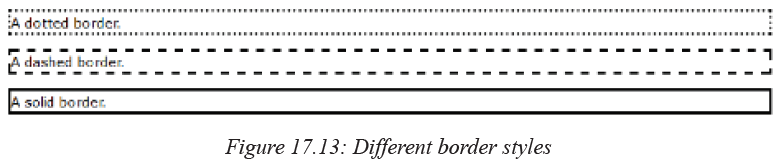
The results of such specifications in CSS would resemble the illustrations in Figure 17.13 below:
Activity 17.13: Setting the padding of an element
Open Notepad and type the following text exactly the way it is below then save the file as borders.html: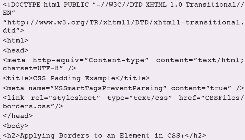
Now create the following in Notepad too and save it as borders.css.

After that load the HTML file (borders.html) in your browser. What do you see? Your results should be similar to what is shown in Fig. 17.14 below:

17.8 Creating a CSS page from Scratch
Activity 17.14: Creating CSS page example
Individual Work: Assuming you want to develop a CSS web page which contains information about resent discoveries in space science. You are told that the website should have a layout similar to Figure 17.15 below. Follow the steps provided to finally create your page.
1. Start by creating the following directory structure on the desktop or any other location in your computer. If you are using WAMP server, create it in the www folder because this is the default folder where Apache sever looks for websites.
Main Folder: myFolder
Subfolders within myFolder -- CSSFiles; Pictures.
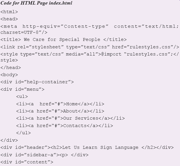
2. Open a text editor and then create the following basic HTML page:<html>
<head>
<title> Respect for People with Special Needs </title>
</head>
<body>
</body>
</html>Save the page as index.html in the htdocs directory.
3. Looking at Figure 17.15, the width of the page is 760 pixels. We therefore, start by creating a container on the page which is this wide. Let the container be centered on the page. Nothing will float outside this width on the page. Between the <body> </body> tags insert container creating text as shown below:
A container called help-container has now been created by HTML on the page. Save and exit.
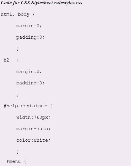
4. Create a new blank text file. Save it as rulestyles.css in the CSSFiles folder. Enter the following text in the file and save.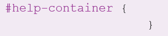
The # placed before the ID tells the browser that we are selecting a container ID that we have already defined. If we were selecting a class we would start with a (.) instead for example .help-stars{} if such a class did exist.
We use IDs to define elements that appear once on a page. We use classes for elements that appear many times on a page e.g. font formats.
5. To add background color to our container, we can do the following: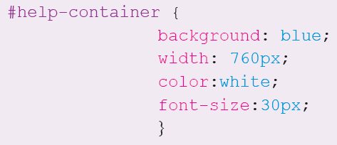
6. After saving (5) above, open index.html and modify it to look as below though do not include the line numbers.
<!DOCTYPE html PUBLIC “-//W3C//DTD XHTML 1.0 Transitional//EN”
“http://www.w3.org/TR/xhtml1/DTD/xhtml1-transitional.dtd”>
Explanations:
Line 3: it sets the parsing text format.
Line 5: it links the HTML file to the CSS file or style sheet.
Line 6: works the same as line 5. You can do without it if you have line 5.
Line 9: calls the CSS ID in the div container.
Line 10: applies the CSS ID formats on the text and div container.
7. Start your server. In the browser type: localhost/htdocs and then press the Enter key. You should be able to see the results as shown in Figure 17.16 below: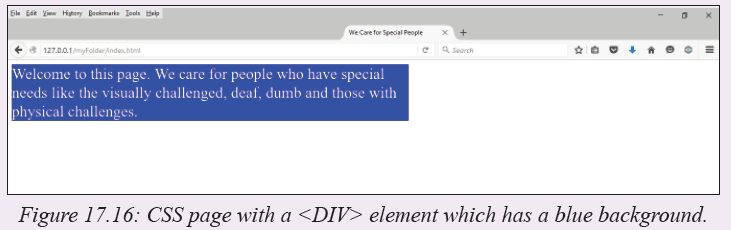
8. Notice the container seems to leave some white space on the left and top of the screen. We can be able to center it on the screen by using the margin =auto; property in the CSS file. Here we go:
Notice the comma between html and body: it stands for or

The first three lines forces the margin and padding to start from 0 since by default html usually leaves space on the left and top of the page as margins and padding. If you refresh your web page, you will notice that the container now starts from the very edge.
9. Good. We are now ready to add the various divisions of the page by dividing the “help-container” in the HTML file. We want to create the layout in Figure 17.1. So we add new divs each with its own unique id. Here we go: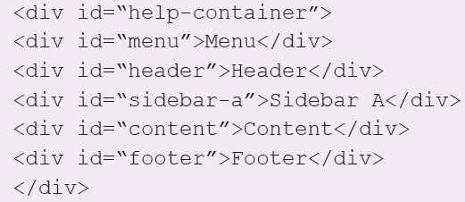
If you refresh you page, it should now look as the one in Figure 17.17. Notice that the divs are arranged one above another as is the normal document flow. Using CSS we are going to specify a different layout. We achieve this by going to our CSS style sheet, removing the background color from the main container and specifying new values for all our new divs separately.
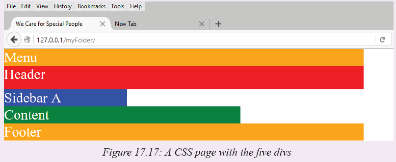
NB: We deleted the text in the help-container div. We also opened the galaxy.css and specified a color for each new div we created in order to get what you see in Figure 17.10.
10. Now, edit rulestyles.css to look as below. We wish to float some of the <DIV> elements to the right or left depending on our design:
Let us try to explain some of the code on the fly:
• Lines 6,21,26,31: they set the width of the div.
• Lines 11,16: sets the height of the div. Where no height is specified, the div will expand with text.
• Line 19: tells the sidebar-a div to float to the right.
• Line 24: tells the content div to float to the left.
Save the changes and refresh your page. Your page should now look like Figure 17.18 below: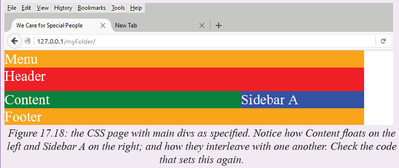
11. This layout looks okay for now as long as you have not added text. Upon adding some text, some misalignments will start to be seen. For example, let us add the following text in the content area:
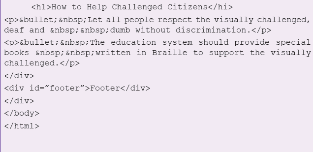
<div id=“content”>How to Help Challenged Citizens
• Let all people respect the visually challenged, deaf and dumb without discrimination.
• For citizens that don’t have limbs, support them physically when required and financially to help them purchase prosthetics.
• The education system should provide special books written in Braille to support the visually challenged.
</div>
Notice what happens to the page layout now as captured in Figure 17.19.
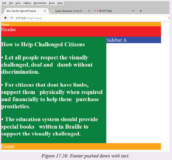
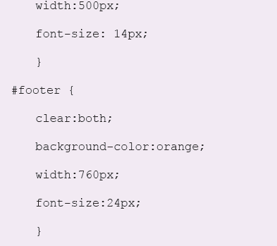
Notice that the text in the content area does not push the footer down with it as we expect. This is because any floated element in CSS cannot push the elements below it. We need to introduce the “clear” property in the footer which will make sure that it is pushed down as the elements above it expand. This is how you will do it: open your css style sheet then make sure that the code under footer looks as follows:
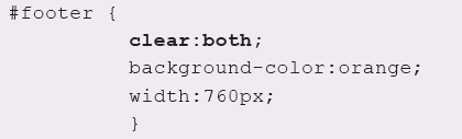
The clear property will have the effect on the footer as captured in Figure 17.20. refresh your page to see this:
12. In some browsers, the boundary between the Content and the Sidebar A may not be as clearly defined as is shown in Figure 17.7. Instead, the text of the content may flow into the white space under the blue Sidebar A. If this happens, then you may need a different means of specifying the extent of the right margin of the Content relative to the right margin of the container.
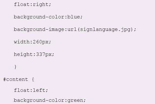
You will need to use the “margin-right” property i.e.#content {
margin-right:260px;
background-color:green;
}In so doing, you are telling the browser that the right margin of the content div is set at 260px from the right margin of the main container (galaxy-container). Hence, the container region cannot overlap with the sidebar that has been floated to the right.
You can now use the text formatting commands to format the text in each div. We need to do the following:(a) To add a menu to the menu div.
(b) To add a title in the Header div.
(c) To add copyright information in the footer.
13. Add the following in the header section:<div id=“header”>
<h2>Let Us Learn Sign Language </h2>
</div>Refresh your page to see the new header as shown in Figure 17.21.
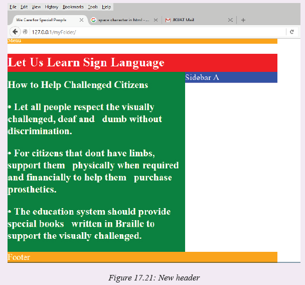
Notice the space between the menu and the header. This is caused by the default padding and margins. Open your style sheet file and strip these default values:
h2 {
margin:0;
padding:0;
}If you do it correctly the white space will disappear.
14. To add a menu we use the unnumbered list. Edit the text in the menu div section as follows:1. <div id=”menu”>
2. <ul>
3. <li><a href=“#”>Home</a></li>
4. <li><a href=“#”>About</a></li>
5. <li><a href=“#”>Our Services</a></li>
6. <li><a href=“#”>Contacts</a></li>
7. </ul>
</div>Line 2: the <ul> stands for unnumbered list. In this instance, it acts as a container for the menu items.
Line 3-6: the <li> stands for list values. Each li creates a unique identifier for the menu items. Each menu item should ideally be linked to a page (hence the href property).
If you refresh your page now, yo will see your menu having bullets one item after the next. We don’t want a bulleted list. We want a horizontal menu. We therefore move to step 15 below.
15. Open the CSS style sheet and edit #menu to become menu ul and menu li:
1. #menu ul {
2. list-style:none;
3. margin:0;
4. padding:0;
5. height:35px
6. }
7. #menu li {
8. float:left;
9. margin:0 1.00em;
10. }Explanations:
Line 1: points to the unnumbered list menu (ul).
Line 2: specifies that the list has no numbering style.
Line 7: points to the menu list items.
Line 8: floats the menu list items to the left and arranges them horizontally one after the next.
Line 9: specifies the spaces between menu items.
Save your work and refresh your page. It should now look like Figure 17.22 below:
16. Let us now format the text on our page. Let us start by creating a heading for our content. The heading is “How to Help Challenged Citizens”. We want to format it with the <h2> tag:
<div id=“content”>
<p><h2>How To Help Challenged Citizens</p></h2>
- Let all the people respect the visually challenged, deaf and dumb citizens.
- For citizens that don’t have limbs, support them physically when required and financially to help them purchase prosthetic limbs.
- The education system should provide special books written in Braille to support the visually challenged.
</div>
Do not forget to add the following in the style sheet file:
h3 {
margin:0;
padding:0;}
p {
margin:0;
padding:0;
}
17. Let us display the image of a sign languahe in the sidebar.
Download a .jpg image of one of sign language and save it in the Pictures folder as galaxy.jpg. To display this in the sidebar div add edit the code in the sidebar-a section of the style sheet:
#sidebar-a {
float:right;
background-image:url(../Pictures/signlanguage.jpeg);
width:260px;
height:237px;
}
Carefully specify the dimensions of the image to fit the sidebar space. When you refresh your page, you now have the following as shown in Figure 17.23. Notice we have deleted some of te text in the content area. Also, notice the image causes the sidebar to flow downwards so that it can fit according to the specifications that you gave in the CSS file.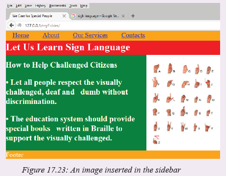
NB: Check for the code of this Activity in the code section below.

Activity 17.15: CSS assignment
Create a CSS web page for your school. Let it have a layout like the one in Activity
17.6 but you can choose to have a different layout if you so wish.Assessment Exercise 17.1
Fill in the blanks in the following statements:
(a) Using the ___________ element allows authors to use external style sheets in
their pages.
(b) To apply a CSS rule to more than one element at a time, separate the element
names with a_________.
(c) Pixels are a
(d) The __________pseudo class is activated when the user moves the mouse cursor
over the specified element.
(e) Setting the overflow property to_______ provides a mechanism for containing
inner content without compromising specified box dimensions.
(f) While ___________ is a generic in-line element that applies no inherent
formatting and ____________is a generic block-level element that applies no
inherent formatting.
(g) Setting property background-repeat to ____________tiles the specified
background image vertically.If you float an element, you can stop the flowing of text by using property________.
(i) The property allows you to indent the first line of text in an element.
(j) Three _______ components of the box model are the________, ________ and_______.
Unit Test 17
1. Write a CSS rule that makes all text in a div to be of font color green.
2. Write a CSS rule that places a background image in a div.
3. Write a CSS rule that gives all h1 and h2 elements a padding of 0.5 ems, and a margin of 0.5 ems.
4. Create a CSS web page displaying the flag of Rwanda floating to the left. Write the National anthem of Rwanda and float it to the right of the flag.
5. Using HTML and CSS create a static website for your school that has the following features:
(a) The school logo at the top center of the page.
(b) The school motto just below the logo, also centered on the page.
(c) A menu bar with the following commands: Home, About, Subjects, Clubs, Games Teams.
(d) Create three sections one on top of the other below the menu. In the first section, display a picture of your school.
(e) In the second section, describe the location of your school and give directions on how a visitor can trace their way to the school.
(f) In the lowest section, give the contact information for the school e.g. Telephone, address etc.
(g) At the bottom of the page, include the copyright information.
NB: Specify the font styles, color and background color as you wish. However make sure that your colors give an attractive interface. A good method of selecting colors is to use the color scheme of your school if it exists.Glossary
Algorithm: A logical step-by-step procedure for solving a problem in terms of instructions to be executed, and the order in which the instructions are to be executed.
Arithmetic and Logic Unit (ALU): A part of the central processing unit that performs computations and makes comparisons as instructed.
Array: An array is a group of contiguous memory locations having identified by the same name for storing data the same type.
Artificial intelligence (AI): A field of computer technology in which researchers and electronic product developers concentrate on developing computers that mimic human intelligence.
Assignment: In programming context, assignment is an operation that causes operand
on the left side of the assignment operator to have its value changed to the value on the right.BIOS: This is an abbreviation for Basic Input Output System, a read-only firmware that contains the basic instruction set for booting the computer:
Bit: Bit is a short form of binary digits referring to a single digit 0 or 1 used to represent any data in digital computers.
Boolean data type: Data type used to represent two values: true (1) or false (0).
Boolean logic: A form of algebra in which all values are reduced to either true or false
Boot Order: Sequence in which a computer should check available storage devices
for the operating system’s boot files.Byte: A group of bits used to store a single character. A byte usually consists of seven or eight bits, which the computer handles as a unit. Cascading style sheet: Styles that define how HTML elements and markup should be displayed by the browser.
Computer hardware: The physical computer equipment one can see and touch. Such equipment includes; the system unit, input devices, storage devices and output devices.
Computer program: A set of instructions that directs the computer on the tasks to perform and how to perform them. These instructions are specially written using computer programming languages.
Computer system: A computer system refers not only to the physically attached
devices to the computer, but also to software and the user.Conditional logic: This is a Boolean statement formed by combining two statements or facts using conditional rules. Control structure: Refers to a statement or block of code that determines the flow or order in which other program statements are executed.
Control unit: The part of the CPU that interprets instructions and controls all the operations in a computer system. The control unit monitors on the input, storage, the arithmetic and logic operations, and the output operations to have the instructions carried out.
Declaration: In programming context, declaration refers to reserving memory location by specifying the type of data to be stored.
Device Driver: utility program that acts as an interface between a hardware device and the operating system.
Disk formatting: refers the process of preparing a new disk for use by imprinting sectors and tracks on the surface of the disk so that the operating system can recognise and make it accessible.
Drive: Devices used to read and/or write (store) data on a storage media. Electronic mail (e-mail): A type of mail system that uses computers and telecommunication facilities to transmit messages.
Electrostatic discharge (ESD): Refers to flow of static electricity when two triboelectric objects come into contact.
Ergonomics: Refers to applied science of equipment design intended to optimize productivity by minimizing discomfort and fatigue.
Ethics: Refers to a set of moral principles that govern behaviour of an individual
or group.Expression: Refers to a sequence of operators and operands that specifies relational
or mathematical computation.Flowchart: Program design tool represent an algorithm graphically using a set of
standard symbols.Function prototypes: This is a statement in C or C++ programming used to declare a function without implementing its body.
Goto: This is a form of jump statement used to transfer control to lines of code identified using labels.
Hard copy: Hard copy refers to the tangible output produced mostly on a piece of paper by devices such as printers and plotters.
Hard disk: Also referred to as a hard drive or a winchester disk, is a sealed unit in which are shiny, metallic disk platters and read/write heads that read and recorddata on the disks.
HMDI: This is an abbreviation for High Definition Multimedia Interface, an interface used for transferring compressed and uncompressed digital audio or video data:
Hypertext Markup Language (HTML): This a standard web development language used for describing the structure of a web document.
Infinite loop: This is an endless loop that may be caused by boolean condition that
is never returns false.
Input/output (I/O) devices: Devices used for entering data to be processed and for
reporting the results of processing.Input: A collection of raw data at the start of information processing cycle.
Integrated circuits: Thousands of small circuits etched on a silicon chip. As these circuits are made more and more compact, they are called Large Scale Integrated (LSI) and Very Large Scale Integrated (VLSI) circuits.
Interpreter: A language processor that translates the source program statementby- statement allowing the CPU to execute one line before translating the next.
Logic gate: These are the basic building blocks of electronic circuits having one or more inputs but returning only one output in digital systems.
Logic Programming: Rule-based nonprocedural programming paradigm that focuses on use of symbolic logic or predicate calculus.
Looping: In programming context, looping refers to repeated execution of a block of statements until a boolean condition returns false.
Microcomputer: The name computer with a microprocessor as its brain. A microcomputer can perform input, processing, storage and retrieval, and output operations rapidly, accurately, automatically, and economically despite its relatively small physical size.
Microprocessor: A complete central processing unit of a computer built silicon chip.
Minicomputer: A computer having a smaller capacity for both primary and secondary storage than medium size and large size mainframe computers.
Modular Programming: Programming approach in which complex program is broken down into smaller components known as modules, procedures or functions.
Networks: Communication systems that connect computers, terminals, and other
electronic office equipment for the purpose of efficient communication and sharing of resources.Nibble: This is a sequence of four bits Half a byte, which is usually a grouping of 4 bits is called a nibble.
Object-oriented Programming (OOP): Programming paradigm in which programming procedures (methods) are combined with data (state) to form objects that are organized into classes.Ones complement: Refers to bit-by-bit negation of a binary number. It is usually considered as a step to finding negative binary number of decimal numbers.
Operating system: This is a complex program that is responsible for controlling processing operations in a computer system, Examples of common Operating
Systems are: Microsoft Windows, UNIX, Linux and Mac OS. Output: Useful information available at the end of the information processing cycle.
Parameter passing: Refers to exchange of data between two functions. In other words
parameter passing serves as hence serving as the communication mechanism between two functions.Peripheral devices: Refers to devices that are connected to the system unit called through ports.
Programming Paradigm: Refers to pattern, theory or systems of ideas that used to guide development of computer programs.
Pseudocode: Refers to structured statements used to express an algorithm input, processing and output logic of a program.
Random-Access Memory (RAM): A type of main memory that holds data and information temporarily before and after processing.
Read-Only Memory (ROM): This is a type of main memory that stores data or instructions permanently or semi permanently.
Repetitive Strain Injuries (RSI): This is a health related problem characterized by eye strain, headache and dizziness caused by prolonged use of computers.
Reserved words: These are keywords that have a special meaning in a language and can only be used for the intended purpose.
Robotics: Study of robots controlled by computer to perform tasks ordinarily done
by human beings.Semiconductor: Materials that are neither bad conductors nor good conductors such as silicon on which integrated and support circuits are etched. It is used for developing microprocessors, solid state memory, RAM and other electronic components.
Source code: Refers to a set of instructions or statements written by a programmer
that are not yet translated into machine-readable form.Supercomputer: The largest, fastest, and most expensive type of computer. A supercomputer can perform hundreds of millions of complex scientific calculations in a second.
System unit: This is the main part of most desktop computers within which are components like the processor, hard disk drive and main memory
Utility program: A collection of instructions designed to make common processing operations run smoothly.
Variable: In programming context, a variable correspond to location in memory in which a value required by a program can be stored.
Web server: A program that runs on a computer and is responsible for replying to web browser requests for resources such as web pages.
World Wide Web: Refers to hypertext interactive, cross-platform, and graphical information repository known as website that runs over the Internet.