UNIT 4 GRAPHIC DESIGN
Key Unit competence: To be able to create various designs withillustrations and different letters styles using digital devices
i) Lines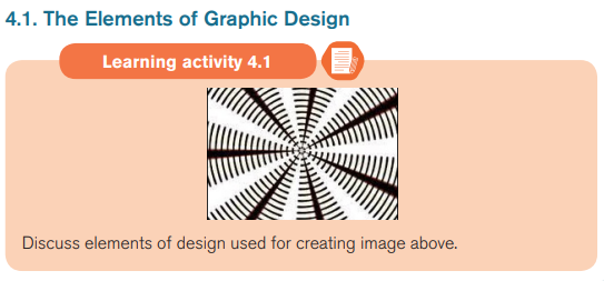
Lines are used as roadmaps to direct the viewer’s eye movements. They
can exist on their own or be employed to create texture and movement to
connect information, to demarcate space or even to create a desired mood.
Lines can be vertical, horizontal, diagonal, circular, patterned, free form or
solid/bold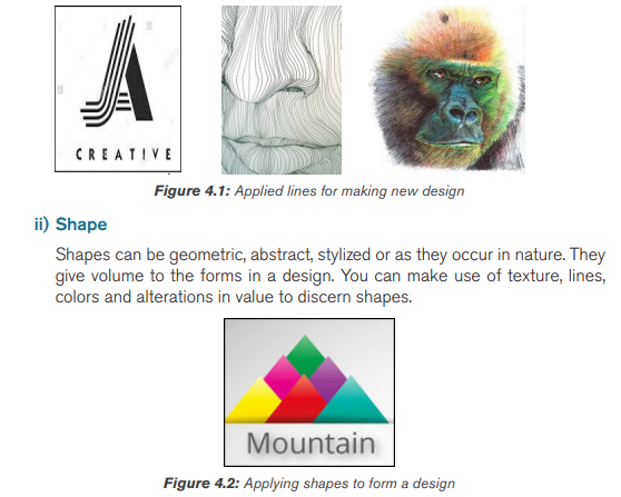
iii)Texture
Texture is a powerful graphic design tool used to enhance design with details
necessary for creating visual impact. It delivers a sense of feel, especially
with two-dimensional images. In graphic design, texture can take the form
of layers or gradation of text, lines or shapes.
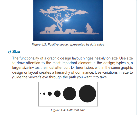
iv)Space
In design expression; white space is called negative space. It can be used
to connect, separate or maximize the relationship between the elements
making up the design. Negative space creates groupings, enhances
expressions and emphasizes hierarchies. Space can also be used to givethe illusion of depth or multi-dimension
vi)Value
This refers to how dark or light (in terms of color) something is. In a
monochromatic image, value is used to define the shape and texture of a
design element. Value comes in handy when you want to convey the illusion
of movement or bring one element into sharp focus while another recedesinto the background.
vii) Color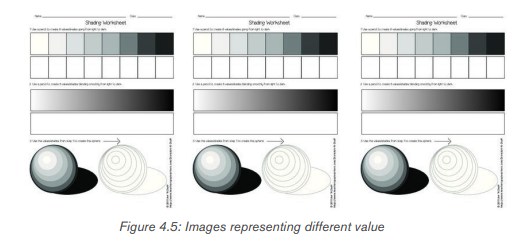
People process color subconsciously. To establish mood, create appeal,
generate interest and get a message across, color is the most potent tool inyour graphic design arsenal
Aspects/qualities of design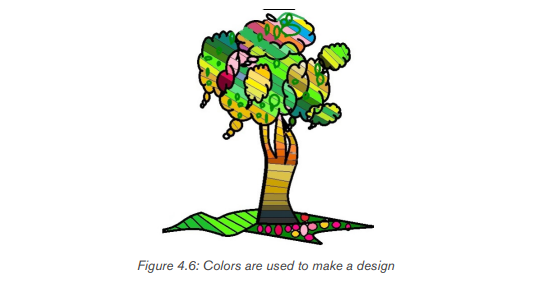
Layout in graphic design deals with the arrangement of visual elements so as to
achieve specific communication objectives.
When designing, the graphic designers should rely on the required information
to present the layout properly, such as rotating and resizing the images, which
requires time and efforts. In order to be able to design quickly, it is necessary
to plan the layout in advance to save time and create a consistent look for your
design.
Legibility: the artist should choose the kind of lettering that will be easy to read
at a glance. It should not be too congested or condensed. The words should have
proper spacing, a good background color and illustrations should be seen clearly.
Placement: don’t overlap your images over your font, but make sure they are
next to any wording that helps explain them. You shouldn’t be using these just to
fill a giant empty space. All of your images should have purpose.
Illustration: are those images or pictures that accompany the text to explain
it, illustrations help the viewer to understand well and quickly the message. On a
poster it is better when the illustration takes a big place at least 60% of the wholeplace.
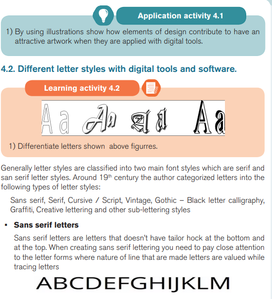
• Serifs
The serifs – small decorative strokes added at the end of the letterforms
The different thickness in the strokes – not every stroke has the samethickness.
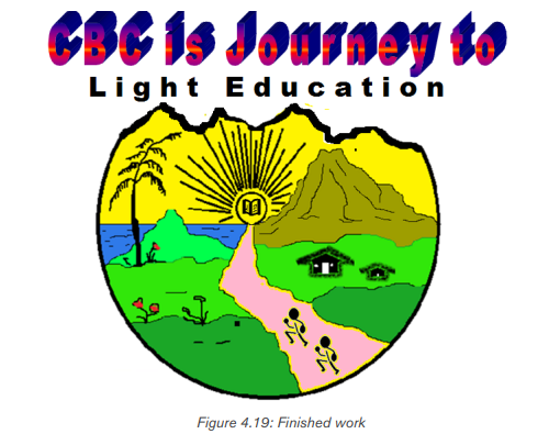
Poster making using digital tools
A poster is a large notice or picture that you stick on a wall or board, often in order
to advertise something. Synonyms: notice, bill, announcement and advertisement
Steps for designing a professional poster
• Determine you poster format
• Brainstorm the content
• Pick a suitable template
• Use colours to grab attention
• Choose graphics and typography
• Clean up any clutter
Example of a poster with machine software design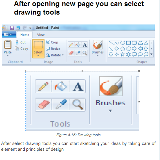
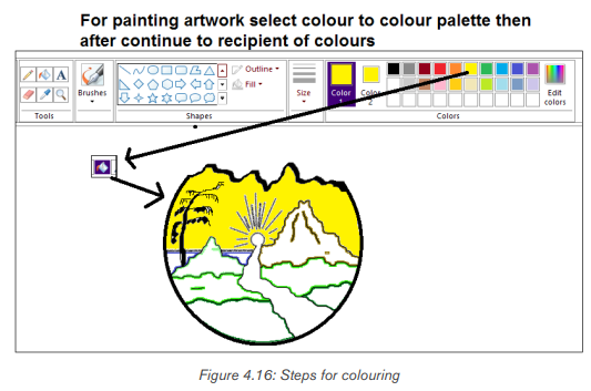
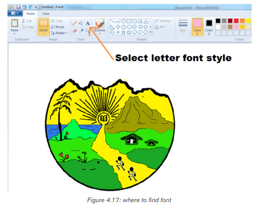
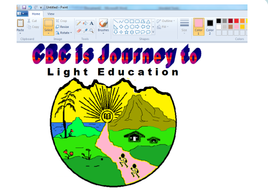
Figure 4.18: Applying colours in font style