General
- ICT S3 SB File Uploaded 25/01/22, 13:15
- S3: ICT TG File Uploaded 10/08/22, 18:12
Unit 5: Charts and Objects in Spreadsheets
Key Unit Competence
Use Charts and objects in a spreadsheet, use different techniques to organize a printable datasheet.
5.1 Charts (Graphs)
A chart is a graphical representation of numerical data. It is a sheet of information in form of a table, graph, diagram or object.
Charts enable users to see results of data in detail, interpret and predict current and future data in a much easier way.
5.1.1 Uses of charts
- Used to summarize numerical information.
- View relationships between different variables e.g. Price against sales volume.
- Detect trends overtime and make forecasts.
- search for patterns among a large amount of figures.
Note: In unit 3, we looked at how we create charts in MS Word and this means you already know something about charts. Like in MS Word, a chart is created almost the same way in MS Excel but the difference is in steps you take to create it.
5.1.2 Types of charts
there are several types of charts used to present data pictorially. the charts mainly include; column, bar pie, line and scatter graphs.
Activity 5.1
You are given the following data to enter in Microsoft excel. save the data as ‘ICt marks’. Use the data to create a column, bar, pie, line and scatter charts. (Follow steps for creating a chart in section 5.2).

1. Column chart:A column chart displays data as vertical bars. If the data in table 5.1 above is entered in spreadsheet and a column chart created for ICT marks, it may appear as shown in picture 5.1.

2. Bar chart: A bar chart represents data mainly as horizontal bars or objects.
When the data in table 5.1 is used in Ms excel to create a chart, a bar chart for ICT marks may appear as shown in picture 5.2.
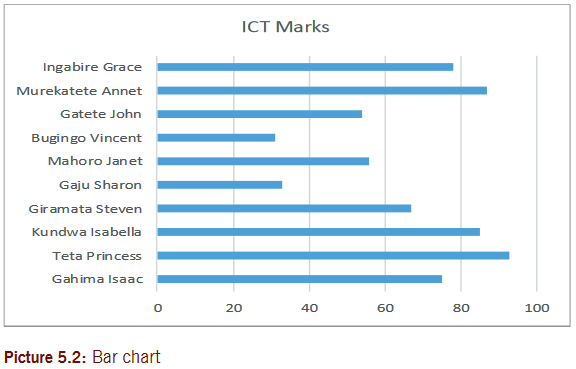
Difference between column and bar charts
A bar chart represents data using horizontal objects but a column chart uses vertical objects.
Similarity between column and bar charts
Both bar and column charts represent data using bars or columns to compare items. the length of each bar or column is proportional to the data that it represents. this means that a bar or column corresponding to a value of 100 would be twice as long as one corresponding to value of 50.
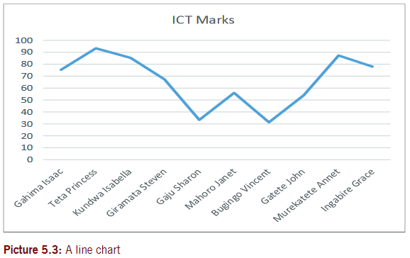
3. Line chart (line graph)
A line chart is a graphic representation of data plotted using a series of lines.
If the data in table 5.1 is used to create a line chart, it would appear as shown in picture 5.3.
4. Pie chart
Pie chart is a circular chart sliced into sections; each section represents a percentage of the whole. Pie charts do not display horizontal and vertical axes as other charts.
If the data in table 5.1 is used to create a pie chart, it would appear as shown in picture 5.4.

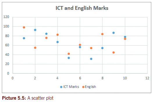
5. Scatter chart /graph
A scatter plot is graph of plotted points showing the relationship between two sets of data.
A scatter (XY) plot is a graph used to plot the data points for two variables. each scatter plot has a horizontal axis (x-axis) and a vertical axis (y-axis). one variable is plotted on each axis.
If English marks are added to table 5.1 to have two variables, then the scatter plot would appear as shown in picture 5.5.
5.2 To create a chart in Microsoft Excel
there are several charts you can create and the common ones are; bar, pie, column and line charts. Common charts are illustrations that are frequently used to represent data in figures.
to create a chart follow the steps given below;
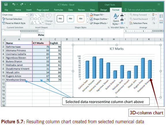
Step 1:Create or open an existing workbook with well-prepared numerical data. In this case open a file ICT marks.
Step 2: select all the cell data you need to be represented in the chart (including all the labels and titles). If the data is not nearby to each other, press Ctrl as you select other pieces of data.
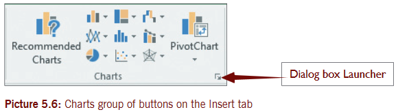
Step 3: on the Insert tab, in the Charts group, click on the chart type you want (example is Column) and then click on the sub type
Desired from the list that displays (example is 3-D Clustered column).
Step 4: the new chart displays automatically as a floating object(embedded chart) in your data.
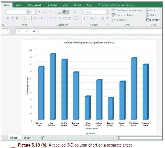
Using table 5.1, we create a 3-D column chart, and it appears as shown in picture 5.7.
a) If you want the chart to remain in the sheet as object, drag it to appropriate position below or on the right of the data. You can also resize it.
b) If you want the chart to be on a separate sheet do the following:
(i) on the Design tab (under Chart Tools), in the Location group at the right, click on the Move Chart button.
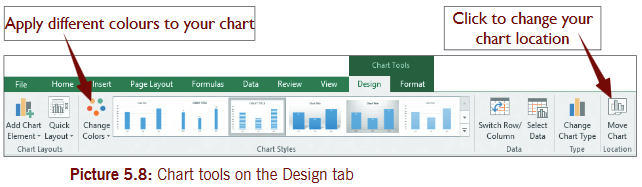
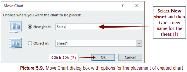
(ii) In the Move Chart dialog box that displays as shown below, choose where you want the chart to be placed and click OK.
Note: Once you select data for charting, press F11 to place the chart on a separate sheet or press Alt + F1 to place it as an object in the sheet.
Step 5: the new chart will display on its page as shown in picture 5.10(a). Label your chart by applying chart title, x-axis title and y-axis title.
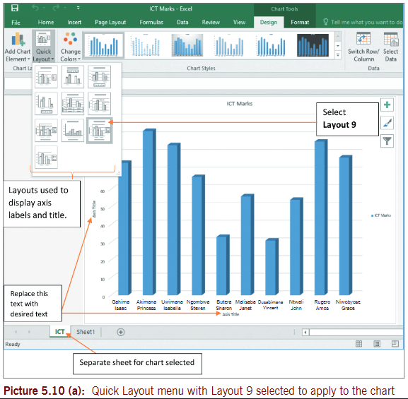
5.2.1 How to apply a predefined chart layout to your chart
Use the steps given below to apply chart layouts on the charts (column, bar and line charts) you created in Activity 5.1.
Step 1: select the chart/graph.
Step 2: on Design tab, in the Chart Layouts group, click Quick Layouts button. on the list of layouts, select Layout 9 (or you can select any other desired).
Step 3:Replace the default text in the x-axis, y-axis titles and Chart title with learners’ names, marks in percentages and a chart showing learners performance in ICT, respectively.
Note: For the chart to be easier to understand, titles must be added i.e. chart title and axis titles.
If the column chart in Activity 5.1 is changed to a 3-D column chart and labelled, it appears as shown in the screenshot. see picture 5.10(b).
Activity 5.2
1. organize the following data in a spreadsheet software.

a) Create a 3-D line chart to display information in table 5.2.
b) Apply labels and title on your chart. save your work as ‘Rain-temperatures’ and print your work.
2. the data in table 5.3 shows Animal data between the years; 1991 and 2000. enter the following data using Microsoft excel.
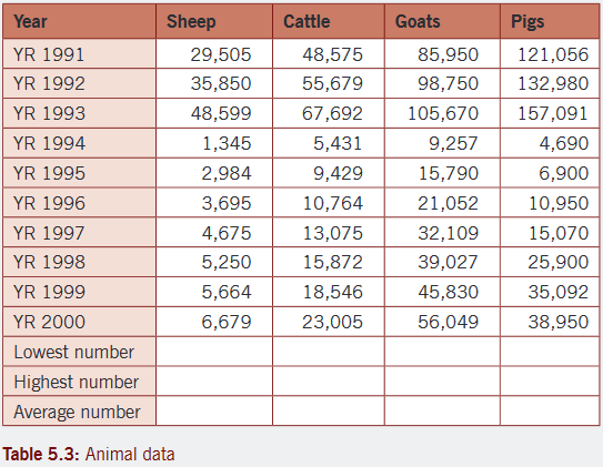
a) Copy the information above onto sheet 2 and then include one decimal place on all the figures.
b) Apply a suitable border on all the data.
c) Determine the lowest, highest and average livestock for each category given.
d) Use appropriate range of data series to represent the data for the year 1991 on a pie chart . Place your chart on a separate sheet and name the sheet YR1991.
e) Represent the data for the years; 1991, 1992, 1993, 1994, 1995, 1996 and 2000 on a 3D- column chart.
5.2.2 How to apply a predefined chart style
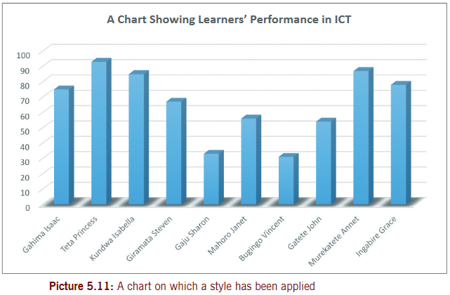
A style is a format clearly created which you can use to improve appearance of your chart. Follow the steps below, using the chart you created in Activity 5.1.
Step 1:Click in the Chart that you want to apply a style. the Chart Tools will display.
• on the Design tab, in the Chart Styles group, click the chart style you want to use.
If a chart style is applied to picture 5.1 we created in Activity 5.1, the results are shown in picture 5.11.
5.2.3 Creating a combination chart
A combination chart contains data series plotted using more than one type of chart.
We are going to group to use the data below to create a combination chart.
Steps to create a combination chart
Step 1:Create a chart containing all the data you want.start by entering the data in spreadsheet software and save it as Comb.
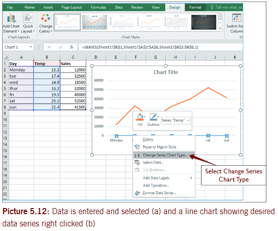
Step 2:Right click on the data series you want in the chart.
Step 3: select the Change Series Chart Type from the shortcut menu.
Step 4: select a different chart type and then observe the changes.

Note: When a combination chart is created, it is important you apply two vertical scales.
5.2.4 Change chart type
We are going to use ICT marks file to change chart type. Begin by opening the column chart as picture 5.10(b) and follow the steps given below.
Step 1: select the chart you want to change.
Step 2: on the Design tab in the Type group, click Change Chart Type.
You can also right click the chart and select Change Chart Type.
Step 3:In the Change Chart Type dialog box that displays, select the chart type and sub type you want.
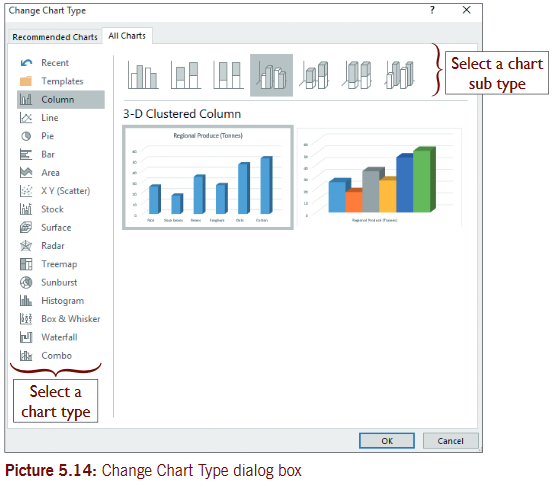
Step 4:Click OK.
In case you select a Bar Chart, the resulting chart will appear as shown in picture 5.15.

Activity 5.3
Create the following data in Microsoft excel as it is and save it as Exam Results. the figures are in percentage pass at credit level.

a) set the number of decimal places to 1.
b) Create a 3D-clustered column chart on a separate sheet to display the data given in the table above. name the sheet as ‘3D results’.
c) Apply a chart layout that includes all titles to your chart.
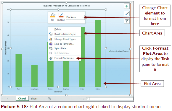
d) Format the plot area to a pattern fill having a yellow (50%)color in the foreground and white in the background.
e) Change the fill color for Data series ‘Boys’ to purple and ‘Girls’ to a gradient fill with a red color and black color.
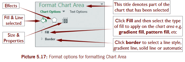
5.3 Formatting chart
to format a chart is to change the appearance of a chart so as it looks attractive. You can format chart background colors and patterns, legend, axis and labels. now open ICT marks file to get a saved bar chart, as shown in picture 5.15.
Follow the steps below to format chart
Step 1:Create or open an existing chart in Ms excel.
Step 2:Click or select any part of the chart e.g. Chart Area, legend, horizontal axis or horizontal axis title, vertical axis or vertical axis title, data series, etc.

Step 3: on Format tab, in the Current Selection group click Format Selection. the task pane displays (on the right of excel window) showing Chart Options to format Chart Area. the task pane displays Chart options depending on the part you have selected.
Alternatively, you can format a chart quickly by right clicking on any part of the chart you want to format. In the shortcut menu, select Fill Color or Line color you want.
5.4 Format cell data as a table
Cell data is any piece of data you want to format as a table contained within spreadsheet cells.
Steps to format cell data as table
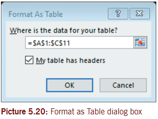
Step 1: select the spreadsheet data you want to format as table or click in it (must be nearby each other). In this case, open Comb file.
Step 2: on the Home tab, in the Styles group, click Format as Table drop down list and select a desired table style from the list.
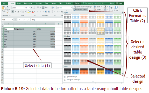
Step 3:Format as Table dialog box appear, click OK.
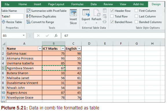
Step 4: table tools display on the Design tab. Use table tools to modify your table as desired.
Step 4: table tools display on the Design tab. Use table tools to modify your table as desired.
 5.5 Printable datasheetBefore you print a worksheet, it is important that you set a print area. Printing is the action of producing a hard copy information using a printing machine such as a printer or printing press. Page setup options control the layout of a printed sheet and therefore must be used before a worksheet is printed. Page setup options include; margins, headers and footers.5.5.1 To set page marginsUse the data given in Comb file and use it to set page margins. Follow the following steps.Step 1: on the Page Layout tab, in the Page Setup group, click Margins and in the menu select “Custom Margins”.
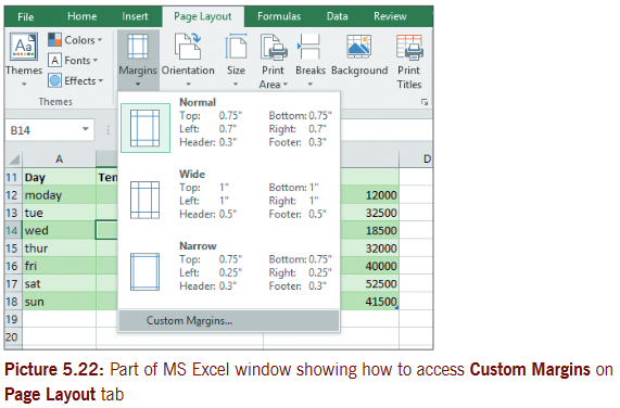 Step 2:In the Page Setup dialog box for Margins, increase or reduce the margins and click OK.
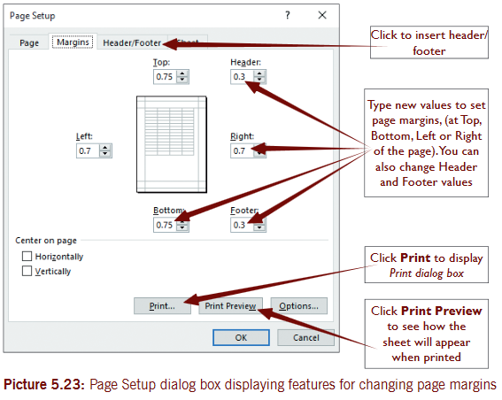 5.5.2 Set headers and footersA header is information printed at the top of every page and footer is information printed at the bottom of every page. Headers are suitable for Company names, page titles; footers are good for page numbers and printout dates or times.Note: Headers and footers are not displayed on the worksheet in normal view.On ordinary worksheets you can Insert header/footer by clicking on Insert tab, in the Text group, click Header/Footer. Automatically the cursor goes in the center of the header.Insert header/footer (for chart sheet)Follow the steps given below to insert header and footer.Step 1: on the Page Layout tab, in the Page setup group, click dialog box Launcher.Step 2: In the Page setup dialog box that displays, click on Header/Footer tab.Step 3: Click on Custom Header to insert your header or Custom Footer to insert footer.Step 4: Click in the Left section, Center section, or Right section box, and then click the buttons to insert the header or footer information that you want in that section.
 The page setup dialog box is shown in picture 5.16, if you click either Custom Header or Custom Footer, the Header or Footer dialog box displays. to add or change the header or footer text, type additional text or edit the existing text in the Left section, Center section, or Right section box.
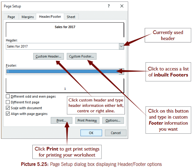 When you click on Custom Header or Custom Footer you get a Header and Footer dialog box respectively. When you use these dialog boxes, you can position your text or object in the left, center or right section of the page in the header and footer.
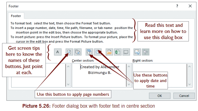 Header/Footers are displayed only in Page Layout view and on the printed pages. You can insert headers or footers in Page Layout view where you can see them, or you can use the Page Setup dialog box if you want to insert headers or footers for more than one worksheet at the same time.For other sheet types, such as chart sheets, you can insert headers and footers only by using the Page Setup dialog box.
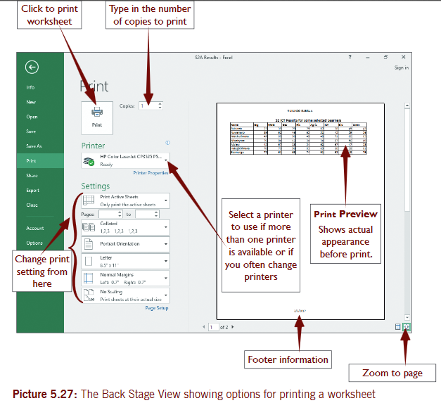 In Microsoft excel 2016, when you want to print or get a print preview, you always get the same screen similar to the one in the picture above. on File tab, click Print or press Ctrl + P on keyboard.The following important commands are available in the screenZoom: Magnifies the page to actual size. this button is located on the lower right.Print: sends a copy of the worksheet to the default printer.Page Setup: Displays page setup dialog box.5.5.3 Print areathis is one or more ranges of cells that you designate to print when you don’t want to print the entire worksheet. this means only the print area set is printed.A worksheet can have multiple print areas. each print area will print as a separate page.To define or specify the print areaUse the steps given below to specify print area. Use data give below.Step 1:Create or open an existing worksheet.Step 2: select the cells you want, define as print area (data range).Step 3: on the Page Layout tab, in the Page Setup group, click Print Area, and then click Set Print Area.
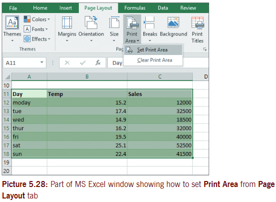 Note: A line around the data marks the print area. When you save a worksheet the print area is also saved.Use the same steps given above to add and clear the print area.5.5.4 Printing a ChartIf you want to quickly print the chart which is part of the data, select/click it and press Ctrl + P on keyboard. Click print button to print using default printer.If the chart is on a separate sheet; select Print on the File tab, then click print button to print from default printer.End of Unit 5 Assessment1. A business consultancy firm advertises in the local newspaper and it spends different amounts of money on advertising and records the number of appointments booked from different adverts as shown in table below.RequiredProduce a scatter graph (with smooth lines and markers) from the data given in table below to see any correlation between the amount spent on adverts and the appointments booked.
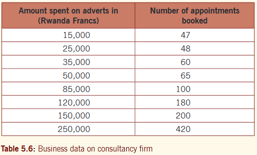 Label and save your graph as ‘business’. Print your graph.2. Use a suitable spreadsheet software on your computer and enter the following data beginning from cell A1 on sheet1. save the file as Results.
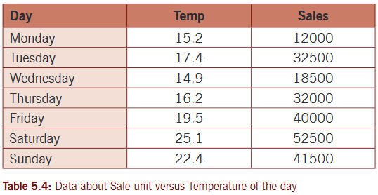
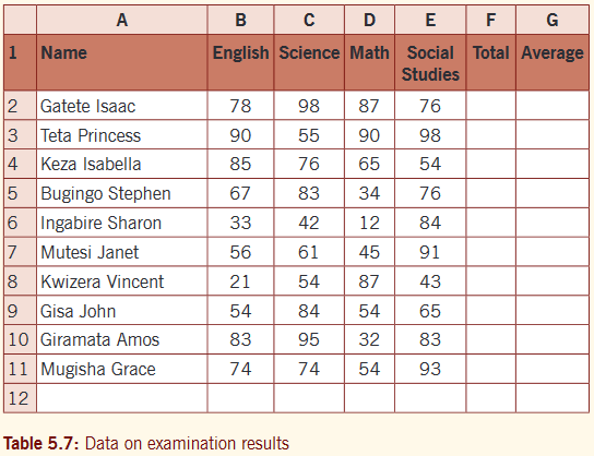 Requireda) Create a 2D-clustered column chart to represent learners’ performance in science and social studies. Label your chart correctly on a separate sheet. name the sheet as 2ess. Format your chart appropriately.b) Create a 3D-clustered column chart to represent all learners’ performance in the four subjects. Place your chart on a separate sheet you name as ‘Comparison’. Format your chart as desired.c) Use a suitable formula to calculate the total marks and average marks in the total column and average column respectively. Represent the total and average marks on a stacked line chart. Place the chart as an object on sheet2.d) Create a pie chart as an object on sheet3 to represent the performance of learners in Math only.3. Mrs Gaju has a wholesale shop selling Mineral water. the shop is located in one of the suburbs of Kigali City. Last week she decided to record track of how many bottles of mineral water she sells versus the noon temperature of that day. the figures for 7 days are as shown below:
 a) organize the data in a spreadsheet and save it as Gaju sales.b) Create a combination chart (temperature with a column chart and sales on a line chart). Apply different vertical scale for sales, a chart on a separate sheet. name sheet as ‘mineral water’.c) Apply titles or otherwise use a suitable Quick layout on your chart that can make it more organized.d) Insert header as your names and footer as Page numbers.e) Print your charts on separate sheets that contain suitable headers.