General
UNIT 17:Elementary Statistics
Key unit competence
By the end of this unit, you should be able to collect, represent and interpret
data.
Attitudes and values
• Appreciate the importance of data collection in daily life situations.
• Appreciate the importance of interpreting and extracting information from
tables.
• Appreciate the importance of statistics tables and graphs in daily life
situations
17.1 Statistics and data
It is the branch of mathematics which deals with collection, representation,
interpretation and retrieval of data.
Meaning of data
A collection of information in the form of numerical figures is called data.
Examples of data are:
• Ages of pupils in P4 in our class.
• Heights of all pupils in our school.
• Masses of goats in a market.
• Prices of milk in different markets.• Number of children born in Rwanda per day.
17.2 Qualitative and Quantitative data
Quantitative data is the type of data which can be expressed in terms of
numbers. For example:
• Number of cars that pass through a certain town per day.
• Number of pregnant cows in a kraal.
• Marks obtained by pupils in a Math test.
• Ages of people in a market
Qualitative data is a type of data which cannot be expressed in terms of
numbers. In other words, it cannot be quantified. We use other attributes other
than numbers to describe qualitative data.
Examples of qualitative data
• A person’s skin colour; I am black, brown or white.
• A person’s sex; I am either a male or female.
• Someone’s nationality; I am a Rwandan, my friend is a Ugandan and our
neighbour is Congolese.
• My favourite soda; the answer can be coca cola, fanta orange or pepsi.
17.3 Ways of collecting data
There are many ways of collecting data which may include the following:
1. Questionnaire
A questionnaire is a written set of questions that are given to people in order to
collect facts or opinions (data) about something.
2. Census
A census is a study that obtains data from every member of a population. A
census is very expensive because it is very hard to reach everybody. A national
population is carried out to determine the number of people in a country.
In Rwanda, the last Housing and Population census was carried out in August 2012.
3. Sample survey
A sample survey is a study that obtains data from a very small group of a
population. The result of the sample survey is used to make conclusion for the
whole population.
4. Observation
This is where the person collecting the data makes observations and compiles
his/her data accordingly. For instance, a person can simply observe and countthe number of girls in a class without necessarily talking to anyone.
5. InterviewIn this method of collecting data, people are asked some questions directly.
17.4 Presentation of Data
Presentation of data is a method of displaying data in a very simple way so that
the data collected can be easily understood. Data can be displayed in manyforms namely:
• Table
• Bar graph
• Pie chart
• Line graph• Pictograph
However, at this level, we shall look at table and bar graph only.
17.4.1 Table
This is a very simple way of presenting data. The data is presented in columnsand rows.
Example 17.1
The data below shows the results of football matches by three teams in a
football league:
Kanombe United: Win = 6, Draw = 3, Loss = 1
Kigali Stars: Win = 6, Draw = 0, Loss = 4
Gisenyi Boys: Win = 4, Draw = 2, Loss = 4
(a) Present the information on a table.
(b) If a win is worth 3 points, a draw 1 point and a loss is worth 0 point,which team has got the highest points?
Solution
(a) Let us arrange our data in a table like the one below:
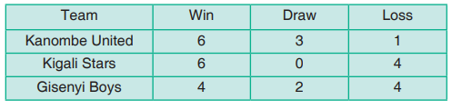
(b) Total points:
Kanombe United = (6 × 3) + (3 × 1) + (1 × 0) = 18 + 3 + 0 = 21 points.
Kigali Stars = (6 × 3) + (0 × 1) + (4 × 0) = 18 + 0 + 0 = 18 points.
Gisenyi Boys = (4 × 3) + (2 × 1) + (4 × 0) = 12 + 2 + 0 = 14 points.Kanombe United has the highest points = 21 points.
Activity 17.1
In this class activity, each pupil will ask the age of all the pupils of the classand represent this data in a table.
Example 17.2
The data below shows the marks obtained (out of 100) by some pupils in aMaths test:
56 56 76 23 09 89 90 43 23 12 64 88
43 54 76 23 22 43 12 54 29 66 74 50
(a) Represent this data in a table.
(b) How many pupils did appear for the test?
(c) How many pupils scored 76% marks?
(d) How many pupils got less than 50% marks?(e) What was the highest marks scored?
Solution
(b) Total number of pupils who appeared for the test = 24 pupils.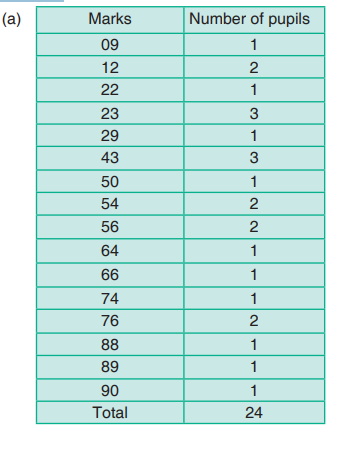
(c) 2 pupils scored 76% marks.
(d) Number of students who got less than 50%
= 1 + 2 + 1 + 3 + 1 + 3 = 11 pupils.(e) The highest mark scored was 90%.
Exercise 17.1
20 pupils are asked for their favourite colour. The answers are as follows:
Red, Red, Blue, Black, Yellow, Green, Green, Black, Pink, Pink, Pink, Blue,
Blue, Yellow, Green, Red, Black, Red, Red, Pink(a) Represent this data in a table.17.4.2 Bar graph
(b) Which colour is liked by the most number of pupils?(c) Which colour is liked by the least number of pupils?
A bar graph is drawn by representing the data on two perpendicular axis. Thevertical axis is called the y-axis and the horizontal axis is called the x-axis.
Example 17.3
The data below shows the number of boys from P1 to P5 in GS Gisozi.
The vertical axis shows the number of boys and the horizontal axis represents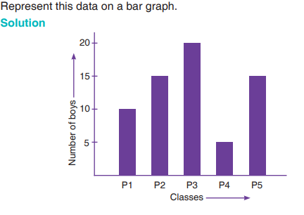
the classes. The height of a bar correspond to the number of boys on the
Y- axis.
From the graph we can see that;
• P1 has 10 boys, P2 has 15 boys, P3 has 20 boys, P4 has 5 boys and P5
has 15 boys.
• P3 has the most number of boys and P4 has the least number of boys.• Total number of boys from P1 to P5 = 10 +15 + 20 + 5 + 15 = 65 boys.
Activity 17.2
Ask each pupil about their favourite fruit. Write the number of pupils of eachfruit, and collect the data in a table. Represent this data by a bar graph.
Example 17.4
A survey was carried out in a certain school to find out the means of transport
used by pupils to go to school. It was found out that each pupil go to school bybus, on foot or by bicycle. The data is shown in the bar graph below:
(a) What quantity is represented on the vertical axis?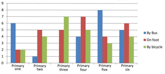
(b) What quantity is represented on the horizontal axis?
(c) How many pupils go to school by bus in P4?
(d) How many pupils go to school by bus in P3?
(e) How many pupils go to school by bicycle in the whole school?
(f) Which class has the largest number of pupils?
Solution
(a) “Number of pupils” is represented on the vertical axis.
(b) “Classes” is represented on the horizontal axis.
(c) 4 pupils go to school by bus in P4.
(d) There is no bar for the bus in P3. This means no pupil in P3 goes to
school by bus.
(e) Total number of pupils who go to school by bicycle = 2 + 4 + 7 + 5 + 3
+ 4 = 25 pupils.
(f) There are 16 pupils in P4. So P4 has the largest number of pupils inthe school.
Assessment Exercise
1. The birth rate per thousand of five countries over a period of time isshown below:
Represent above data in a bar graph.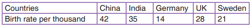
2. The table given below shows the monthly expenditure (in percentage) onvarious items, in a family.
Represent the above data in a bar graph.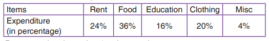
3. The graph below shows the salary of five ladies who work in a certainfactory. Use it to answer the questions that follow.
(a) How much money does each lady get?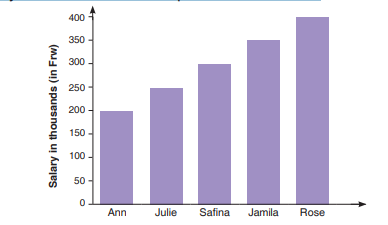
(b) Find the sum of Safina’s and Ann’s salary.(c) Find the average of Julie’s, Safina’s and Rose’s salary.