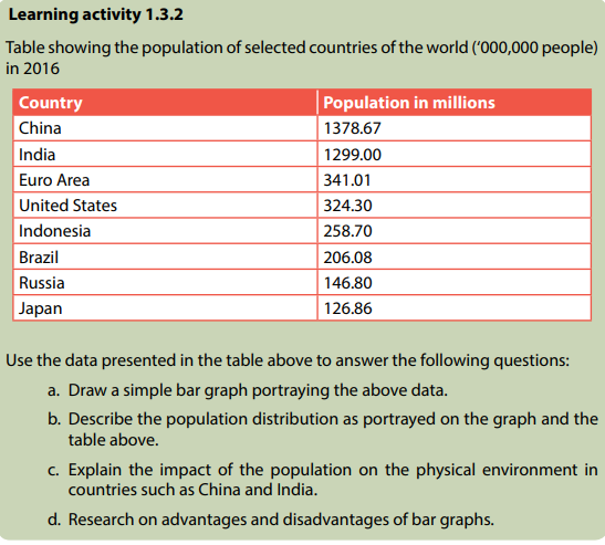
General
- Geography S5 SB File Uploaded 28/01/22, 13:38
- S5 : Geography TG File Uploaded 19/08/22, 10:37
UNIT 1: STATISTICAL GRAPHS, DIAGRAMS AND MAPS
Key unit competence: By the end of this unit, I should be able to interpret statistical data, construct statistical graphs, diagrams and maps
Introductory activity
Read the story below and use it to answer the questions that follow:
Rwanda exported over 250b frw Agricultural products in 2017. The National Agriculture Exports Development Board (NAEB), says the country’s agricultural exports generated revenues amounting to 304.6 million frw from January to September 2017 compared to 232.65 million earned in the same period in 2016. In the first quarter of 2017/18, agricultural exports generated 116 million frw against 82,809,581 frw in the first quarter of 2016/17. Agricultural crops locally produced and exported like coffee, tea, and pyrethrum generated 108 million frw from January to September of 2017, compared to 89 million in the same period in 2016. The volume of exported vegetables was 18.98 million kilograms from January to September 2017, compared to over 15.61 million kilograms in the same period of 2016, meaning that the quantity of exports increased by only 21.56%. The value of exported vegetables was 8 billion frw from January to September 2017, against 4.2 billion frw in the same period of 2016, implying an increase of 98.65 percent, and a rise in price per unit of the vegetables.
Now answer the following questions:
a. Name the data which are represented in the passage?
b. Using the past studies in both ordinary level, senior four and personal research:
i. Identify other methods to represent the data displayed in the passage.
ii. Discuss the importance of the geographical data identified in (a) above and make a class presentation, if possible using ICT tools, or flip charts or any other resource available.
iii. Comment on the Rwanda’s exports between January 2017 to Oct 2017 and account for the variations in the trend of exports.
1.1. Definition of statistics and importance of statistical graphs and diagrams in geography
Learning activity 1.1
Read the story below and use it to answer the questions that follow: Micomyiza Jeanne and Habinshuti Gilbert made their field study on ‘The effects of human activities on the physical environment in Twubahane village. They used various methods of data collection. Jeanne was interested in writing down every observed aspect in a descriptive manner while Gilbert filled his note book with tables and charts that he would interpret after the field trip. Some other students who had also attended the fieldwork study, used various methods of noting down data, such as line graphs, bar graphs with description foot notes. They could look at the graphs and charts drawn and easily understand the content contained therein. The collected numerical data revealed that 12 farmers were using poor methods of farming, 20 farmers had applied agro-forestry and tree planting, 2 farmers were engaged in charcoal burning, 7 people had large herds of cattle whose impact on the environment was so evident. All data collected were presented and recorded on a chart.
a. Explain why most students were interested in using the statistical way of data recording.
b. Does the passage above represent statistics? Explain your answer.
c. Using the example of Habinshuti, examine the importance of statistical graphs and diagrams in Geography.
1.1.1 Definition of Statistics
The term statistics is defined in many ways by various authors. The term holds its origin from the Latin word “Statisticum collegium” that stands for council of state, later it changed into the Latin word “Status” that means a group of numbers or figures, the Italian word “Statista” (statesman) and German: “statistic” that means (Analysis of data about the state). This shows that originally statistics were used for governmental purposes. However, later the usefulness of statistics in the real-world experiences increasingly became important. The term statistics therefore, refers to the science of collecting, analyzing, interpreting and presenting various data. It is a science of how data are collected, analyzed and interpreted. Statistics deals with data. It is very necessary to understand the meaning of the term data. Data is a word used to mean the information used as a foundation for reasoning, discussing and calculating. This implies that statistics and data go hand in hand.
1.1.2: Importance of statistical graphs and diagrams in geography
Statistical graphs and diagrams play a key role in geography. They are needed in various aspects of human activities in this 21st century. They are important in the following ways:
1. Statistical graphs and diagrams help students to summarize huge and a wide range of information for future analysis. Diagrams and graphs hold huge information in accurate way.
2. The geographers can identify and interpret the relationship existing between various variables. For example, the relationship between the increase of prices for commodities and increase in cost of fuel.
3. Facilitate easy understanding of various geographical variables and clearly show the trend and variations of production, trade, among many others.
4. Statistical diagrams and graphs enable the learners to acquire various skills such as analytical skills, interpretation and presentation of geographical data. Such skills can be used in other areas after school.
5. Most of statistical diagrams and graphs enable the students and geographers to save time as data is being recorded down.
6. Statistical graphs and diagrams provide a good and attractive visual impression. Therefore, arousing the interest of the reader or geographer in what is portrayed by the graph or diagram.
7. The data contained thereon the statistical graphs and diagrams, are used in making effective decisions. Therefore, logical judgmental conclusions are made based on factual data.
8. Statistical diagrams and graphs facilitate easy memory of the reader or students/geographers. Data and geographical information presented on diagrams and graphs are easily remembered than the data presented in a descriptive manner.
9. They help geographers to predict the trend of geographical events of various phenomena. For example, if a given graph shows a positive increase trend of coffee in country X, for some considerable years, it becomes easy to make predictions.
Application Activity 1.1
Using first hand experiences and skills acquired in statistics, explain how statistics is important in your daily life and show how it would help to understand geography.
1.2. Line and curve graphs
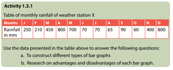
Learning activity 1.2.1
Land use in country X from 2015 to 2017
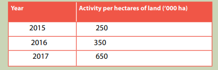
Using the knowledge and skills acquired from Mathematics and the data provided in the table above, answer the following questions:
a. Draw a simple line graph to represent the above information
b. Use the same data indicated in the table above, to construct a simple curve graph
c. Using both the data and the graphs drawn, comment on the trend of land use in country X from 2015 to 2017.
d. Discuss the advantages and disadvantages of simple line graph
There are several types of line and curve graphs. They range from simple to more complex depending on the composition and nature of the statistical data to be represented or portrayed. Under this category of statistics in geography, the following are the main line graphs:
i. Simple line and curve graph
ii. Group or comparative line graph
iii. Compound line graphs
iv. Divergence graphs
1.2.1. Simple line and curve graphs
A line graph is one which shows plotted points connected by a series of short straight lines. This distinguishes it from the simple curve graph in which plotted points are joined by a single smooth line. The illustrations 1.1 and 1.2 display the sample examples of the simple line and curve graphs used in Geography. With line graphs plotted points are observable while with curve graphs points are not noticeable. Also, with a simple line graph, the line suspends without touching the two-vertical axis while in a simple curve graph the smooth line drawn touches the two-vertical axis.
Construction of a simple line graph
The following are steps to be followed while constructing a simple line graph. The same applies to the drawing of a simple curve graph. These steps are stated as follows
1. The independent variables are indicated on horizontal axis. (Independent variables mean that when there is a change in the independent variable or variables, this results into a direct reaction of the dependent variables.)
2. The dependent variables are represented on the vertical axis. (Dependent variables are items that are reliant on the independent variables. That is to say; these are measurable responses from the reaction caused by a change in the independent variables).
3. The vertical axis should start from Zero. While the top part be slightly greater than the maximum value to be indicated or recorded on it.
4. The length of the horizontal line is determined by the number of the independent values in relation to the scale.
5. Draw two vertical lines on both sides and exact numbers of values of constant relationship recorded on the two axes. However, this is not a must be done condition.
6. When plotting points in correspondence to both independent variables and dependent variables, it is appropriate to put the dot in the middle of the two vertical lines as shown below:
Worked example
Table 1. 1: The table showing temperature recorded at station B
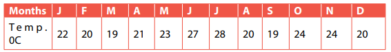
Use the data presented in the table above to answer the following questions that follow:
a. Construct a simple line graph to portray the above statistical data.
b. Draw a simple curve graph to illustrate the above statistics shown on the table.
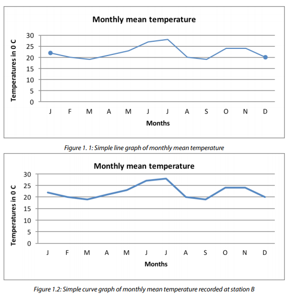
Advantages of simple line and simple curve graphs
1. They are simple to draw or construct.
2. When neatly drawn, they provide a good visual impression.
3. They are easy to interpret.
4. Less time is needed to construct them.
5. Simple errors or error free because of the simplicity nature of the methods.
6. Simple calculations are involved.
7. They can be used together with other statistical methods and diagrams such as dot maps in a super-imposition manner.
8. They have a multi-purpose service. For example, they are used in representing several geographical aspects such as the trend of crop production, variation in temperature, minerals, etc.
Disadvantages of simple line and simple curve graphs
1. There is no accurate interpretation because of some points are plotted basing on estimation of values. 2. There are difficulties in determining the appropriate scale especially when large figures or values are used.
3. The curve graphs are less accurate in comparison to simple line graphs.
4. It is not easy to use the simple line and curve graphs to compare various categories of data.
5. Changing scale of either axes, can greatly change the visual impression of the graph.
6. They are only used while dealing with continuous data.
1.2.2. Group or comparative graphs

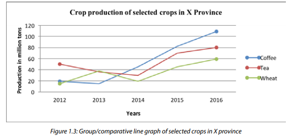
Group or comparative line graphs are also known as multiple line/curve graphs. This form of statistical method is used to portray more than one dependent variable. It uses several lines of which each represents a given specific variable of individual item. For group or comparative line graphs, the table has many dependent variables as shown below:
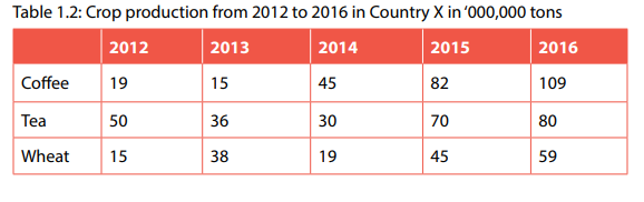
The above table shows several dependent variables as well as the independent variables. There are 5 years and three crops such as coffee, tea and wheat. When critically analyzed, you find that for each independent variable in the left column (Crops) can be represented by a single simple line graph. The difference comes with group graph or comparative graph, each crop will be represented on the same graph.
As earlier said, a comparative line graph has several lines as shown by the sample below:
Construction of group or comparative line/curve graph
Below are steps or guidelines to be followed while drawing a Group or comparative/ multiple line/curve graphs:
1. Several lines are constructed on the same graph.
2. The lines drawn representing individual variables or items should be easily distinguishable from one another. It is advised to use varying colours.
3. Avoid congesting the graph with many lines. The recommendable maximum number of lines is five. However, if the data given is having more than five independent variables that determine number of lines to be drawn.
4, The lines/curve should not cross each other unless the data given requires it. If it happens therefore, strictly varying colours or shading must be used.
5. Lines should not touch the vertical axis.
6. Names of variables being represented should be written directly on each line.
Worked example:
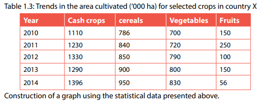
It is important to realize that lines are not crossing each other. The graph drawn shows that there was an increase in cultivated areas for all cash crops with exception for the area under fruits where a decreasing trend was observed.
Advantages of group/comparative line graph
1. It is a simple method as it does not involve a lot of calculations.
2. It gives a clear impression of the different variables presented on one graph.
3. It can be used to show comparison of different items.
Disadvantages of group/comparative line graph
1. The presence of many variables on the same graph makes their interpretation more difficult.
2. The values for each period are not easy to determine.
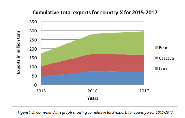
1.2.3. Compound line graph

A compound line graph is also known as a cumulative line graph. It is the type of graph where a variety of variables are presented as subsequent lines. Therefore, a compound line graph displays cumulative totals. It is drawn in a way that lines are super-imposed above each other; creating several segments or components.
Construction of a compound line graph
The following are the steps that must be followed while constructing a compound line graph:
1. Make a cumulative table representing progressive or cumulative totals of the provided variables.
2. Select the appropriate scale for both dependent and independent variables.
3. Follow the steps used when a simple line graph is being drawn. It should be the variables with large or biggest values to begin.
4. The lines constructed for each variable should connect onto the two vertical lines on both sides.
5. Super-impose other lines on top of the first line beginning from each segment or component. Indicate the name of the variable in each section shaded.
6. The lines drawn must begin from or attached to the vertical axis as earlier emphasized.
7. Since plotting of points is dependent on the calculated values in a cumulative manner, lines therefore, must not cross each other. In case they do so, then, the data given, or the calculated cumulative totals will be having a problem.
8. If the statistical data is in large numbers, it is very advisable to convert the value of each variable into percentage. Thereafter, calculate the cumulative totals. Such calculations should be indicated.
Worked example:
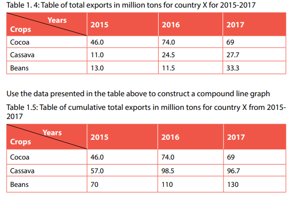
The above cumulative totals can now be used to construct a compound line graph; as shown below:
Advantages of compound line graph
1. They are easy to interpret.
2. They provide a good visual impression.
3. They are simple to draw.
4. Less space is used.
5. They can be used to present a variety of variables.
6. They are suitable for comparison purposes.
Disadvantages of compound line graph
1. When large numbers are used, selecting a suitable scale becomes more challenging.
2. It or they involve calculations such as converting the values into percentages and then determining the cumulative totals.
3. The use of cumulative totals while constructing the compound line graphs makes it difficult to find precisely the actual values of the variables.
1.2.4. Divergence line graphs

Use the diagrams above to answer the following questions:
a. Identify the differences existing between the two graphs presented above.
b. Research on advantages and disadvantages of the graph showing the anomalies in mean rainfall at Kigali weather station.
Divergence line graphs are statistical graphs that directly portray variations in values. When there is a rise in values; a plus sign (+) is used in the figure while a fall or decrease in values is portrayed using a negative sign (-). This type of graph is used while dealing with variables whose values are highly changing spatially and temporally.
Construction of a divergence line graph
There are six steps to follow when one is drawing a divergence line graph. These are:
1. Draw two vertical lines (axis) and leave a reasonable space for the baseline; on which the independent variables are to be indicated.
2. Draw the average line commonly known as the zero line. This should join the center of the two-vertical axis.
3. Draw a basement line for independent variables; joining the bases of the two vertical lines. The length of the horizontal line is determined by the number of independent variables and the horizontal scale used.
4. Determine the average values of all the values indicated in the table. This is obtained using the following formula:

5. Deduct the average value from each value. The positive and negative signs should be indicated or shown.
6. The figures or values with positive sign (+) are plotted above the Zero line or average line. While the negative values are plotted below or beneath the zero or average line.
7. While determining the scale, the vertical scale should be determined basing on the calculated divergences. The horizontal scale is chosen normally depending on the independent variables provided. 8. Thicken or darken the zero line/average line.
Worked example:
Table 1.7: The table of monthly pineapple production in different areas

The average value = 3,910.11 (in 000 tons)
Therefore, the divergence table will be constructed below:
Table 1.8: The table of monthly pineapple production in different areas
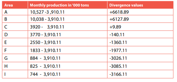
A divergence line graph showing monthly pineapple production in different areas

Advantages of divergence line graph
Below is an outline of the main advantages of divergence line graph:
1. It is easy to construct
2. It provides a good visual impression.
3. It is easy to interpret
4. It is an appropriate method of representing items that need comparative analysis.
5. It requires limited space.
Disadvantages of divergence line graph
1. It involves several calculations for example the total value, getting average or finding divergences.
2. The actual figures are not shown, only divergences are indicated instead.
3. There are some difficulties while determining the scale mostly when the divergences are composed of bigger values and very low ones.
4. Its construction is time consuming.
5. The method allows some inaccuracy while being drawn. This is because if large values are used, decimal points are neglected.
6. To be used, it requires the reader to have the original raw data or a table of values.
Application activity 1.2
1. Collect data on the students’ performance in any subject of your choice and use the scores to construct the following line graphs: simple and curve line graph, comparative, compound and divergence line graphs. 2. Comment on the distribution of statistical data displayed on the constructed graphs.
1.3. Bar graphs
A Bar graphs is one of the statistical methods used to show, portray or represent data. It is a graph constructed using rectangular bars. Bar graphs differ from line graphs because the lines used under bar graphs join to form single and individual rectangular bars. This means that bar graphs stand for a graphic way of numerical (quantitative) comparison by rectangles with heights proportional to the measure of data in question.
The following are different types of bar graphs:
Simple bar graphs
Compound bar graphs
Divergence bar graphs
Age-sex graphs
Dispersion graphs
Circular graphs
1.3.1. Simple bar graphs
A simple bar graph is created following the same procedures as a simple line graph. However, instead of using a line to represent the variables, parallel bars are used. The independent variables are indicated on the horizontal axis and dependent variables shown on the y-axis or vertical line. This form of statistical graph is constructed when a single set of statistical data is used.
Construction of a simple bar graph
The following are the main steps followed to construct a simple bar graph:
1. Create a frame of both vertical and horizontal axes. That is, drawing the X and Y axes. The length of these two lines will be determined by the scales used and the figures to be plotted.
2. Indicate the independent variables on the X axis and dependent variables on Y axis.
3. Select appropriate scale: Both vertical and horizontal scales. This is determined as studied while dealing with line graphs.
4. The horizontal scale will automatically determine the size of the bars. It is recommended that the size of each bar should not exceed 1 cm or go below 1cm in width. Too small and huge bars make the graph lose its primary appearance.
5. While plotting points, use tiny dots to mark the required points. This is because with bar graphs, dots are not supposed to be seen.
6. The volume, percentage or value of the dependent variable is represented by the height of each independent bar.
7. A reasonable small space should be left to separate the bars from the vertical axis.
8. There should be uniformity in terms of the size of bars, separating space existing between bars.
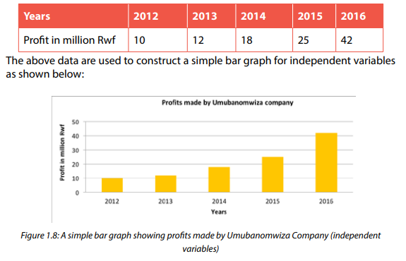
9. The bars should be attached only when a single or similar dependent variable is being dealt with. But this is not a golden ruling. For example, Rainfall, production of coffee or any other variable.
Worked example
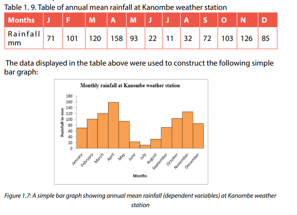
The data used to construct the above simple bar graph deals with single dependent variables like rainfall and that is why the bars are attached to each other. However, the separated bars are used to represent independent variables as shown on the figure below.
Table 1.10: Table showing the profits made in a period of 5 years by Umubanomwiza company
Advantages of simple bar graphs
1. The following are advantages of simple bar graphs:
2. They are easy to interpret.
3. They summarize a large amount of data in a visual form.
4. They display trends easier to highlight or notice than simple line graphs.
5. They can be super-imposed on other statistical diagrams. That is, they can
be used together with other methods.
6. They are easy to construct.
Disadvantages of simple bar graphs
1. They can easily be manipulated to provide false impressions.
2. When large figures are used, determining a suitable scale is more
challenging.
3. Time consuming especially when several variables are dealt with.
4. They do not provide an adequate explanation. Therefore, for them to be
rewardingly understandable, an additional explanation is required.
5. Simple bar graphs do not show key assumptions, causes, impacts and
patterns.
1.3.2 Group bar graph
Group bar graphs also known as multiple bar graphs. Group or multiple bar graph, is a statistical technique used to represent data that is made up of several dependent variables, that can hardly be shown using simple bar graph. A group of bars is constructed following the steps involved in the drawing of a simple bar graph. The only difference is that group bar graph is constructed by attaching a set of bars representing individual variables.
Construction of a group bar graph
The following are the main steps involved in construction of a group bar graph:
1. The way of constructing a group bar graph is the same as that of simple bar
graph.
2. The bars are drawn in the form of a set and touching each other for each
independent variable. This implies that bars are grouped but separated from
another group by a space.
3. The bars are drawn in a vertical manner.
4. The independent variable that has the largest values should be started with
and drawn on the left and continuing in a descending order towards the right.
5. The arrangement of the first group should be maintained throughout.
6. The width of all bars must be similar. That is, ensure that all bars display equal
size.
7. Shade differently each individual bar and maintain the same shading or
colouring up to the last group of bars.
8. A suitable title as adapted from the title of the table used should be indicated
on the top of the graph. In the title, the type of the statistical method used
must be stated.
Worked example:
Table 1. 11: Table of Irish potatoes production in ’000 tons in selected areas

Advantages of group bar graph
1. It is easy to interpret.
2. It favours comparative analysis of the statistical data being dealt with.
3. It is simple to draw.
4. The calculations involved are simple and easy.
5. It provides a wonderful visual impression when it is coloured.
6. It can be used together with other diagrams in a super-imposed way.
7. It is suitable for a wide range of variables.
Disadvantages of group bar graph
1. It requires a large space.
2. It is challenging while determining the scale.
3. It may be difficult to interpret when it is congested.
1.3.3 Compound bar graph
Compound bar graphs are also called cumulative or divided bar graphs. This form of statistical graph is used to show how the total in any one bar is divided up between several subtotals basing on the calculated cumulative totals. This implies that the totals used to plot the variables are progressive in nature. A compound bar graph used when there is more than one variable and a variety of the items are to be portrayed using one bar. Basing on cumulative totals as calculated depending on the raw data on the table provided, a given bar can be divided into segments. The size of each segment depends on the value of variable being represented.
Construction of a compound bar graph
The following are the main steps followed to construct compound bar graph:
1. It is constructed by using cumulative progressive totals.
2. It requires selecting a suitable scale that can favour the plotting of both big
and small values.
3. The plotted data are displayed in percentages by starting with the greatest
value and ending with the smallest figure.
4. The width of each bar is determined basing on the scale used.
5. The number of bars will be determined by the number of variables to be
represented in each set of bars.
6. The varying sheds or colors are used for each individual segment or
component of every bar
Worked example
Table 1. 12: Coffee and tea production in ’000 tones for selected regions in 2017


1.3.4. Divergence bar graphs
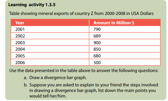
The primary purpose of the divergence bar graph is to represent the way values of various variables deviate from the average/mean value. Therefore, this statistical method shows the fluctuation of the variables.
Construction of divergence bar graphs
1. The steps to be followed while constructing divergence bar graph are:
2. Construct the two vertical axis lines.
3. Join the two vertical lines with the horizontal line at the base line.
4. Draw the average line which is known as a zero line at the center of the
two vertical lines. Write the average against this line at the end points
where “0” is indicated.
5. Find the total of all the value of the variables and divide it by the number
of the items to get the average. Subtract the average obtained from each
value, to get the divergences or deviations.
6. Select the suitable scale basing on the divergences calculated.
7. Plot the negative values below the average line and the positive ones above the same line.
Worked example
Table 1. 13: Coffee production in ‘000 tons for country X from 2010 to 2017
The following divergence bar graph shows the country’s coffee production in ‘000 tons from 2000-2008 which is drawn using the data presented in Table 1.14 above.
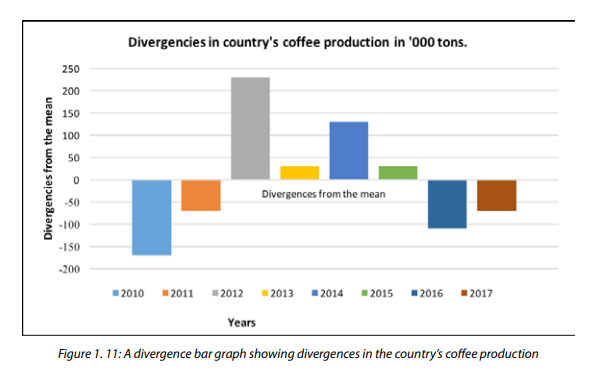
Advantages of divergence bar graphs
1. The following are advantages associated with divergence bar graphs:
2. They provide a good visual impression.
3. They are appropriate for comparison purposes.
4. They are easy to construct.
5. They are less complex therefore, easy to interpret.
6. They use limited space.
Disadvantages of divergence bar graphs
1. There are several calculations involved.
2. The method is only limited to a single item or commodity.
3. Determining the scale especially when the values have a wider amplitude
is challenging.
4. The plotting of values is only based on divergences. Therefore, the actual
values are not seen.
1.3.5. Age and sex graphs
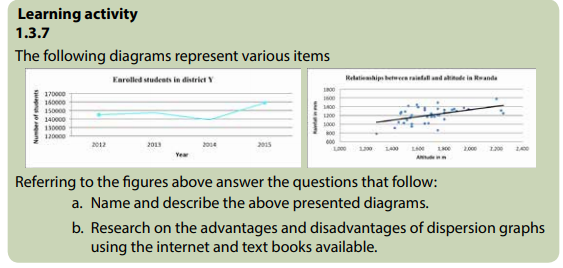
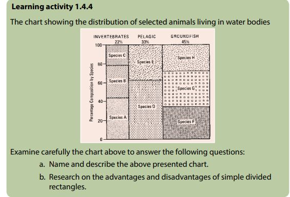
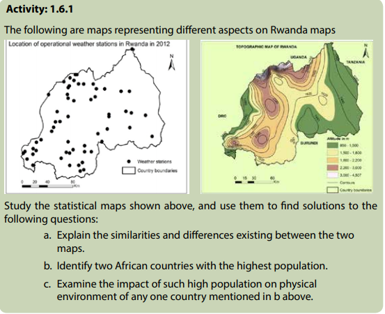
Activity 1.3.6Statistical diagrams showing population structure in two different countries:
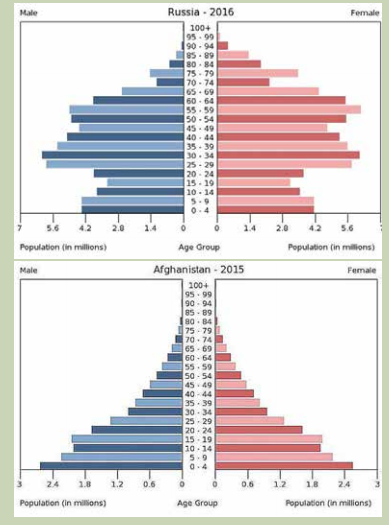
Refer to the figures presented above to answer the following questions:
a. Name the diagrams indicated above.
b. Differentiate the two diagrams represented above based on their
structure.
c. Research on the advantages and disadvantages of such diagrams.
An age-sex graph is also known as a population pyramid. It is a type of bar graph that represents the structure of the population of a country or area basing on age and sex. An age-sex graph forms a structure of pyramid as the population grows.
It is a graphical drawing that displays the distribution of several age groups in each population of a country or part of the world, which makes the shape of a pyramid as the population grows. It typically involves two back-to-back bar graphs, with the population plotted on the horizontal line and age on the vertical line. The left side of the population pyramid should indicate the Male and the right for Females. It is usually in age groups of five years for example 0 - 4 years; 5 - 9 years; 10 - 14 years and so on. The age groups are indicated or plotted in the middle.
Therefore, the primary purpose of the population pyramid is to portray the population structure and age groups. The number may be in a raw form or converted into percentages. Population pyramids are often regarded as the most actual way to graphically represent the age and sex distribution of a population. This is so, because of its clear visual interpretation and direct display of the true picture of the real structure of the population.
Construction of an age-sex graph
When drawing an Age-sex pyramid, the following steps should be observed:
1. It is constructed on two X- axis; one to portray male and another for
females.
2. Males are represented on the left and females on the right. The bars
representing each sex are separated by a space. It is in this space that age
groups are indicated in a progressive manner.
3. The data provided should be grouped using the interval of 5 years as
follows; 0 - 4; 5 – 9; 10 – 14; 15 – 19; 20 – 24; 25 – 29; 30 - 34 and so on.
4. After forming the age groups; the lowest group which forms the youngest
is indicated on the base of the graph.
5. The left horizontal line should have figures for males and the one on top
right showing the figures for females.
Worked example:
Table 1.15: Population Structure (age-sex) of country X
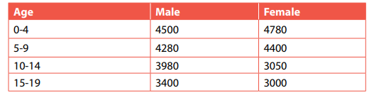
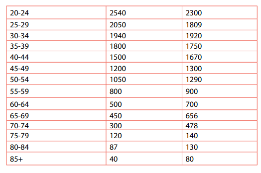
The following age-sex bar graph of country X is drawn using the data presented in the table above.

Advantages of an age-sex graph
The following are the main advantages of an age-sex graph:
1. It provides instant display of the composition of the population being
portrayed with consideration of the age and sex.
2. It portrays the general shape of the population structure that facilitates
analytical purpose.
3. The features associated with the age-sex pyramid can indicate factors
affecting an area or region it presents.
4. It gives a good visual impression that captures the attention of the reader
or interpreter.
5. It is easy to interpret
6. It has limited or sometimes no calculations involved, therefore, it is easy to
draw.
7. Age-sex pyramid is suitable for comparison purposes. For example, the
number of females and males in each area.
Disadvantages of an age-sex graph
1. It is only used to represent the population structure.
2. It is only used alone and hardly super-imposed on other methods.
3. There is loss of important information due to the use of figures that are in
age-cohorts.
4. It cannot show the population distribution (does not describe or show the
trend of the population growth).
5. It is only used in population geography.
6. The actual figures may not be seen since in most cases percentages are
used.
7. It takes a lot of time to construct.
8. It takes a lot of space.
9. It is challenging to determine a suitable scale.
1.3.6. Dispersion graph
The dispersion graph is a statistical representation method that displays the tendency of data scattered over a range. It is also called scatter graph. It shows the distribution of the dependent variables in relation to independent variables. Hence, it is used to show the relationship existing between two variables.
Construction of a dispersion graph
Below are the main steps followed while constructing a dispersion graph:
1. Draw the vertical axis and horizontal axis.
2. Select the suitable scale for both axes.
3. Determine the variable that qualifies to be independent variable and the
dependent variable.
4. Indicate the dependent variables along the vertical axis and the
independent variables on the horizontal axis.
5. Plot the points using visible dots that are thickened.
Worked example:
The table below shows the examination scores in Dihiro G.S in Bugesera District in relation to the hours assigned.


It is important to mention that dispersion graphs can display both negative and positive correlations. For instance, there is a positive correlation between studying hours and students’ examination scores because the students’ examination scores increase with an increase of the hours of studying. However, the following graph shows a negative correlation between altitude and temperature.
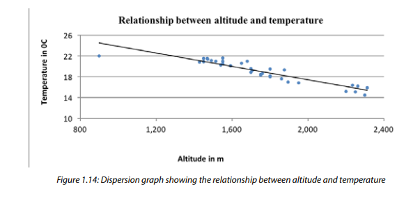
The figure above shows that there is a negative correlation between altitude and temperature as far as the temperatures decrease with altitude.
Advantages of a dispersion graph
1. A dispersion graph displays the relationship between two variables;
2. It tests how reliable the data collected is;
3. It is easy to draw;
4. It provides a good visual impression;
5. It easily portrays the anomalies associated with data.
Disadvantages of a dispersion graph
1. Some information that may be important is not displayed.
2. It is more reliable when a wide data is used but when the data used is
small, the conclusion may not logically be reliable.
3. Much time is required when huge information is used.
4. It is easily constructed using ICT (Excel) and hard to construct manually.
1.3.7 Circular graph
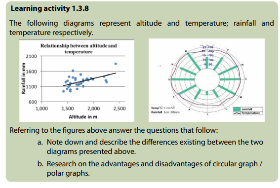
Circular graphs are known as the polar graphs. These are statistical and graphical diagrams that take a circular shape as the face of a clock. They are called polar graphs because they display the layout as the one made by the longitudes radiating from the poles.
Construction of a circular/polar graph
1. Construct a circle of a convenient size. It is advisable to use large circles to
avoid congesting the graph with information.
2. In the middle of the bigger circle, draw a small circle where additional
information such as activities carried out can be portrayed.
3. Partition the big circle into 12 equal angular parts all touching on the
inner small circle. Make sure that each segment represents 30 degrees. To
get these 30 degrees, 360 degrees are divided by 12 segments.
4. Labeling of the circular graph begins from twelve o’clock which marks the
month of January. Thereafter, other months follow, taking the clock wise
order up to December.
5. The scale is determined in degrees centigrade for temperature and bars
are plotted basing on the radii portraying rainfall totals or amounts.
6. Plot points for temperature and join each with a continuous curve.
7. Avoid writing words that are upside down or sharply tilted. The writing on
the graph should enable the reader not to tilt or turn around the graph.
8. Indicate all the characteristics of a good statistical diagram such as title, key, accuracy and neatness among many others.
Worked example:
Table 1. 17: Table showing agricultural activities through the year and received rainfall


Advantages of a circular graph
1. They have a good visual impression.
2. Compared to the information dealt with, little space is used.
3. It portrays a wide range of items such as rainfall, temperature, and
agricultural activities.
4. They do not involve complicated calculations.
5. Displays the relationship or influence of climate on human activities.
Disadvantages of a circular graph
1. Sometimes it is very difficult to label the graph because of its circular
nature.
2. They consume a lot of time especially when many items are to be
represented.
3. It is sometimes hard to compare some items such as rainfall values since
they are displayed apart and hardly lie on the same baseline.
4. They are more challenging while drawing.
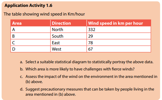
Application Activity 1.3
There is cutting down of trees in Ubwiyunge village. Then senior five students conducted a field work study in the area and they got the following findings:
1000 trees were cut down
549 trees were just recently planted.
1400 tree seedlings
290 trees had reached maturity.
After gathering the information from the farmers and local authorities, they passed a word of thanks to everyone that had assisted them. The respondents were so happy to see students of such high respect and values. Use the information presented above to answer the following questions:
a. Identify the environmental concern associated with Ubwiyunge
village.
b. Explain the environmental conservation measures you would teach
the citizens of the above village.
c. Give a description and interpretation of the constructed graphs.
1.4. Statistical charts
Divided statistical charts may either be divided circles or rectangles. Divided circles are also known as Pie charts. These are graphs that have a shape of a circle, with varying segments that portray a percentage, value or degree of a given component in relation to the general total to be represented. The chart is called a ‘Pie’ chart because when looked at, each segment that forms it, displays a shape of piece of ‘Pie’. It is constructed basing on the degrees that are skillfully measured to partition or divide a circle into various sections with correspondent angle. This implies that each segment or portion represents a given quantity, or value, amount or percentage of the statistical data represented. Divided rectangles are a statistical graphic representation of data, using rectangle that is equaled to the general total of the variable. However, even though the area of the rectangle represents the total, it is partitioned into segments each representing an individual variable. The subdivision of the rectangles in this case stands for individual components (variables).
The following are the main types of divided circles:
1. Simple divided circles
2. Proportional divided circles
3. Simple divided rectangles
4. Compound divided rectangles
1.4.1 Simple divided circles
A circle is drawn to represent statistical total data given. The circle is then divided according to the value of the variables.
Construction of a simple divided circle
The following are steps that are followed in constructing a simple divided circle:
1. Draw a circle of a reasonable size. Avoid using small or very big circles.
2. Determine the degrees proportional to the quantity, value, amount, of the
item or component to be portrayed.
3. Start with the component with the biggest degree. Place this to the right
of 12 o’clock.
4. Arrange the smallest portions or segments to be plotted in one part. That
is, start from the biggest to the very tiny segment.
5. Labeling on a pie chart should take a horizontal order. Where need be,
write the words or names outside the chart using a pointing arrow for the
small segments.
6. Shed each segment differently and use the key for referral purpose. If
colours are available, use them.
7. The segments or components should not go beyond 8 in number. Beyond this figure, the chart becomes over crowded or jam-packed.
Worked sample:
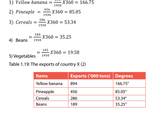
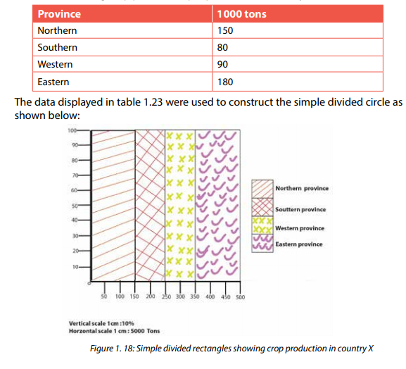
Table 1.18: The exports of country X (1)
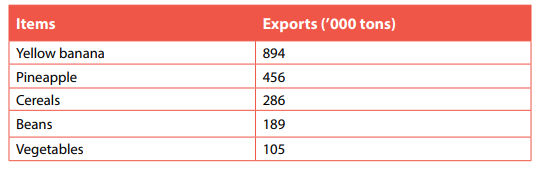
The data presented above can be used to construct a simple divided circle. The presentation of the data displayed in table 1.18 above is done using a simple divided circle. This requires calculating the values of each data in degrees. These calculated degrees can be also converted into percentages.

Advantages of a simple divided circle/pie chart
Simple divided circles or pie charts are increasingly becoming a common tool used in the representation of statistical data. This is because of their advantages as shown below:
1. When the wedges /portions are clearly shaded or coloured, they provide a
good visual impression.
2. They are effective and reliable when two or more variables are to be
comparatively analyzed.
3. When well-labeled, they are easy to interpret.
4. They don’t require specific skills to be understood as it is the case for
dispersion graphs or divergence graphs, among many others.
5. They involve simple calculations which make them easy to draw.
6. Pie charts can be super-imposed on other statistical methods such as
maps.
7. They can be used for a wide range of purposes in geography and other
disciplines.
8. Pie charts are used as a summarizing tool, where vast data is set in a visual
way.
9. The divided circles require minimal additional explanation or description.
Disadvantages of a simple divided circle/pie chart
1. They deal with degrees and sometimes percentages. Therefore, exact
figures may not be easily noted by the reader.
2. Pie charts are not suitable for tracking the trend of a given variable. This
implies that several pie charts must be used.
3. Pie charts can easily be maliciously manipulated or intentionally altered,
therefore, displaying incorrect information. Hence, the reader may make
erroneous conclusions.
4. They are constructed without basing on a specific scale, this leaves a gap
in the exactness of the method.
5. They provide errors due to lack of accuracy, especially when tiny degrees
are plotted. The thickness of the pencil affects the perfection of the
method.
6. Labeling the pie chart sometimes is challenging especially when small
degrees are plotted.
7. Pie charts or divided circles take a lot of time to construct. This is because
of the calculations, measuring, drawing, and shading.
8. Large wedges/portions for bigger values tend to over shadow the small
values.
9. In case there are several portions of almost matching size, it is challenging
and confusing or difficult to interpret and assimilate the data.
10. The reader may find it challenging to comparatively analyze nonadjacent segments. That is, the reader will keep twisting and turning the
chart to have a suitable angle of observation.
1.4.2. Proportional divided circles
Learning activity: 1.4.2
Use internet, text books and other sources of information to research on the
following:
a. Description of proportional divided circles.
b. How proportional divided circles are constructed.
c. Advantages and disadvantages of proportional divided circles.
Proportional divided circles are also called comparative divided circles. They are used when more than one variable is dealt with. They are used for comparison purpose.
Construction of proportional divided circles
The techniques involved in the construction of proportional divided circles are like those of a simple divided circle especially how the varying segments are being portioned. However, the proportional divided circles are constructed using circles of varying sizes which are used once their totals are not uniform. Steps involved in the construction of comparative divided circles are described here under:
1. The number of the circles to be constructed will depend on how many
variables are being dealt with. For example, if one is comparing imports
and exports, then the comparative divided circles will be two.
2. In case the totals of the independent variables are the same, therefore, the
circles to be drawn will be of the same size.
3. The circles will have varying sizes, if the totals of the independent variables
differ.
4. Circles should be constructed near each other to facilitate the comparison.
5. Find the square root of each total of the independent variable.
6. The size of each circle should be proportional to the totals. Therefore,
determine the radius of each circle that is obtained by use of the square
root of each total.
7. While dividing each circle into wedges or portions, follow the steps
involved in drawing a simple divided circle.
8. There must be uniformity in the arrangement of the segments for all the
circles.
Worked example:
The table below shows the exports and imports valued in Rwandan francs for selected regions
Table 1.20: The exports and imports in FRW for selected regions
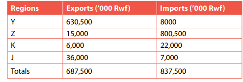
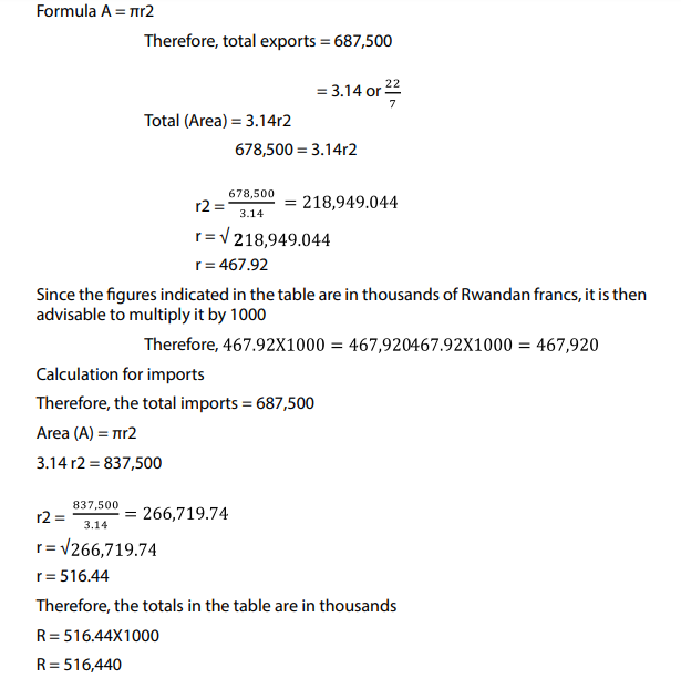
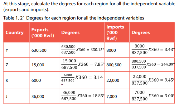
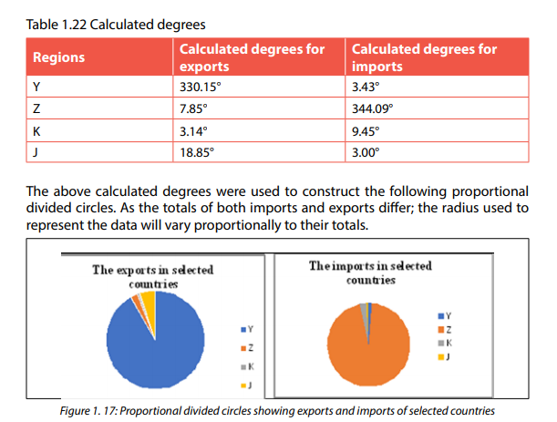
The proportional divided circle was constructed below using the data provided in table above. The variation of totals implies that the proportional divided circles will be of differing sizes. Therefore, the radius for each circle is determined as follows:
Calculation for exports:
Area = the totals of exports

Advantages of proportional divided circles
1. Comparative divided circles capture the attention and interest of the
reader because of the wonderful visual impression they offer.
2. They are suitable statistical graphical methods for the data that require
comparative analysis and interpretation.
3. They provide an instant visual interpretation of the data represented.
4. Once the segments are determined in terms of degrees, the method is
easy to draw.
5. There are simple calculations involved.
Note: This statistical method shares directly most of the advantages of a simple divided circle as earlier studied.
Disadvantages of proportional divided circles
1. They are not constructed on a scale which affects the effectiveness and
exactness of the data.
2. Small degrees sometimes are hard to plot, and such provides erroneous
effects in the interpretation of data.
3. When small degrees are involved, writing or labeling becomes hard and
over-crowding of the chart occurs.
4. The determining of the radius, degrees and finding the totals, makes the
method time consuming.
1.4.3. Simple divided rectangles
Learning activity 1.4.3
Use internet, text books and other sources of information to research on the
following:
a. Description of divided rectangles.
b. How simple and compound divided rectangles are constructed
c. Advantages and disadvantages of simple and compound divided
rectangles.
Divided rectangles are a statistical graphic representation of data, using rectangle that is proportional to the general total of the variable. However, even though the area of the rectangle represents the total, it is partitioned into segments each representing individual variables. Two methods can be used; these include the following: simple divided rectangle and compound divided rectangle. A rectangle is subdivided to indicate the constituent parts. The simple divided rectangle represents the total value or area of the components.
Construction of simple divided rectangle
Simple divided rectangles are constructed in the following ways:
1. A rectangle is drawn whose area is proportional to the quantity or value of
all parts.
2. The rectangle is then divided into strips of uniform height.
3. The variation in the values of the constituent parts are represented by
making subdivisions along the horizontal scale.
4. The vertical axis shows a constant of any convenience, but most suitably and commonly recommendable is 100%.
5. The quantity or values are indicated along the horizontal axis. The height
is determined by using a given scale of any choice.
6. Divide the rectangle into segments each representing a given value or
quantity. But at the end all should add up to make a complete rectangle.
7. The portions or wedges should be shaded differently or coloured in a
varying manner.
Worked example:
The table below shows crop production in country X per province.
Table 1. 23 showing crop production per province in a country X
Advantages of simple divided rectangles
The following are some of advantages of simple divided rectangles:
1. When the rectangles are clearly shaded or coloured, they provide a good
visual impression.
2. They are effective and reliable when two or more variables are to be
comparatively analyzed.
3. When well-labeled, they are easy to interpret.
4. They involve simple calculations which make them easy to draw.
5. They can be used for a wide range of purposes in geography and other
disciplines.
6. They require minimal additional explanation or description.
Disadvantages of simple divided rectangles
1. They deal with sometimes percentages. Therefore, exact figures may not
be easily noted by the reader.
2. Simple divided rectangles can easily be maliciously manipulated or
intentionally altered, therefore, displaying incorrect information. Hence,
the reader may make erroneous conclusions.
3. They are constructed without basing on a specific scale. Such leaves a gap
in the exactness of the method.
4. They may provide errors, due to lack of accuracy; especially when tiny
degrees are plotted. The thickness of the pencil affects the perfection of
the method.
5. Large wedges/proportions for bigger values tend to over shadow the
small values.
1.4.4. Compound divided rectangles
This statistical method is like a simple divided rectangle. The difference is that, with compound divided rectangle, each segment is partitioned basing on the general total, it is further sub-divided to represent the sub-divisions of the segments as illustrated by the practical example.
Construction of compound divided rectangle
Steps taken for the construction include:
1. Get the data to be represented and calculate the total value. This is where
there is the addition of all the absolute values given.
2. Draw a rectangle which is proportional to the total quantity calculated in
step 1 above.
3. Estimate the vertical scale and this should be constant. This is usually
given in percentages to simplify data presentation.
4. Subdivide the rectangle into strips of uniform heights but with different
subdivisions using the horizontal scale which must be proportional to
their values.
Worked example
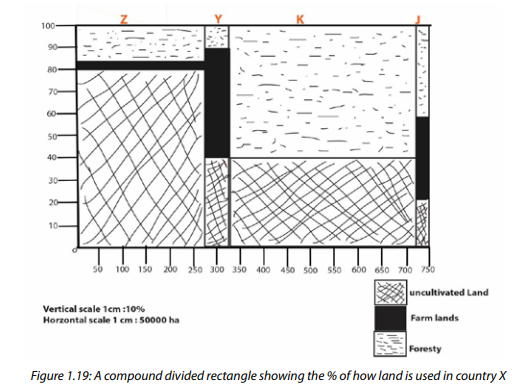
The table below shows how the land is used in country X.

The data displayed in table 1.24 were used to construct the simple divided rectangle as shown below: It should be noted that, in this case the total area (000) km2 is used to determine the suitable horizontal scale, while the % against each independent variable, will be used to portion the segments.
Advantages of compound divided rectangles
Compound divided rectangles are very important statistical methods of data
representation as it is explained below:
1. It conveys much more statistical information when compared with other
graphs like compound bar graphs;
2. It occupies little space compared to circular graphs;
3. It gives clearly the total values of an entity in question;
4. It is very simple to construct because it does not involve a lot of
mathematical calculations compared to divided circles;
5. It gives a good visual impression when well-drawn and shaded.
Disadvantages
1. It is challenging to find a convenient scale;
2. They are not applicable to the representation of statistical data that are
locational in nature;
3. This method does not give absolute individual values.
4. Shading consumes a lot of time if many subdivisions are involved.
5. It is limited to the use of location purposes.

1.5. Repeated symbols
Activity 1.5.1
Using various sources of geographical information research on:
a. Repeated symbols used in statistics to represent geographical
information on charts.
b. Advantages and disadvantages of each method used to represent
geographical information on charts using repeated symbols.
Repeated symbols are a form of statistical method used to represent the data that emphasizes locational aspects. That is, some geographic information may require representing symbols of the same size and nature on a map and clearly locating the symbol in its almost exact place. Such symbols are repeated all over the map being super-imposed in relation to where they are intended to be located.
For example, when dealing with livestock, one may say, one symbol of cow
 represents 260 cows. Therefore, the total number of the symbols of a cow will be
equal to 260 X total number of symbols. Suppose, on map X, there are 100 symbols
of a cow, the reader will count them to get the number:
represents 260 cows. Therefore, the total number of the symbols of a cow will be
equal to 260 X total number of symbols. Suppose, on map X, there are 100 symbols
of a cow, the reader will count them to get the number:100 symbols indicated on Map X
One symbol of a cow = 260 cows.
The actual number of cows represented will be 100 X 260 = 260,000 cows.
There are different kinds of charts which are represented using repeated symbols.
These include: proportional circles, squares, cubes and spheres.
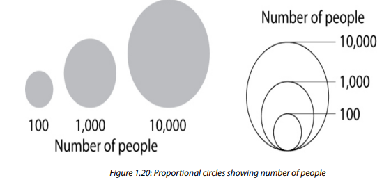
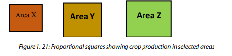
1.5.1 Proportional circles
Circles of different circumference are drawn based on the quantity of the item supposed to be represented. It involves mathematical calculation, and the use of square roots is required to obtain the radii of the circles required. It is constructed like the proportion squares diagram
Advantages of proportional circles
1. They display relative proportions of multiple classes of data;
2. The size of the circle can be made proportional to the total quantity it
represents;
3. They summarize a large data set in visual form;
4. They are visually simpler than other types of graphs;
5. They permit a visual check of the reasonableness or accuracy of
calculations;
6. They require minimal additional explanation.
Disadvantages of proportional circles
1. They do not easily reveal exact values.
2. Many proportional circles may be needed to show changes over time.
3. They fail to reveal key assumptions, causes, effects, or patterns.
4. They may be easily manipulated to yield false impressions.
1.5.2. Proportional squares
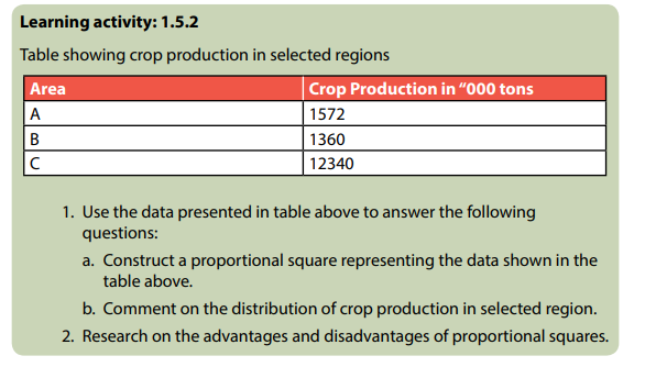
The proportional squares are almost used in equivalent manner as proportional circles. The general total is equivalent to the area of the square. This implies that the quantity in question will be directly represented equivalently by the size of the square, whose length will be determined by the square root of the total.
Construction of proportional squares
There are mainly five steps followed while drawing proportional squares. This requires remembering the skills acquired in drawing squares. These steps include the following:
1. Find the length of the sides of squares. This is obtained by calculating the
square roots of the totals of variables.
2. Draw the squares for each variable. This means use the square roots to
determine the length in centimeters.
3. If the proportional squares are to be super-imposed on maps or any other
statistical diagram, the south-west corner of the square must touch the
point of location or representation.
4. Proportional squares can be drawn alone without being super-imposed
on maps.
5. The location or the position of the area being represented can be read by
looking where the south-west corner connects or touches.
Worked example:
Use the table1.25 below to answer the questions that follow:
Table 1.25 showing the crops product in ‘000 tons in selected areas
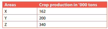
The data presented in table 1.25 above were used to construct proportional squares
shown below following the recommended steps.
Calculation made to determine the square root and length in cm of each crop is
presented in the table below:
Table 1.26 showing square root and length in cm of each crop derived from the data
shown in table 1.25
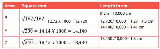
The square roots are multiplied by 1000 because the raw data in the table are reduced by ‘000 in tons. The square roots after being multiplied by 1000 each, the figures become big. However, they are reduced by a uniform figure of 1cm: 10,000; to get at least simple figures that are easily measurable.
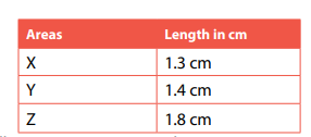
The following are proportional squares constructed based on the above length in Cm:
Advantages of proportional squares
1. Easy to construct;
2. They promote a good visual impression;
3. They can accommodate several figures;
4. They can be used together with other diagrams such as maps;
5. They involve few calculations.
Disadvantages of proportional squares
1. They are sometimes difficult in interpretation due to over-lapping.
2. It is hard to analyze small figures reflected between totals.
3. It shows directly the figures on the square, if a slight difference exists
between figures it is hard to tell the accuracy of the figures.
4. They occupy large space, hence are less economical.
1.5.3. Proportional cubes
They are representing quantitative distribution of the objects. The side of the cube is directly related to the cube root of the quantity.
Construction of proportional cubes (cuboids)
The following are the major steps to be followed while constructing proportional
cubes:
1. Calculate the cube root of the value or quantity or total to be represented
by the cube.;
2. Place the drawn cubes along the same straight for the purpose of
comparison. This is applicable where they are not placed to the base map.
3. Show the key and all elements of a good statistical diagram.
4. Once used on the base map, maintain the same pattern of constructing
the individual cubes.
5. Indicate the quantity in terms of cube roots along the cubes (on the face
of the cube).
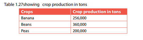

The data presented in the table above are used to construct a proportional square The cube roots for each variable to be used in the construction of a proportional square are calculated below:

These cube roots are too big but can be used when they are reduced using the scale
indicated above (1cm: 20 cm). The reduced centimeters are now used to construct
the cubes.
Beans= 4 cm
Bananas = 3.2 cm
Peas= 2.9 cm
Sweet potatoes 2.3 cm
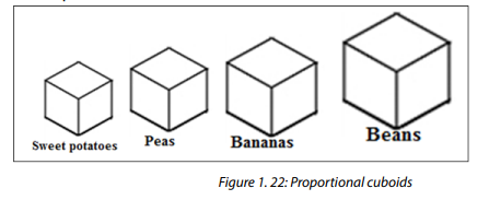
Advantages of proportional cubes
1. They are easy to construct.
2. They promote a good visual impression.
3. They can accommodate several figures.
4. They can be used together with other diagrams such as maps.
5. They involve few calculations.
Disadvantages of proportional cubes
1. They are sometimes difficult in interpretation due to over-lapping.
2. It is hard to analyze small figures reflected between totals.
3. It shows directly the figures on the cubes, if a slight difference exists
between figures it is hard to tell the accuracy of the figures.
4. They occupy large space, hence are less economical.
1.5.4. Proportional spheres

Proportional spheres serve the same purpose as the cubes. The volume of the spheres should be proportional to the quantities they represent. The radius of the sphere is determined by calculating the cube root of the quantity to be represented (the volume of a sphere is 4/3/r3). The sphere is then drawn in its correct position on the map. Proportional spheres are not normally used except on a locational basis.
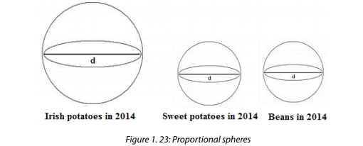
Advantages of proportional spheres
1. Easy to construct.
2. They promote a good visual impression.
3. They can accommodate several figures.
4. They can be used together with other diagrams such as maps.
5. They involve few calculations.
Disadvantages of proportional spheres
1. They are sometimes difficult in interpretation due to over-lapping.
2. It is hard to analyze small figures reflected between totals.
3. It shows directly the figures on the spheres, if a slight difference exists
between figures it is hard to tell the accuracy of the figures.
4. They occupy large space, hence are less economical.
Application Activity 1.5
The table showing enrolled students at selected schools

Use the above presented data in the table to answer the following questions:
1. Construct different types of charts using repeated symbols.
2. Interpret the constructed charts in (a) above.
3. Suggest how peace and different Rwandan values may be promoted at
Ineza, Ubworoherane and Kwigira schools.
1.6. Statistical diagrams
Statistical maps are used in a situation where the data represented need to reflect the distribution of the variable being portrayed. Therefore, maps are used since it is easier for the reader to see directly the location in relation to the variable represented.
There are four main types of statistical maps, namely:
1. Dot maps.
2. Isoclines maps.
3. Shading maps or choropleth maps.
4. Flow maps.
1.6.1. Dot maps
A dot map is a map type that uses a dot symbol to show the presence of a feature or phenomenon found within the boundaries of a geographic area. In addition, with dot maps, there is an attempt to show the pattern of distribution within the area by placing the dots where the phenomenon is most likely to occur. In a one-to-one dot map, each dot represents a single recording of a phenomenon. Care must be taken to place the dot in its correct position on the map.
1. Determine the value of each dot. Take note of the nature of quantity. The
value of dots on the maps will depend on the smallest quantity (value) or
the biggest figure.
If the lowest figure on the table is 2500 for Z and highest 5000 (K) then the
value of dot can be:
5000 = 5 dots (K)
1000
2500 = 2.5 dots = 3 dots (Z)
1000
Therefore, in area K there were five dots and 3 dots in place Z. It is very important to note that, the dot value should not be unnecessarily exaggerated. Too big or too small dot value provides wrong impression which interrupts with the analytical results of the data.
2. In case there are halves or fractions, it is necessary to round off that whole
number of dots. For example, if you calculated and found that there are 3.5,
4.6, and 5.1 dots, then it is advisable to round up these figures to read 5
instead of 4.5.
3. The size of a dot should be reasonable. Not too big or very tiny. It should be
able to enable the reader to be able to use his/her eyes to count the dots.
4. All dots used on the map should have equal size.
5. Plot all dots using a pencil so that in case of a mistake, it becomes easy to
correct it.
Worked sample
Table 1.28. Population density of Rwanda in 2012 by district
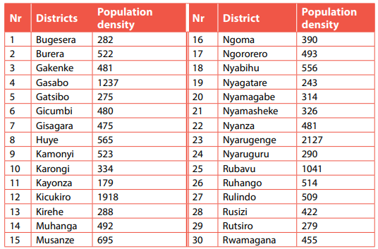
The data presented above are used to construct a dot map of the population density of Rwanda in 2012

Advantages of dot maps
1. Dot maps provide a good visual impression.
2. They are suitable for the representation or portrayal of the data of spatial
distribution such as population distribution.
3. They don’t involve difficult or challenging calculations.
4. It is very easy for the reader to immediately compare the distribution of
what is represented, e.g. population distribution.
5. It can be conveniently used for the portrayal of a varying range of items
such as distribution of crops, population, volume, area, etc.
Disadvantages of dot maps
1. There is a risk of giving false impression especially when dots are evenly
spread.
2. It involves more calculations such as determining the population density,
dot value, etc.
3. They provide unclear impact due to the congestion of data in densely
populated areas.
4. Drawing with free hand dots of equal size is difficult and challenging.
5. Identifying and locating are exposed to personal subjective decision.
6. In areas where there are many dots near each other, it is difficult to find
the number without making errors.
1.6.2. Isoline maps
Learning activity 1.6.2
The table showing different lines that join places of equal values
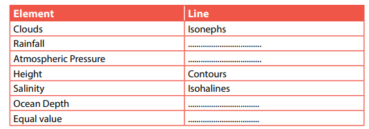
Use the information presented in the table above to answer following questions:
a. Fill in the missing information.
b. Describe how isoline maps are drawn and used in geography
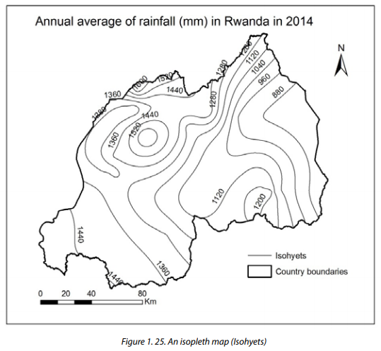
An isoline or isopleth map is a map with continuous lines joining points of the same value. For instance, the lines joining equal altitude (contour lines), temperature (isotherms), barometric pressure (isobars), wind speed (isotachs) and wind direction (isogon), etc.
Construction of isoline maps
The construction of an isopleth map is done as follows:
1. Obtaining an outline base map and the appropriate necessary
geographical data.
2. Marking in the points and their values on the map.
3. Deciding on a suitable interval of units.
4. Drawing curved lines joining all places with equal values; always starting
with the highest value.
5. Making sure that the lines do not cross or touch each other.
6. Numbering the isopleth lines.
Advantages of isoline maps
1. They are useful in showing the distribution of geographical phenomena at
a large scale.
2. They are useful in illustrating the distribution of even and uneven
phenomena.
3. It is easy to obtain values on any point of the map.
4. Isoline maps are used for comparing variables.
5. They provide a clear impression of population density.
6. They can be used together with other statistical diagrams in a superimposed way.
7. They don’t involve calculations.
8. There are easy to construct and easy to interpret.
9. They provide a good visual impression.
Disadvantages of isoline maps
1. With isoline maps, the interpretation may not be easy especially when the
isopleth lines are not clearly shaped.
2. It may be difficult to calculate isoline interval on the map.
3. Isopleth maps are not suitable to present the population distribution.
4. In drawing isoline maps; the administrative boundaries are not taken into
account.
5. Isopleth lines may be difficult to draw, especially where there are points to
join.
6. Isoline maps provide unreliable impression, on assumption that the gap
between two adjacent isoline lines is uniform.
7. It is very hard to determine the distance area on isoline maps.
1.6.3. Shading or choropleth maps
Learning activity 1.6.3
Using internet, textbooks and other sources of geographical information research
on:
a. The difference existing between choropleth and isoclines map.
b. Description of how choropleth maps are constructed.
c. Advantages and disadvantages of choropleth maps.
Choropleth maps are thematic maps in nature described by a series of varying shading patterns, each representing proportionally the measurement of a given statistical variable being portrayed on the map. The choropleth map provides an easy way to visualize how a measurement varies across a geographic area or it shows the level of variability within a region. A choropleth map is a map which shows regions or areas with the same characteristics.
Construction of choropleth maps
A choropleth map is made as follows:
1. Drawing a base map showing administrative units such as provinces or
districts.
2. Calculating the average densities, ratios or percentages for each
administrative unit.
3. Choosing and drawing grades or scales of densities to be used.
4. Indicating on the map the grade of shading or coloring to be used for
each administrative unit.
5. Shading or coloring the map but leaving boundary lines
6. Dividing the range of values into groups.
7. Including a key showing individual boxes.
8. Showing increases or decreases in population density, average crop yields,
etc.
Worked example:
Table 1.29: Population density of Rwanda in 2012
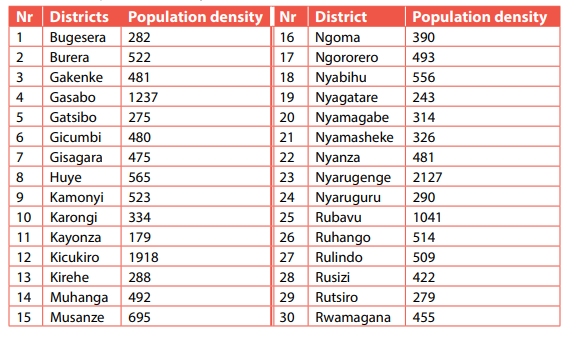
The data presented above are used to construct a choropleth map showing the population density of Rwanda in 2012

Advantages of choropleth map
1. Most often choropleth maps represent the typical value for the region not
spread uniformly within the region.
2. Choropleth maps are used for phenomena that have spatial variation that
coincide with the boundaries of the spatial area used for map.
Disadvantages of choropleth map
1. Choropleth map is suitable for mapping discrete phenomena.
2. In most cases it is not easy to use absolute numbers in choropleth map.
3. To make phenomena comparable for administrative units it should be
quite often standardised.
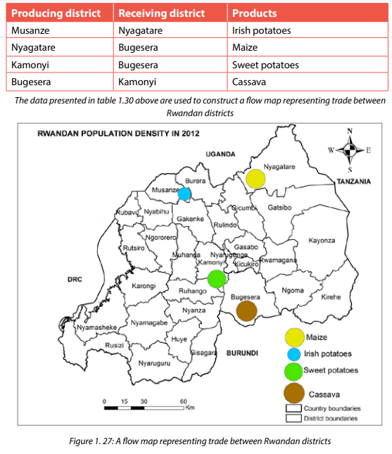
1.6.4. Flow maps
Flow maps are statistical methods used to represent diagrammatically the movement of goods from one area to another. They are commonly used to represent the flow of imports and exports. They are again used in other ways, such as the flow of traffic by water, air or rail.
Construct of a flow map
1. The line drawn show the direction of flow.
2. The width of the line represents the quality of goods imported or
exported.
3. Write the amount of goods directly on/alongside the line of lines.
4. The drawn lines are colored to avoid congestion. In this case, a key can be
of a good help.
5. Determine the width of the lines by using a suitable scale.
6. Lines should not be too big or small. It is advisable to use a scale expressed
in millimeters but not in centimeters.
7. Show all elements of a good statistical diagram, namely, Title, Scale, and
Key among many others.
Worked example
Study the table below showing exchange of agricultural products in ‘000 tons from
one district to other districts in Rwanda.
Table1.30 showing exchange of agricultural products in ‘000 tons from one district
to other districts in Rwanda.
Advantages of flow maps
1. They are the only suitable method for portraying the movement of goods.
2. They are easy to interpret.
3. They can be used together with other maps and statistical diagrams.
4. They provide a good visual impression.
5. They are suitable for comparison purpose.
6. They do not involve difficult calculations.
Disadvantages of flow maps
1. They take a lot of time to draw.
2. They hardly provide immediate interpretation.
3. They are more challenging to draw.
1.6.5. Wind rose
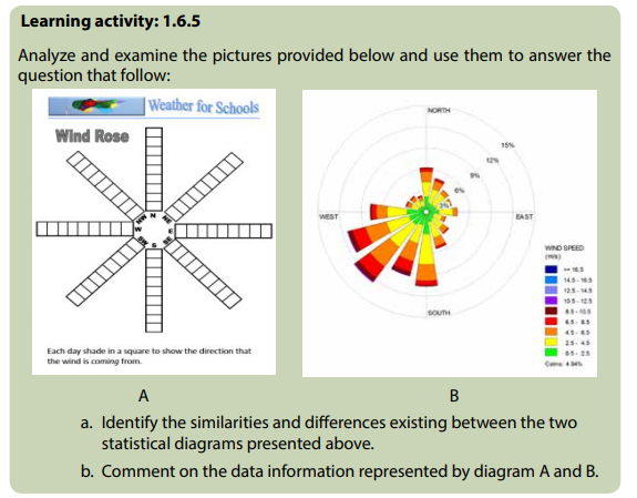
A wind rose is another statistical tool used to portray diagrammatically the average occurrence and direction of wind associated with a specific area. The wind rose is used by meteorologists to summarize data about the wind in relation to specific peed, location, and time. There are two types of wind rose namely simple and compound wind roses. It is important mentioning that there are two types of wind rose namely simple and compound wind rose.
Construction of a wind rose
1. Draw a circle of any convenient size. This marks the central point of wind
rose.
2. Show or indicate the calm days inside the circle.
3. Construct a wind rose following the main 8 points of a compass can also
be applied.
4. The days are indicated by the length of the columns commonly known as
arms.
5. Determine a suitable scale of your convenience.
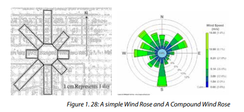
Construction of compound wind rose
1. Apply all the steps involved while constructing a simple wind rose.
2. The width of the columns represents the speed of the wind. When there
is a rise in the speed of wind, the width of the column is expected to
increase too.
3. Divide the columns into segments following the Beaufort Scale.
4. Draw a key to represent the different segments of each column.
Advantages of wind roses
1. They are easy to interpret.
2. They provide a good visual impression because of the way they display
polygon shape and colours.
3. The reader can have clear and faster information replaced.
4. They portray a wide variety of aspects such as, wind direction, speed, and
frequency.
5. They facilitate the central comparison of the climatic data.
Disadvantages of wind roses
1. There are challenges involved while determining the scale for the
columns.
2. They do not emphasize seasonal patterns and the movement of winds.
3. They require the reader to have skills and specialty in interpretation.
End unit assessment
Landslides and floods hit several parts of Rwanda between 7 and 8 May 2016 after a period of heavy rainfall. Government officials say that at least 49 deaths have been recorded so far. Some of the victims drowned in flood water, others died after houses collapsed under the heavy rain and landslide.
The worst hit areas are the districts of Gakenke and Muhanga. As many as 34 people have died in Gakenke, 8 in Muhanga, 4 in Rubavu and 3 in Ngororero. Around 26 injuries have also been reported. Reports from the Ministry for Disaster Management and Refugee Affairs reported that over 500 houses have been destroyed. Therefore, use the statistical information presented above to do the following:
a. Extract statistical raw data mentioned in the story.
b. Use appropriate statistical diagrams, graphs and charts to display the
portrayed data in (a) above.
c. Identify and describe the geographical phenomena that are highlighted in
the news print.
d. Explain how you would use the data collected and statistical diagrams,
graphs and charts constructed to advise the people and the government
on the environmental challenges to be addressed.
e. Assess the environmental challenges to be addressed in the area and show
measures of controlling them.
- S5 Geograph SB File Uploaded 11/10/21, 09:06