Unit 4 Univariate Statistics and Applications
Key Unit competence: Apply univariate statistical concepts to collect, organise,analyse, interpret data, and draw appropriate decisions
Introductory activity
1. (a) How do you think collecting and keeping data is importantdaily?
b) In your field of study, which kind of data can a person collect?And give an example of each kind of data.
c) Is collecting, organizing, and interpreting data helpful in makinga family budget? What do you think about a national budget?
2. Suppose you have a shop selling food, and you want to know thetype of food most people prefer to buy:
i) Which statistical information will you need to collect?
ii) How will you collect such information?
iii) Which statistical measure will help you know the mostpreferred food?
3. During an accounting exam, out of 10, ten students scored thefollowing marks: 3, 5, 6, 3, 8, 7, 8, 4, 8, 6.
a) Determine the mean mark of the class.
b) What is the mark that many students obtained?
c) Compare and discuss the mean mark of the class and the mark
for every student. What advice could you give to an accountingteacher?
4.1 Basic concepts in univariate statistics
4.1.1. Statistical concepts
Learning Activity 4.1.1
1. Using the internet or any other resources, do research.
i) What do you understand by the term statistics?
ii) What are the different branches of statistics?
iii) What are the key terms used in statistics?
2. Suppose your company is given a market for supplying milk and
fruits to all primary school students in Rwanda. If the student must
choose between milk and fruits, what should a company do to ensurethat it will supply what students want?
CONTENT SUMMARY
Statistics is the branch of mathematics that deals with data collection,
data organization, summarization, analysis, interpretation, and drawing ofconclusions from numerical facts or data.
Statistics plays a vital role in nearly all businesses and forms the backbone for
all future development strategies. Every business plan starts with extensive
research, which is all compiled into statistics that can influence a final decision.
Statistics helps the businessman to plan production according to the taste ofcustomers.
Branches of statistics
There are two branches of statistics, namely descriptive, and inferentialstatistics.
a. Descriptive statistics
Descriptive statistics deals with describing the population under study. It
consists of the collection, organization, summarization, and presentation ofdata in a convenient and usable form.
Examples of descriptive statistics
• The average score of accounting students on the mathematics test.
• The average monthly salary of the employees in a company.
• The average age of the people who voted for the winning candidate in thelast election.
b. Inferential statistics
Inferential statistics consists of generalizing from samples to populations,
performing estimations and hypothesis tests, determining relationships amongvariables, and making predictions.
The results of the analysis of the sample can be deduced to the larger population
from which the sample is taken. It consists of a body of methods for drawing
conclusions or inferences about characteristics of a population based on
information contained in a sample taken from the population. This is because
populations are almost very large; investigating each member of the populationwould be impractical and expensive.
Examples of inferential statistics
• Collecting the monthly savings data of every family that constitutes your
population may be challenging if you are interested in the savings pattern
of an entire country. In this case, you will take a small sample of families
from across the country to represent the larger population of Rwanda. You
will use this sample data to calculate its mean and standard deviation.
• Suppose you want to know the percentage of people who love shopping
at SIMBA supermarket. We take the sample of the population and find
the proportion of individuals who love the SIMBA supermarket. With the
assistance of probability, this sample proportion allows us to make a fewassumptions about the population proportion.
In statistics, we generally want to study a population. Because it takes a lot
of time and money to examine an entire population, we select a sample torepresent the whole population.
The population is a collection of persons, things, or objects under the study.
The population is also defined as the universe, or the entire category underconsideration.
A sample is the portion of the population that is available, or to be made
available, for analysis. A sample is also defined as a subset of the populationstudied. From the sample data, we can calculate a statistic.
A statistic is a number that represents a property of the sample. For example, if
we consider one district in Rwanda to be a sample of the population of districts,
then the average (mean) income generated by that one district at the end of
the financial year is an example of a statistic. The statistic is an estimate of apopulation parameter, in this case the mean.
A parameter is a numerical characteristic of the whole population that can be
estimated by a statistic. Since we considered all districts to be the population,
then, the average (mean) income generated by district over the entire districtis an example of a parameter.
Application activity 4.1.1
1. Using an example, differentiate descriptive statistics from inferentialstatistics.
2. We want to know the average (mean) amount of money senior five
students spend at Kiziguro secondary school on school supplies
that do not include books. We randomly surveyed 100 first-year
students at the school. Three of those students spent 1500Frw,
2000Frw, and 2500Frw, respectively. In this example, what couldbe the population, sample, statistic and parameter?
4.1.2 Variables and types of variables
Learning Activity 4.1.1
Gisubizo conducted research on clients’ satisfaction with bank services.
She wanted to understand the relationship between clients’ satisfactionand the amount of money they saved in that bank.
a) What could be the variables to consider in her research?
b) Will those variables give qualitative or quantitative information?
CONTENT SUMMARY
A variable is a characteristic of interest for each person or object in a population.
A variable is a characteristic under study that takes different values for different
elements. A variable, or random variable, is a characteristic or measurement
that can be determined for each member of a population. For example, if we
want to know the average (mean) amount of money senior five students spend
at Kiziguro secondary school on school supplies that do not include books.
We randomly surveyed 100 first year students at the school. Three of those
students spent 1500Frw, 2000Frw, and 2500Frw, respectively. In this example,
the variable could be the amount of money spent (excluding books) by one
senior five student. Let X = the amount of money spent (excluding books) by
one senior five student attending Kiziguro secondary school. Another example,
if we collect information about income of households, then income is a variable.
These households are expected to have different incomes; also, some of themmay have the same income.
Note that a variable is often denoted by a capital letter like X , Y, Z,.... and
their values denoted by small letters for example x, y, z,....The value of a
variable for an element is called an observation or measurement.
In statistics, we can collect data on a single variable or many variables. For
example, if we are interested in knowing how well the company is paying its
employees, we shall only collect data on the salaries of the workers in the
company. In this case, we will categorize these statistics as univariate statistics.
This unit only discusses univariate statistics and its application. When one
variable causes change in another, we call the first variable the independent
variable or explanatory variable. The affected variable is called the dependent
variable or response variable. There are mainly two types of variables:qualitative variables and quantitative variables.
• Qualitative variables
Qualitative variables are variables that cannot be expressed using a number.
They express a qualitative attribute, such as hair color, religion, race, gender,
social status, method of payment, and so on. The values of a qualitative variabledo not imply a meaningful numerical ordering.
Qualitative variables are sometimes referred to as categorical variables.
For example, the variable sex has two distinct categories: ‘male’ and ‘female.’
Since the values of this variable are expressed in categories, we refer to this as
a categorical variable. Similarly, the place of residence may be categorized as
urban and rural and thus is a categorical variable. Categorical variables may
again be described as nominal and ordinal. Ordinal variables can be logically
ordered or ranked higher or lower than another but do not necessarily establish
a numeric difference between each category, such as examination grades (A+, A,
B+, etc., and clothing size (Extra large, large, medium, small). Nominal variables
are those that can neither be ranked nor logically ordered, such as religion, sex,etc.
• Quantitative variables
Quantitative variables also called numeric variables, are those variables that
are expressed in numerical terms, counted or compared on a scale. A simple
example of a quantitative variable is a person’s age. Age can take on different
values because a person can be 20 years old, 35 years old, and so on. Likewise,
family size is a quantitative variable because a family might be comprised of one,
two, or three members, and so on. Each of these properties or characteristics
referred to above varies or differs from one individual to another. Note that
these variables are expressed in numbers, for which we call quantitative or
sometimes numeric variables. A quantitative variable is one for which the
resulting observations are numeric and thus possess a natural ordering orranking.
Quantitative variables are again of two types: discrete, and continuous. Variables
such as some children in a household or the number of defective items in a box
are discrete variables since the possible scores are discrete on the scale. For
example, a household could have three or five children, but not 4.52 children.
Other variables, such as ‘time required to complete a test’ and ‘waiting time in a
queue in front of a bank counter,’ are continuous variables. The time required
in the above examples is a continuous variable, which could be, for example,1.65 minutes or 1.6584795214 minutes.
Application activity 4.1.2
Suppose you have a company that sells electronic devices.
i) If you are interested in understanding how your clients are satisfied
with your products. Which variable (s) will you consider in collectingthe data? Is this a univariate statistics? Why?
ii) If you are interested in understanding the relationship between
clients’ satisfaction and educational levels. Which variable (s) will
you consider in collecting the data? Is this a univariate statistics?Why?
4.1.3 Data and types of data
Learning Activity 4.1.3
Using the internet or any other resources, do research. What do youunderstand by the term data? Give an example.
CONTENT SUMMARY
Data are individual items of information that come from a population or sample.
Data is also defined as a set of observations. Data are the values (measurements
or observations) that the variables can assume. They may be numbers, or they
may be words. Datum is a single value. Data may come from a population or
from a sample. Lower case letters like x or y generally are used to representdata values.
The observations or values that differ significantly from others are called
outliers. Outliers are at the extreme ends of a dataset. Dataset is a collection
of data of any particular study without any manipulation. Information are
facts about something or someone. Most data can be put into the followingcategories: qualitative, and quantitative.
Qualitative data are the result of categorizing or describing attributes of a
population. Qualitative data are also often called categorical data. Clients’
satisfaction, quality of goods, color of the car a person bought are some
examples of qualitative (categorical) data. Qualitative (categorical) data aregenerally described by words or letters.
Quantitative data are the result of counting or measuring attributes of a
population. Quantitative data are always numbers. Amount of money, number
of items bought in a supermarket, and numbers of employees of the company
are some examples of quantitative data. Quantitative data may be either
discrete or continuous. Data is discrete if it is the result of counting (such
as the number of students of a given gender in a class or the number of books
on a shelf). Data is continuous if it is the result of measuring (such as distance
traveled or weight of luggage). All data that are the result of counting are calledquantitative discrete data.
These data take on only certain numerical values. If you count the number of
phone calls you receive for each day of the week, you might get values such as
zero, one, two, or three. Data that are not only made up of counting numbers,
but that may include fractions, decimals, or irrational numbers, are calledquantitative continuous data.
Example
You go to the supermarket and purchase three soft drinks (500ml soda, 1ml
milk and 300ml juice) at 5000frw, four different kinds of fruits (apple, mango,
banana and avocado) at 800frw, two different kinds of vegetables (broccoli and
carrots) at 500frw, and two desserts (ice cream and biscuits) at 1000frw.
In this example,
• Number of soft drinks, different kinds of fruits, different kinds of vegetables,
and desserts purchased are quantitative discrete data because you countthem.
• The prices (5000frw, 800frw, 500frw, and 1000frw) are quantitativecontinuous data.
• Types of soft drinks, vegetable, fruits, and desserts are qualitative orcategorical data.
A collection of information which is managed such that it can be updated
and easily accessed is called a database. A software package which can be
used to manipulate, validate and retrieve this database is called a Database
Management System. For example, Airlines use this software package to book
tickets and confirm reservations which are then managed to keep a track of theschedule.
Application activity 4.2.1
Describe the data and types of data used in the following study. We want
to know the average amount of money spent on school uniforms annually
by families with children at G.S Kayonza. We randomly survey ten families
with children in the school. Ten families spent 65000Frw, 45000Frw,
65000Frw, 15000Frw, 55000Frw, 35000Frw, 25000Frw, 45000Frw,85000Frw and 95000Frw, respectively.
4.1.4. Levels of measurement scale
Learning Activity 4.1.4
A researcher surveyed 100 people and asked them what type of place
they visited (rural or urban) and how satisfied (very satisfied, satisfied,
somehow satisfied, not satisfied) they were with their most recent visit to
that place. Those people were also asked to provide their ages. What arethe variables involved in this research?
Classify those variables according to how their data values could be
categorized or measured. Is it possible to rank data values obtained fromthose variables?
If yes, rank them. Is it possible to find the difference between the datavalues of each variable?
CONTENT SUMMARY
Variables classified according to how they are categorized or measured. For
example, the data could be organized into specific categories, such as major
field (accounting, finance, etc.), nationality or gender. On the other hand, can the
data values could be ranked, such as grade (A, B, C, D, F) or rating scale (poor,
good, excellent), or they can be classified according to the values obtained frommeasurement, such as temperature, heights, or weights.
Therefore, we need to distinguish between them through the measurement
scale used. A scale is a device or an object used to measure or quantifies any
event or another object. In statistics, the variables are defined and categorized
using different levels of measurements. Level of measurement or scale of
measure is a classification that describes the nature of data within the valuesassigned to variables (Kirch, 2008).
There are four levels or scales of the measurement: Nominal, Ordinal, Interval,and Ratio.
Nominal scale
A nominal scale is used to name the categories within the variables by providing
no ranking or ordering of values; it simply provides a name for each category
within a variable so that you can track them among your data (Crossman, 2020).
The nominal level of measurement is also known as a categorical measure andis considered qualitative in nature.
Examples
• Nominal tracking of gender (male or female)
• Nominal tracking of travel class (first class, business class and economyclass).
When the classification takes ranks into consideration, the ordinal level ofmeasurement is preferred to be used.
Ordinal scale
The ordinal level of measurement classifies data into categories that can be
ordered, however precise differences between the ranks do not exist. Ordinal
scales are used when people want to measure something that is not easily
quantified, like feelings or opinions. Within such a scale the different values
for a variable are progressively ordered, which is what makes the scale useful
and informative. However, it is important to note that the precise differences
between the variable categories are unknowable. Ordinal scales are commonly
used to measure people’s views and opinions on social issues, like quality of the
products, services, or how people are satisfied with something.Examples
• if you have a business and you wish to know how people are happy with
your products or services, you could ask them a question like “How happy
are you with our products or services?” and provide the following response
options: “Very happy,” “Somehow happy,” and “Not happy.”
• To test the quality of the canned product, people can use the rating scale
either excellent or good or bad.Interval scale
Unlike nominal and ordinal scales, an interval scale is a numeric one that allows
for ordering of variables and provides a precise, quantifiable understanding ofthe differences between them.
Example
It is common to measure people’s income as a range like 0Frw-100,000Frw;
100,001Frw-200,000Frw; 200,001Frw-300,000Frw, and so on. These ranges
can be turned into intervals that reflect the increasing level of income, by using1 to signal the lowest category, 2 the next, then 3, etc.
Ratio scale
The ratio scale is the interval level with additional property that there is also
a natural zero starting point. In this type of scale zero means nothingness.Another difference lies in that we can attribute some of the quantities to others.
Example
The value of salary for someone is a measurement of type ratio level, where
we can attribute values of wages to each other, as if to say that the person X
receives a salary twice the salary of the person Y. And zero here means that theperson did not receive a salary.
Application activity 4.2.1
Classify each according to the level of measurement with the interpretationof the meaning of zero if it exists.
i) Ages of the company workers (in years).
ii) Color of clothes in a shop.
iii) Temperatures inside the room (in Celsius).
iv) Nationalities of the company workers.
v) Salaries of the company employees.
vi) Weights of boxes of fruits
4.1.5. Sampling and Sampling methods
Learning Activity 4.1.5
Suppose that a certain Secondary School has 10,000 boarding students(the population).
We are interested in the average amount of money a boarding student
spends on meals and accommodation in the year. Asking all 10,000 students
is almost an impossible task. What would you advise that school to do so
that it gets the needed information to know the average amount of moneystudents are spending?
How will it be done so that the information the school gets represents thepopulation?
CONTENT SUMMARY
Collecting data on entire population is costly or sometimes impossible.
Therefore, a subset or subgroup of the population can be selected to represent
the entire population. The process of selecting a sample from an entire
population is called sampling. Since the sample selected is representing the
whole population under study, the samplemust have the same characteristics as
the population. There are several ways of selecting sample from the population.
Some of the methods used in selecting samples are simple random sampling,stratified sampling, cluster sampling, and systematic sampling.
In stratified sampling, the population is divided into groups called strata
and then takes a proportionate number from each stratum. For example, you
can stratify (group) taxpayers by their Ubudehe categories then choose a
proportionate simple random sample from each stratum (Ubudehe category)
to get a stratified random sample. To choose a simple random sample from each
category, number each member of the first category, number each member
of the second category, and do the same for the remaining categories. Then
use simple random sampling to choose proportionate numbers from the first
category and do the same for each of the remaining categories. Those numbers
picked from the first category, picked from the second category, and so onrepresent the members who make up the stratified sample.
In cluster sampling, the population is divided the population into clusters
(groups) and then randomly select some of the clusters. All the members fromthese clusters are in the cluster sample.
For example, if you randomly sample your costumers by gender (males,
females, those who prefer not to say), the three groups make up the cluster
sample. Number each group, and then choose four different numbers using
simple random sampling. All members of the three groups with those numbersare the cluster sample.
In systematic sampling, we randomly select a starting point and takeevery nth piece of data from a listing of the population.
For example, suppose you have to do a phone survey. Your phone book contains
20,000 customers listings. You must choose 400 names for the sample. Number
the population 1–20,000 and then use a simple random sample to pick a
number that represents the first name in the sample. Then choose every fiftieth
name thereafter until you have a total of 400 names (you might have to go back
to the beginning of your phone list). Systematic sampling is frequently chosen
because it is a simple method. All the above-mentioned sampling methods arerandom.
A type of sampling that is non-random is convenience sampling. Conveniencesampling involves using results that are readily available.
For example, a computer software store conducts a marketing study by
interviewing potential customers who happen to be in the store browsing
through the available software. The results of convenience sampling may bevery good in some cases and highly biased (favor certain outcomes) in others.
Application activity 4.1.5
A school account conducted a study to determine the average school fees
parents pay yearly. Each parent in the following samples is asked how
much fee he or she paid for each term. What is the type of sampling in eachcase?
a) A random number generator is used to select a parent from the
alphabetical listing of all parents. Starting with that student,
every 50th parent is chosen until 75 parents are included in the
sample.
b) A completely random method is used to select 75 parents. Each
parent has the same probability of being chosen at any stage of
the sampling process.
c) The parents who have students in nursery, primary, and
secondary are numbered one, two, and three, respectively. A
random number generator is used to pick two of those years. Allstudents in those two years are in the sample.
d) A sample of 100 parents having students at a school is taken
by organizing the parents’ names by classification as a nursery
(parents whose kids are in the nursery), junior (parents whose
kids are in primary), or senior (parents whose kids are insecondary), and then selecting 25 parents from each.
e) An accountant is requested to ask the first ten parents he
encounters outside the school what they paid for tuition fees.Those ten parents are the sample.
4.2 Organizing and graphing data
4.2.1. Frequency table
Learning Activity 4.2.1
The weekly revenues paid (in Frw) by 20 businesspeople are below. 27000,
31000, 24000, 31000, 26000, 36000, 21000, 22000, 34000, 29000, 25000,
29000, 27000, 39000, 27000, 23000, 28000, 29000, 24000, 27000. Which
revenue has been paid by many people? Represent this data in a tabularform (revenue and the number of people who paid each revenue).
CONTENT SUMMARY
Frequency tables are a great starting place for summarizing and organizing
your data. Once you have a set of data, you may first want to organize it to see
the frequency, or how often each value occurs in the set. Frequency tables canbe used to show either quantitative or categorical data.
Example
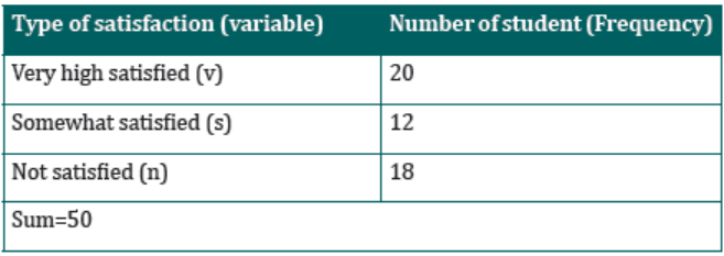
Assume that a sample of 50 taxpayers in a district was selected to understand
how taxpayers are satisfied with the taxes they are paying. The responses of
those taxpayers are recorded below where (v) means very high satisfied, (s)
means somewhat satisfied andmeans not satisfied. v, n, v, n, v, s, n, n, n, n, s,
s, v, n, n, n, s, n, n, s, n, n, n, s, s, s, v, v, s, v, s, v, n, n, n, n, s, v, v, v, v, v, v, v, s, v, v, v, v, v
From the recorded data above, we note that:
• Eleven of them were not satisfied with the taxes they were paying.
• Five of them were somewhat satisfied with the taxes were paying.
• Four of them were very high satisfied with the taxes were paying.
This information can be presented in a tabular form which lists the type of
satisfaction (very high satisfied, somewhat satisfied, and not satisfied) and the
number of students corresponding to each category. Clearly the variable is thetype of satisfaction, which is qualitative variable.
Note that, each of the students belongs to one and only one of the categories.
The number of students who belong to a certain category is called the frequency
of that category. A frequency table shows how the frequencies are distributedover various categories.
Table 4.1: Frequency table
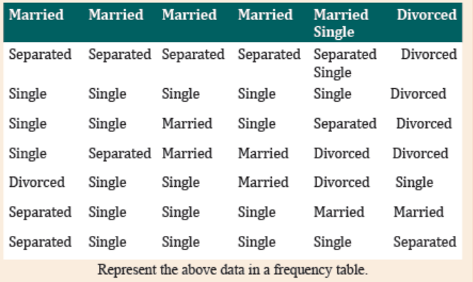
Application activity 42.1
Consider the data on the marital status of 50 people who were interviewed.
4.2.2. Bar graph
Learning Activity 4.2.1
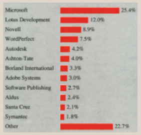
August 27, 1991, Wall Street Journal (WSJ) article reported that the
industry’s biggest companies are absorbing increasing numbers of small
software firms. According to WSJ, the result of this dominance by a few
giants is that the industry has become tougher for software entrepreneurs to
break into. The newspaper printed the chart in the accompanying figure to
depict software companies’ market share breakdown. From entrepreneurs
to corporate giants: market share among the top 100 software companies,
based on total 1990 revenue of $5.7 billion. Refer to this chart to answerthe following questions:
a) List the companies in descending order of market share.
b) What is the combined market share for Lotus Development and
WordPerfect?
c) What is the combined market share for Micro soft, LotusDevelopment, and Novell?
CONTENT SUMMARY
A bar chart or bar graph is a chart or graph that presents numerical data with
rectangular bars with heights or lengths proportional to the values that they
represent. The bars can be plotted vertically or horizontally. A vertical bar chartis sometimes called a line graph.
To construct a bar graph, we use the following steps:
• Represent the categories on the horizontal axis (remember to represent all
categories with equal intervals).
• Mark the frequencies (or percentages) on the vertical axis.
• Draw one bar for each category that corresponds to its frequency (orpercentage) on the vertical axis.
Example 1
The table below shows number of learners per class in a certain school inRwanda.
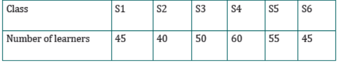
a) Represent the data in a bar chart
b) How many learners are in the whole school?
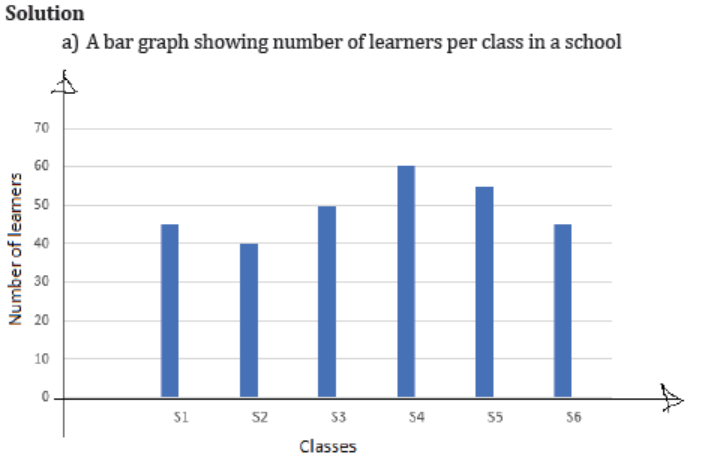
b) The number of learners that are in the whole school
= 45 + 40 + 50 + 60 + 55 + 45 = 295
The school has 295 learners.
Exampe2
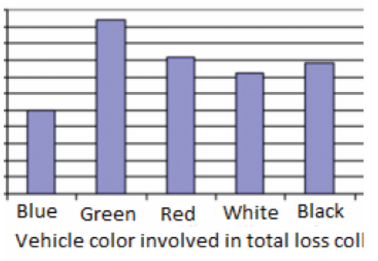
An insurance company determines vehicle insurance premiums based on
known risk factors. If a person is considered a higher risk, their premiums will
be higher. One potential factor is the color of your car. The insurance company
believes that people with some color cars are more likely to get in accidents. To
research this, they examine police reports for recent total loss collisions. Thedata is summarized in the frequency table below:
a) From the frequency table above, identify the highest frequency and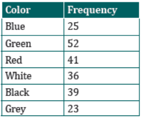
the lowest frequency.
b) Present the car data on bar chart indicating frequency against vehiclecolor involved in total loss collision.
Solution
a) From the bar chart, the highest frequency is 52 and the lowest
frequency is 23
b) The bar chart indicating frequency against vehicle color involved intotal loss collision
Application activity 42.2
1. Iyamuremye is approaching retirement with a portfolio consisting
of cash and money market fund investments worth 1,350,000,
bonds worth 1,650,000, stocks worth 1,850,000, and real estateworth 12,000,000. Present these data in a bar chart.
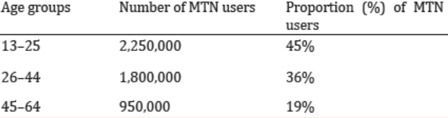
2. By the end of 2022, MTN Rwanda had over 5 million users. The table
below shows three age groups, the number of users in each age
group, and the proportion (%) of users in each age group. Constructa bar graph of this data.
4.2.3 Histogram and polygon
Learning Activity 4.2.3
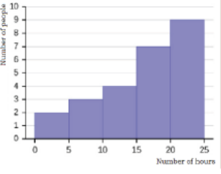
The graph below indicates the number of hours people work during a week.
The vertical axis represents the number of people, while the horizontal axisrepresents the number of hours people spend at work.
a) How many people spend more hours at work? How many hours
do those people spend?
b) In total, how many people participated in this study?c) What is the name of this graph?
CONTENT SUMMARY
After you have organized the data into a frequency distribution, you can
present them in graphical form. The purpose of graphs in statistics is to
convey the data to the viewers in pictorial form. It is easier for most people to
comprehend the meaning of data presented graphically than data presentednumerically in tables or frequency distributions.
The three most commonly used graphs in research are
a) The histogram.
b) The frequency polygon.
c) The cumulative frequency graph or ogive (pronounced o-jive).
a. The Histogram
The histogram is a graph that displays the data by using contiguous vertical
bars (unless the frequency of a class is 0) of various heights to represent thefrequencies of the classes.
Example1: suppose the age distribution of personnel at a small business is:
25, 24, 29, 20, 32, 39, 36, 30, 30, 39, 40, 42, 45, 47, 48, 43, 49, 50, 54, 58, 50,65, 79.
Form classes by grouping ages of these personnel in categories as follows: 20-29, 30-35, 39, 40-49, 50-59, 60-69, 70-79.
For each group, write the number of times numbers in that group are
occurring. To construct a histogram, we need to enter a scale on the horizontal
axis. Because the data are discrete, there is a gap between the class intervals,say between 20 and 29 and 30–39.
In such a case, we will use the midpoint between the end of one class and thebeginning of the next as our dividing point. Between the 20–29 interval and

respectively. We find the dividing point between the remaining classes
similarly.
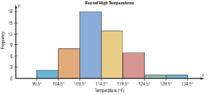
Example2: Construct a histogram to represent the data shown for the record
high temperatures for each of the 50 states.
Step 1: Draw and label the x and y axes. The x axis is always the horizontal axis,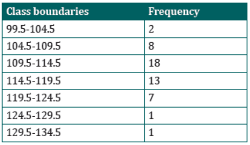
and the y axis is always the vertical axis.
Step 2: Represent the frequency on the y axis and the class boundaries on thex axis.
Step 3: Using the frequencies as the heights, draw vertical bars for each class.See Figure below
b. The Frequency Polygon
The frequency polygon is a graph that displays the data by using lines that
connect points plotted for the frequencies at the midpoints of the classes. Thefrequencies are represented by the heights of the points.
Example:
Using the frequency distribution given in Example 2, construct a frequency
polygon
Step 1: Find the midpoints of each class. Recall that midpoints are found byadding the upper and lower boundaries and dividing by 2:
Step 2: Draw the x and y axes. Label the x axis with the midpoint of each class,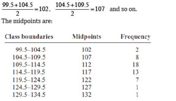
and then use a suitable scale on the y axis for the frequencies.
Step 3: Using the midpoints for the x values and the frequencies as the y values,plot the points.
Step 4: Connect adjacent points with line segments. Draw a line back to the
x axis at the beginning and end of the graph, at the same distance that theprevious and next midpoints would be located, as shown in figure.
The frequency polygon and the histogram are two different ways to represent
the same data set. The choice of which one to use is left to the discretion of theresearcher.
c. The cumulative frequency graph or Ogive.
The ogive is a graph that represents the cumulative frequencies for the classesin a frequency distribution.
Step 1: Find the cumulative frequency for each class.
Step 2: Draw the x and y axes. Label the x axis with the class boundaries. Use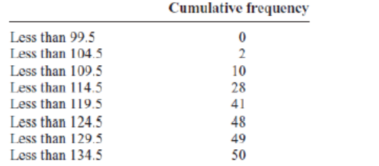
an appropriate scale for the y axis to represent the cumulative frequencies.
(Depending on the numbers in the cumulative frequency columns, scales suchas 0, 1, 2, 3, . . . , or 5, 10, 15, 20, . . . , or 1000, 2000, 3000, . . . can be used.
Do not label the y axis with the numbers in the cumulative frequency column.)In this example, a scale of 0, 5, 10, 15, . . . will be used.
Step 3: Plot the cumulative frequency at each upper class boundary, as shown
in Figure below. Upper boundaries are used since the cumulative frequencies
represent the number of data values accumulated up to the upper boundary ofeach class.
Step 4: Starting with the first upper class boundary, 104.5, connect adjacent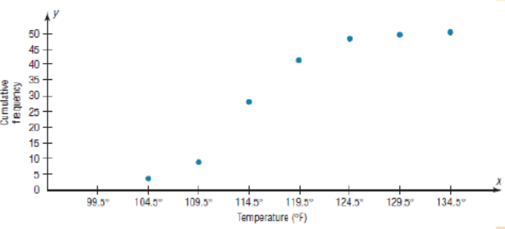
points with line segments, as shown in the figure. Then extend the graph to the
first lower class boundary, 99.5, on the x axis.
Cumulative frequency graphs are used to visually represent how many values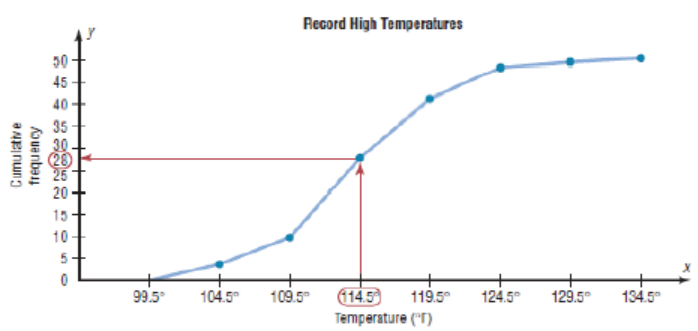
are below a certain upper class boundary. For example, to find out how many
record high temperatures are less than 114.5 0F, locate 114.5 0F on the x axis,
draw a vertical line up until it intersects the graph, and then draw a horizontalline at that point to the y axis. The y axis value is 28, as shown in the figure.
Application activity 42.3
Consider the following data:
45,50,55,60,65,70,75,47,51,56,61,66,71,76,48,52,57,62,67,72,77,49,53,5
8,63,68,73,78,49,54,59,64,68,74,49,51,55,61,68,71,51,56,61,69,71,52,56,
62,66,72,53,57,62,67,72,54,58, 63,67,74,58,63,68,58,64,68,59,64,69,55,64,69,56,64,68,61, 61,62,62,63.
Then:
a) Make this data in a frequency distribution table with Class
boundaries width equal to 5 and containing Class boundaries,
Midpoints, Frequencies, Relative frequencies, Percentages, andCumulative frequencies.
b) Draw the histogram for the frequencies, relative frequencies,
percentages, and percentage frequencies in the distributiontable.
4.2.4 Time series graph
Learning Activity 4.2.4
The graph below shows the number of buyers per quarter (per threemonths) who have visited a supermarket.
From the graph,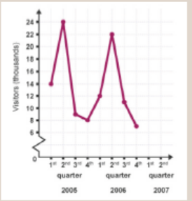
a) In which quarter did few people visit the supermarket?
b) How many people did buy at the supermarket in the second
quarter of 2005?
c) In total, how many buyers did visit the supermarket from 2005to 2007?
CONTENT SUMMARY
In most graphs and charts, the independent variable is plotted on the horizontalaxis (the X − axis ) and the dependent variable on the vertical axis (the Y − axis ).
A time series is defined as having the independent variable of time and thedependent variable as the value of the variable being studied.
A time series graph is a line graph that shows data such as measurements,sales or frequencies over a given time.
Frequently, “time” is plotted along the x-axis. Such a graph is known as a timeseries
graph because on it, changes in a dependent variable (such as GDP: GrossDomestic Production, inflation rate, or stock prices) can be traced over time.
They can be used to show a pattern or trend in the data and are useful for
making predictions about the future such as weather forecasting or financialgrowth.
To create the time series graph,
• Start off by labeling the time-axis in chronological order.
• Label the vertical axis and horizontal axis. The horizontal axis always
shows the time, and the vertical axis represents the variable beingrecorded against time.
• After labelling, plot the points given in the data set.
• Finish the graph by connecting the dots with straight lines.
Example
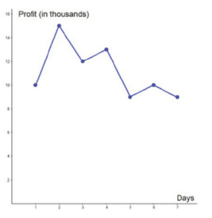
In a week, a certain company is making a profit of 10000 FRW on the first
day, 15000FRW on the second day, 12000FRW on the third day, 13000FRW
on the fourth day, 9000FRW on the fifth day, 10000FRW on the sixth day, and9000FRW on the seventh day. In a tabular form, this can be presented as
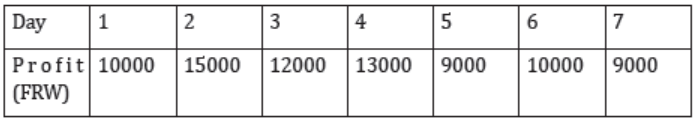
The time series graph is
Application activity 4.2.4
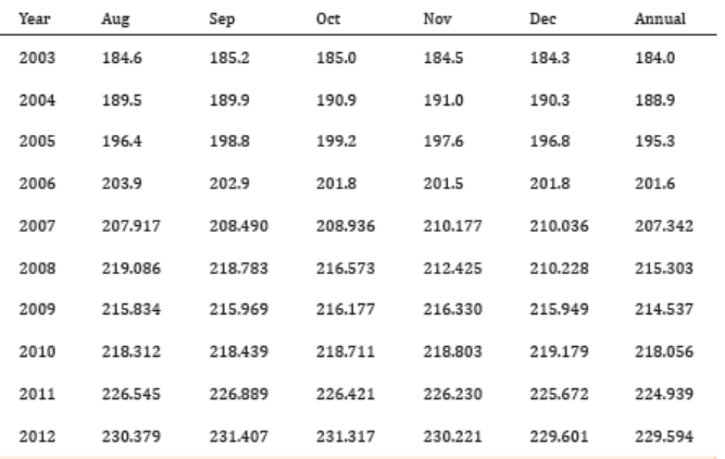
The following data shows the Annual Consumer Price Index each month
for ten years. Construct a time series graph for the Annual Consumer PriceIndex data only.
4.2.5 Pie chart
Learning Activity 4.2.5
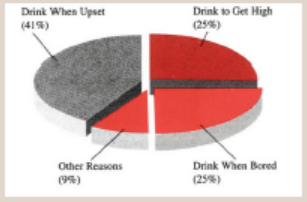
The chart below presents data on why teenagers drink. Use the information
shown in the chart to answer the following questions:
a) For what reason do the highest numbers of teenagers drink?
b) What percentage of teenagers drink because they are bored orupset?
CONTENT SUMMARY
A pie chart, sometimes called a circle chart, is a way of summarizing a set of
data in circular graph. This type of chart is a circle that is divided into sections
or wedges according to the percentage of frequencies in each category of thedistribution. Each part is represented in degrees.
To present data using pie chart, the following steps are respected:
Step 1: Write all the data into a table and add up all the values to get a total.
Step 2: To find the values in the form of a percentage divide each value by
the total and multiply by 100. That means that each frequency must also beconverted to a percentage by using the formula
Step 3: To find how many degrees for each pie sector we need, we take a full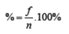
circle of 360° and use the formula:
Since there are 3600 in a circle, the frequency for each class must be converted
into a proportional part of the circle. This conversion is done by using theformula:
Step 4: Once all the degrees for creating a pie chart are calculated, draw a circle
(pie chart) using the calculated measurements with the help of a protractor,and label each section with the name and percentages or degrees.
Example.
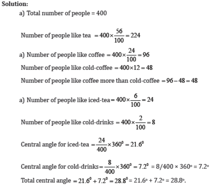
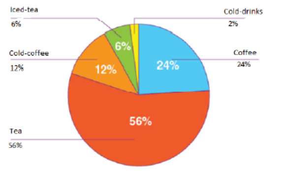
1. In the summer, a survey was conducted among 400 people about their
favourite beverages: 2% like cold-drinks, 6% like Iced-tea, 12% likeCold-coffee, 24% like Coffee and 56% like Tea.
a) How many people like tea?
b) How many more people like coffee than cold coffee?
c) What is the total central angle for iced tea and cold-drinks?
d) Draw a pie chart to represent the provided information.
Example 2:
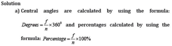
A person spends his time on different activities daily (in hours):
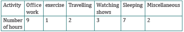
a) Find the central angle and percentage for each activity.
b) Draw a pie chart for this information
c) Use the pie chart to comment on these findings.
b) Using a protractor, graph each section and write its name and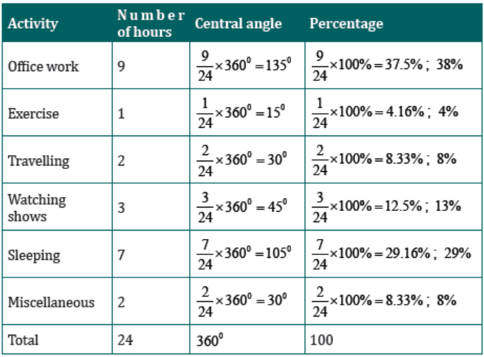
corresponding percentage, as shown in the Figure below
Application activity 4.2.5
After selling fruits in a market, Aisha had a total of 144 fruits remaining.The pie chart below shows each type of fruit that remained.
a) Find the total cost of mangoes and pawpaws if a mango sells at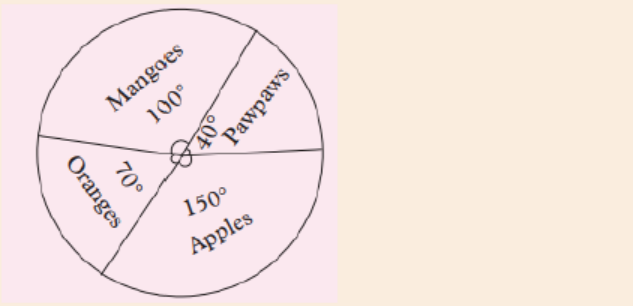
30 FRW and pawpaw at 160 FRW each.
b) Which types of fruit remained the most?
c) Draw a frequency table to display the information on the piechart.
4.2.6 Graph interpretation
Learning Activity 4.2.4
The graph below shows the sizes of sweaters worn by 30 year 1 students
in a certain school. Observe it and interpret it by answering the questionsbelow:
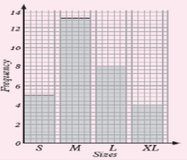
a) How many students are with small size?
b) How many students with medium size, large size and extra largesize are there?
CONTENT SUMMARY
Once data has been collected, they may be presented or displayed in various
ways including graphs. Such displays make it easier to interpret and comparethe data.
Examples
1. The bar graph shows the number of athletes who represented fiveAfrican countries in an international championship.
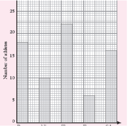
a) What was the total number of athletes representing the five countries?
b) What was the smallest number of athletes representing one country?
c) What was the most number of athletes representing a country?
d) Represent the information on the graph on a frequency table.
Solution:
We read the data on the graph:
a) Total number of athletes are: 18 + 10 + 22 + 6 + 16 = 72 athletes
b) 6 athletes
c) 22 athletes
d) Representation of the given information on the graph on a frequencytable.
2. Use a scale vertical scale 2cm: 10 students and Horizontal scale 2cm: 10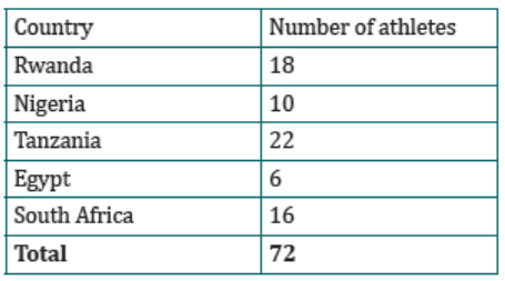
represented on histogram below to answers the questions that follows
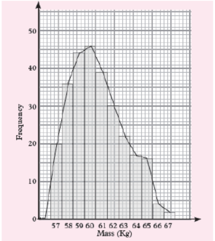
a) estimate the mode
b) Calculate the range
Solution:
a) To estimate the mode graphically, we identify the bar that represents
the highest frequency. The mass with the highest frequency is 60 kg.
It represents the mode.
b) The highest mass = 67 kg and the lowest mass = 57 kgThen, The range=highest mass-lowest mass=67kg − 57kg =10kg
Application activity 4.2.5
The line graph below shows bags of cement produced by CIMERWAindustry cement factory in a minute.
a) Find how many bags of cement will be produced in: 8 minutes, 3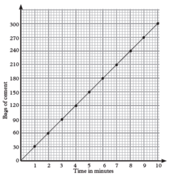
minutes12 seconds, 5 minutes and 7 minutes.
b) Calculate how long it will take to produce: 78 bags of cement.
c) Draw a frequency table to show the number of bags producedand the time taken.
4.3 Numerical descriptive measures
4.3.1 Describing data using mean, median, and mode
Learning Activity 4.3.1
Consider a portfolio that has achieved the following returns: Q1=+10%,
Q2=-3%, Q3=+8%, Q4=+12%, Q5=-7%, Q6=+12% and Q7=+3% over sevenquarters.
a) What is the average return on investment?
b) Which return of the portfolio is in the middle?
c) Which return of the portfolio that has been achieved frequently?
CONTENT SUMMARY
A measure of central tendency is very important tool that refer to the centre
of a histogram or a frequency distribution curve. There are three measures ofcentral tendency:
• Mean
• Median
• Mode
Difference between the mean, median and mode
• Mean is the average of a data set.
• The median is the middle value in a set of ranked observations. It is also
defined as the middle value in a list of values arranged in either ascending
or descending orders.• Mode is the most frequently occurring value in a set of values.
How to find mean
The most used measure of central tendency is called mean (or the average).
Here the main of interest is to learn how to calculate the mean when the dataset is raw data.
The following steps are used to calculate the mean:
Step 1: Add the numbers
Step 2: Count how many numbers there are in the data set
Step 3: Find the mean by dividing the sum of the data values by the number ofdata values
Mathematically, mean is calculated as follows:
Here, the mean can also be calculated by multiplying each distinct value by its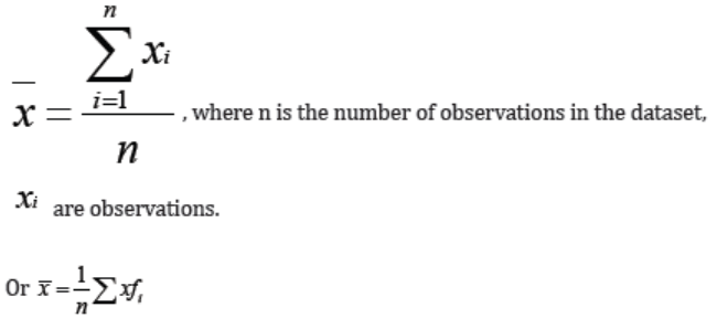
frequency and then dividing the sum by the total number of data values.
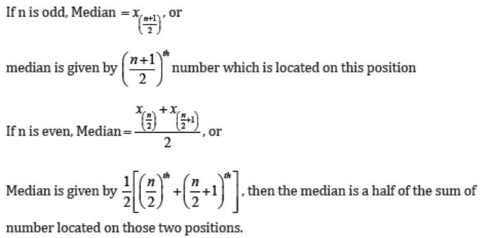
How to find median
• Rank the given data sets (in increasing or decreasing order)
• Find the middle term for the ranked data set that obtained in step 1.
• The value of this term represents the median.
In general form, calculating the median depends on the number of
observations (even or odd) in the data set, therefore applying the above stepsrequires a general formula.
Consider the ranked data x1, x2, x3,..., xn the formula for calculating the median
for the two cases (even and odd) is given by:
Example 1
To understand the three statistical concepts, consider the following example:
A Supermarket recently launched a new mint chocolate chip ice cream flavour.
They want to compare customer traffic numbers to their store in the past seven
days since the launch to understand whether their new offering intrigued
customers. Here is the customer data from last week: Monday =92 customers,
Tuesday =92 customers, Wednesday =121 customers, Thursday =120
customers, Friday = 132 customers, Saturday = 118 customers, and Sunday
=128 customers. To make sense of this data, we can calculate the average:
• Find the sum by adding the customer data together, 92 + 92 + 118 + 120 +
121 + 128 + 132 = 803• Number of days is equal to 7.
The mode is 92 customers because on Monday and Tuesday, 92 customers
were received. To find the median, we need to arrange data as follows: 92, 92,
118, 120, 121, 128, 132. Then, the middle value is 120. Therefore, the medianis 120.
The value at the fourth position in the ranked data above is 120. Hence,
median is 120.
Example 2
Calculate the mean of the pocket money of some 5 students who get
2500 FRW, 4000 FRW, 5500 FRW, 7500 FRW and 3000 FRW.
Sum all the pocket money of five students
= (2500 + 4000 + 5500 + 7500 + 3000) FRW = 22500FRW.
Divide the sum by the number of students = 22500 / 5 = 4500FRW .
The mean of the pocket money of 5 students is 4500FRW .
Application activity 4.3.1
Find the average and median monthly salary (FRW) of all six secretaries
each month earn (in thousands) 104, 340, 140, 185, 270, and 258 each,respectively.
4.3.2 Summarizing data using variance, standard deviation,
and coefficient of variation
Learning Activity 4.3.2
You and your friends have just measured the heights of your dogs (inmillimeters):
The heights (at the shoulders) are 600mm, 470mm, 170mm, 430mm, and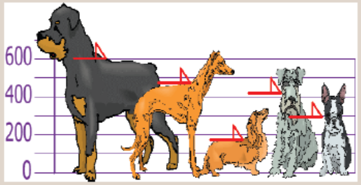
300mm.
a) Work out the mean height of your dogs.
b) For each height subtract the mean height and square the difference
obtained (the squared difference).
c) Work out the average of those squared differences. What do younotice about the average?
Variance
Variance measures how far a s t of numbers is spread out. A variance of zero
indicates that all the values are identical. Variance is always non-negative: a
small variance indicates that the data points tend to be very close to the mean
and hence to each other, while a high variance indicates that the data points are
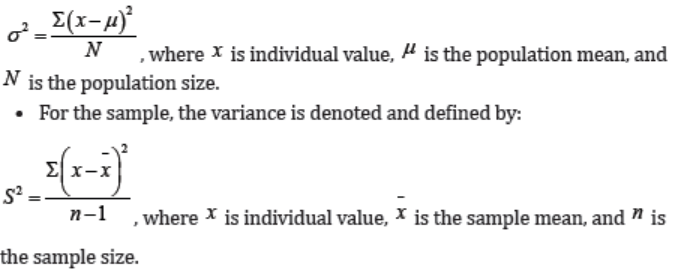
very spread out around the mean and from each other.• For the population, the variance is denoted and defined by:
How to find variance
To calculate the variance follow these steps:
• Work out the mean (the simple average of the numbers)
• Then for each number: subtract the Mean and square the result (the squared
difference).• Then work out the average of those squared differences.
Example1:
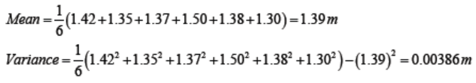
The heights (in meters) of six children are 1.42, 1.35, 1.37, 1.50, 1.38 and 1.30.
Calculate the mean height and the variance of the heights.
Example2:
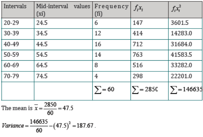
The number of customers served lunch in a restaurant over a period of 60 daysis as follows:
Find the mean and variance of the number of customers served lunch using this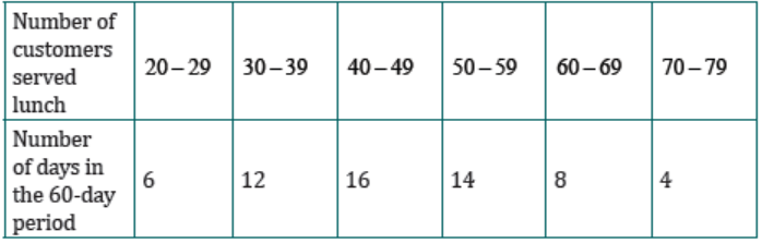
grouped data.
Solution
To find the mean from grouped data, first we determine the mid-interval valuesfor all intervals;
Standard deviation
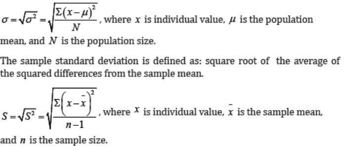
A most used measure of variation is called standard deviation denoted by ( σ
for the population and S for the sample). The numerical value of this measure
helps us how the values of the dataset corresponding to such measure arerelatively closely around the mean.
Lower value of the standard deviation for a data set, means that the values
are spread over a relatively smaller range around the mean. Larger value of
the standard deviation for a data set means that the values are spread over arelatively smaller range around the mean.
How to find standard deviation
Take a square root of the variance. The population standard deviation is defined
as: square root of the average of the squared differences from the populationmean.
Example:
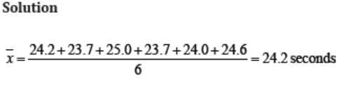
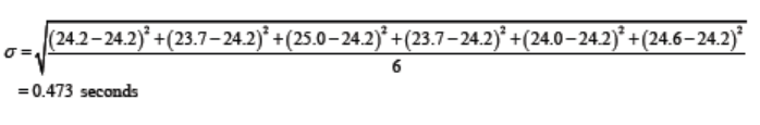
The six runners in a 200 meter race clocked times (in seconds) of 24.2, 23.7,25.0, 23.7, 24.0, 24.6.
Find the mean and standard deviation of these times.
Range
The range for a data set is depends on two values (the smallest and the largest
values) among all values in such data set. The range is defined as the differencebetween the largest value and the lowest value.
Mean deviation
Another measure of variation is called mean deviation; it is the mean of thedistances between each value and the mean.
Coefficient of variation
A coefficient of variation (CV) is one of well-known measures that used to
compare the variability of two different data sets that have different units ofmeasurement.
Moreover, one disadvantage of the standard deviation that its being a measureof absolute variability and not of relative variability.
The coefficient of variation, denoted by (CV), expresses standard deviation as apercentage of the mean and is computed as follows:
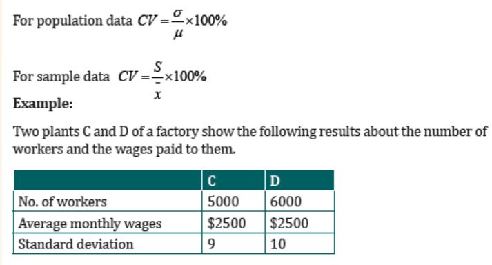
Using coefficient of variation, find in which plant, C or D there is greater
variability in individual wages.
In which plant would you prefer to invest in?
Solution
To find which plant has greater variability, we need to find the coefficient of variation.
The plant that has a higher coefficient of variation will have greater variability.
Coefficient of variation for plant C:
Using coefficient of variation formula,
Plant C has CV = 0.36 and plant D has CV = 0.4
Hence plant D has greater variability in individual wages.
I would prefer to invest in plant C as it has lower coefficient (of variation)
because it provides the most optimal risk-to-reward ratio with low volatilitybut high returns.
Application activity 4.3.2
A music school has budgeted to purchase three musical instruments. They
plan to purchase a piano costing $3,000, a guitar costing $550, and a drum
set costing $600. The mean cost for a piano is $4,000 with a standard
deviation of $2,500. The mean cost for a guitar is $500 with a standard
deviation of $200. The mean cost for drums is $700 with a standard
deviation of $100. Which cost is the lowest, when compared to other
instruments of the same type? Which cost is the highest when comparedto other instruments of the same type. Justify your answer.
4.3.3 Determining the position of data value using quartiles
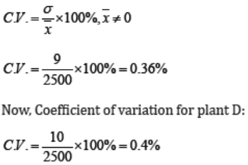
Learning Activity 4.3.3
Consider the prices of 11 items arranged in order of rank in the table below.
i) Identify the median price.
ii) How many items were bought at a price below the median price?
iii) How many items were bought at a price above the median price?
iv) Find the middle price of the lower half of the set of prices.
v) Find the middle price of the upper half of the set of prices.
vi) Together with the median price, what do the middle prices in (iv) and(v) do to the given data? Discuss.
CONTENT SUMMARY
Any data set can be divided into four equal parts by using a summary measurecalled quartiles.
There are three quartiles that used to divide the data set which is denoted by Qi
for i =1,2,3 . The following definition is illustrated the meaning of the quartiles.
Quartiles are three summary measures that divide a ranked data set into fourequal parts. The following are three quartiles:
• First quartile (Q1 ) is the middle term among the observations that are lessthan the median.
• Second quartile ( Q2) is the same as the median.
• Third quartile (Q3) is the value of the middle term among the observationsthat are greater than the median.
How to find quartiles
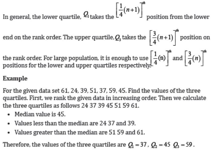
Application activity 4.3.3
The heights in cm of 13 boys are: 163, 162, 170, 161, 165, 163, 162, 163,164, 160, 158, 153, 165. Determine the three quartiles.
4.5 Measure of symmetry
4.5.1 Skewness
Learning Activity 4.3.4
Consider the two data sets that were recorded for the temperature:
Dataset1: 78, 78, 79,77,76,72,74,75,74,75,76,77, 76; Dataset2: 66, 65, 58,
59, 61, 59, 61, 58, 60, 64, 59, 64, 60, 59, 58, 59, 61, 58, 60, 61, 58, 60, 63, 58,
60, 63, 58, 60, 63, 59.
a) Represent the two datasets using bar graphs.
b) Find the mean, median, and mode of each dataset.
c) Compare the mean, median, and mode of each dataset. Do all
measures of a central tendency (mean, median, and mode) lie inthe middle?
CONTENT SUMMARY
Sometimes data are distributed equally on the right and left of the mean value.
Such data are said to be normally distributed or bell curved. They are also called
symmetric. This means that the right and the left of the distribution are perfectmirror images of one another.
Not all data is symmetrically distributed. Sets of data that are not symmetric are
said to be asymmetric. The measure of how data are asymmetric or symmetric
can be is called skewness. The mean, median and mode are all measures of the
center of a set of data. The skewness of the data can be determined by how
these quantities are related to one another. There are three types of skewness:
• Right skewness
• Zero skewness• Left skewness.
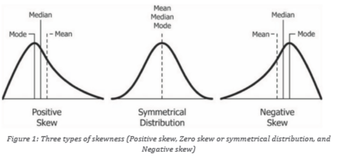
Data skewed to the right (Positive skewness).
Data that are skewed to the right have a long tail that extends to the right. An
alternate way of talking about a data set skewed to the right is to say that it is
positively skewed. Generally, most of the time for data skewed to the right, the
mean will be greater than the median and both are greater than the mode.
In summary, for a data set skewed to the right: Mode > Median >Mode.Data skewed to the left (Negative skewness).
Data that are skewed to the left have a long tail that extends to the left. An
alternate way of talking about a data set skewed to the left is to say that it is
negatively skewed. Generally, most of the time for data skewed to the left, themean will be less than the median and both less than the mode.
In summary, for a data set skewed to the left: Mode > Median >Mode.
Zero skewness
The symmetrical data has zero skewness as all measures of a central tendencylies in the middle.
In summary, for a data set skewed to the left: Mode = Median = Mean .
Measure of skewness
It’s one thing to look at two sets of data and determine that one is symmetric
while the other is asymmetric. It’s another to look at two sets of asymmetric
data and say that one is more skewed than the other. It can be very subjective
to determine which is more skewed by simply looking at the graph of the
distribution. This is why there are ways to numerically calculate the measureof skewness.
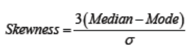
One measure of skewness, called Pearson’s first coefficient of skewness, is
to subtract the mean from the mode, and then divide this difference by thestandard deviation of the data.
The reason for dividing the difference is so that we have a dimensionless
quantity. This explains why data skewed to the right has positive skewness.
If the data set is skewed to the right, the mean is greater than the mode, and
so subtracting the mode from the mean gives a positive number. A similarargument explains why data skewed to the left has negative skewness.
Pearson’s second coefficient of skewness is also used to measure the asymmetry
of a data set. For this quantity, we subtract the mode from the median, multiplythis number by three and then divide by the standard deviation.
Examples in real life
Incomes are skewed to the right because even just a few individuals who
earn millions of dollars can greatly affect the mean, and there are no negativeincomes.
Data involving the lifetime of a product, such as a brand of light bulb, are skewed
to the right. Here the smallest that a lifetime can be is zero, and long lastinglight bulbs will impart a positive skewness to the data.
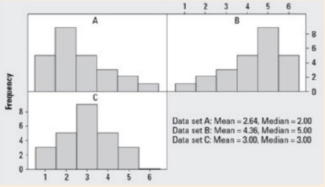
Application activity 4.3.3
Discuss the skewness of the data represented in the histograms below.
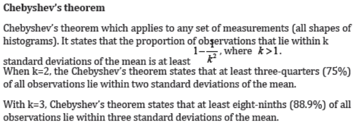
4.5.2 Chebyshev’s theorem and Empirical rule
Learning Activity 4.5.2
a) Find the mean price and the standard deviation.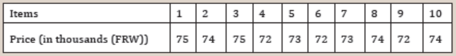
b) How many items with prices falling within one standard deviation
from the mean?
c) How many items with prices falling within two standard deviations
from the mean?
d) How many items with prices falling within three standarddeviations from the mean?
CONTENT SUMMARY
There are two ways in which we can use the standard deviation to make a
statement regarding the proportion of measurements that fall within various
intervals of values centered at the mean value. The information depends on the
shape of histogram.
• If the histogram is bell shaped (symmetric data), the Empirical Rule is used.
• Otherwise (If data are asymmetric), Chebyshev’s theorem is used.
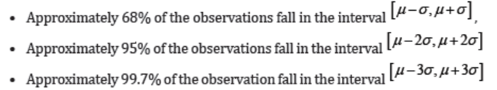
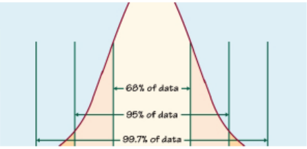
The Empirical Rule
The Empirical Rule makes more precise statements, but it can be applied
only to symmetric data (normally distributed data). For such a sample ofmeasurements, the Empirical Rule states that:
Application activity 4.5.2
Sweets are packed into bags with a normal mass of 75g. Ten bags arepicked at random from the production line and weighed.
Their masses in grams are 76, 74.2, 75.1, 73.7, 72, 74.3, 75.4, 74, 73.1, and72.8.
a) Find the mean mass and the standard deviation. It was later
discovered that the scale was reading 3.2g below the correct
weight.
b) What was the correct mean mass of the ten bags and the correct
standard deviation?c) Compare your answer in a) and b) and comment.
4.6 Examples of applications of univariate statistics
in mathematical problems that involve finance,accounting, and economics.
Learning Activity 4.6
Referring to the concepts you have learnt in this unit, list down concepts
and give examples of how those concepts are applied in solving problemsrelated to finance, accounting, and economics.
CONTENT SUMMARY
With the use of descriptive statistics, we can summarize data related to revenue,
expenses, and profit for companies. For example, a financial analyst who worksfor a retail company may calculate the following descriptive statistics during
one business quarter:
• Mean and median number of daily sales
• Standard deviation of daily sales
• Total revenue and total expenses
• Percentage change in new customers
• Percentage of products returned by customers.
• The mean household income.
• The standard deviation of household incomes.
• The sum of gross domestic product.
• The percentage change in total new jobs.
Using these metrics, the analyst can gain a strong understanding of the current
financial state of the company and also compare these metrics to previous
quarters to understand how the metrics are trending over time. Analyst can
then use these metrics to inform the organization on areas that could useimprovement to help the company increases revenue or reduce expenses.
Application activity 4.6
1. As the controller of the XXX Corporation, you are directed by the
board’s chairman to investigate the problem of overspending
by employees with expense accounts. You ask the accounting
department to provide records of the number of FRW spent by each
of 25 top employees during the past month. The following record
is provided: 292000, 494000, 600000, 807000, 535000, 435000,
870000, 725000, 299000, 602000, 322000, 397000, 390000,
420000, 469000, 712000, 520000, 575000, 670000, 723000,
560000, 298000, 472000, 905000, 305000. The questions theboard of directors wanted to be answered are:
a) How many of our 25 top executives spent more than 600000FRW
last month?b) On average, how much do employees spend?
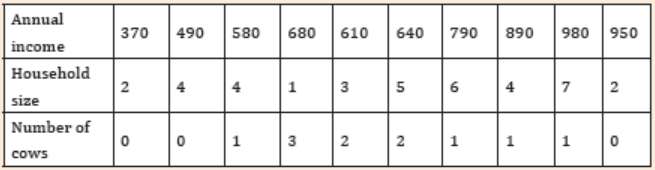
2. Consider the data on household size, annual income (in thousands(FRW)), and the number of cows for each household.
End of unit assessment 4
1. You are assigned by your general manager to examine each of last
month’s sales transactions. Find their average, find the difference
between the highest and lowest sates figures, and construct a
chart showing the differences between charge account and cashcustomers. Is this a problem in descriptive or inferential statistics?
2. When a cosmetic manufacturer tests the market to determine
how many women will buy eyeliner that has been tested for safety
without subjecting animals to injury, is it involved in a descriptive
statistics problem or an inferential statistics problem? Explain youranswer.
3. Suppose a real estate broker, is interested in the average price of a
home in a development comprising 100 homes.
a) If she uses 12 homes to predict the average price of all 100 homes,
is she using inferential or descriptive statistics?
b) If she uses all 100 homes, is she using inferential or descriptivestatistics?
4. The number of sales a salesman had in the previous 7 days are: 5, 1,2, 1, 6, 5, and 1. Calculate the variance and standard deviation.
5. Five people waiting in line at a bank were randomly chosen and
asked how much cash they had in their pocket. The amounts in
dollars are: 16, 17, 18, 19, and 15. Find the variance and standarddeviation.
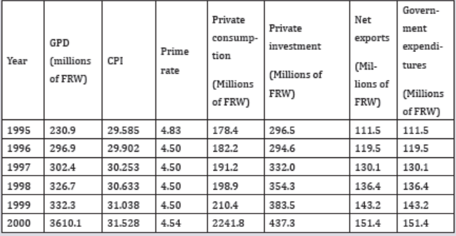
6. Refer to the table below, in which annual macroeconomic data
including GDP, CPI, prime rate, private consumption, private
investment, net exports, and government expenditures from 1995to 2000 are given. Answer the following questions.
a) How many observations are in the data set?
b) How many variables are in the data set?
c) Which of the variables are qualitative and which are quantitativevariables?